Character Creation
Improving Character Creation Experience & Alternative UI Concept

About the project
The objective of the project was to analyze the user experience in the Elden Ring video game and based on that information to improve the players' gaming experience. In addition, a new visual concept for the user interface was proposed with the objective of practicing and improving my visual design skills.
The project was part of the UX/UI in Gaming with Ivy Sang course by ELVTR.
Challenges
Understand the initial gaming experience from Elden Ring players.
Through analysis discover opportunities to improve the gaming experience.
Propose a new visual style to the user interface different from the current one.
Personal Bonus Challenge: Implement part of the design in a game engine
My Rol & Responsabilities
My role in the project ranged from the research and analysis of how the players interact and understand the character creation and the first minutes of gameplay. Then I moved to the creation, testing and iteration of the wireframes solution. And finally the creation of a new visual style different from the current one, ready-to-implement into game engine.
Tools Used


Project Length
7 weeks:
3 week discovery, insights & prototype
3 weeks design & style guide & accesibility test
1 week engine implementation

The Process
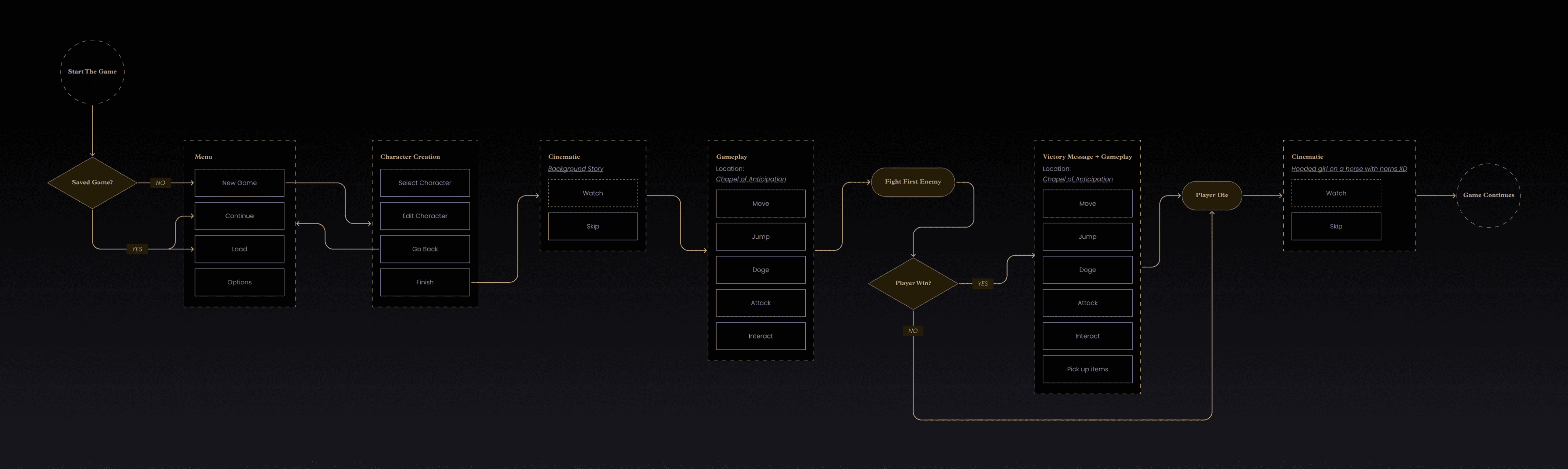
Player Journey
1° week
Screen Mapping
2° week
|
Flow Chart
Wireframes
3° week
|
Usability Test
Moodboard
4-6° week
|
Style Guide
|
UI Mockups
|
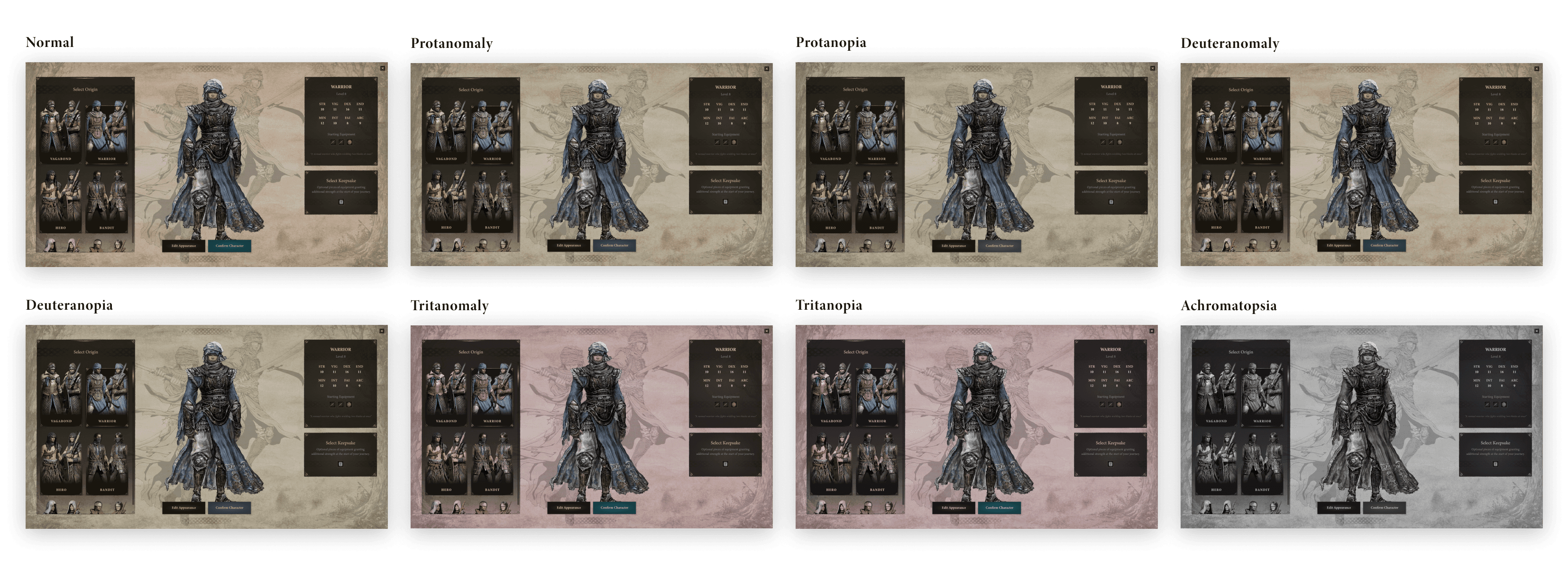
Color Blindness Test
Engine Implementation
7° week
Player Journey
In order to correctly understand the decisions and actions the players take, I analyzed the user experience for the first time players and based on that I propose an improvement solution in the character creation.
What does the player see when interacting in this section? What do you feel? What are you waiting for?, etc. Those were some of the questions that helped me understand the player's thinking.
In advance, players find confusing and overwhelming to make a decision when creating their character.
Note: I extended the analysis beyond character creation to understand the player's first decisions a little more

Player Journey Here
Mapping Screens & Flowchart
After the previous analysis I mapped how a new player interacts with the game, from starting a new game to their first encounter with an enemy. This with the aim of understanding and improving the actions available to the player on each screen.
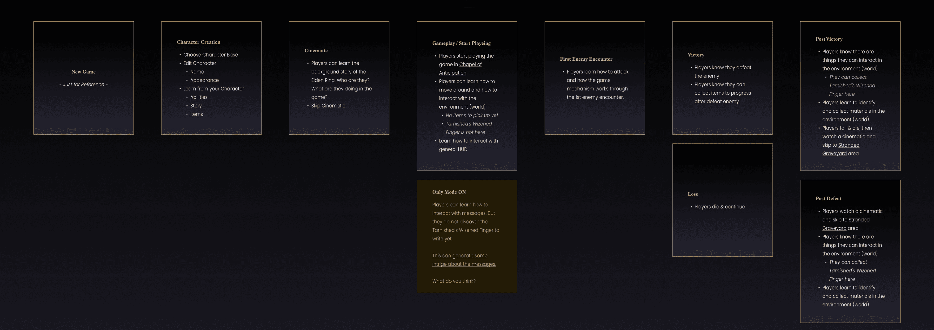
Let’s focus on the character creation
My scope was planned up to the first encounter with an enemy but due to the limited time it was a better decision to focus just on improving the character creation feature as I found many areas of opportunities.
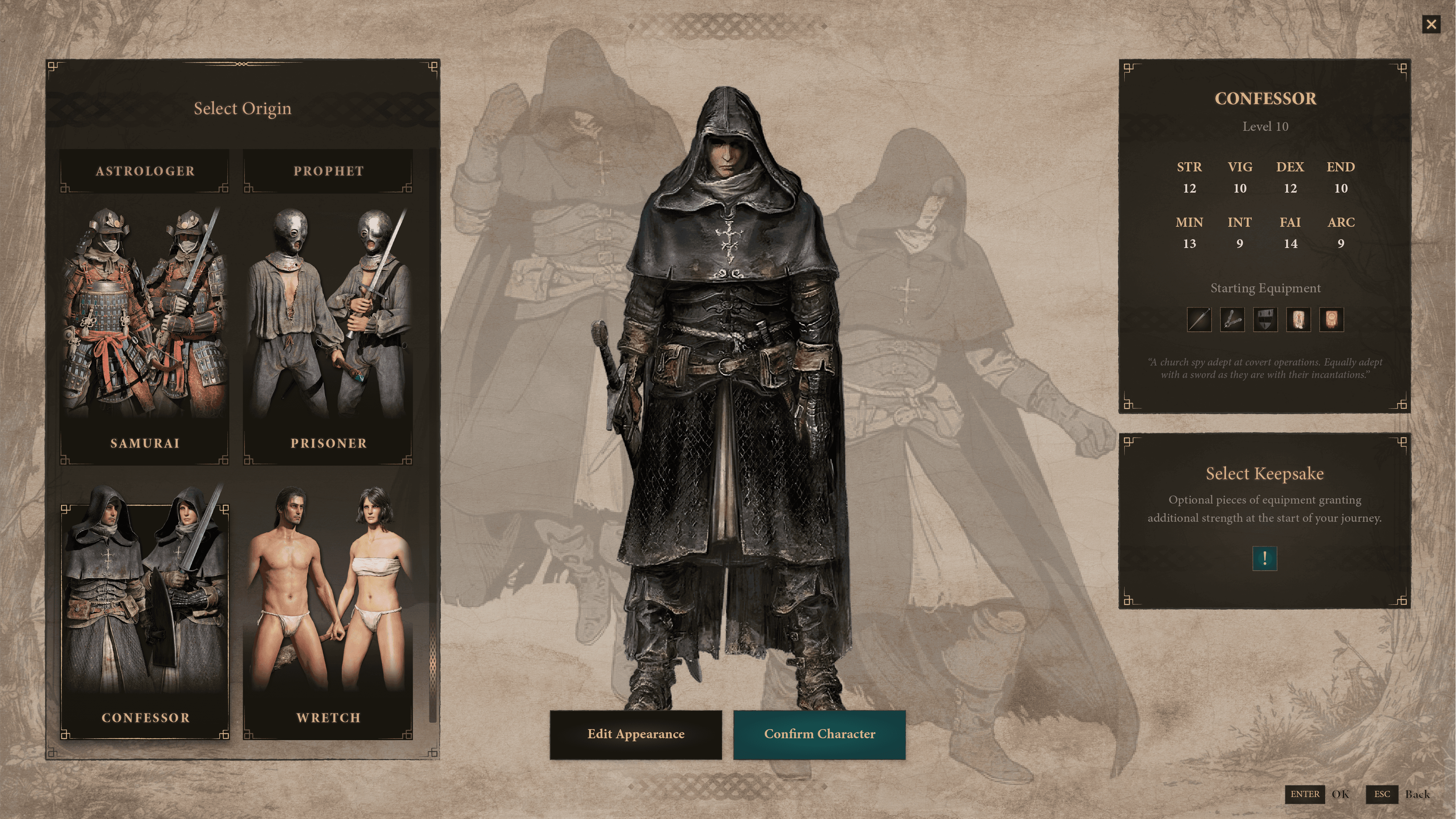
Wireframes
First Prototype
The main and most noticeable change was placing everything on the same screen, that is not selecting the Origin first and then confusingly editing the character.
In addition to being able to interact with most of the texts/components on the screen with the aim of obtaining relevant information about what individual element/text information means.


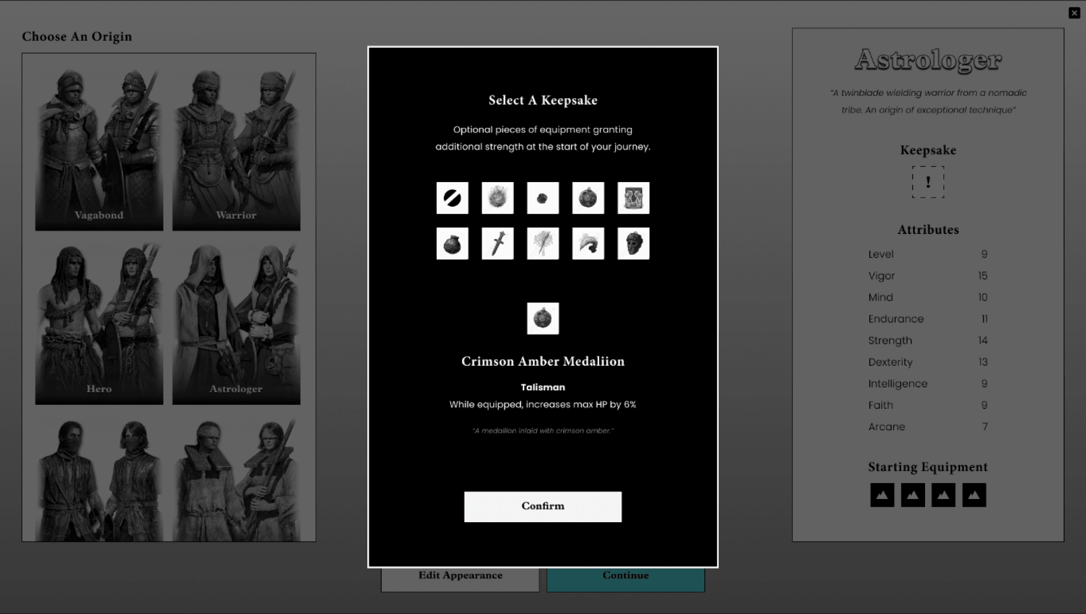
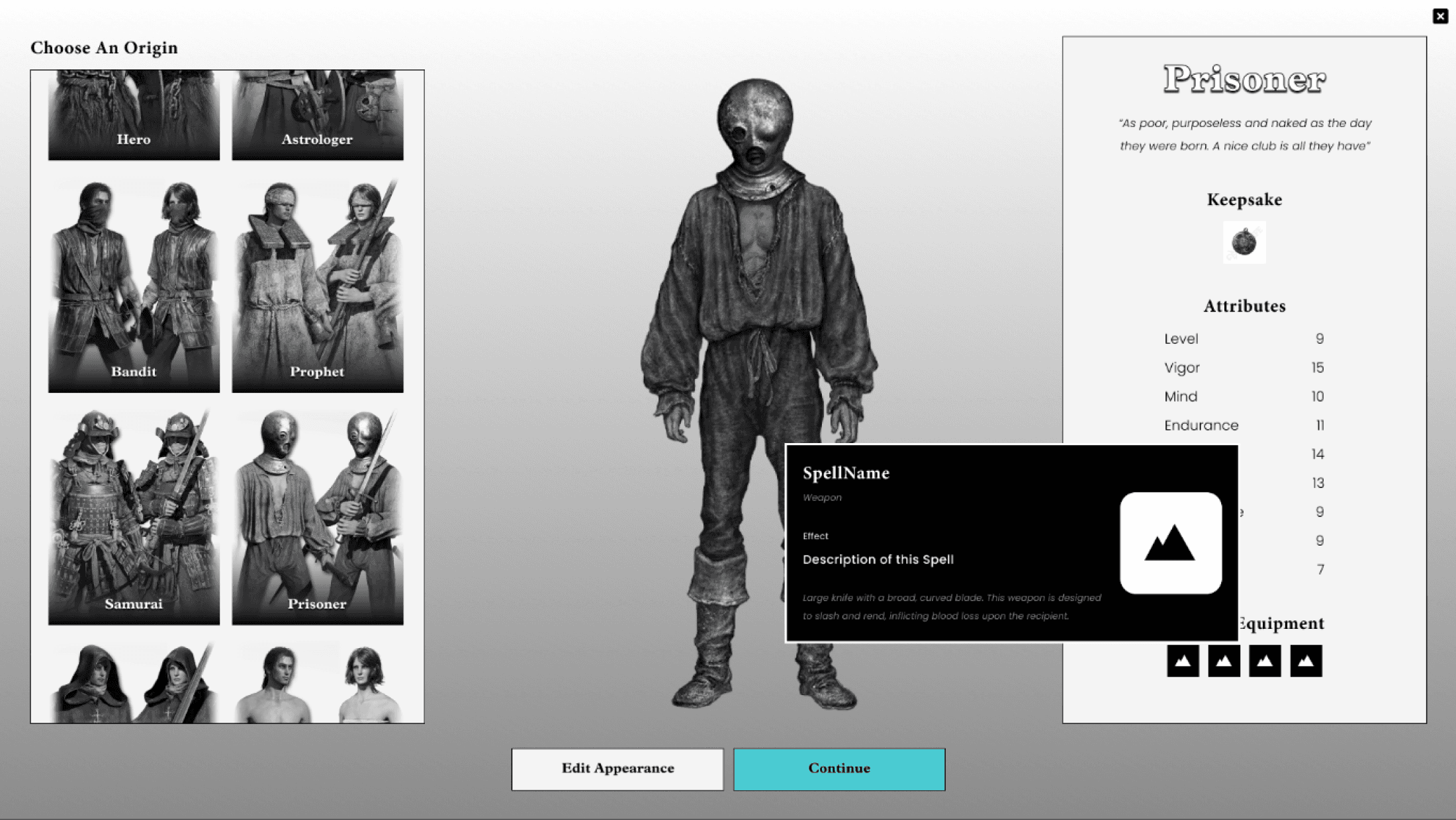
I designed the prototype as complete as possible to help the player (in usability testing)
to better understand what I was looking to achieve with this redesign.
Test Wireframes Prototype Here
Usability Test & Iteration
The previous prototype was tested and documented with 5 users, including new and current Elden Ring players.
“Five is the magic number. 85% of the problems were observed after just five people”
-Jake Knapp “Sprint” pp.198

Positive Feedback
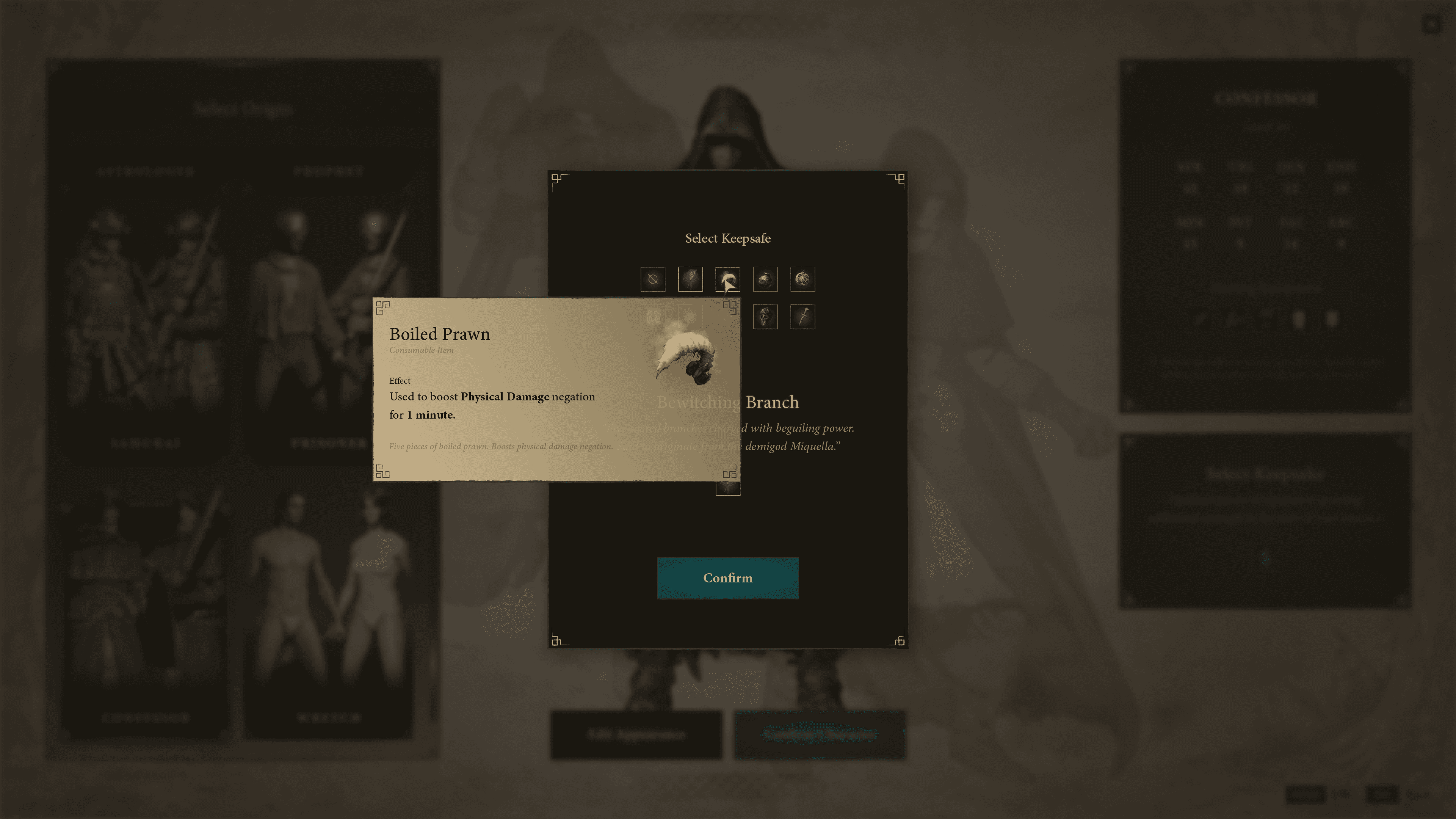
Players create their character and complete all tasks very easily and smoothly, except the keepsake selection.
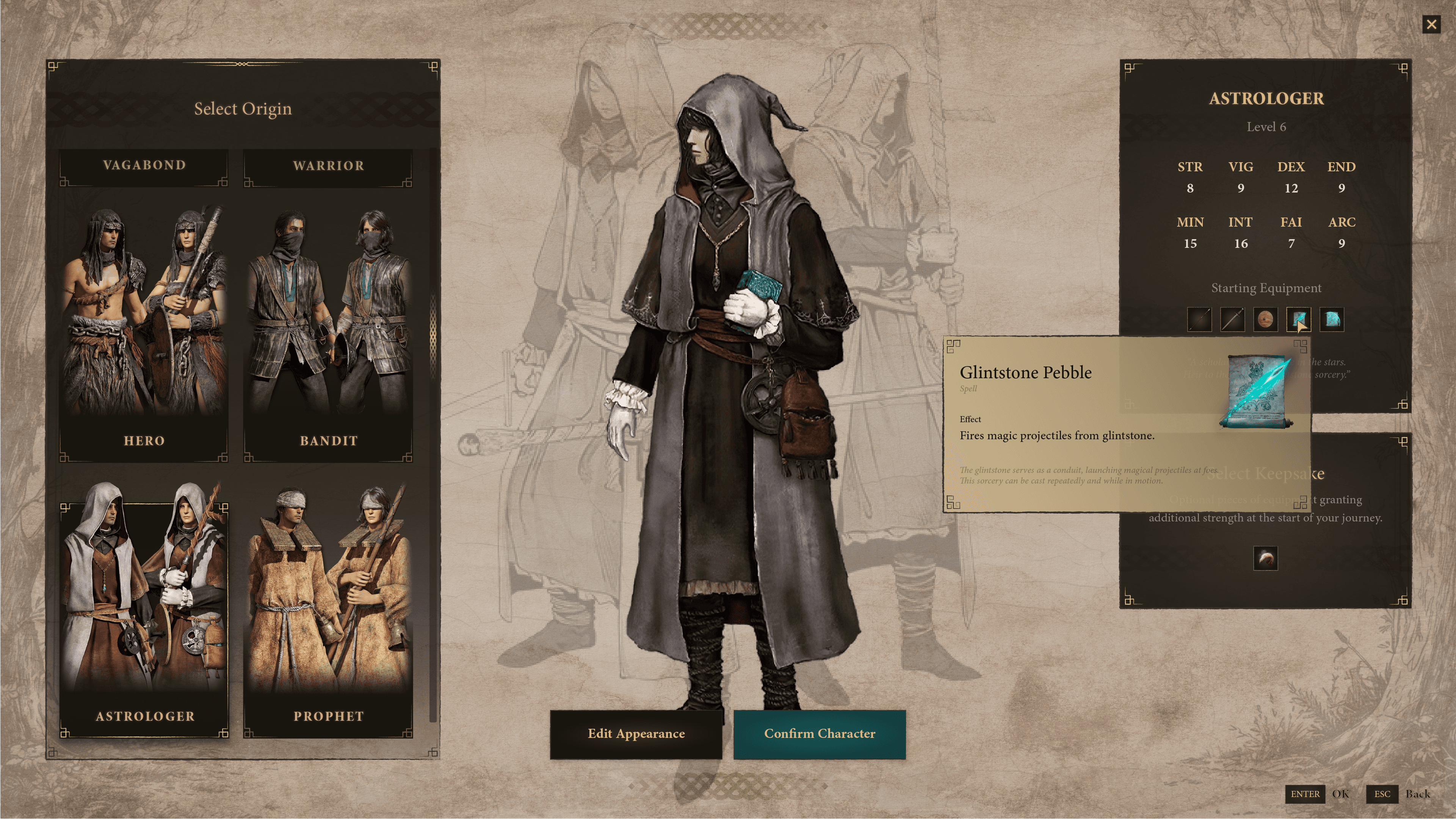
The players like how the origins and information are presented. They commented that is very easy and visually appeal to understand the information
The players like how the information is presented and contextual depending on where they hovered
🤔
To improve
The players want to know ahead what the keepsafe is for and select it easier
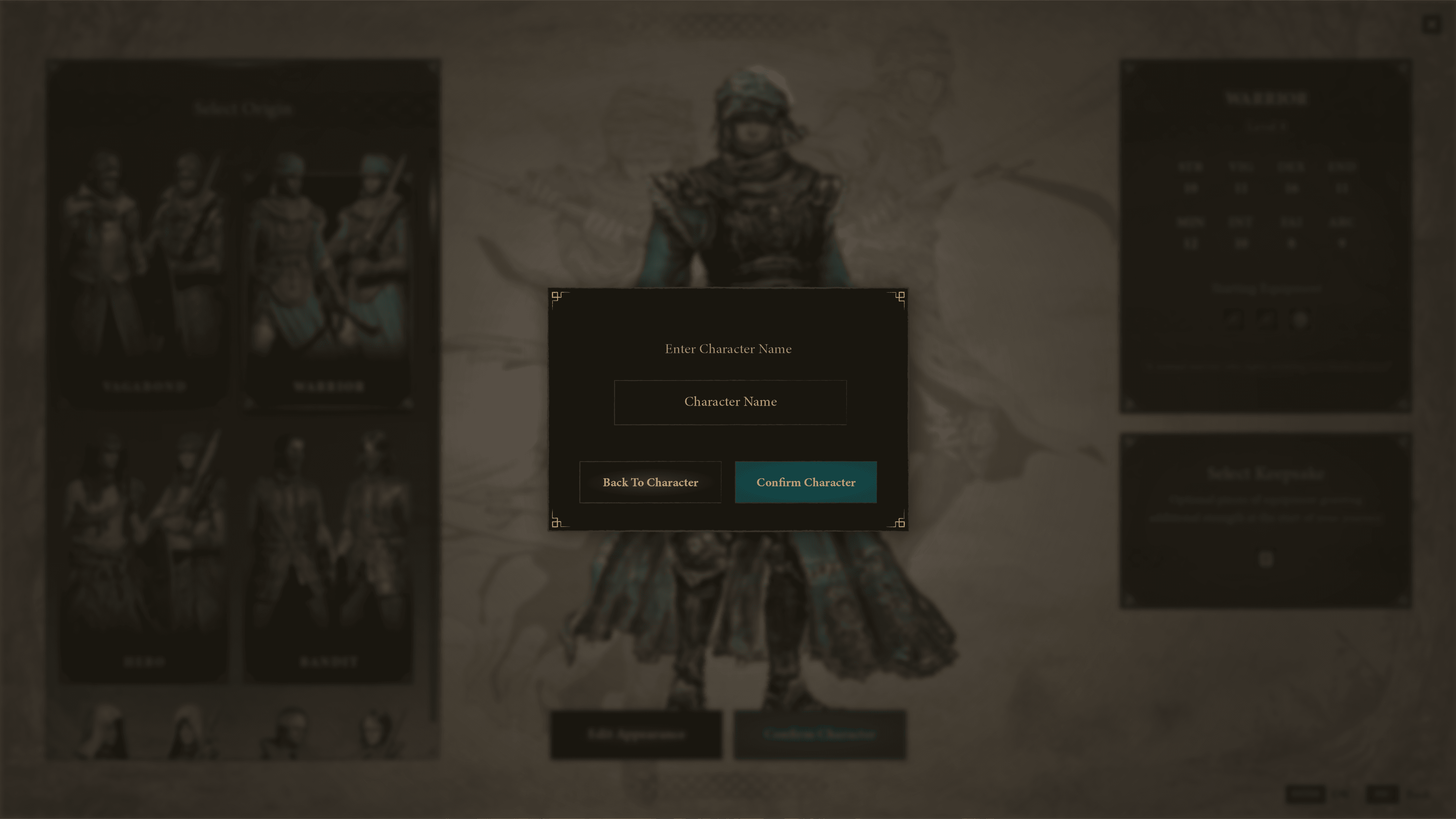
The players want to know they can interact with the buttons “Select Keepsafe” & “Edit Appearence”. Those action went unnoticed at the beginning.
Full Usability Test Study Here
Wireframes iteration
After usability test
Based on the results of the usability tests, I made some changes to the design of the wirefrmaes screens, mainly in how you understand and interact with the Keepsake.

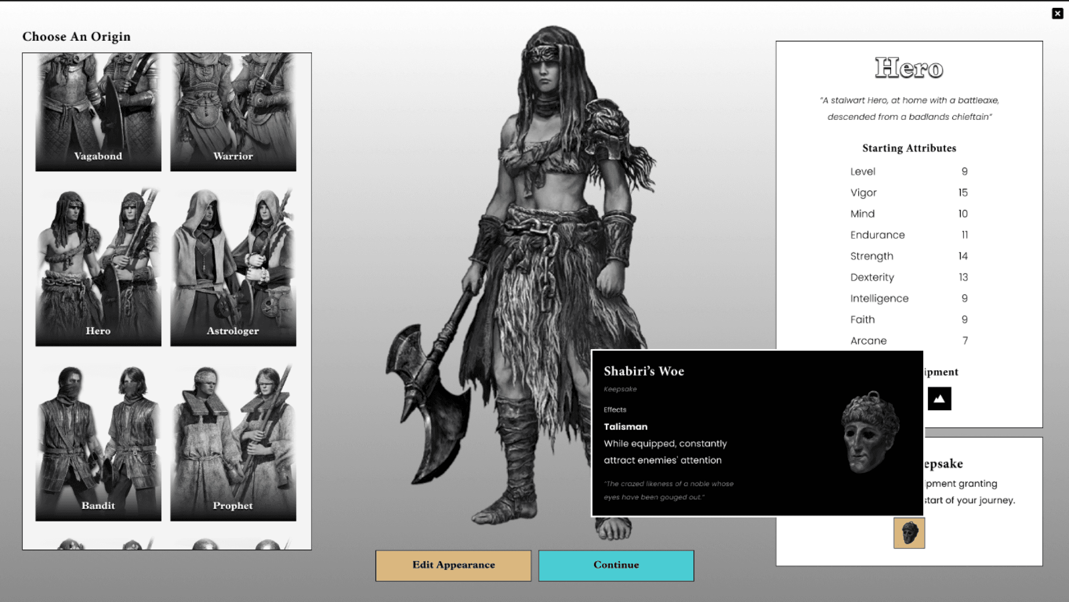
Test Wireframes Iteration Prototype Here
New Style Concpet
One of the challenges I was looking for this project was to create a new visual style, which would not stray too far from the Elden Ring concept but at the same time to be completely different from the current one and to help me strengthen my design skills.
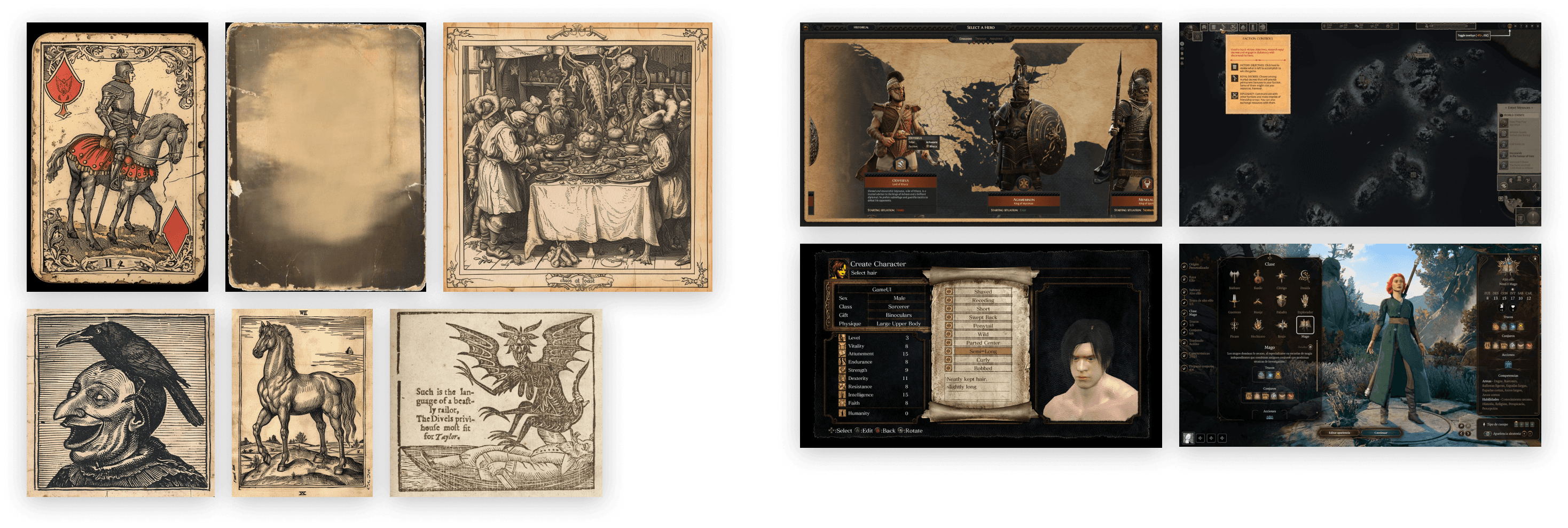
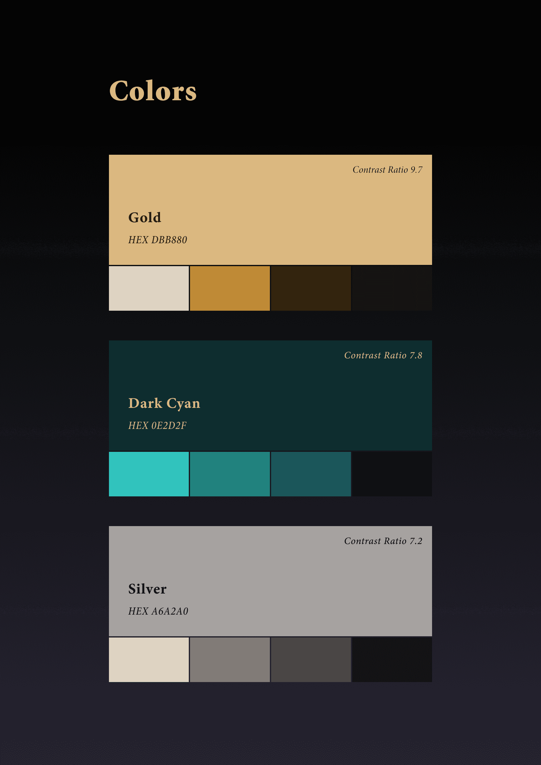
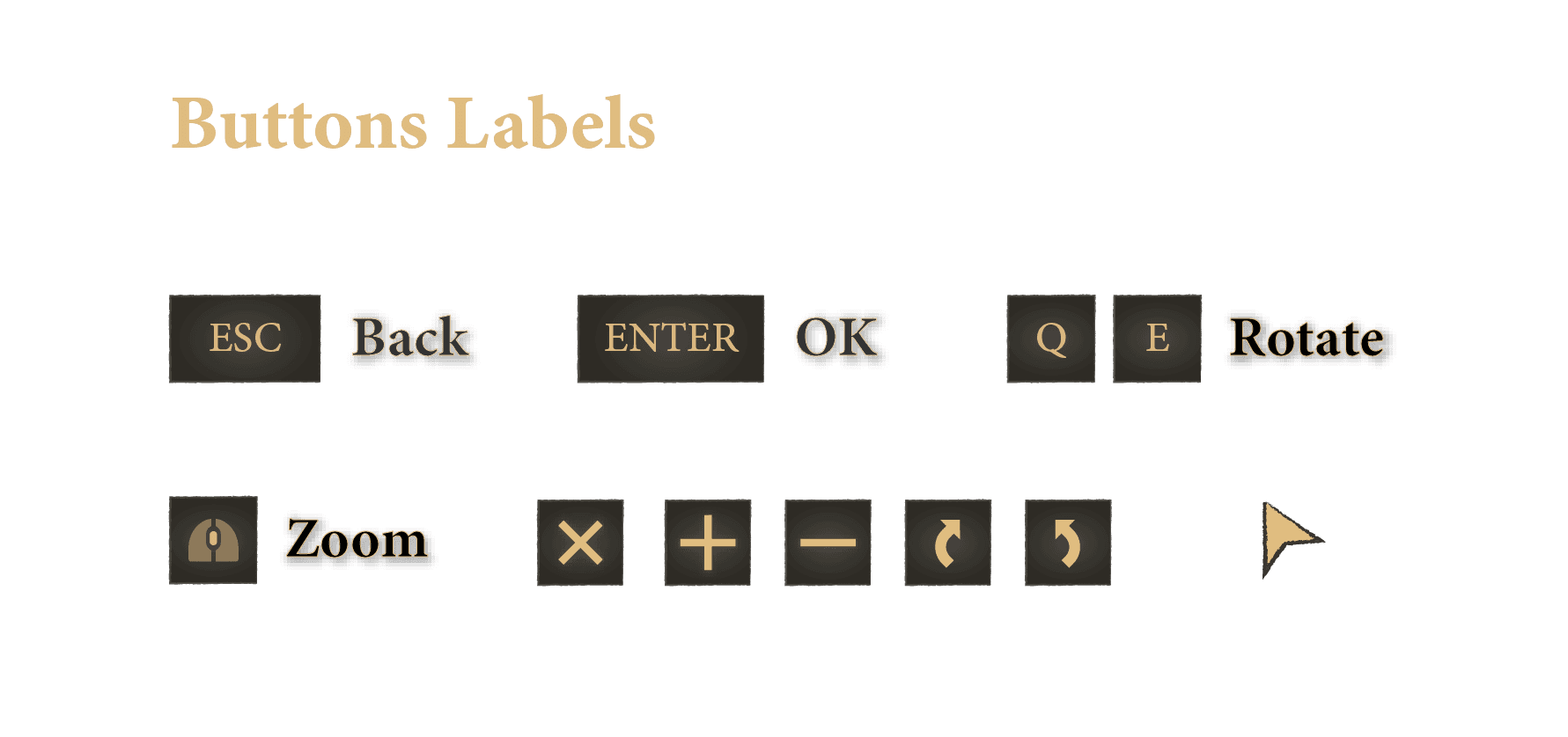
UI Style Guide
The icons & characters were borrowed from Elden Ring Wiki, I designed everything else from scratch.
The background image is a mashup I made from various textures I found for free use and edited in PS.


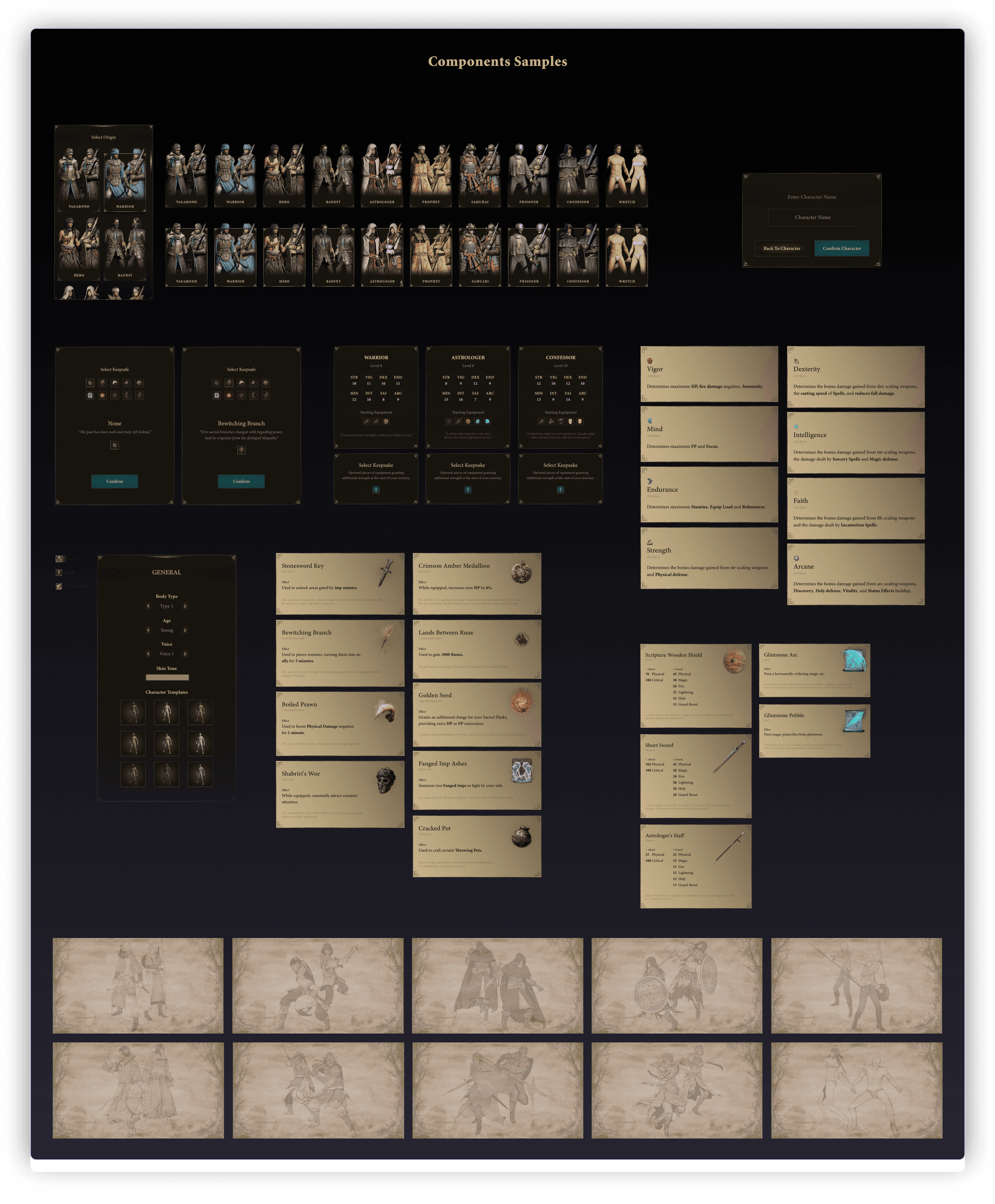
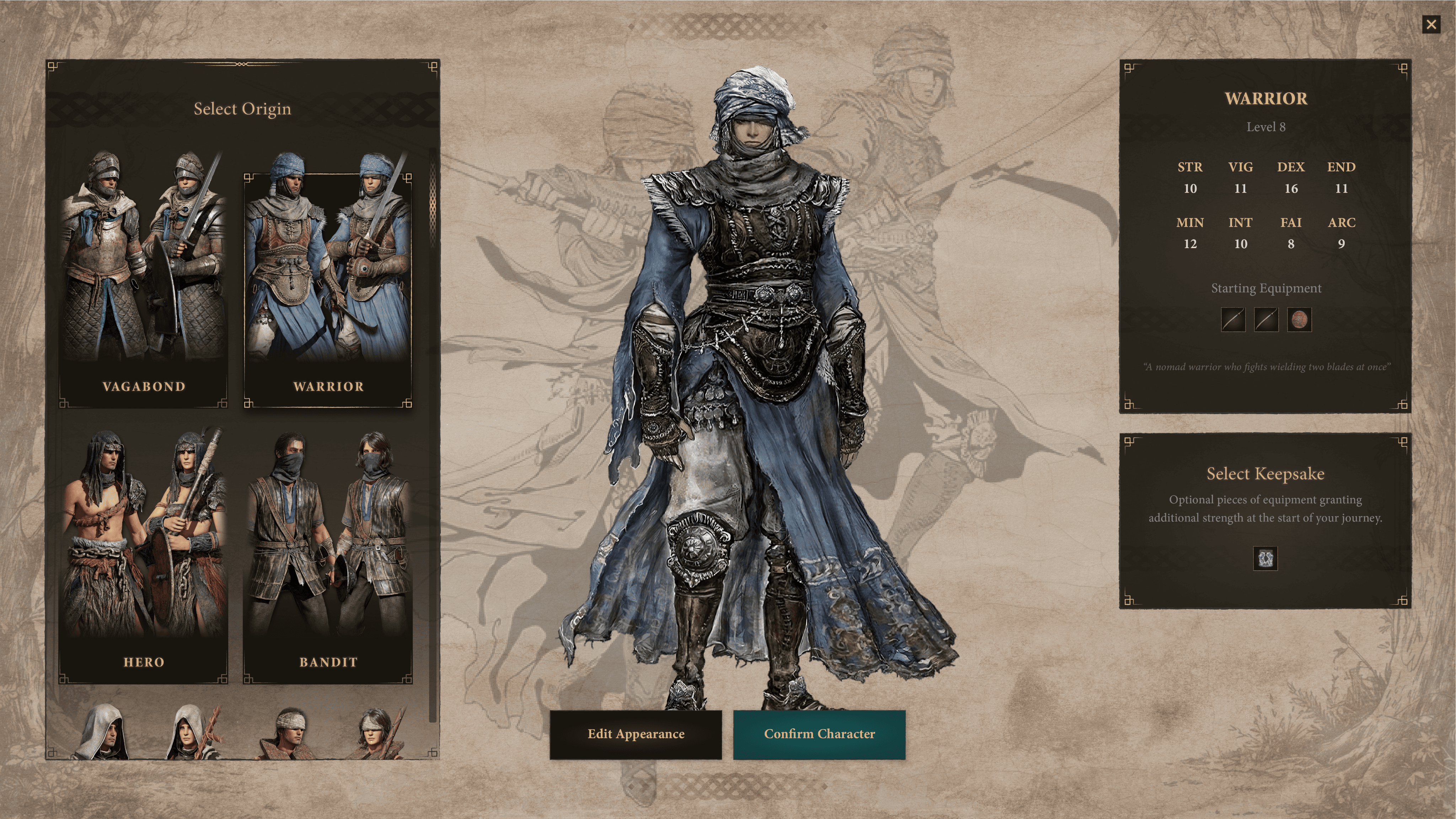
UI Mockup Sample
FInal Product
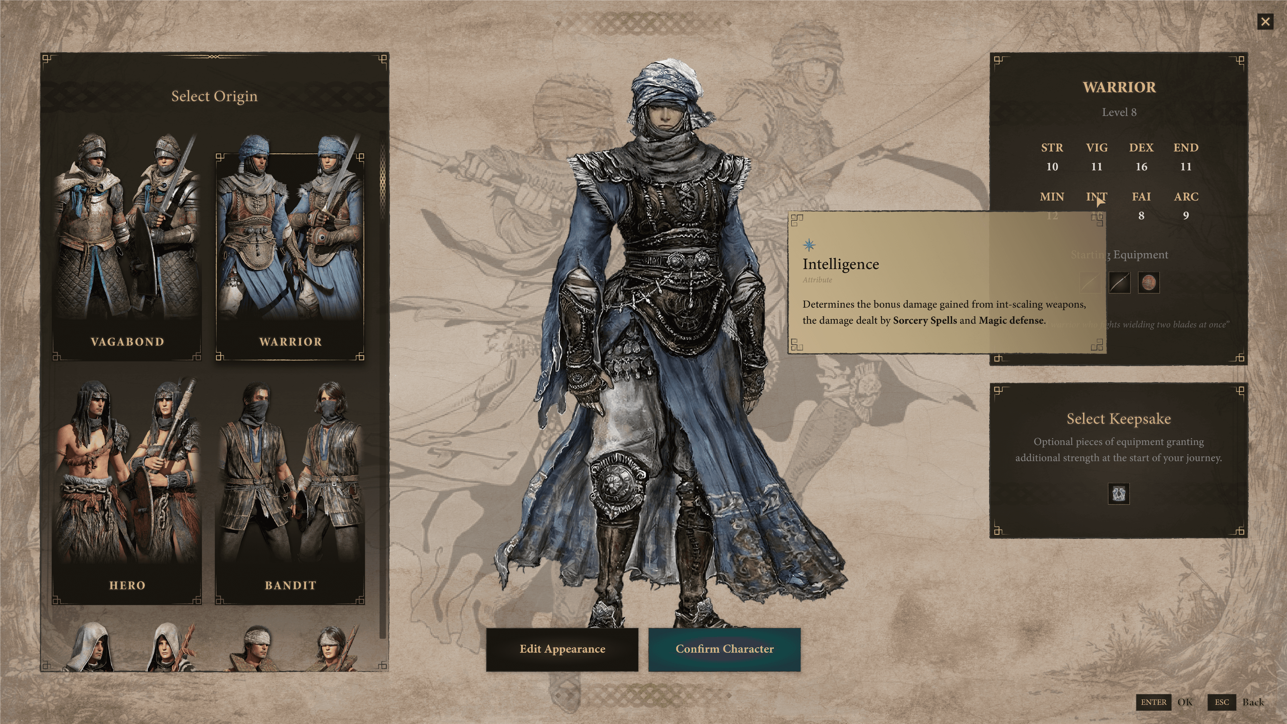
UI Mockups Solution
Final Product Screens
After several visual iterations, here is the final result, which was shared with the testers. Their acceptance was quite positive for this new visual proposal that was different from the current one.
Some comments here:
“Character creation is much more intuitive and easier”.
“I understand more easily the differences between origins”.
“It is clear to understand what a Keepsake is".
“I like the new design, it's a new interesting style.”
Click to expand images


Color Blindness Test
Engine Implementation
Bonus Personal Challenge
One of the challenges I had with this project was to implement the final design in a game engine. Due to the limited time I had, I only implemented the first screen and the basic functionality of selecting an Origin and updating the information based on the Origin selected.
I used UMG in UE5 to practice implementing user interfaces from scracth.
I used Data Tables & Structures to upload and read the information of each Origin (images and text)
I created the animation for the Origin Cards.
The backgrounds of the cards, both general and source cards, are made with UI materials and not with textures (icons and details are images) for a better performance.
I understand that there are more efficient ways to carry out this implementation. I would like to return to this project soon and optimize it as much as possible, from the general structure to only using materials to improve performance and aesthetics.

Unreal Engine Video
Engine Implementation
Outcomes & Post-Mortem
With this project and course I gained a great understanding of a player's process when interacting with a video game for the first time, analyzing their emotions and decisions with the objective of proposing improvements to the main user experience pain points.
Learnings:
It helped me to understand how to apply my design knowledge in UX/UI for a video game.
It helped me to understand the players way of thinking and to translate that into a solution for them for a better and enjoyable play experience.
An extremely satisfying exercise: A video game that already has a visual style and redesigning it with a completely different one.
I learned to understand Data Tables and Structures in Unreal Engine, in addition to implementing UI materials instead of textutras.
Without a doubt, an exceptional project that I enjoyed a lot and I would love to return soon to improve it.
Full Figma project Here
Thanks to Ivy Sang, Jacob and all the ELVTR team for the great course