Overview
DINN is an investment app by Actinver Bank focused on helping first-time investors make better financial decisions. After a brand redesign improved engagement and perception, a key gap remained: the product experience itself wasn’t communicating guidance, trust, or financial support.
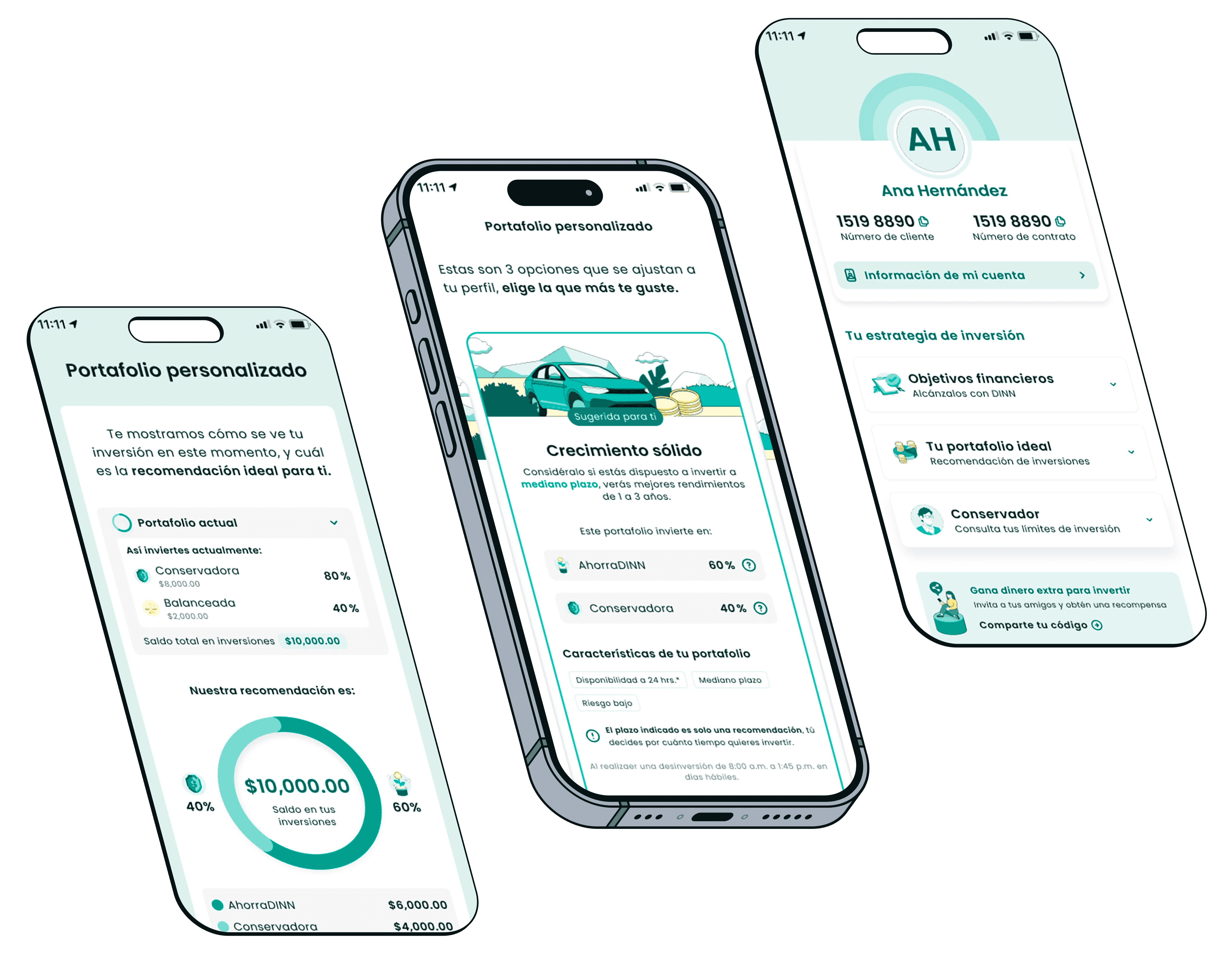
This project focused on redefining the app’s user experience to better express DINN’s value proposition—guiding users through investing instead of simply presenting financial products.
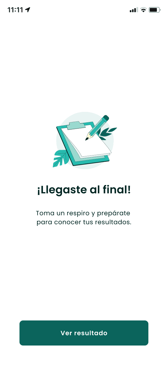
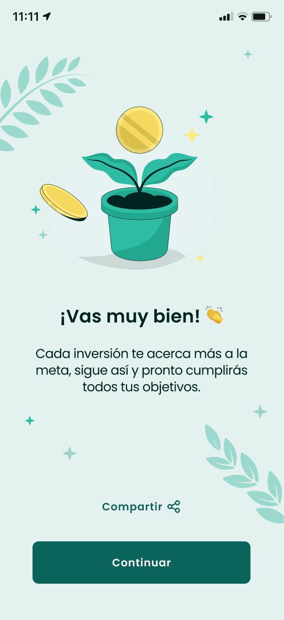
Users needed reassurance, education, and a sense of progress—not just percentages and charts.
My Role
I led the problem definition, facilitated workshops, coordinated ideation and prototyping, and guided the UX and UI execution. I worked closely with designers, stakeholders, and users to validate decisions under tight timelines.
Tools Used


Project Length
4 weeks:
Problem Understanding
Ideation & Prototyping
User Testing & Insights
UX Flows & UI
The Problem
Despite visual improvements, users felt overwhelmed. The app:
Showed investment options without guidance
Relied on technical language
Failed to explain why options mattered
Users needed reassurance, education, and a sense of progress—not just percentages and charts.
Key Insights
Users want to understand investing as a concept, not just numbers.
Trust increases when the app feels supportive and explanatory.
Guidance reduces fear more effectively than additional data.
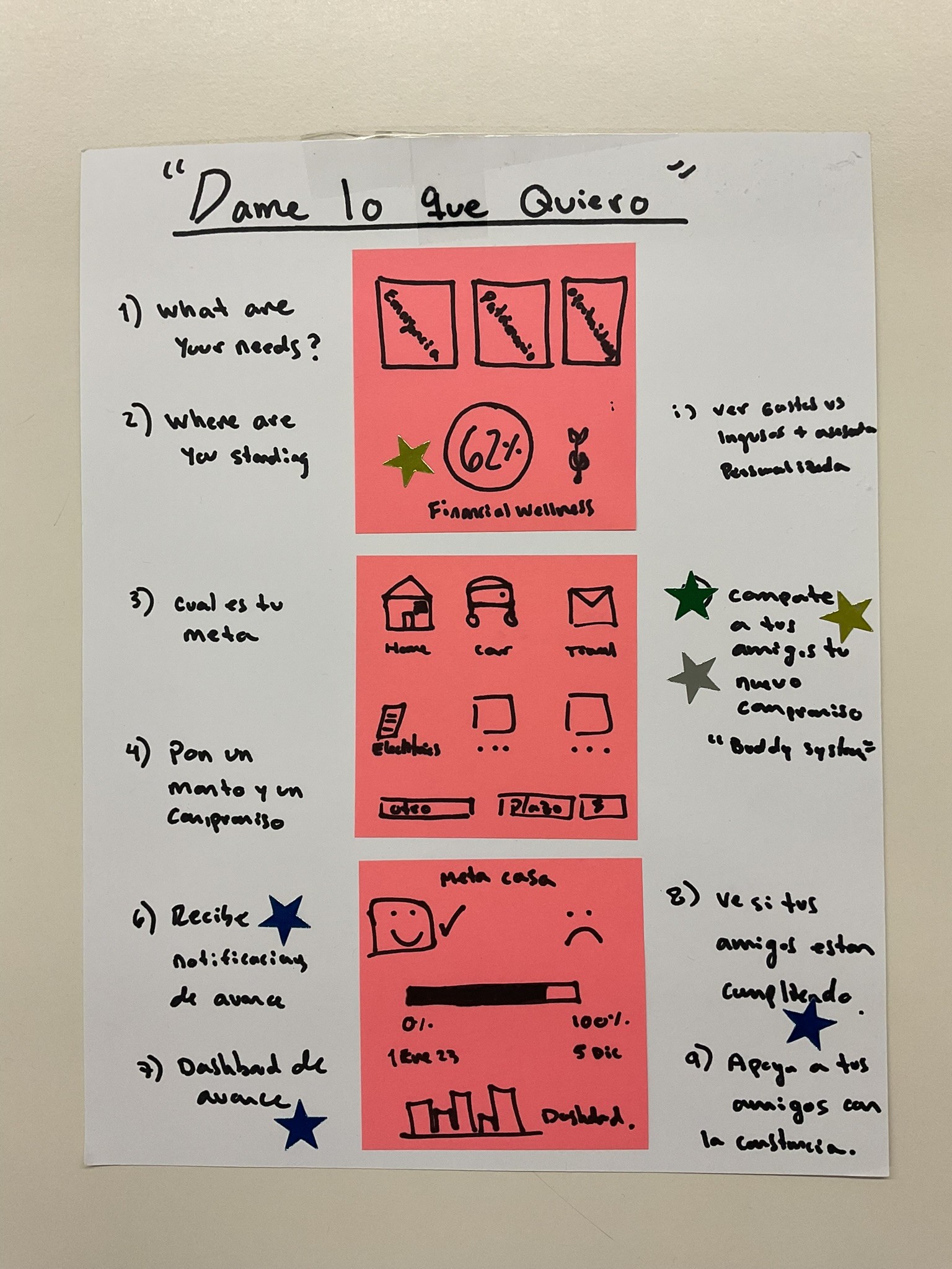
Solution Strategy
We reframed the experience from
“choose a product” to “build an investment path”.
The core idea: help users understand what they’re investing in, why, and what it means for their goals.
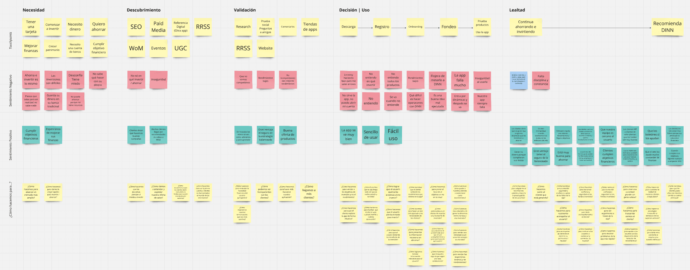
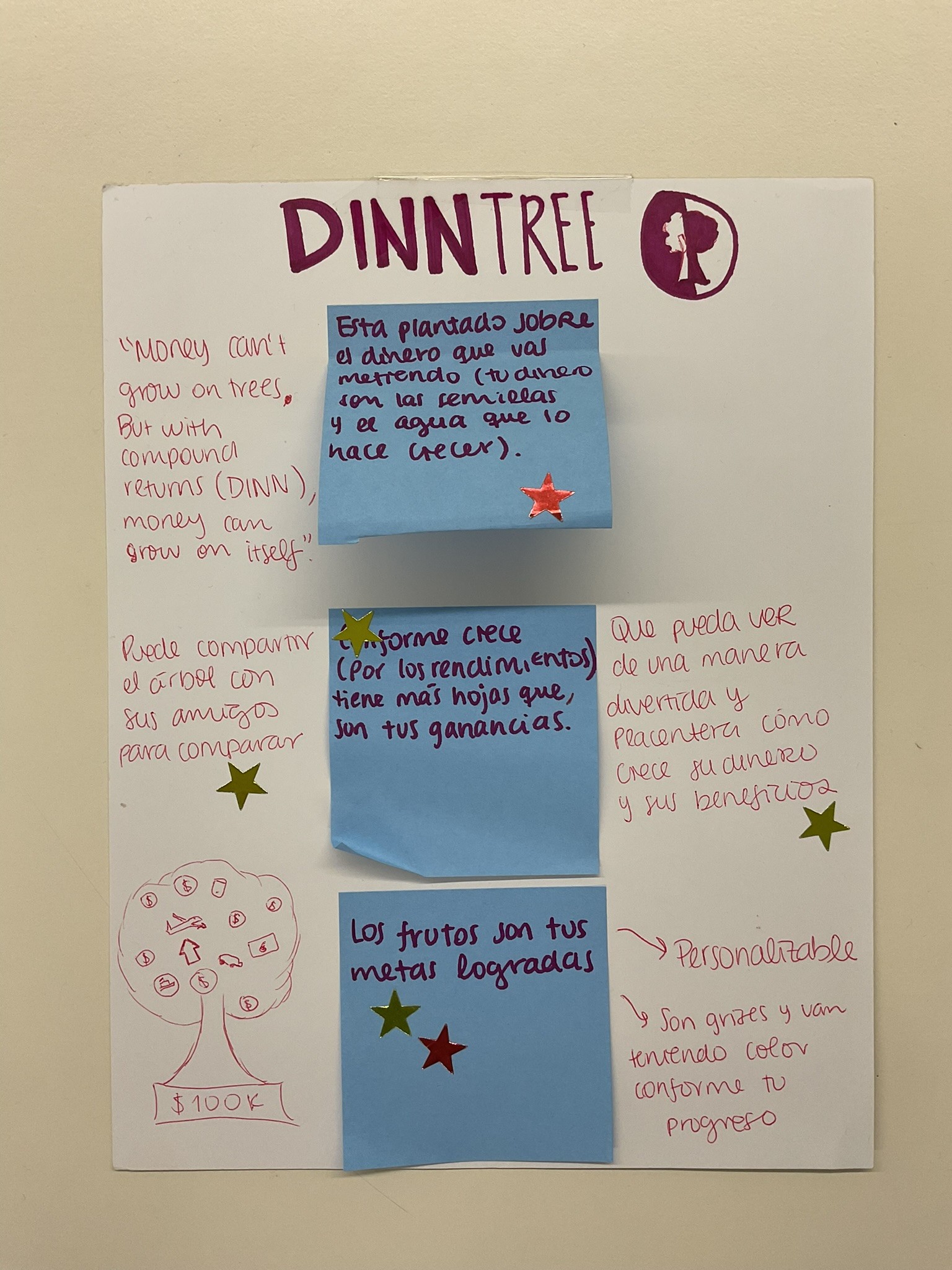
Ideation
We ran rapid workshops and sketched multiple concepts focused on personalization, goals, and clarity.
Once we decided on the focus, our team started gathering information from experts in other areas of the bank (DINN is part of a Mexican bank, Actinver, which has been around for over 30 years) and from other products.
Prototyping
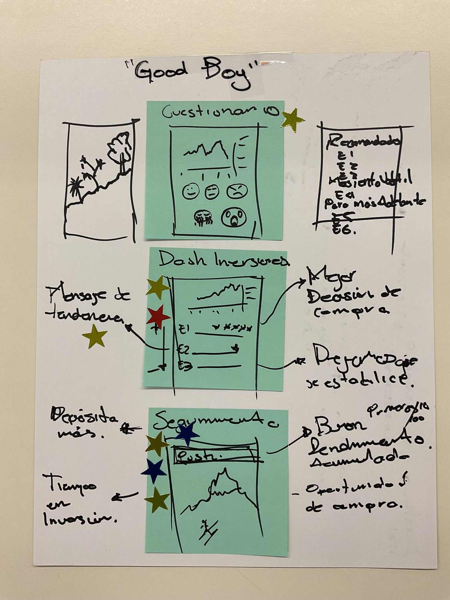
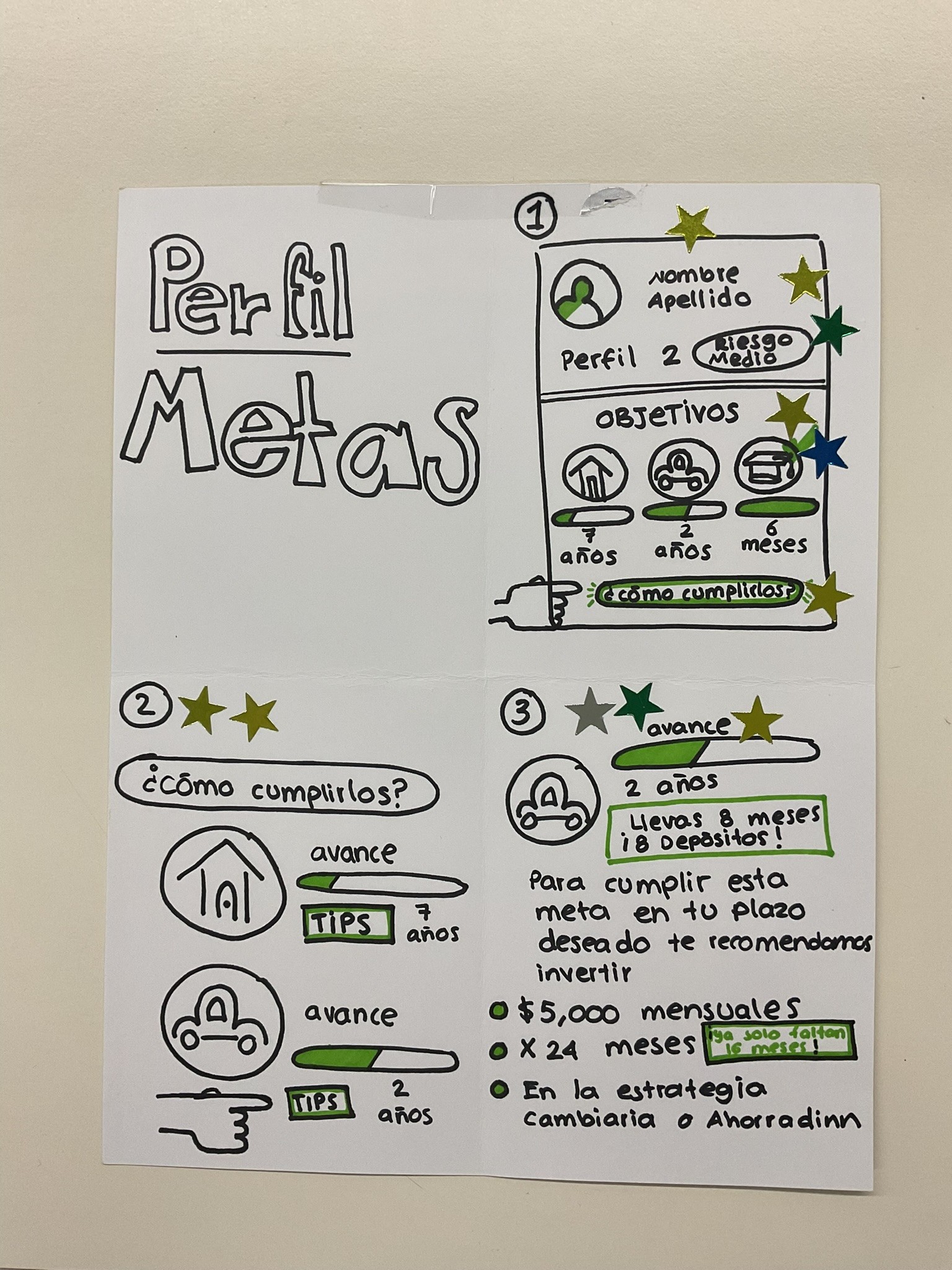
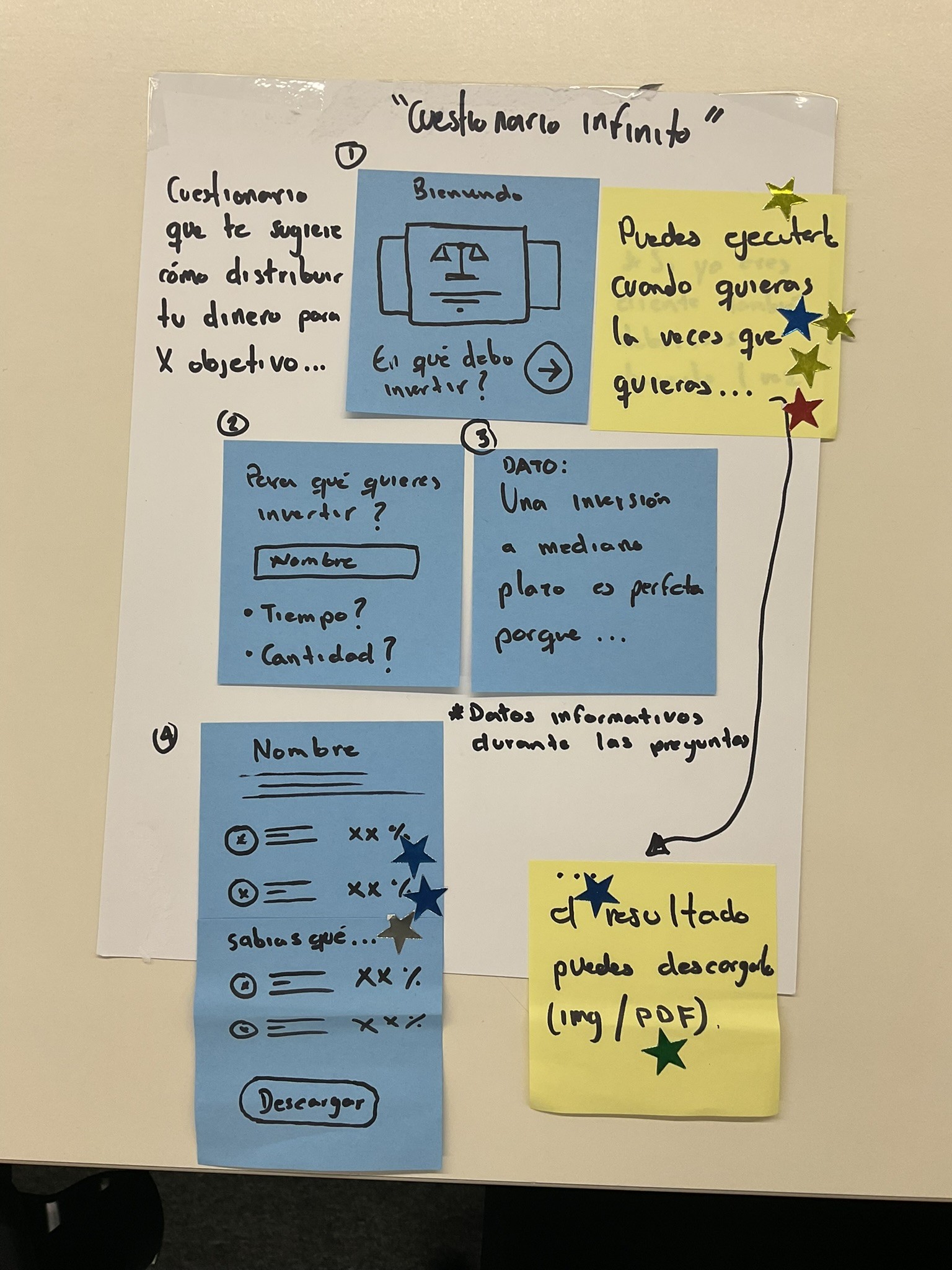
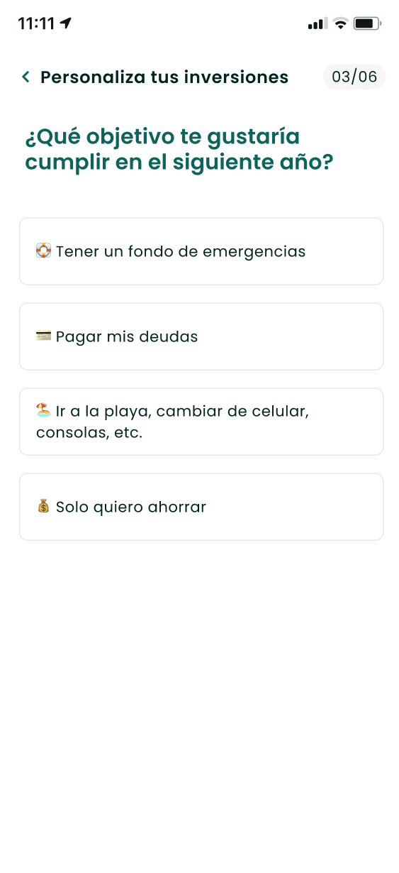
A questionnaire-based flow was created to understand users’ goals, savings capacity, and risk tolerance. Regulatory constraints were respected by integrating mandatory risk assessment flows.
This new questionnaire would be linked to another, which is mandatory by Mexican law, and asks specific questions to determine the client’s risk tolerance. We can’t change that questionnaire right now due to regulations.
User Testing
With limited time, we tested the prototype with 5 DINN clients. Feedback validated the approach and helped refine the experience before full design.
Based on the insights and our timeline, we defined the next steps. In summary, the goal was to design the full experience now, considering all the factors, and consult experts from other areas to ensure the project was as feasible as possible.
Feasibility Alignment
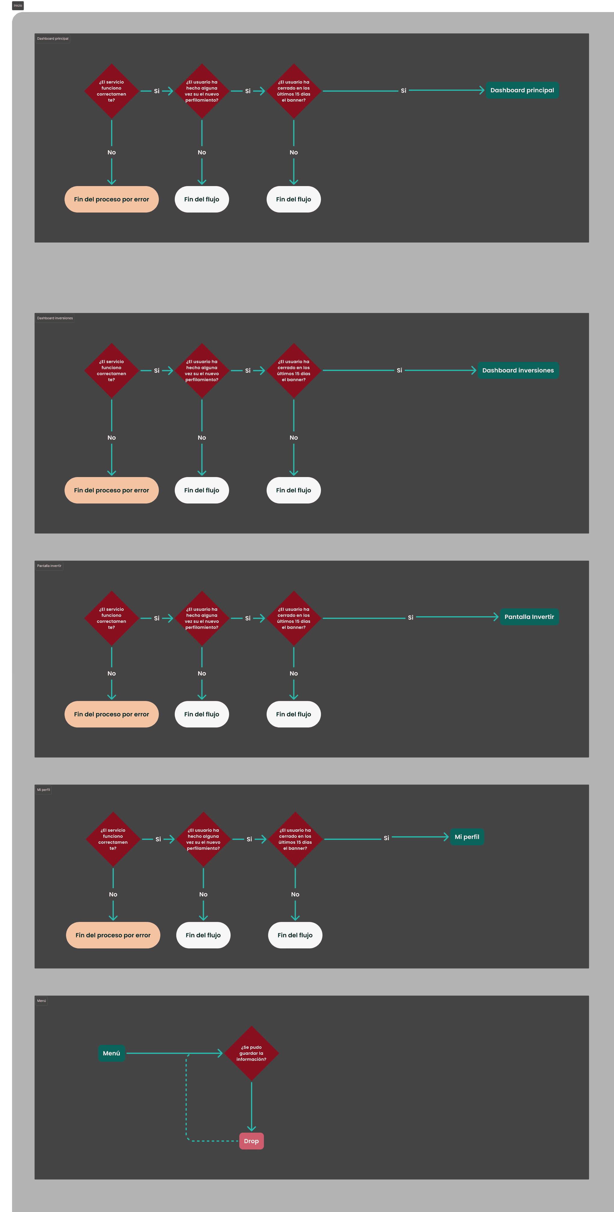
After validating the concept with users, we designed the UX flows while aligning closely with Technology and Legal teams.
Flows balanced user clarity, business rules, and regulatory constraints.
This ensured that all proposed interactions were technically feasible, compliant with financial regulations, and scalable within existing systems—avoiding rework during implementation.
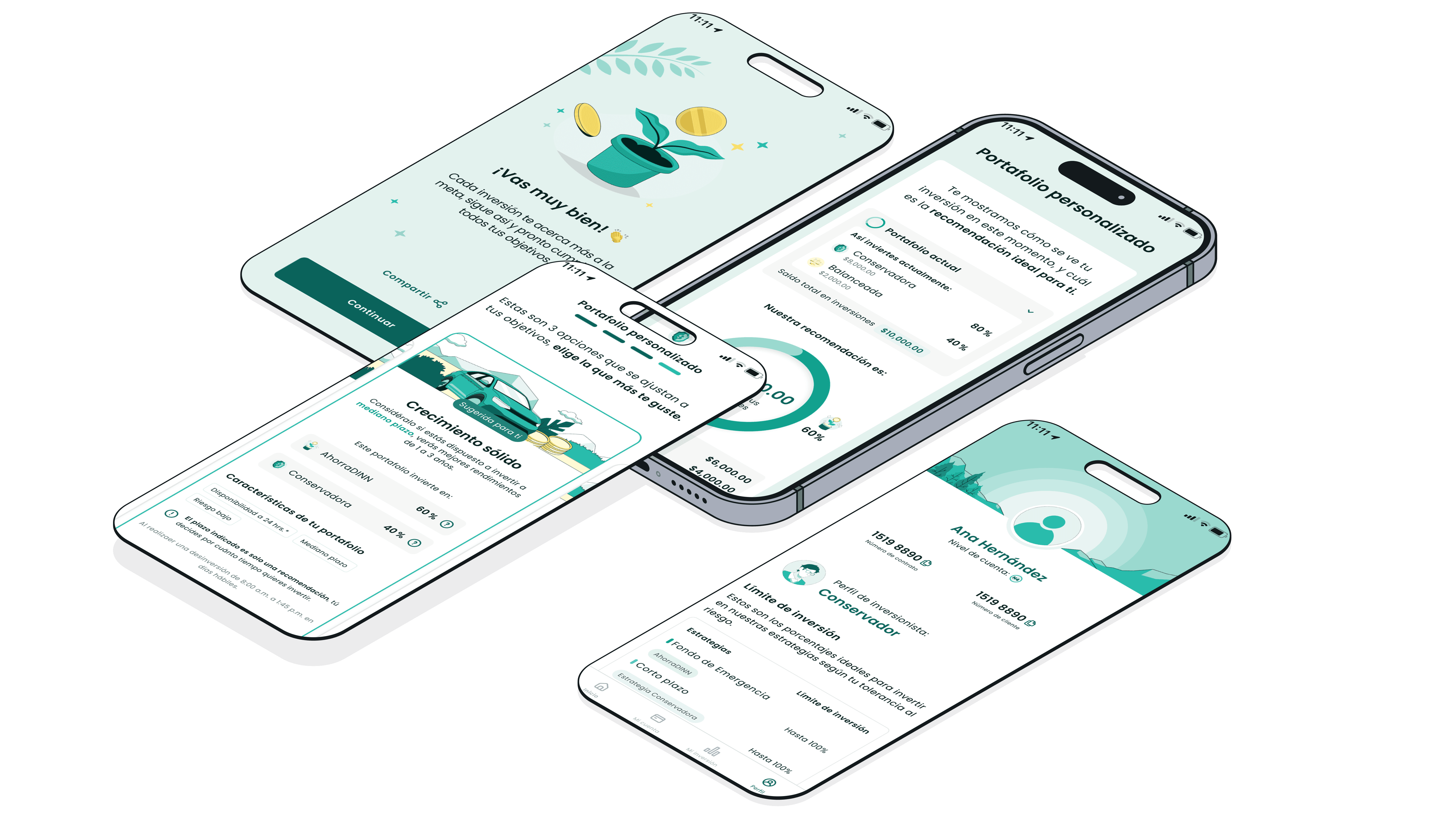
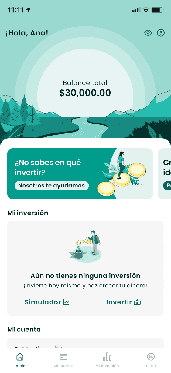
Solution
The final experience introduced:
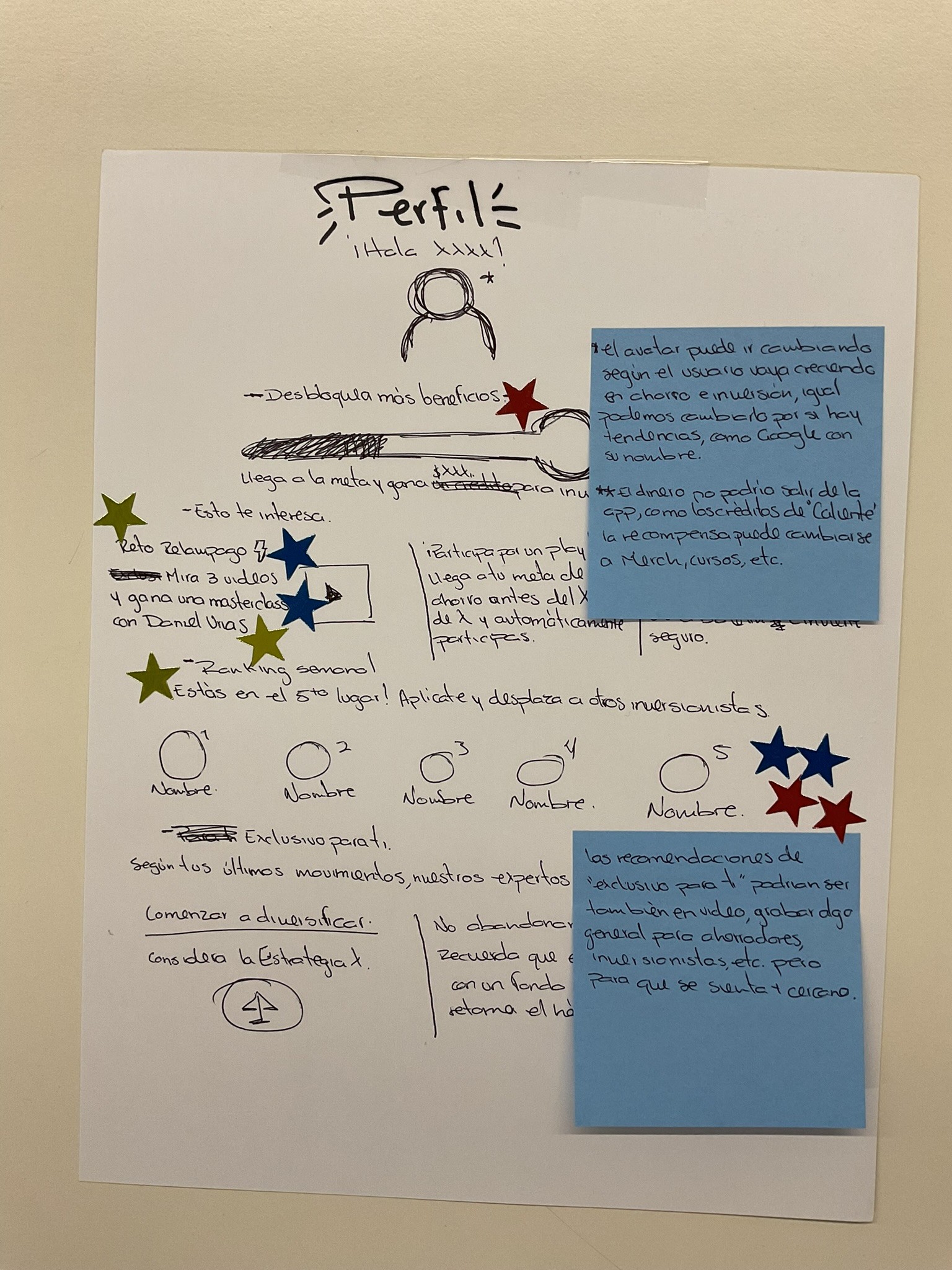
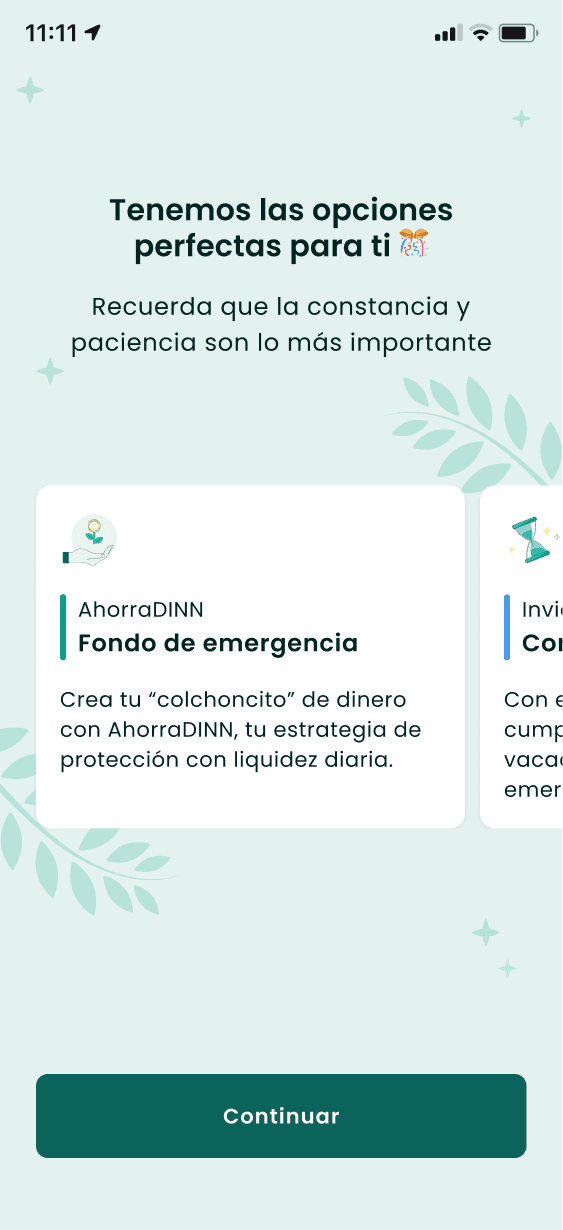
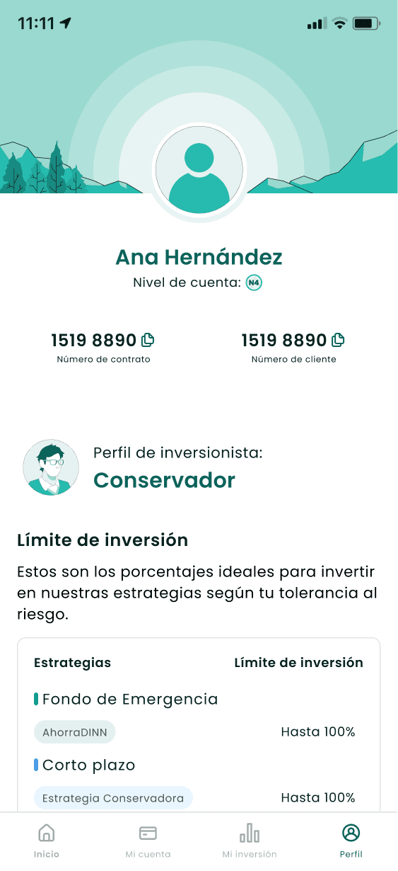
Personalized investment recommendations
Clear explanations tied to user goals
A calmer, more reassuring visual language
Reduced cognitive load and clearer hierarchy
The UI translated complex financial concepts into approachable, human-centered interactions.
Outcome & Learnings
The redesigned experience aligned product, brand, and user expectations. Early feedback showed improved clarity, trust, and confidence when investing. Key learnings:
Guidance is more valuable than information density.
UX plays a critical role in financial trust.
Constraints (legal, time) can drive better design decisions.