Overview
DINN is a mobile investment app owned by Actinver Bank, designed for young users with limited experience in investing. In 2022, rapid user growth and team expansion exposed inconsistencies between the product experience and the brand vision. The project focused on applying the new DINN brand system to the app, ensuring clarity, trust, and scalability across the product.
The objective was to translate the refreshed brand into a coherent, trustworthy, and approachable product experience—without sacrificing usability or credibility.
My Rol
I led the visual audits, brand translation, and implementation strategy across the DINN app. My responsibilities included defining the visual system, coordinating multidisciplinary teams, validating decisions with users, and ensuring consistent execution throughout the product.
Tools Used


Scope
Internal & external visual audits
Visual direction and system definition
Team coordination (designers, illustrators, UX/UI)
User testing and validation
Visual implementation across the app
Brand documentation and governance


The Challenge
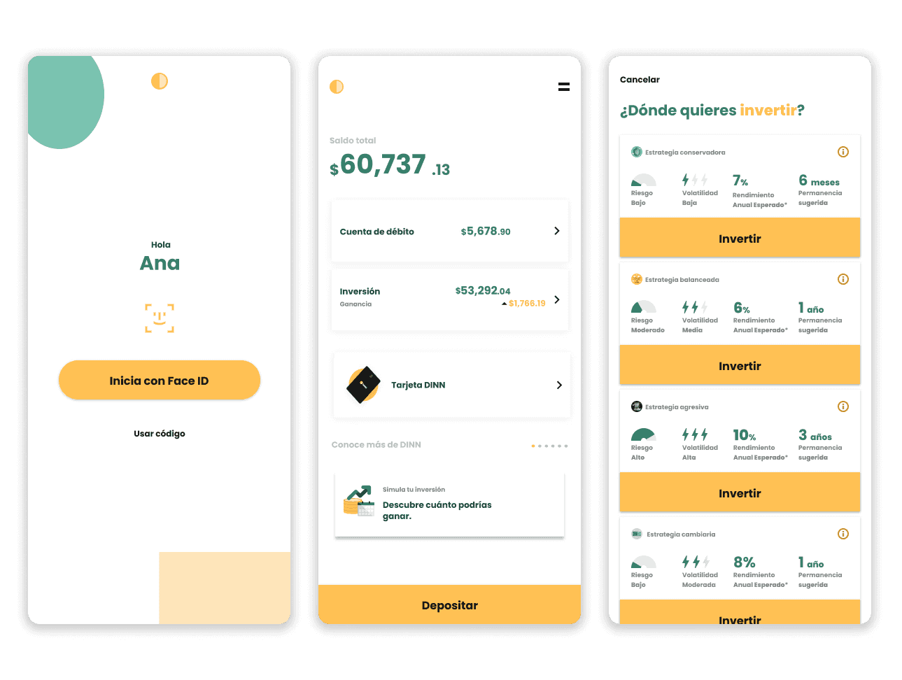
As DINN grew, its visual identity became harder to manage. The brand often felt inconsistent and, in some areas, overly playful—weakening perceptions of trust and credibility, which are critical in financial products.
Key challenges:
Brand inconsistency across product touchpoints
Visual language perceived as childish despite security being a core pillar
Scaling the brand without losing approachability
Ensuring the app clearly conveyed trust, clarity, and guidance
Visual Audits
We conducted two audits:
Internal audit: Led by me, analyzing product UI, brand usage, and inconsistencies.
External audit: Oversaw an external vendor to validate findings and identify gaps.
“Visuals felt too playful, reducing perceived credibility.”
“Brand growth made consistency difficult to maintain.”
“A more supportive and mature system was needed without losing approachability.”
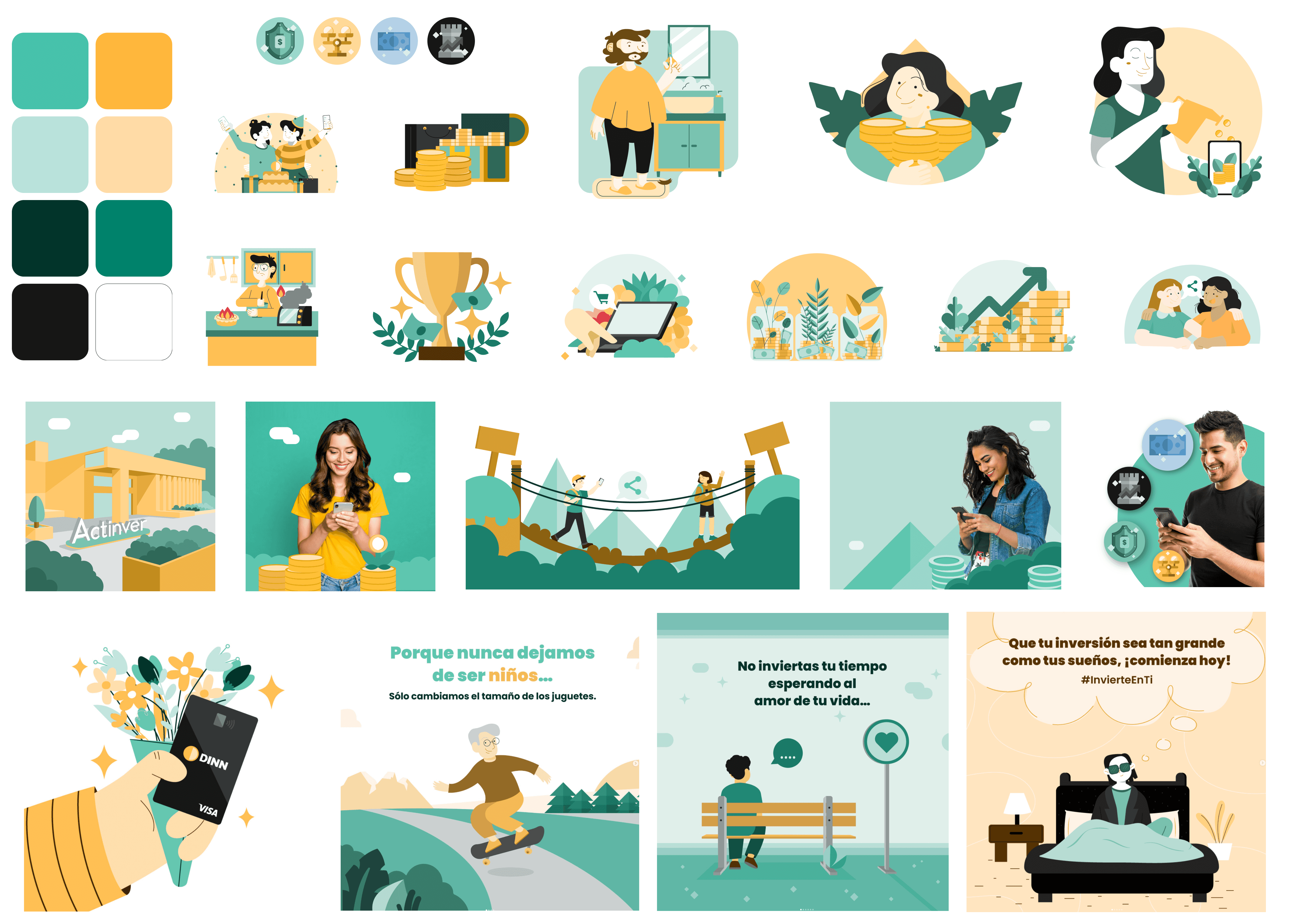
visual Proposal
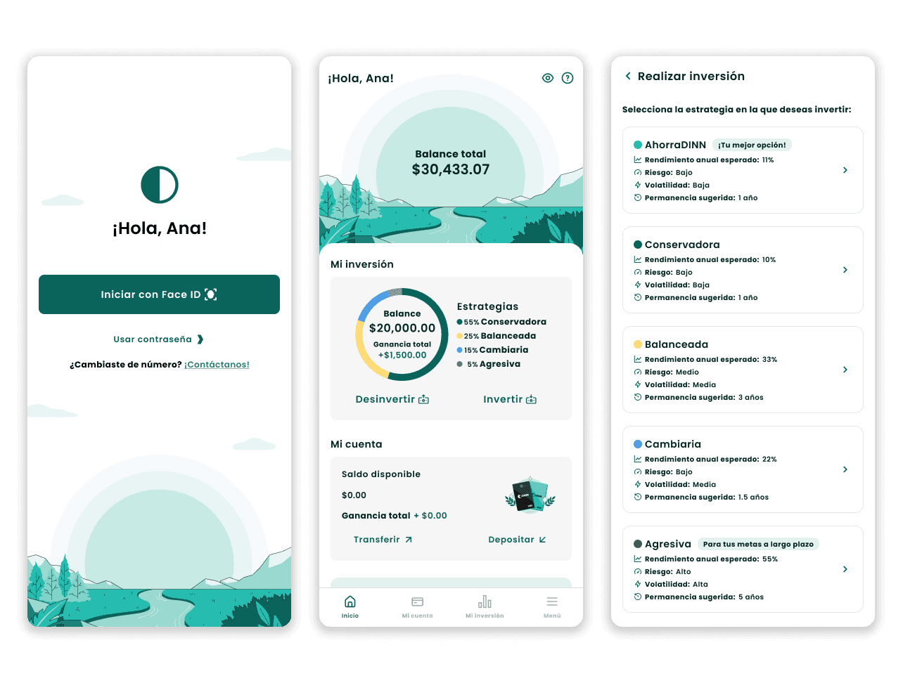
Based on audit findings, I defined the core visual direction:
Refined color system and usage proportions
Clearer typography hierarchy
Reduced decorative noise
More structured layouts and spacing
A calmer, more confident visual tone
I guided designers and illustrators to align on a single, cohesive direction and presented the proposal to stakeholders for alignment.
User Testing
The new visual system was validated with 50 users: 25 current DINN users & 25 users unfamiliar with the brand
Key results
100% perceived increased security
90% associated the new visuals with calmness and stability
85% perceived greater simplicity and ease
80% felt improved trust and transparency
Clear personality perception vs. no clear pattern in the previous identity
These confirmed that the new system successfully communicated the intended brand values.
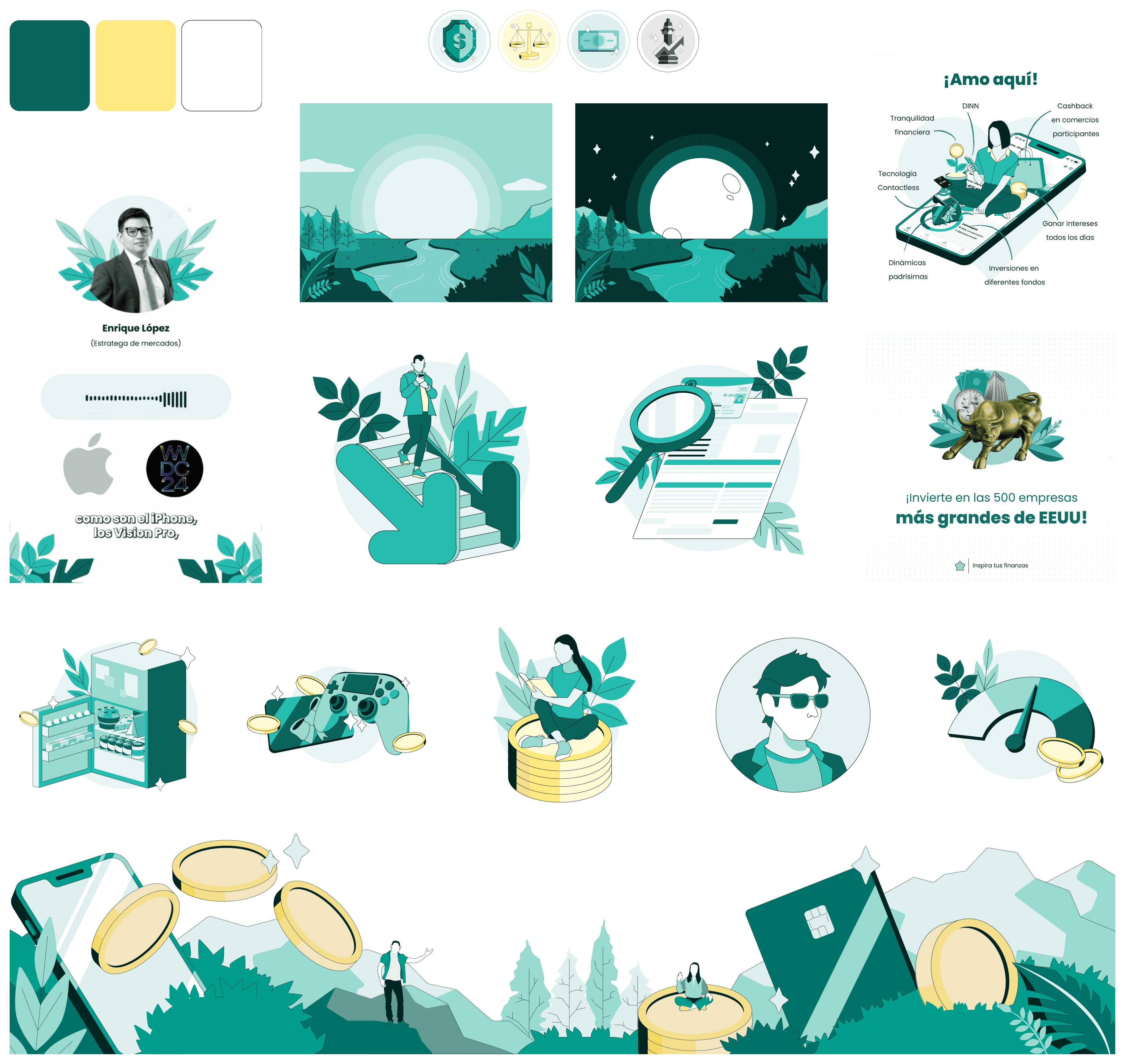
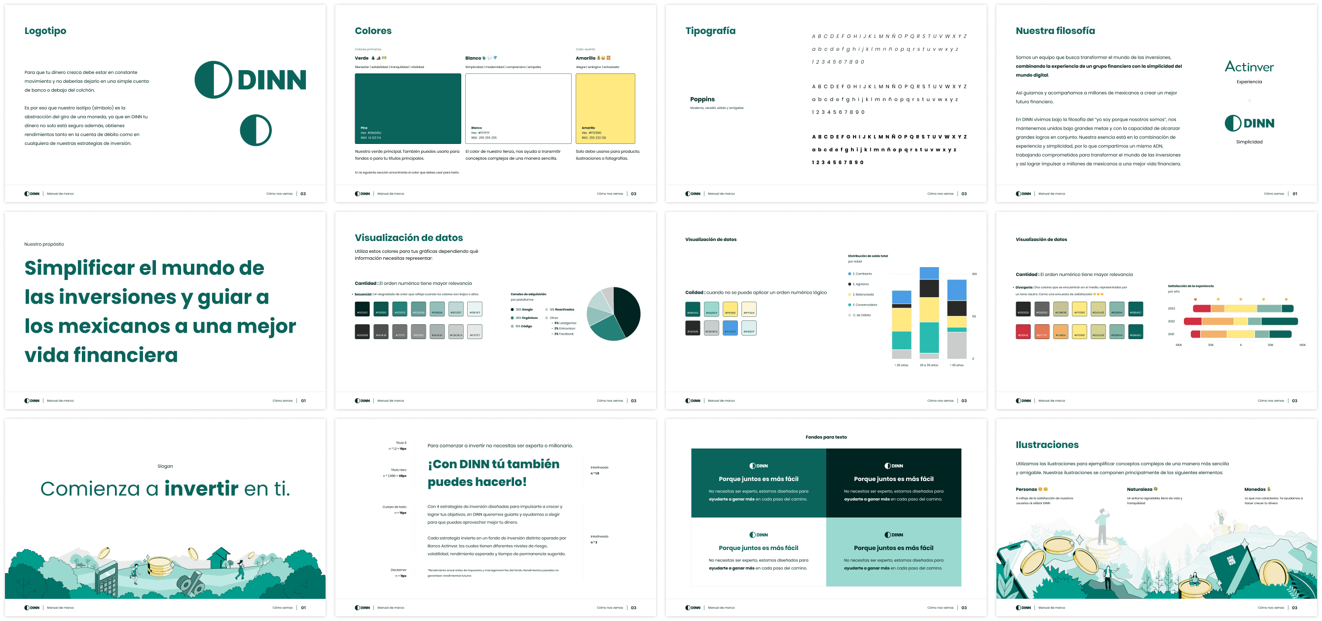
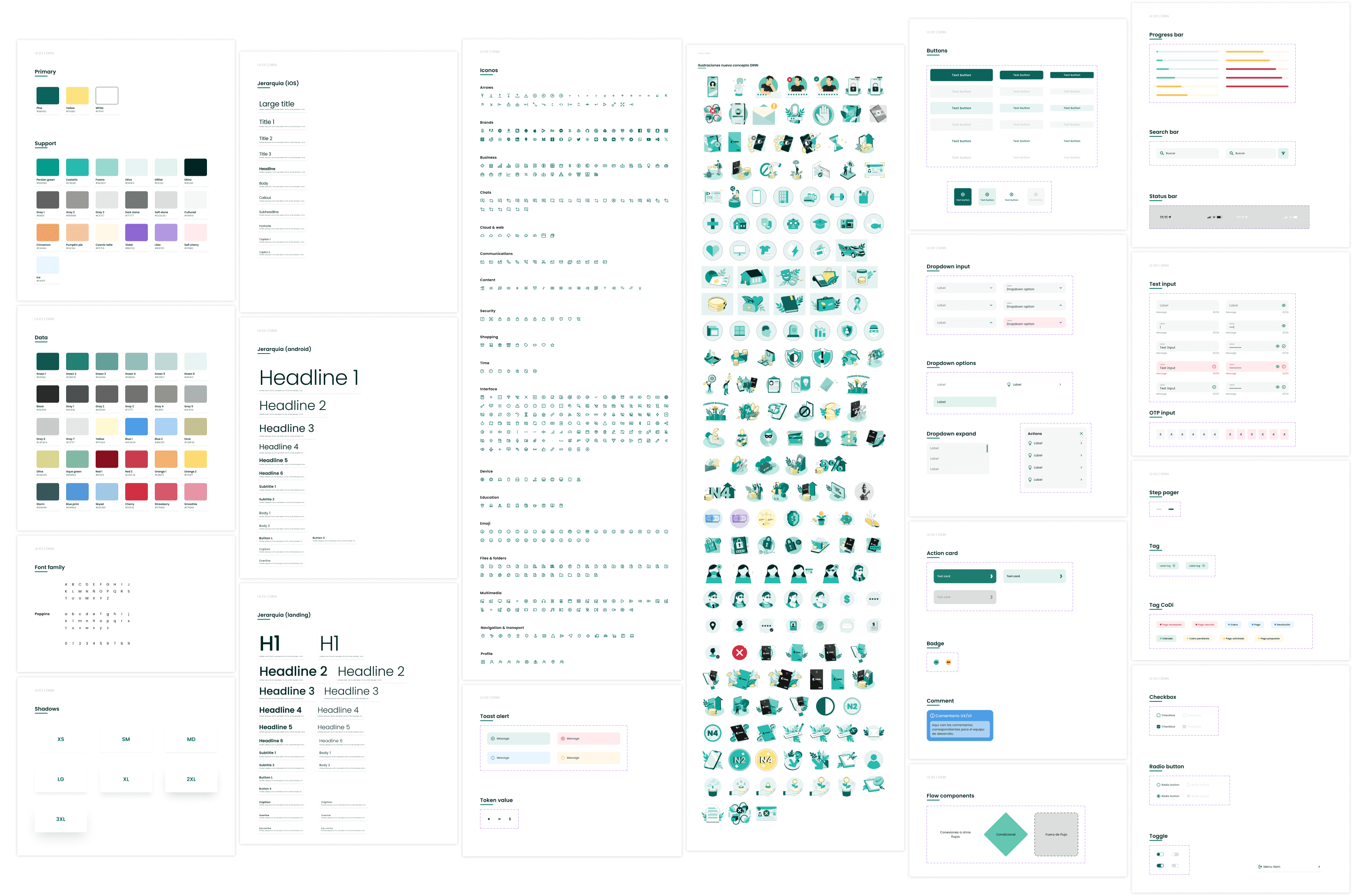
System & Documentation
Once validated, I documented the full visual system in a brand manual to ensure consistency and scalability. This included:
Color usage and hierarchy
Typography rules
Imagery guidelines
Writing and tone-of-voice principles (in collaboration with the communication team)
This documentation became the foundation for future product iterations.

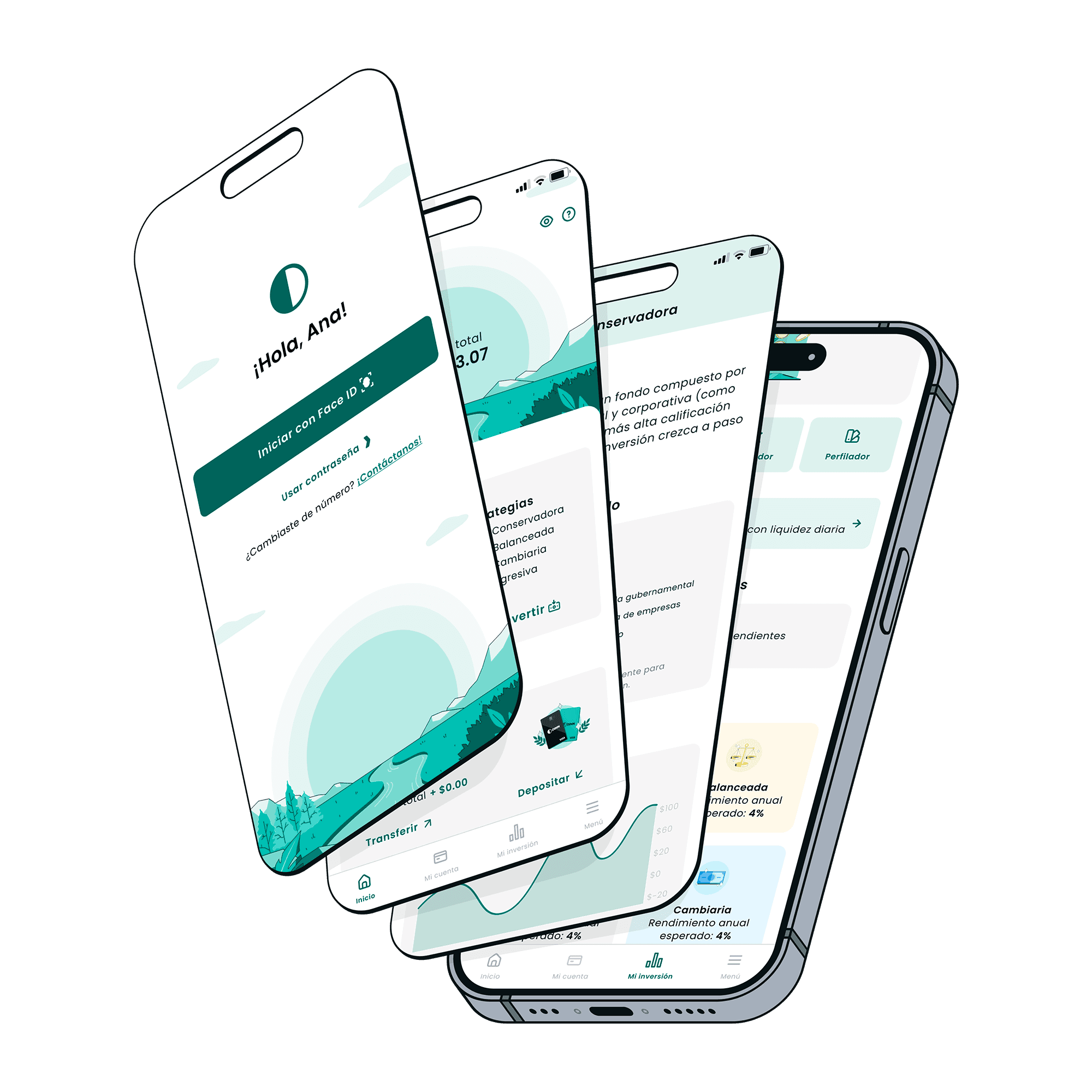
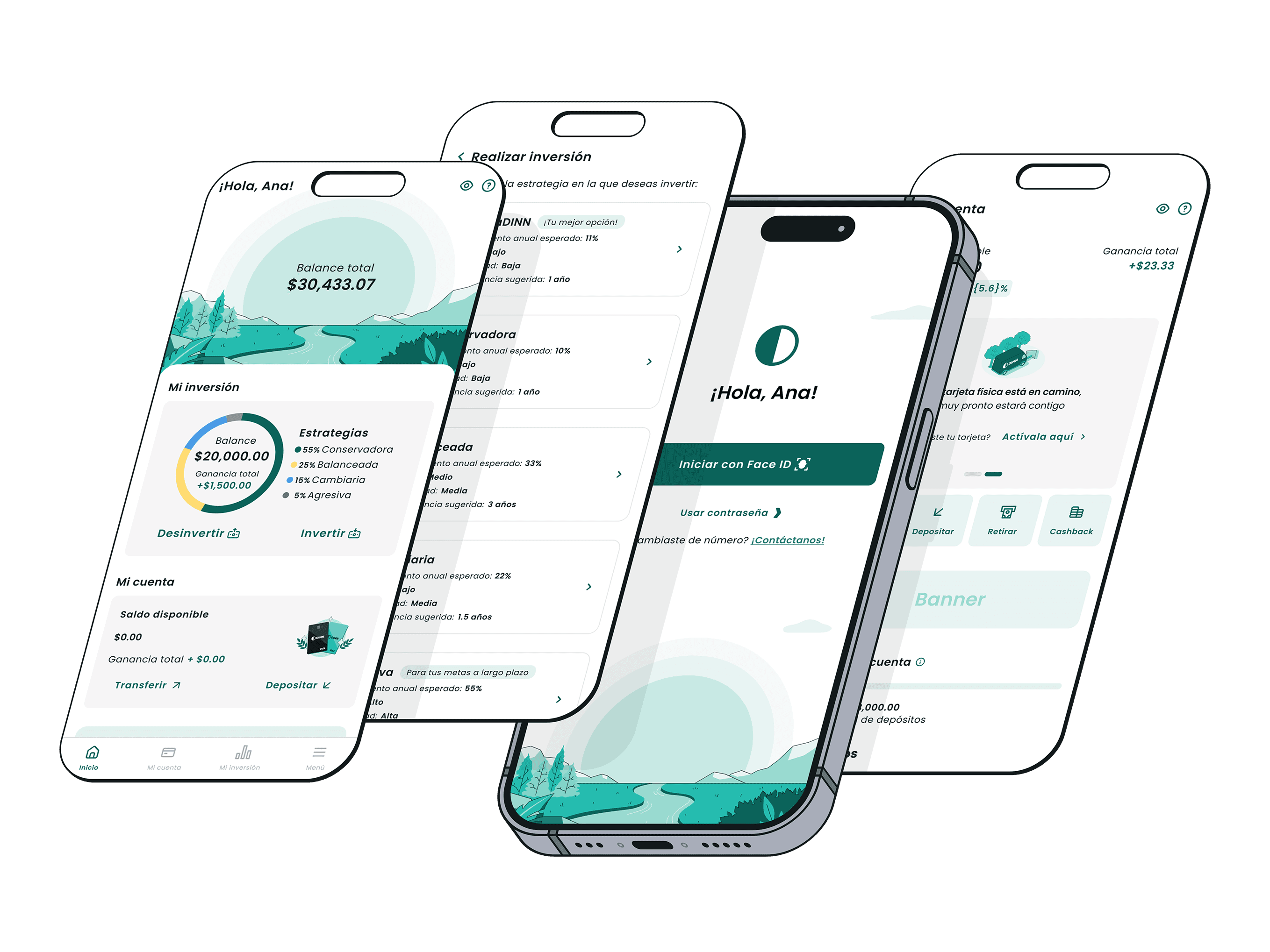
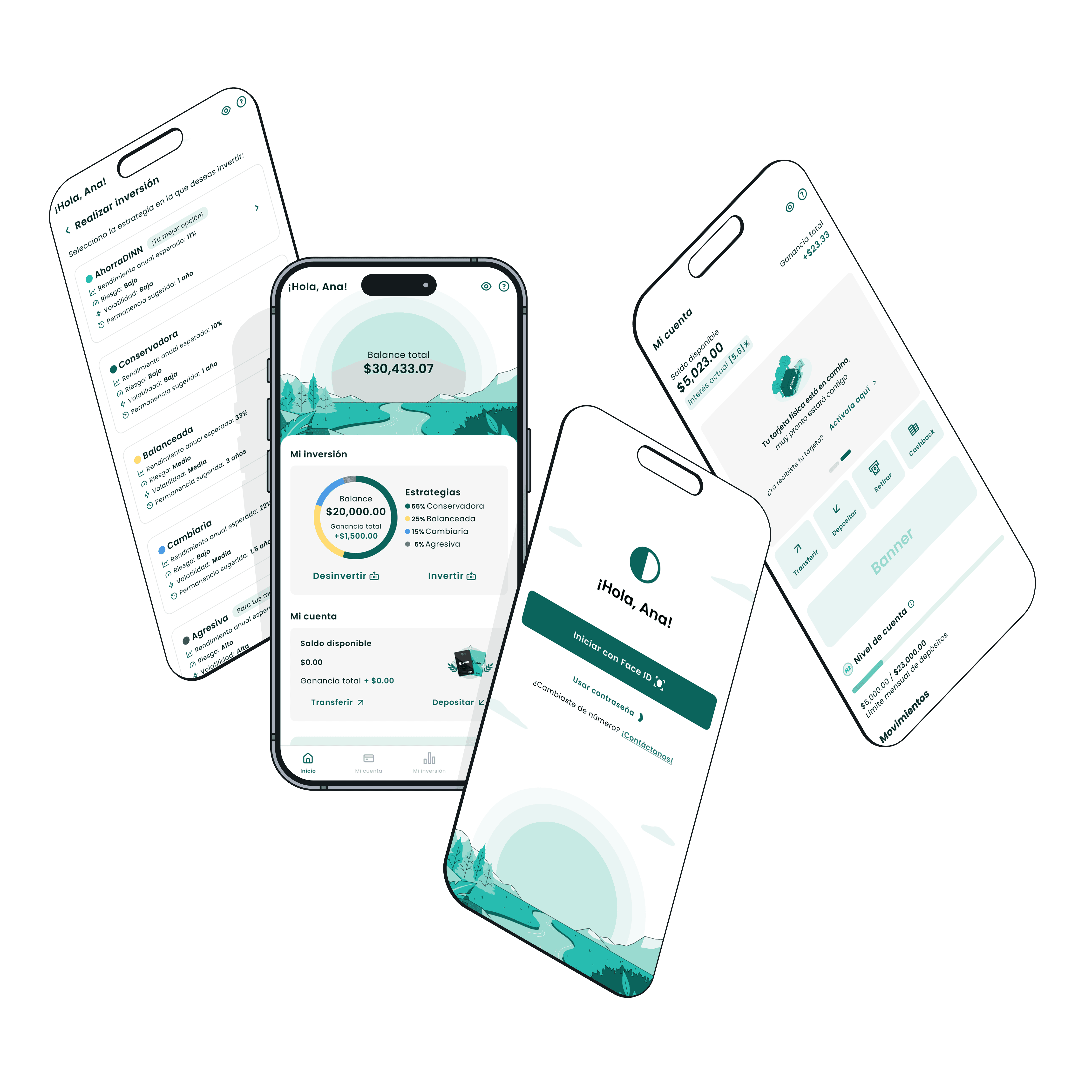
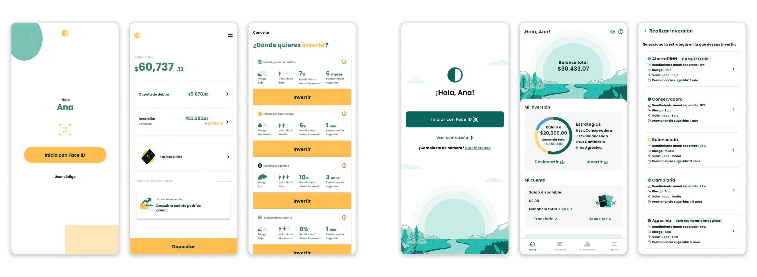
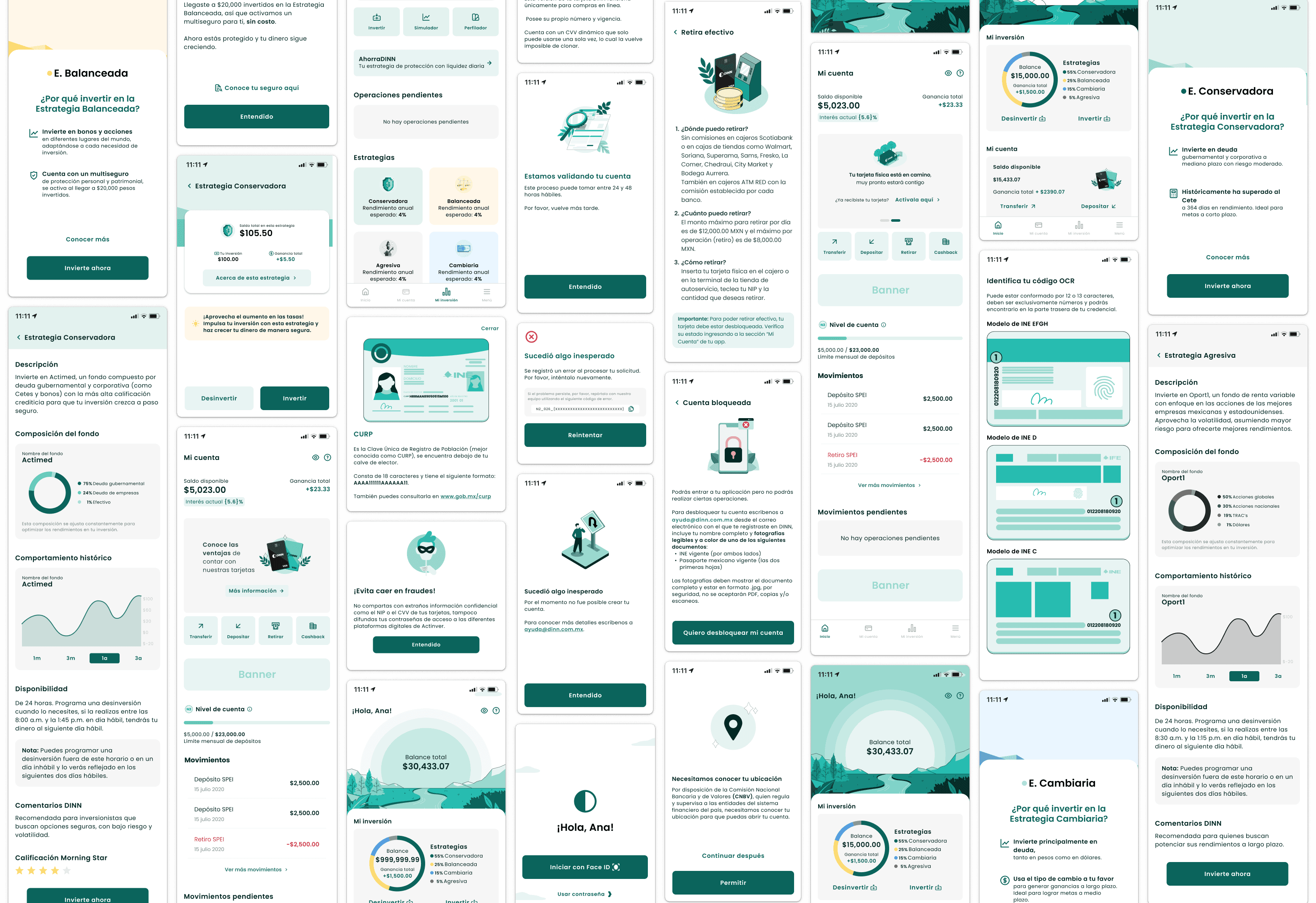
Visual Implementation
The new visual identity was implemented across the entire DINN app. My role focused on:
Coordinating visual execution with UX/UI designers
Supporting implementation across flows and screens
Ensuring consistency and alignment with the brand system
The result was a more structured, confident, and cohesive product experience.
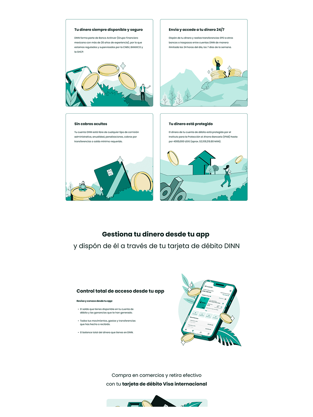
Before VS Now
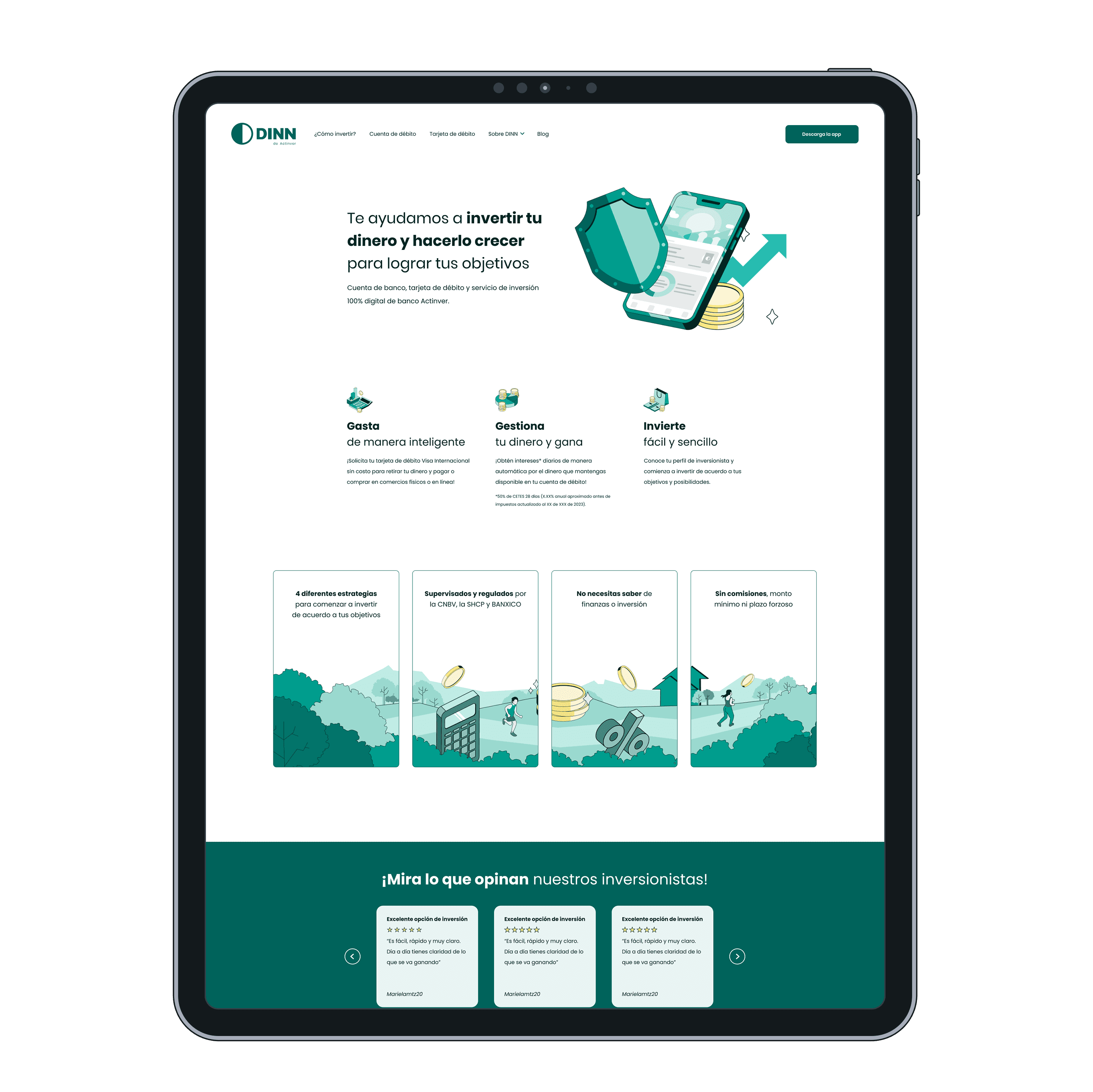
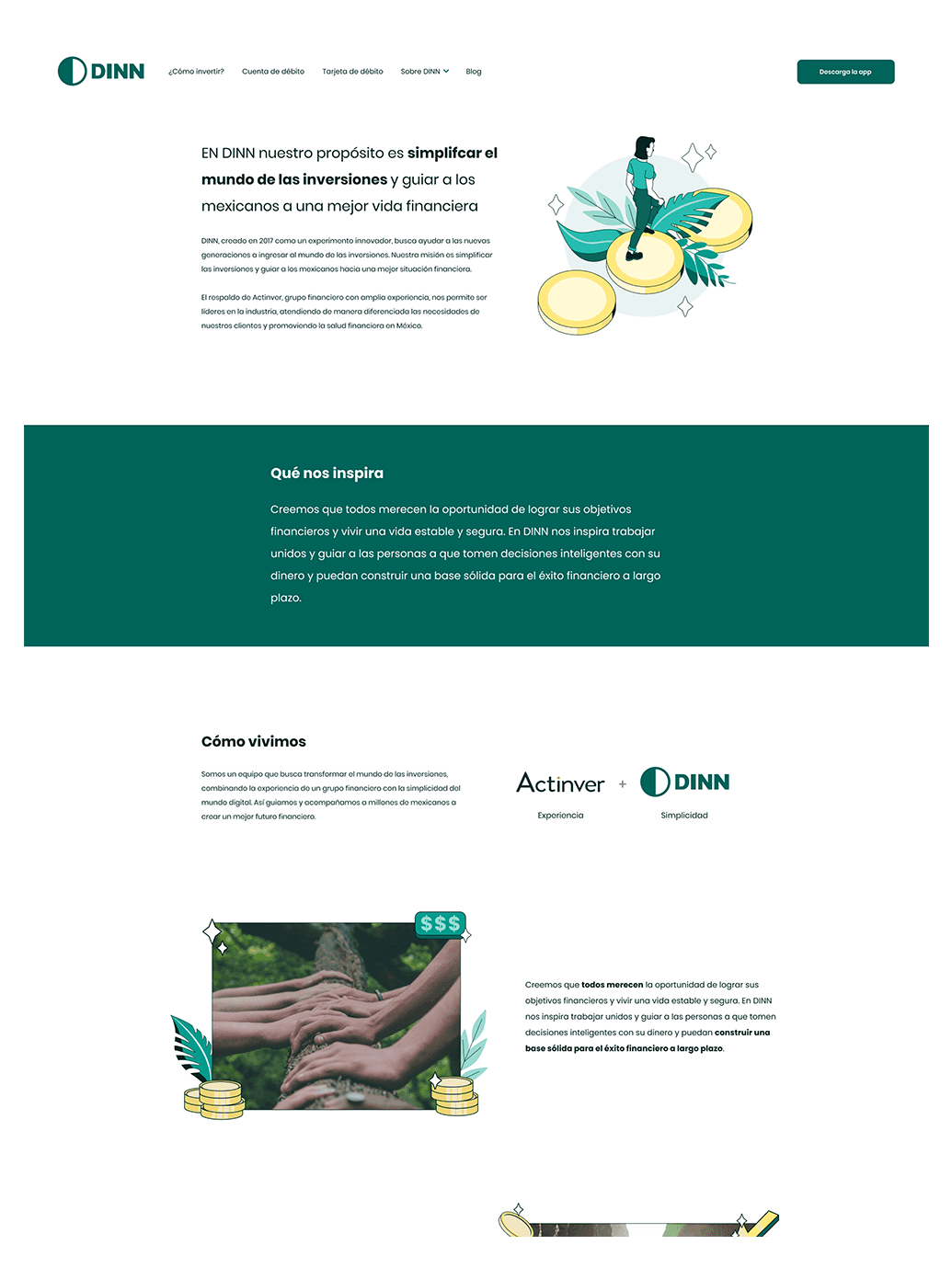
Website was also updated
outcome
The app successfully transitioned to a mature and trustworthy visual language aligned with DINN’s brand vision. The new system established a strong foundation for ongoing iterations, allowing the product to scale visually without losing clarity or approachability.
User feedback consistently highlighted increased trust, clarity, and ease of use compared to the previous version.
I want to thank the DINN design team for all their dedication and effort in executing this project with the highest quality and achieving an excellent result that wouldn’t have been possible without teamwork
Key Takeaways
Translating brand systems into product requires strong alignment between visual design and UX.
User validation is critical when evolving trust-sensitive products like finance apps.
Clear documentation and governance enable consistency at scale.
Leading visual implementation strengthened my ability to operate at the intersection of brand, product, and team leadership.