UI Design · Game UI
Personal · Spec Work
2021
Dark UI — Menus & HUD Design
A complete UI concept for a fictional first-person survival horror game — armory, map, missions, and HUD — built around Mexican brutalist architecture and early 60s horror cinema.
Objective
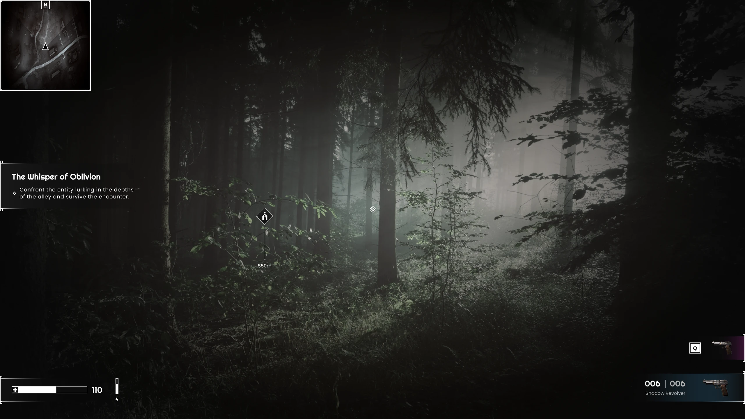
Design a menu system and HUD for a fictional PC horror game: three core screens plus the in-game overlay. Horror game menus tend to commit so hard to atmosphere that navigation suffers — the challenge here was keeping both.
The brief: clean, contemporary, rooted in a specific cultural reference — something with a distinct point of view.
Inspiration
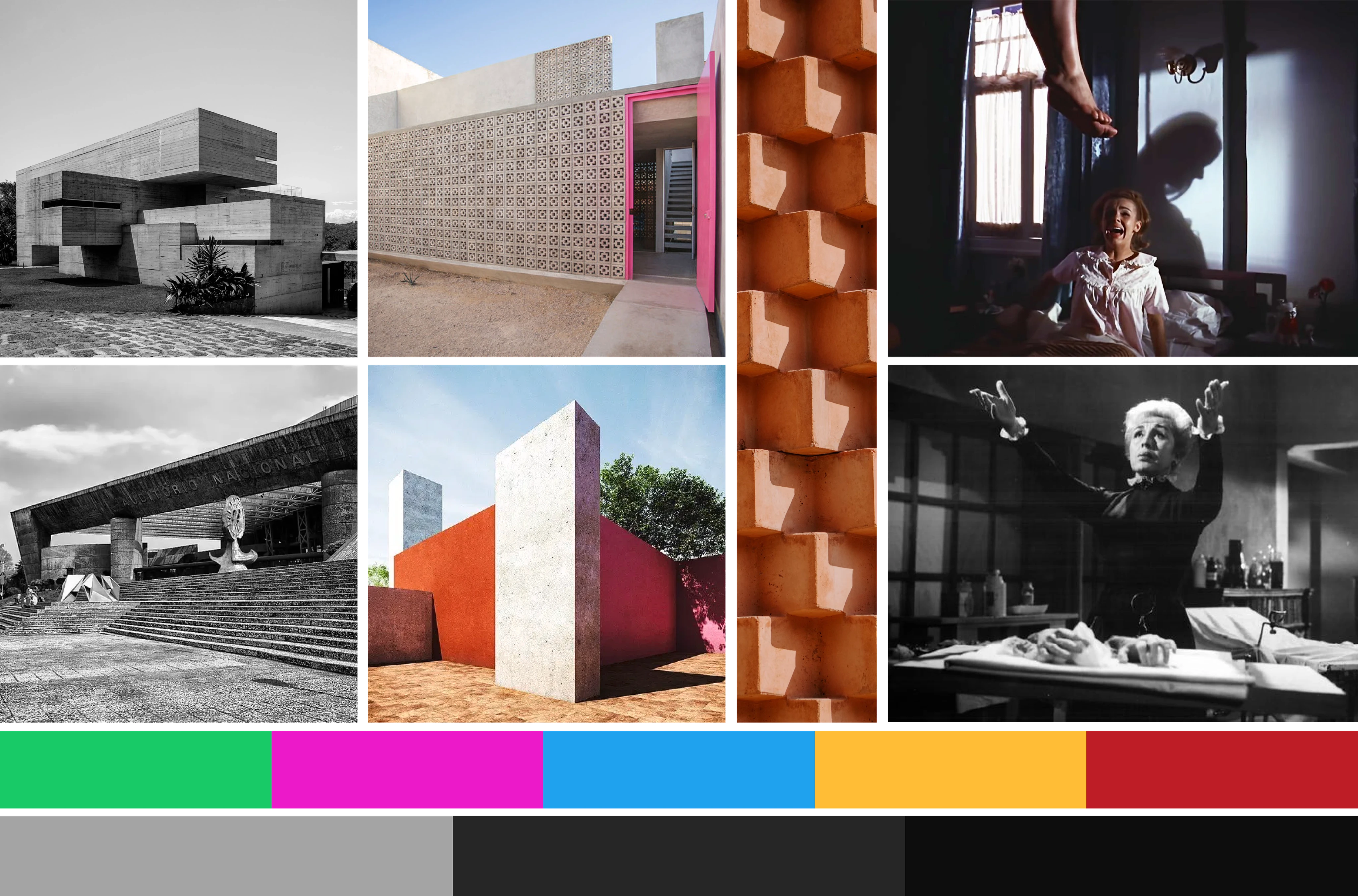
The aesthetic is anchored in two sources: Mexican brutalist architecture from the 60s and the horror cinema of the same era. Rough concrete, heavy geometric forms, deep shadows — but also a strange elegance. The contrast between brutality and precision became the visual language.
References from Cyberpunk 2077 informed the structure — inventory logic, HUD density, information hierarchy. But the visual direction stayed completely disconnected from sci-fi. The result sits closer to a period thriller.
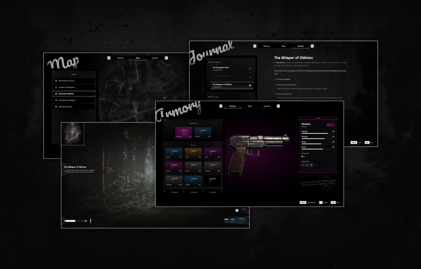
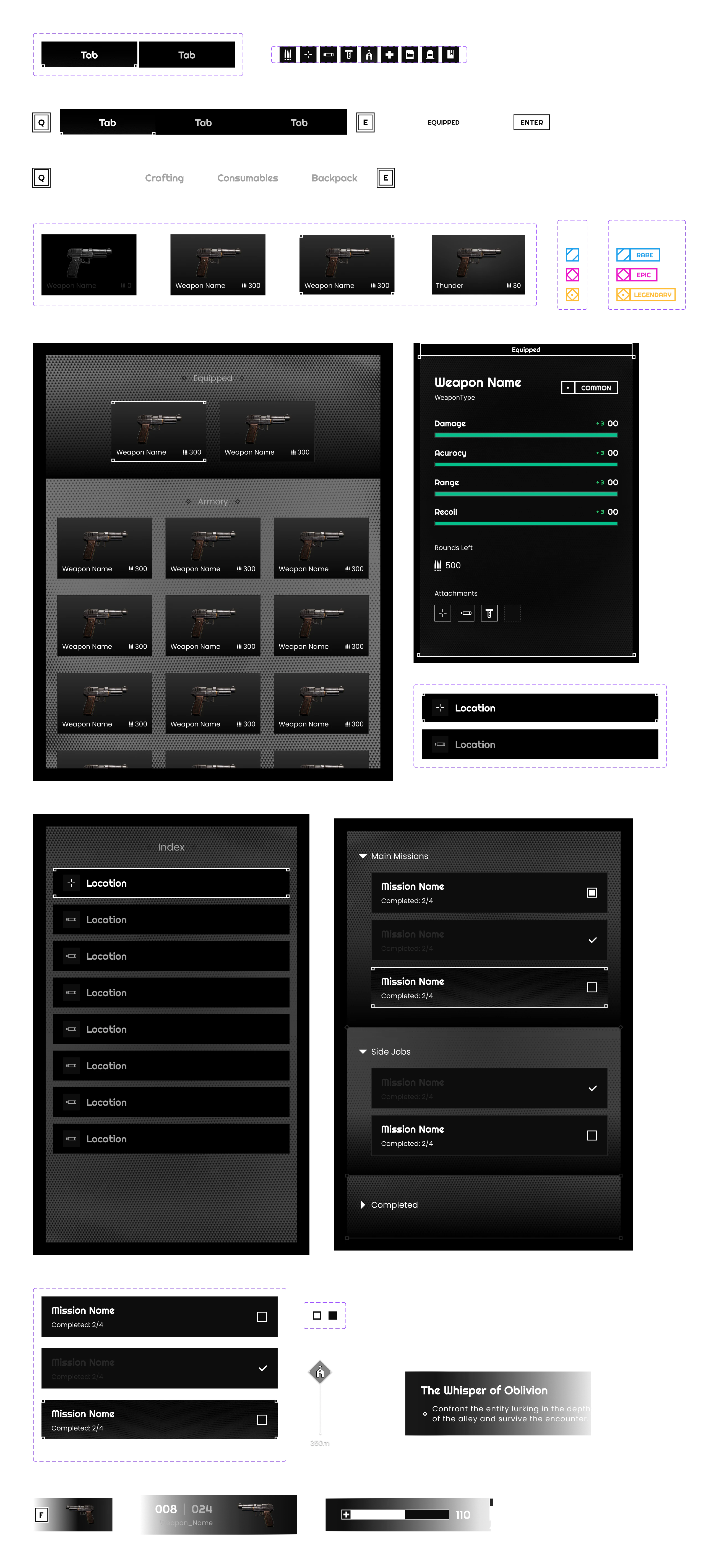
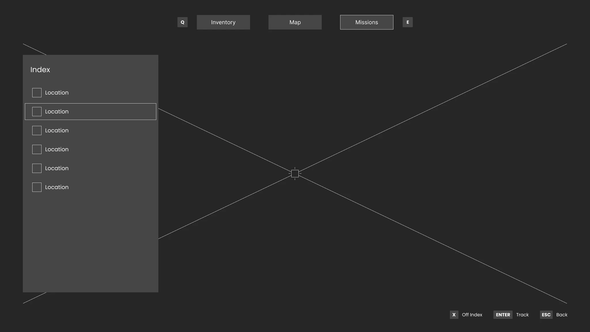
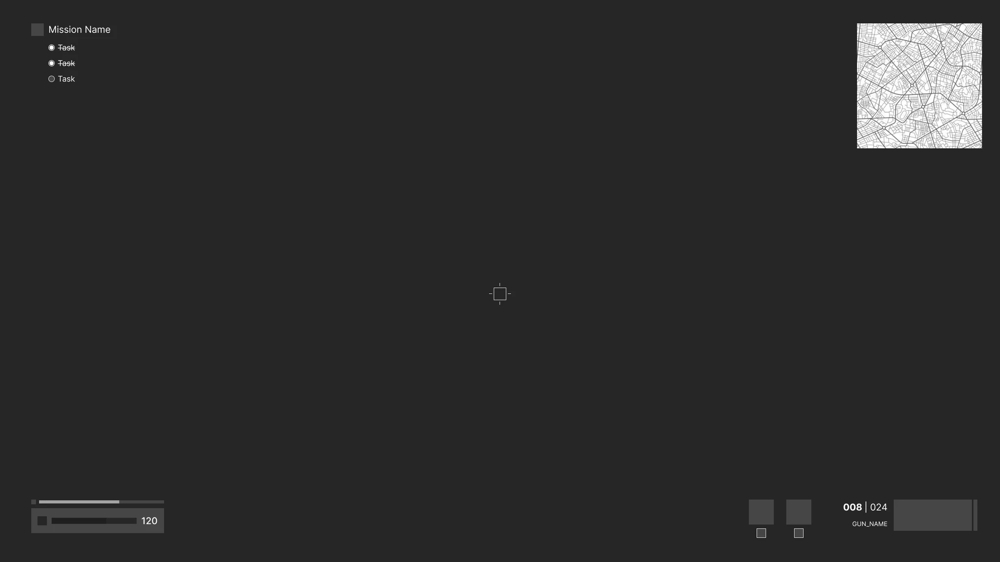
Menus & Components
Four screens built as a system — each with a distinct function, all sharing the same visual logic:
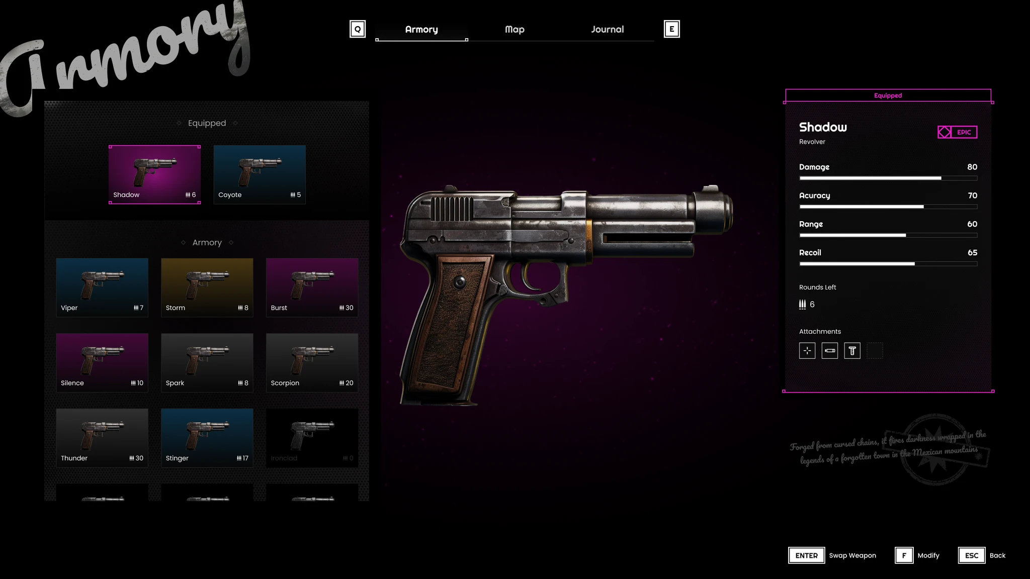
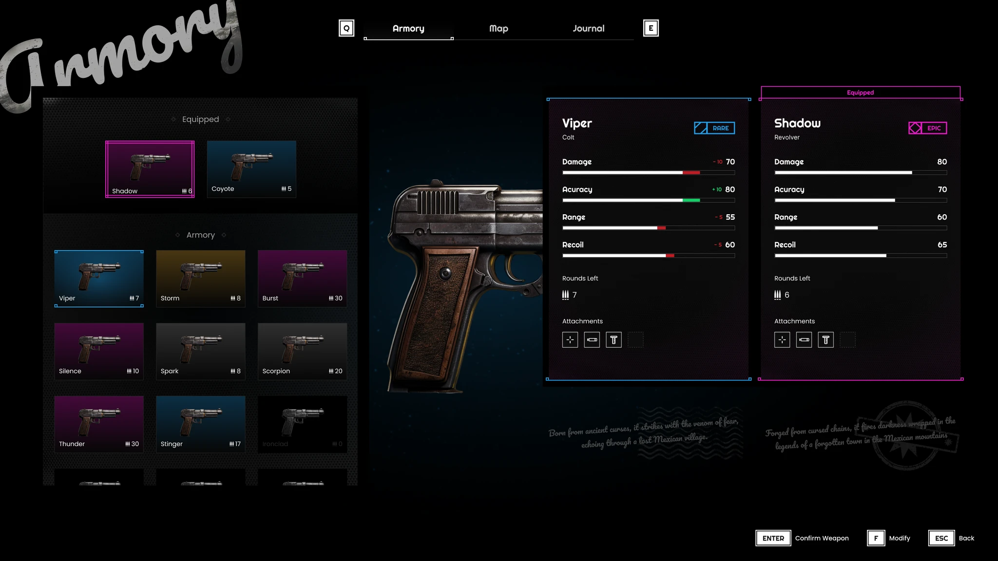
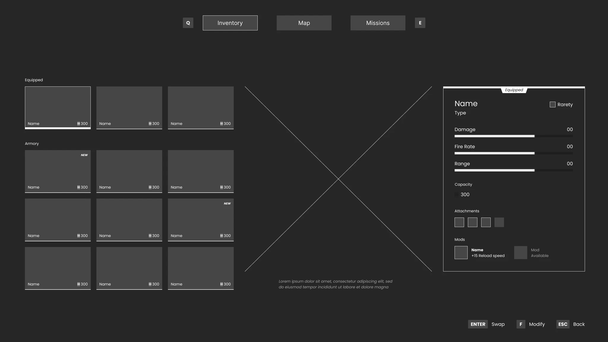
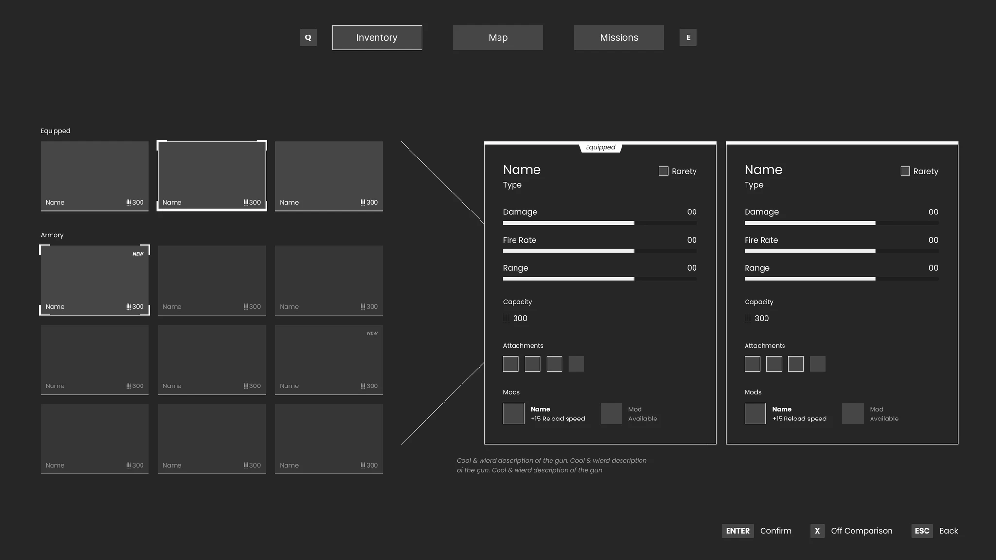
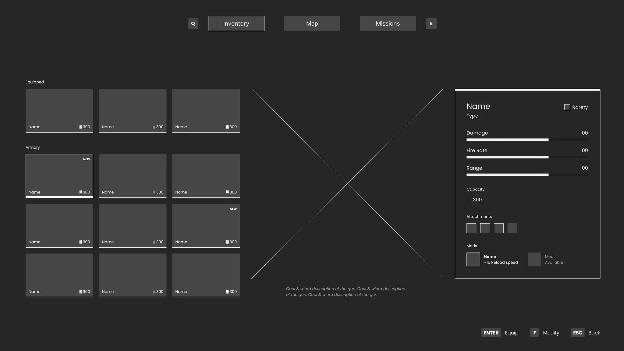
- Armory — Weapon slots with stat detail panel (damage, fire rate, range). Four item tiers with distinct visual states. Built from scratch except weapon models.
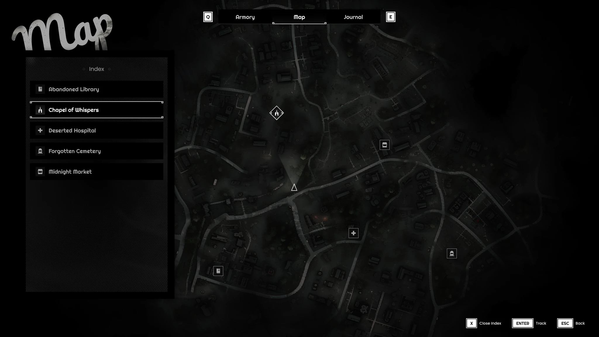
- Map — Topographic dark style with location markers and index sidebar. Tracked locations pin to the HUD minimap.
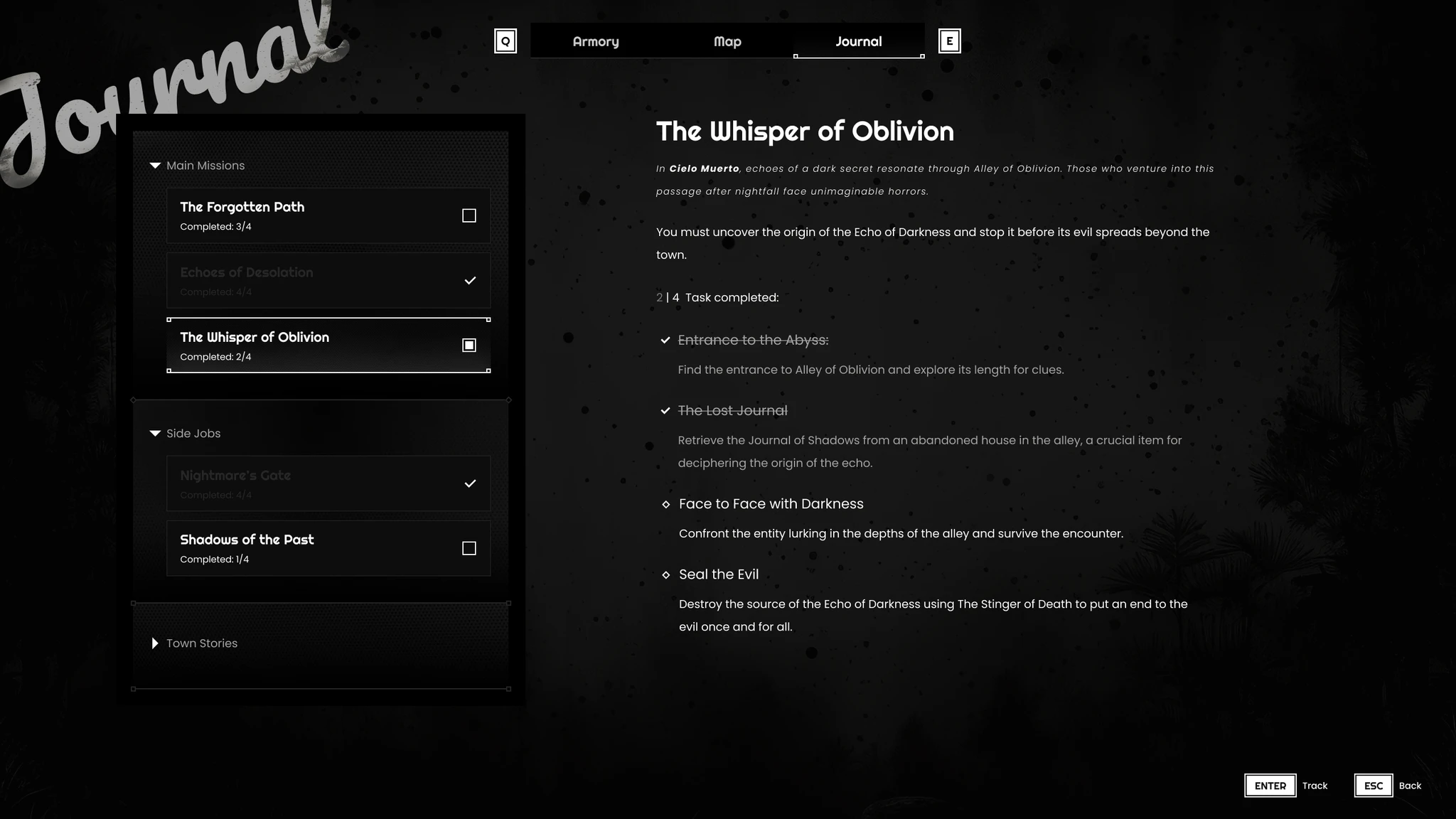
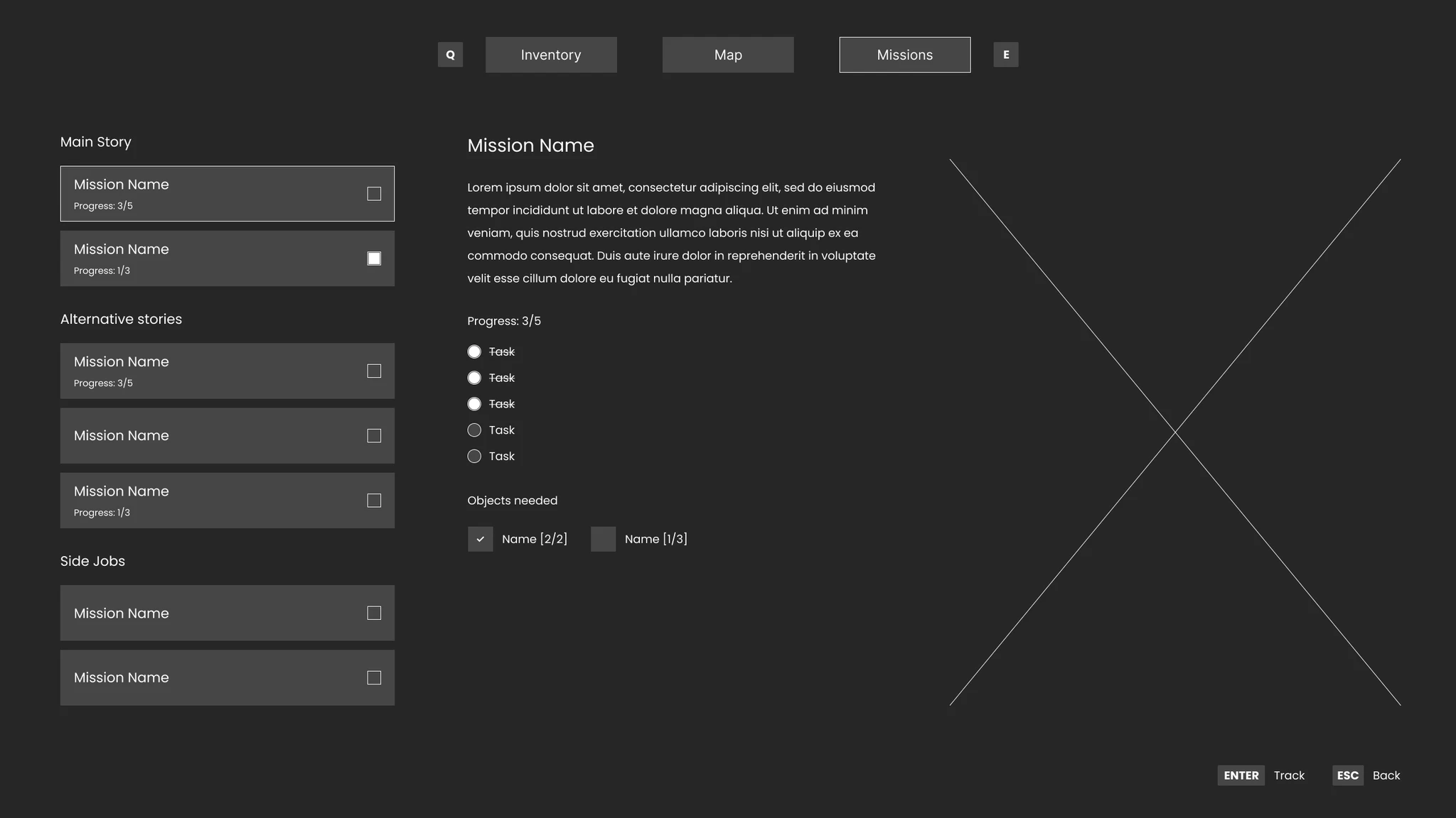
- Missions — Main story, alternative stories, and side jobs with task breakdowns and progress tracking.
- HUD — Minimap, health, active weapon. Minimal by default — surfaces information only when relevant.
Outcome
The main challenge was designing across four very different screen types — inventory, navigation, objective tracking, live HUD — while maintaining a consistent aesthetic logic. Each screen had different information density requirements, but the visual system had to hold across all of them.