UX Research · UI Design · Game
Personal · Spec Work
2023
Elden Ring: Character Creation Redesign
A UX/UI redesign proposal for Elden Ring's character creation — reducing first-time player overwhelm through clearer structure, contextual help, and a new visual system. Partially implemented in Unreal Engine 5.
Objective
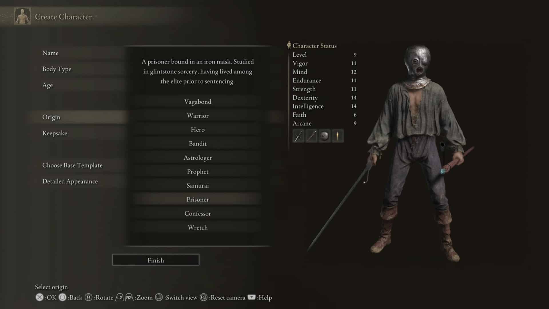
Elden Ring throws players into one of the most complex character creation screens in the genre with almost no guidance. For new players, the volume of choices creates a kind of paralysis before the game has even started.
The goal: reduce cognitive overload without reducing depth. The complexity has value — the problem is how the information is organized and surfaced.
Research & Analysis
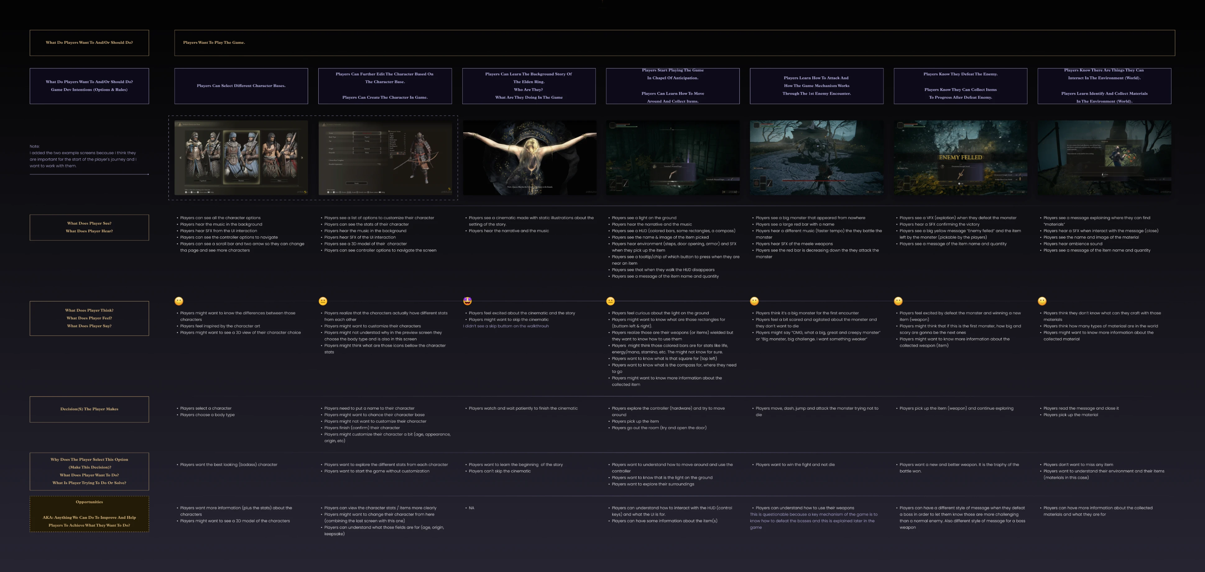
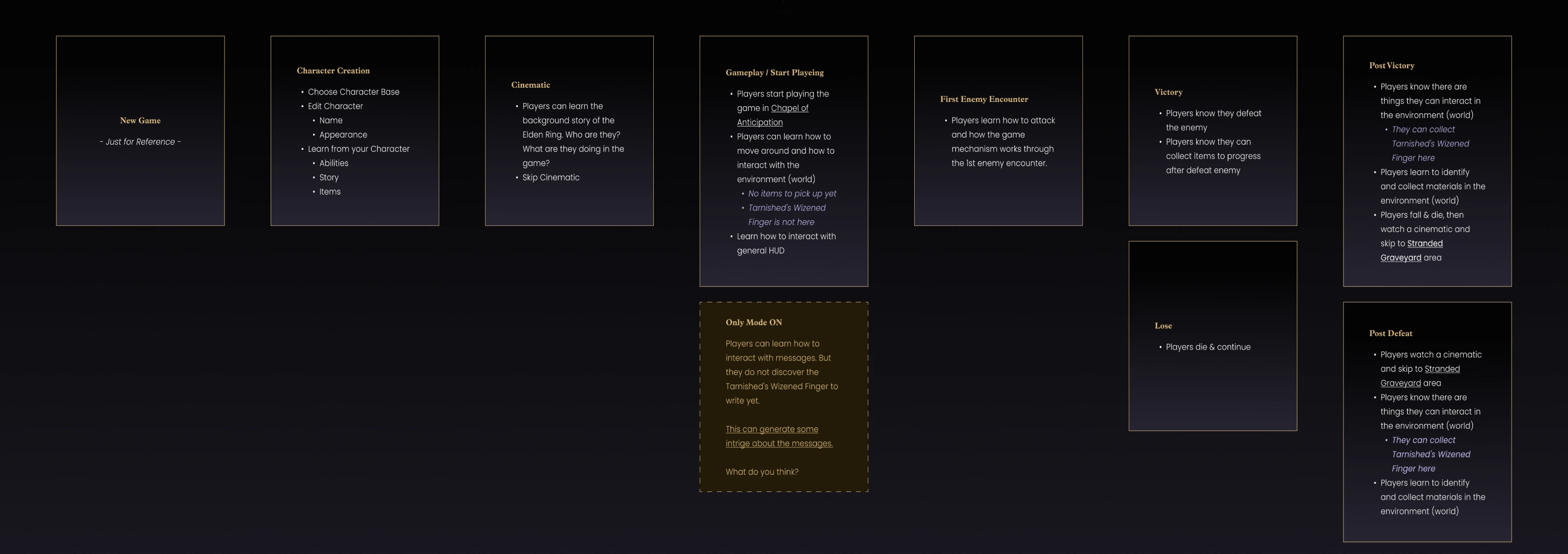
Mapped friction across the early-game flow — character creation, opening cinematic, first combat encounter. Focused on moments of hesitation: where players slowed down, reread, or gave up and randomized a choice. Two areas concentrated most of the friction:
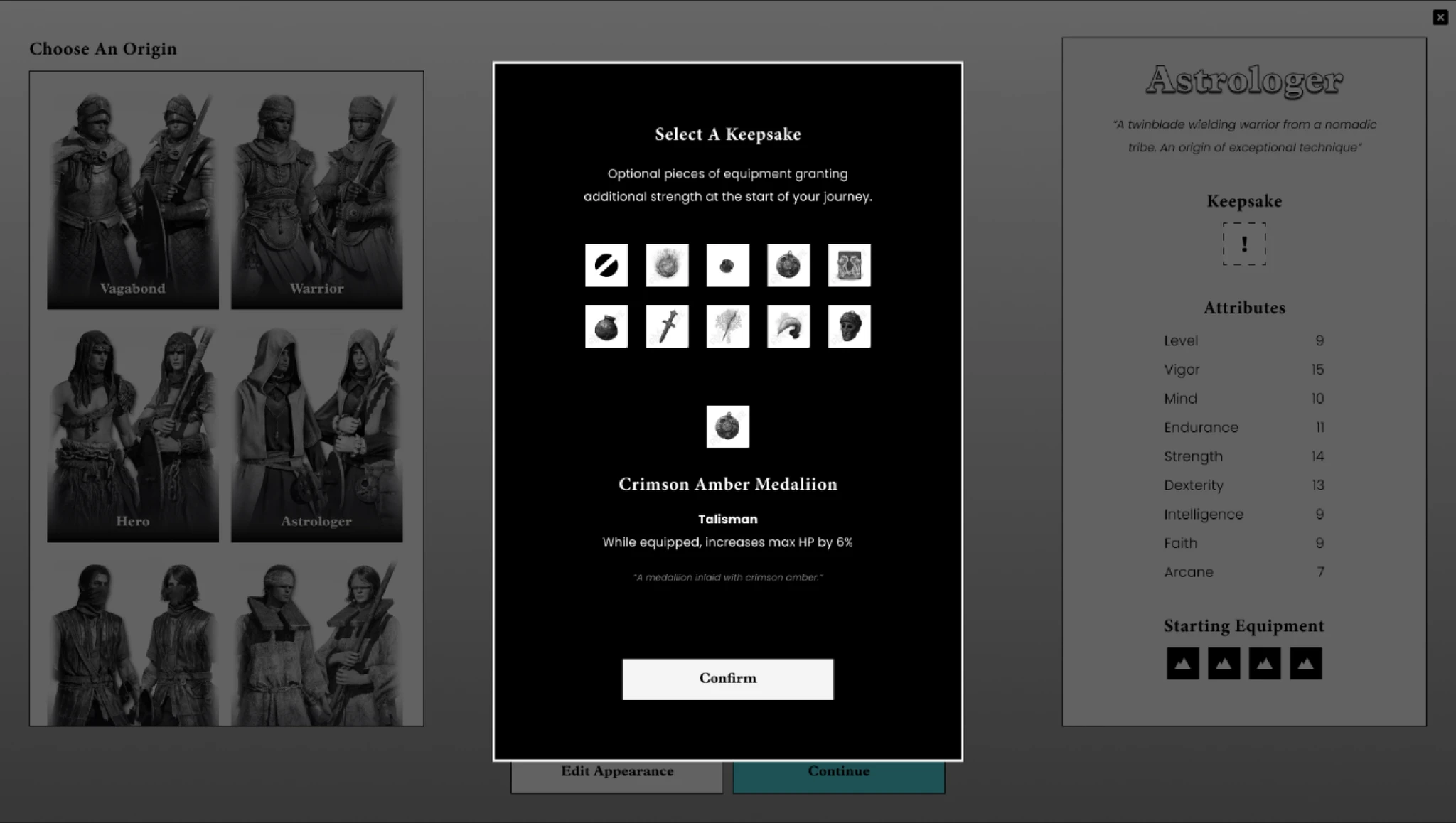
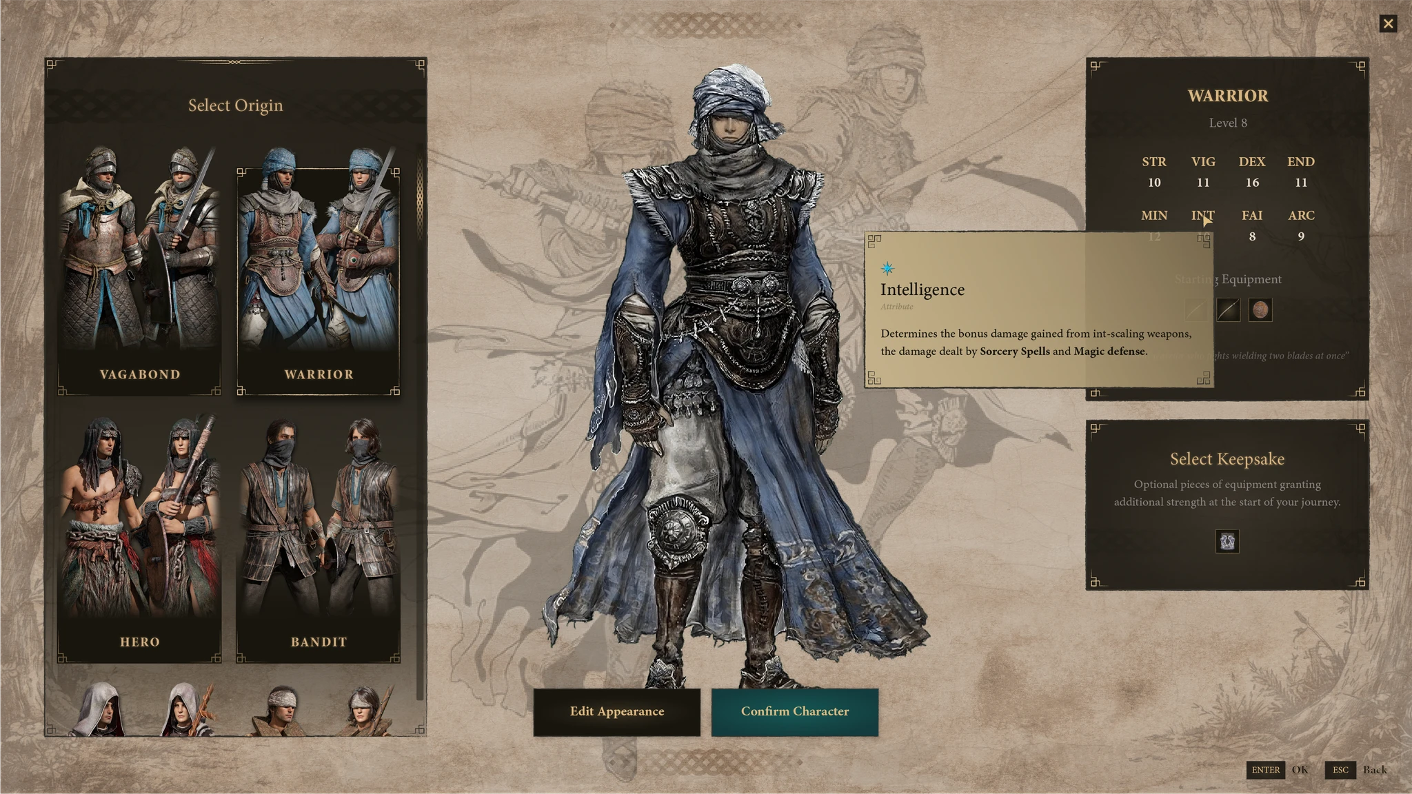
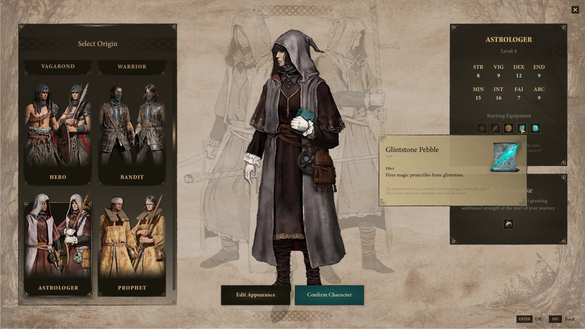
- Keepsake selection — missed entirely on first pass by most players
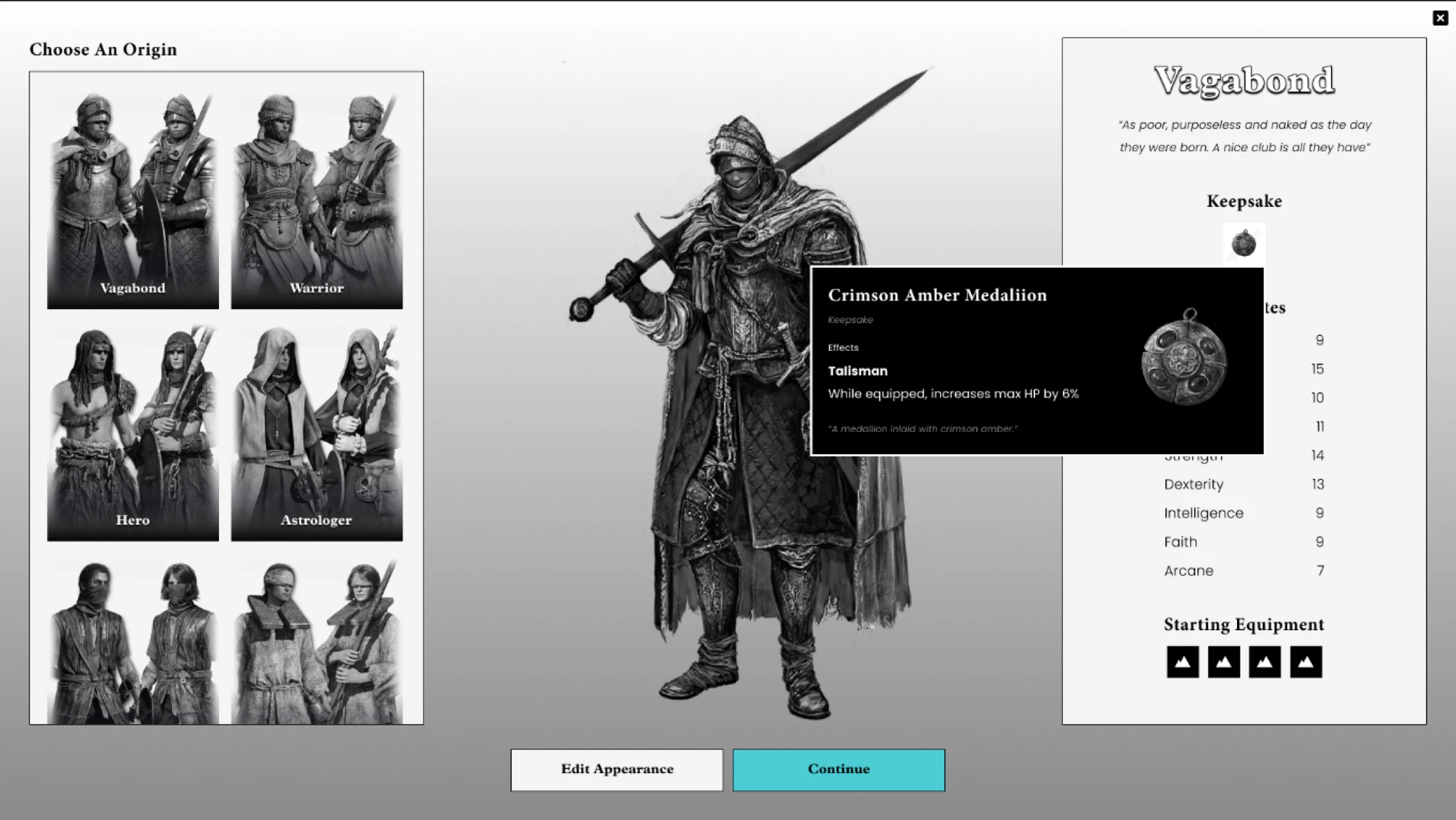
- Origin descriptions — assumed stat knowledge that new players don't have
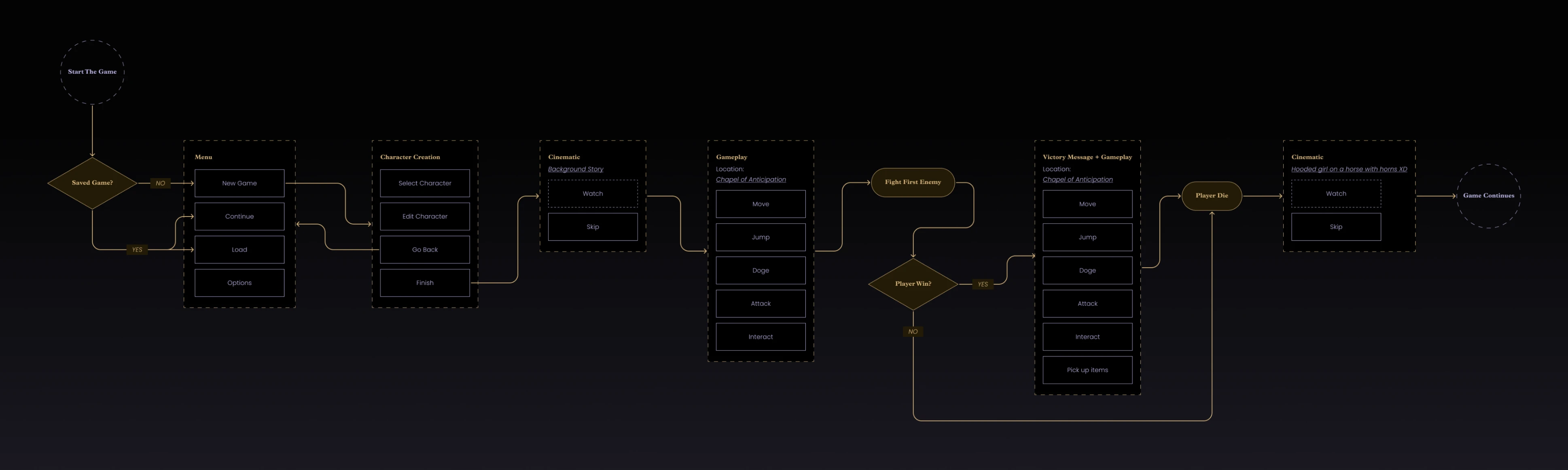
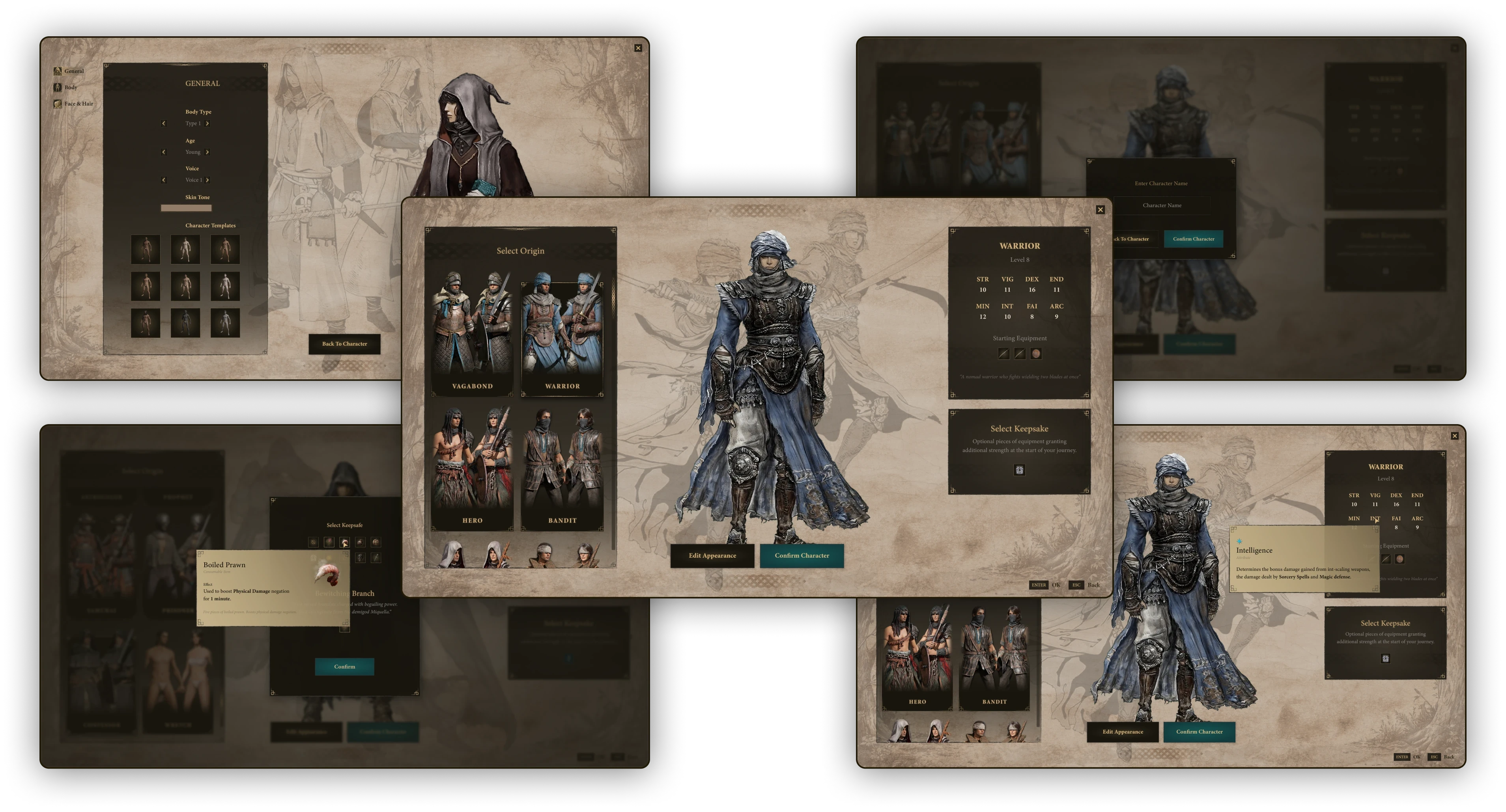
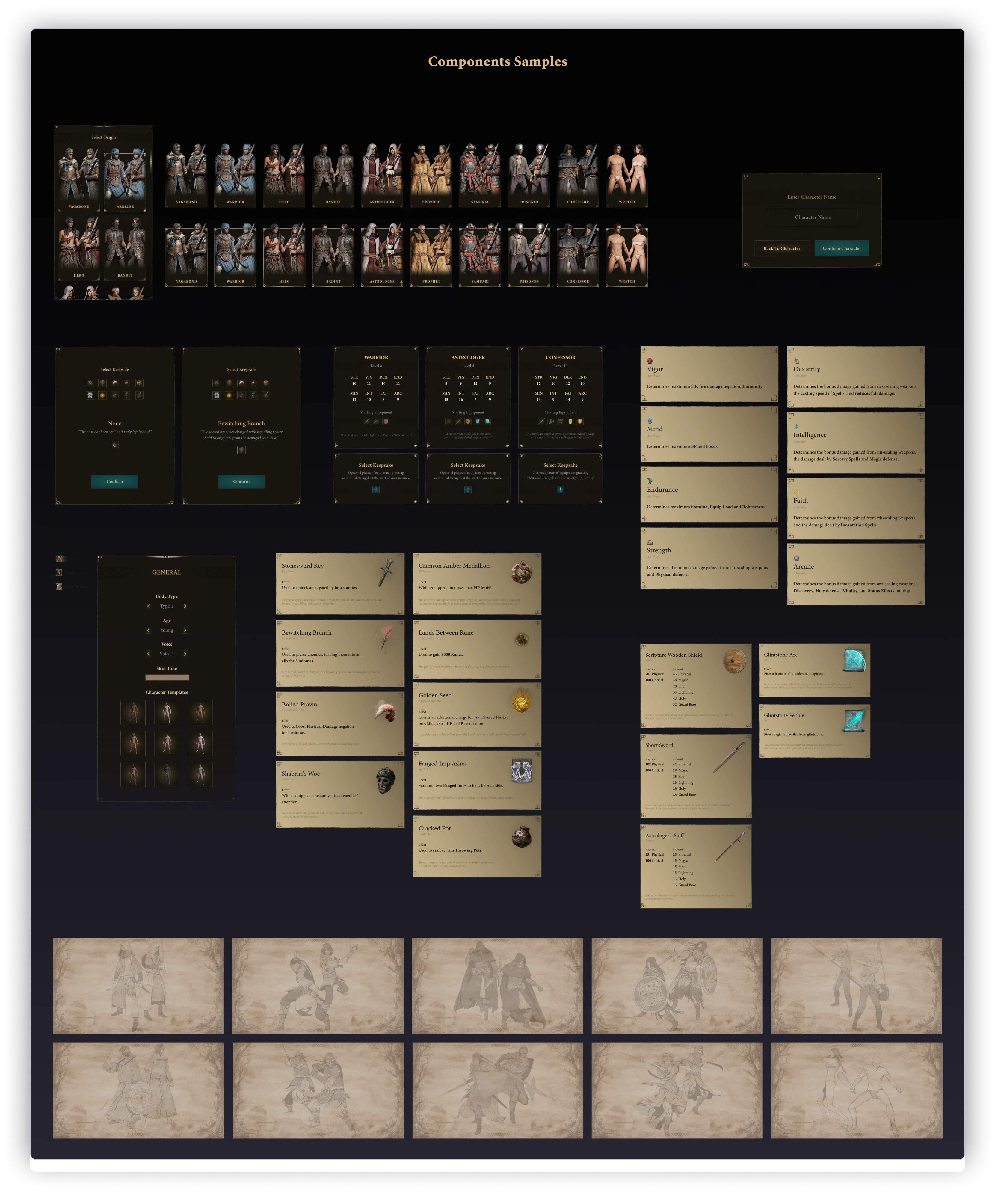
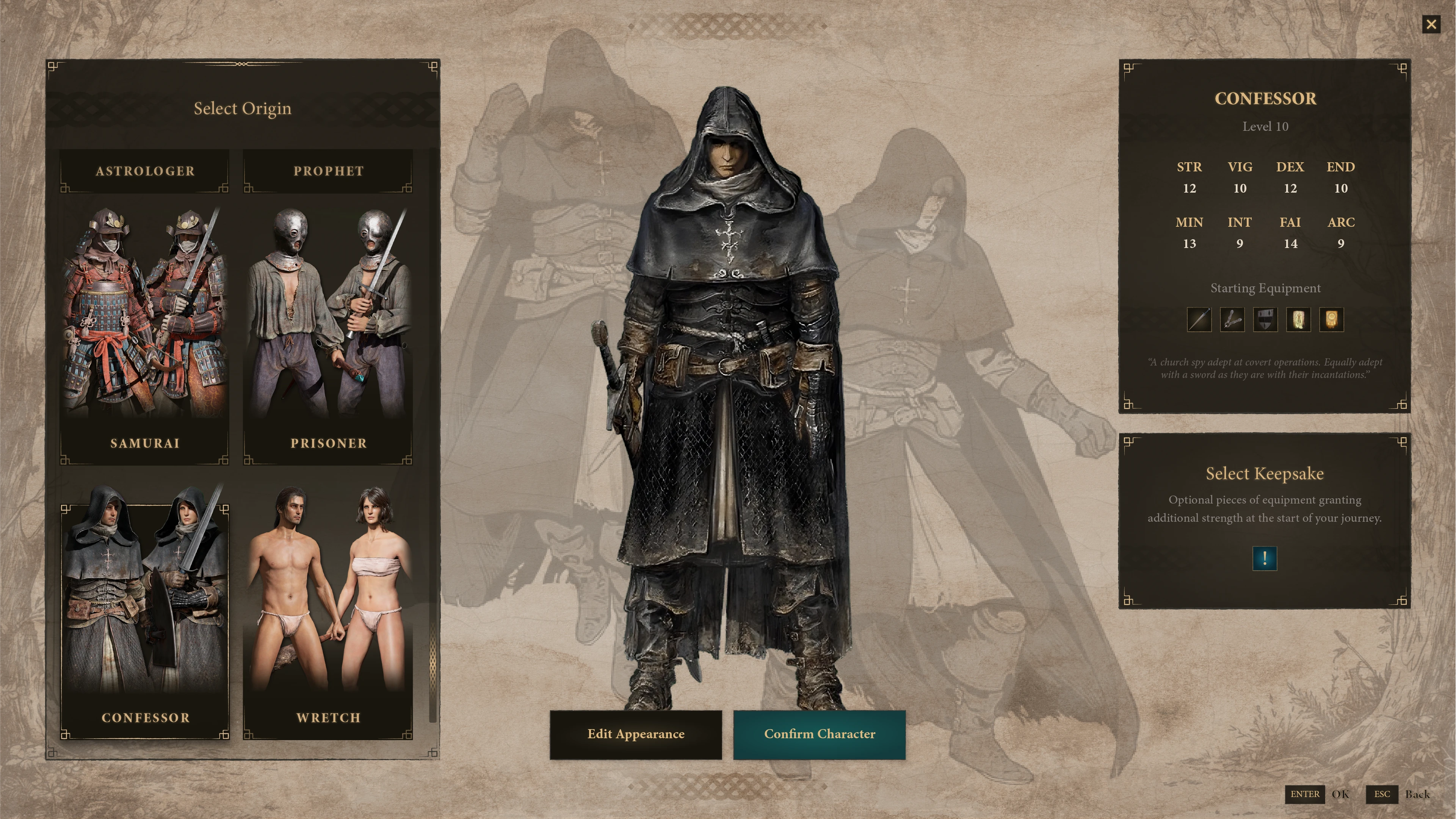
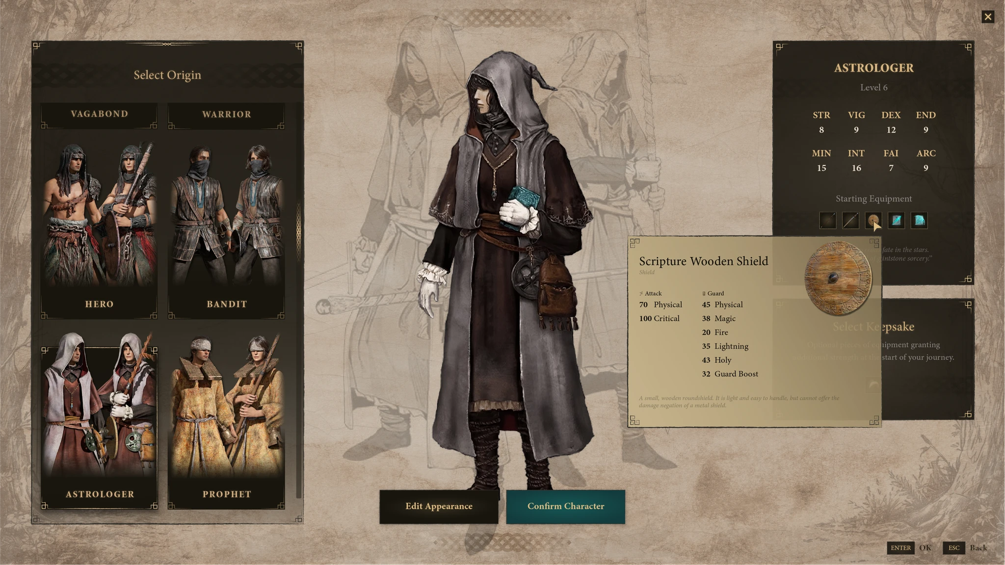
Wireframes V1
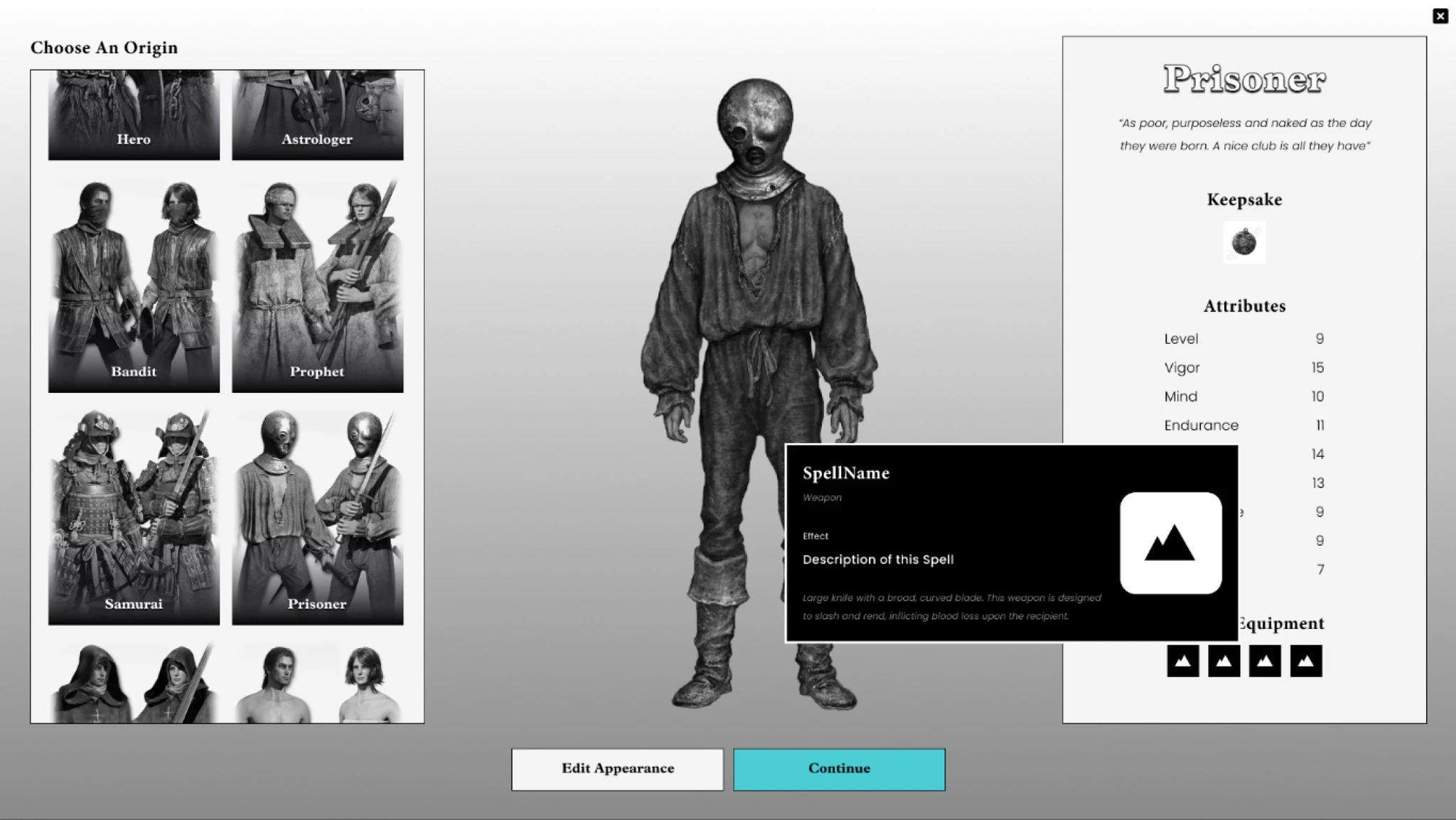
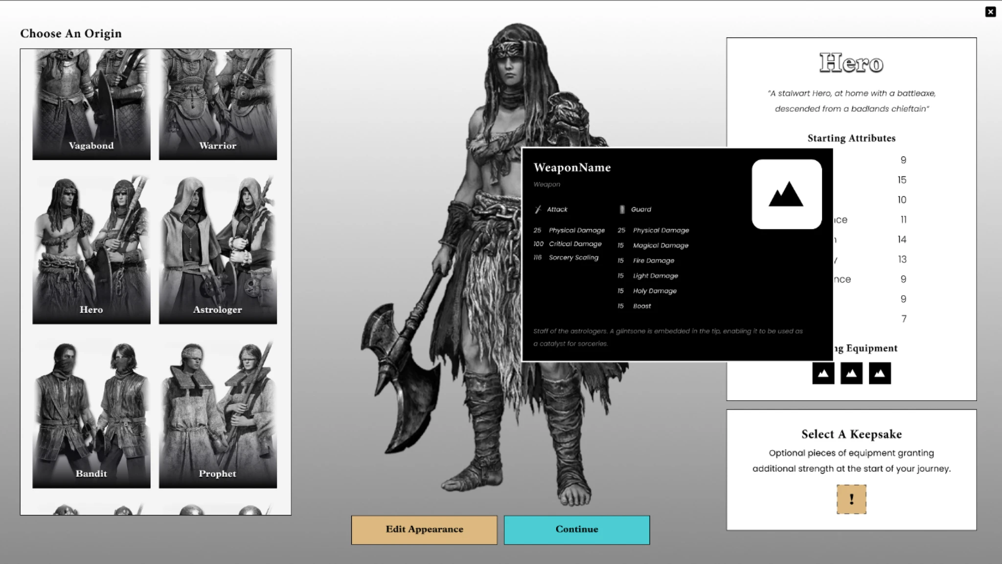
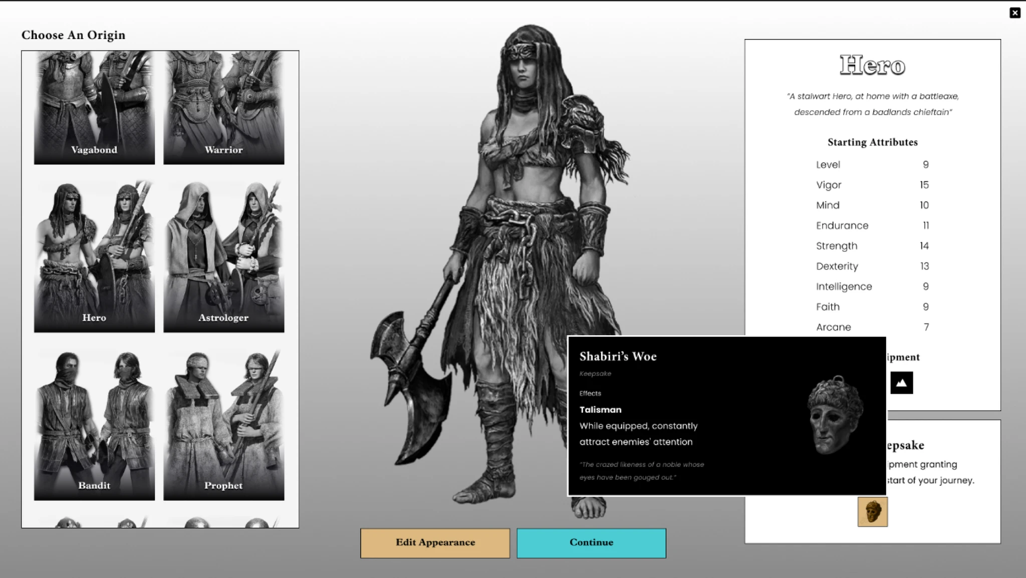
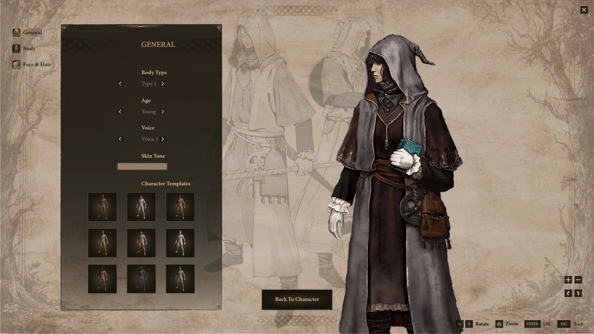
Prototyped a new flow based on the friction map. Three structural changes drove the first version:
- Layout — panels reorganized around decision sequence
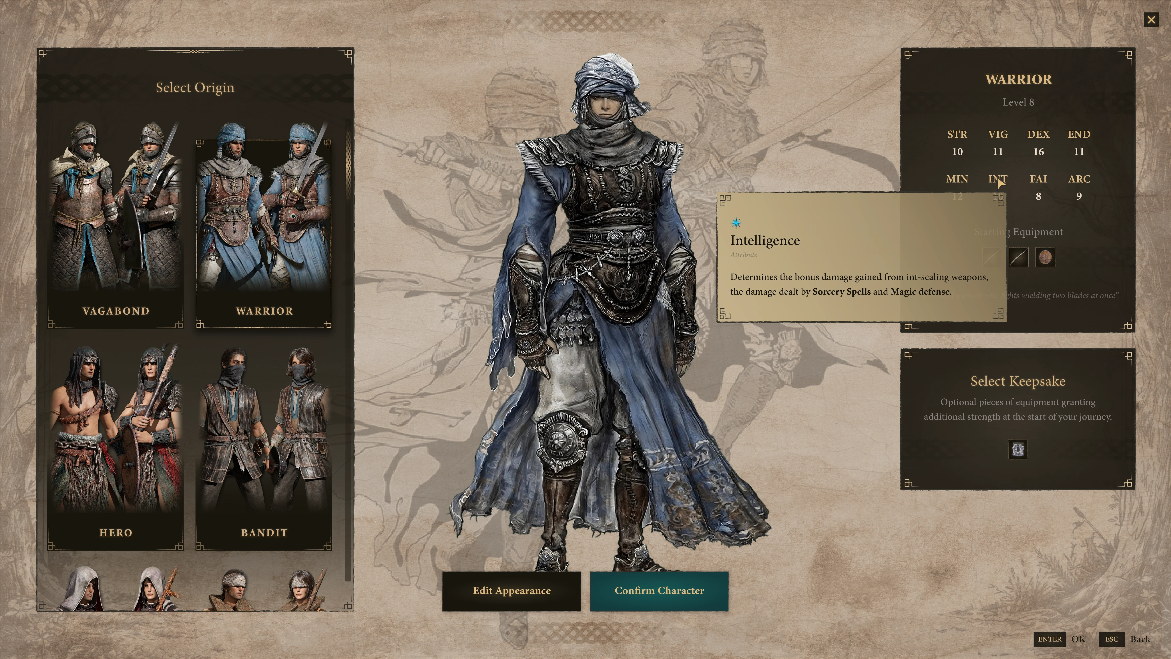
- Contextual help — stat explanations inline at each decision point
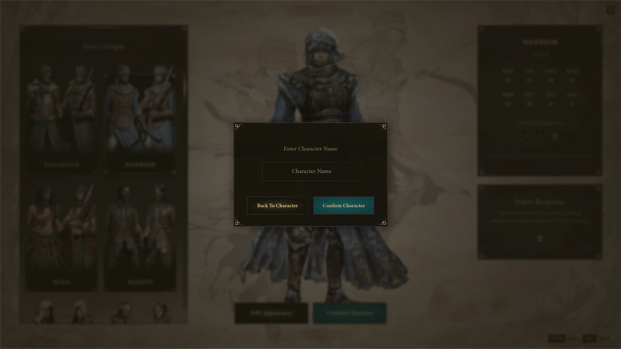
- Action prominence — Keepsake and Edit Appearance made unambiguous
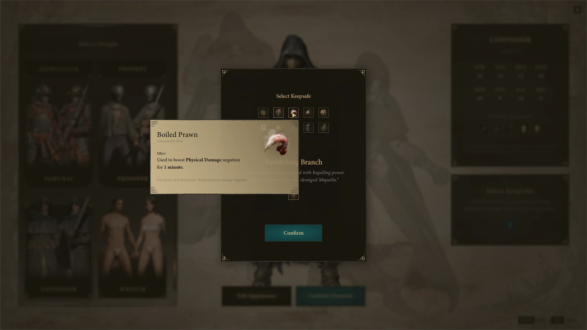
Usability Testing & Iteration
The V1 prototype was tested and documented with 5 users — new and current Elden Ring players. As Jake Knapp notes in Sprint: "Five is the magic number. 85% of the problems were observed after just five people."
- Players completed all tasks easily and smoothly — except keepsake selection
- The origins layout and contextual information on hover were consistently well-received
- Players wanted to know what the keepsake does before selecting it
- Select Keepsafe & Edit Appearance buttons went unnoticed at the beginning
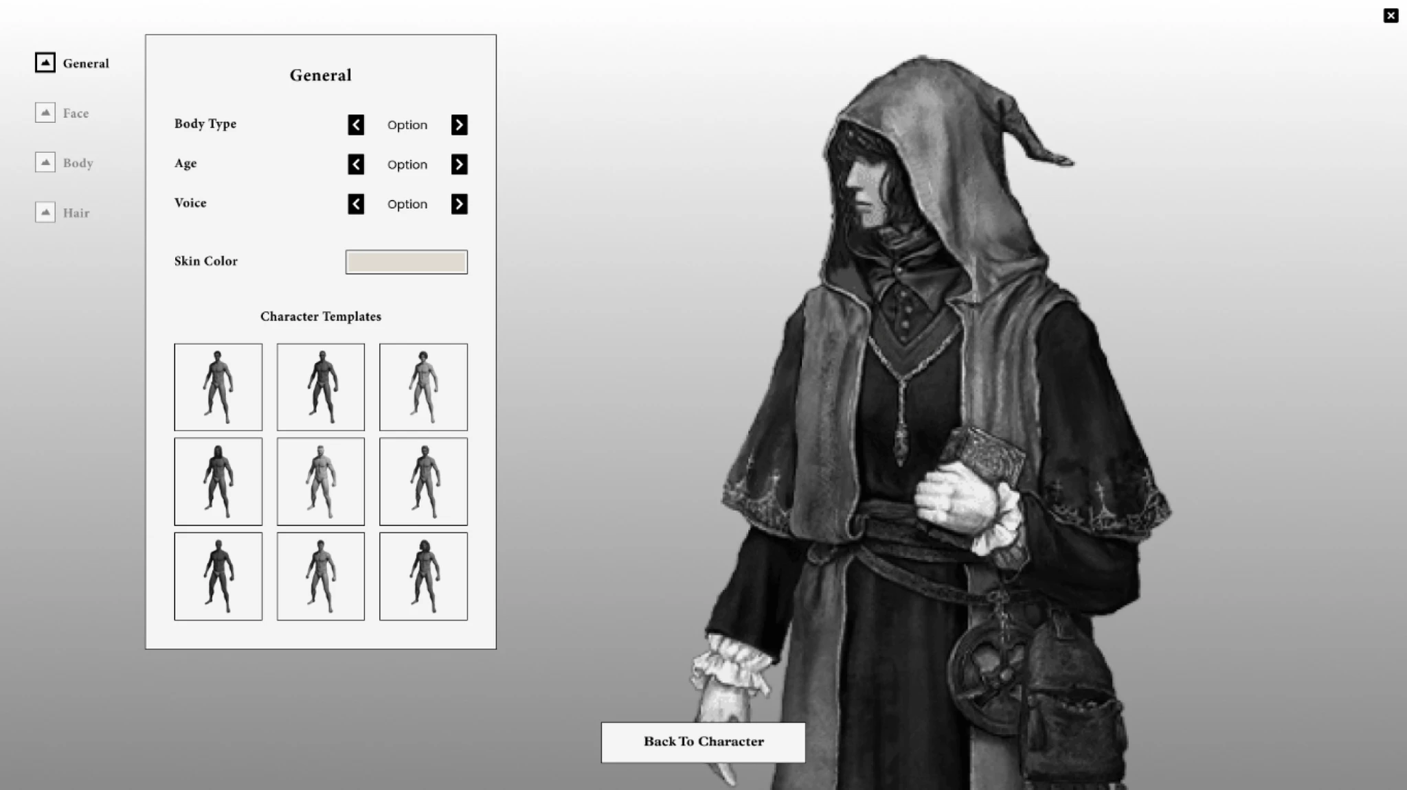
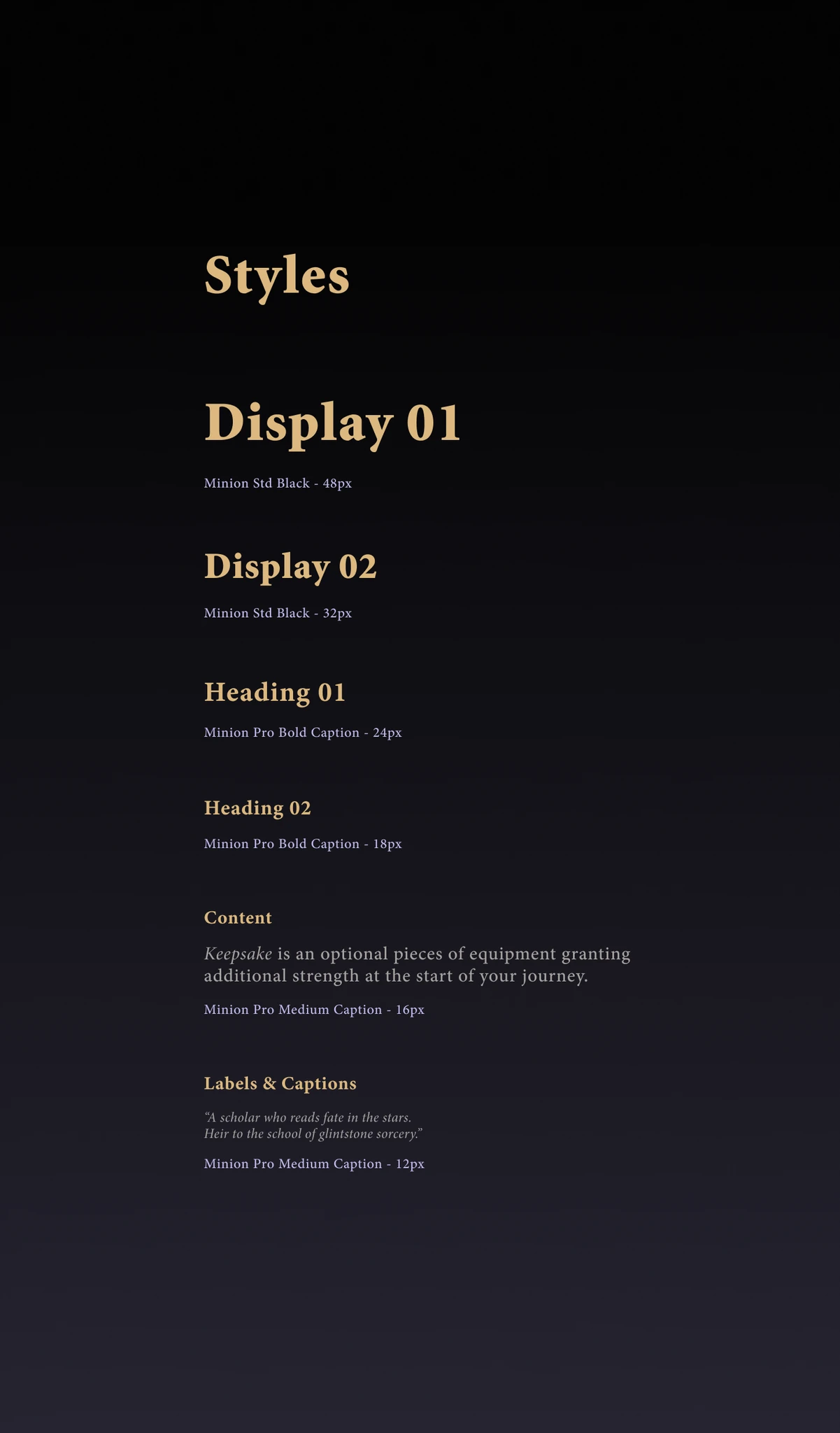
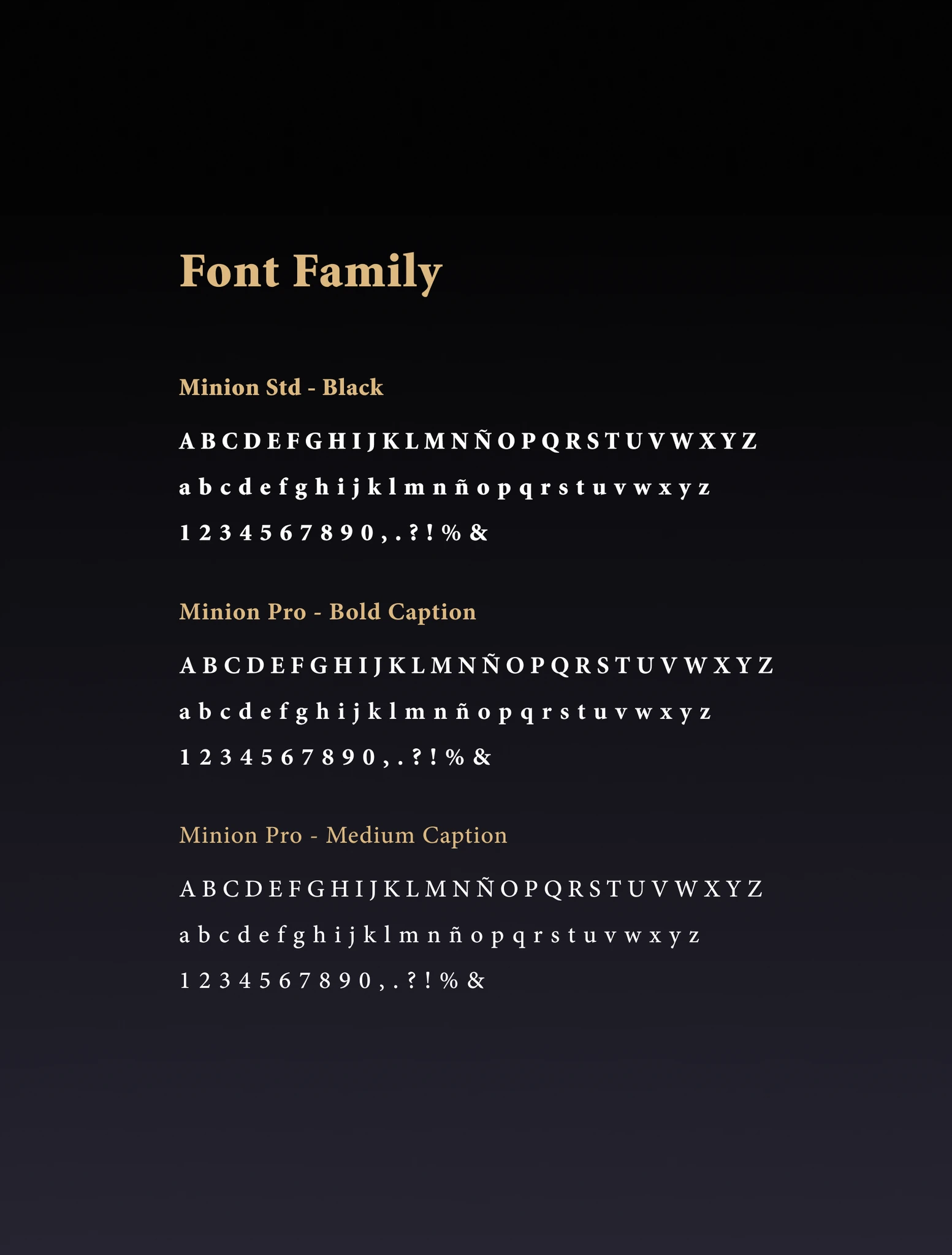
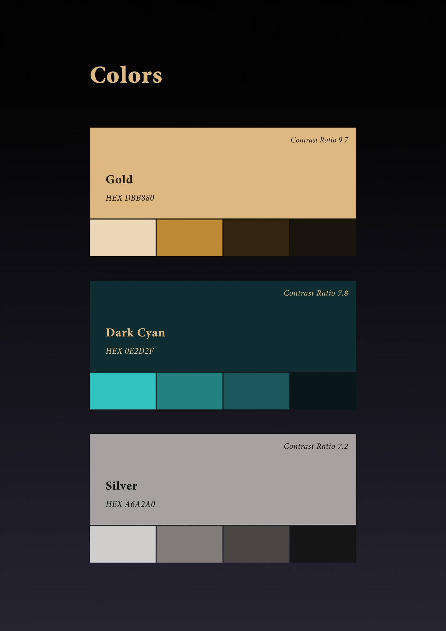
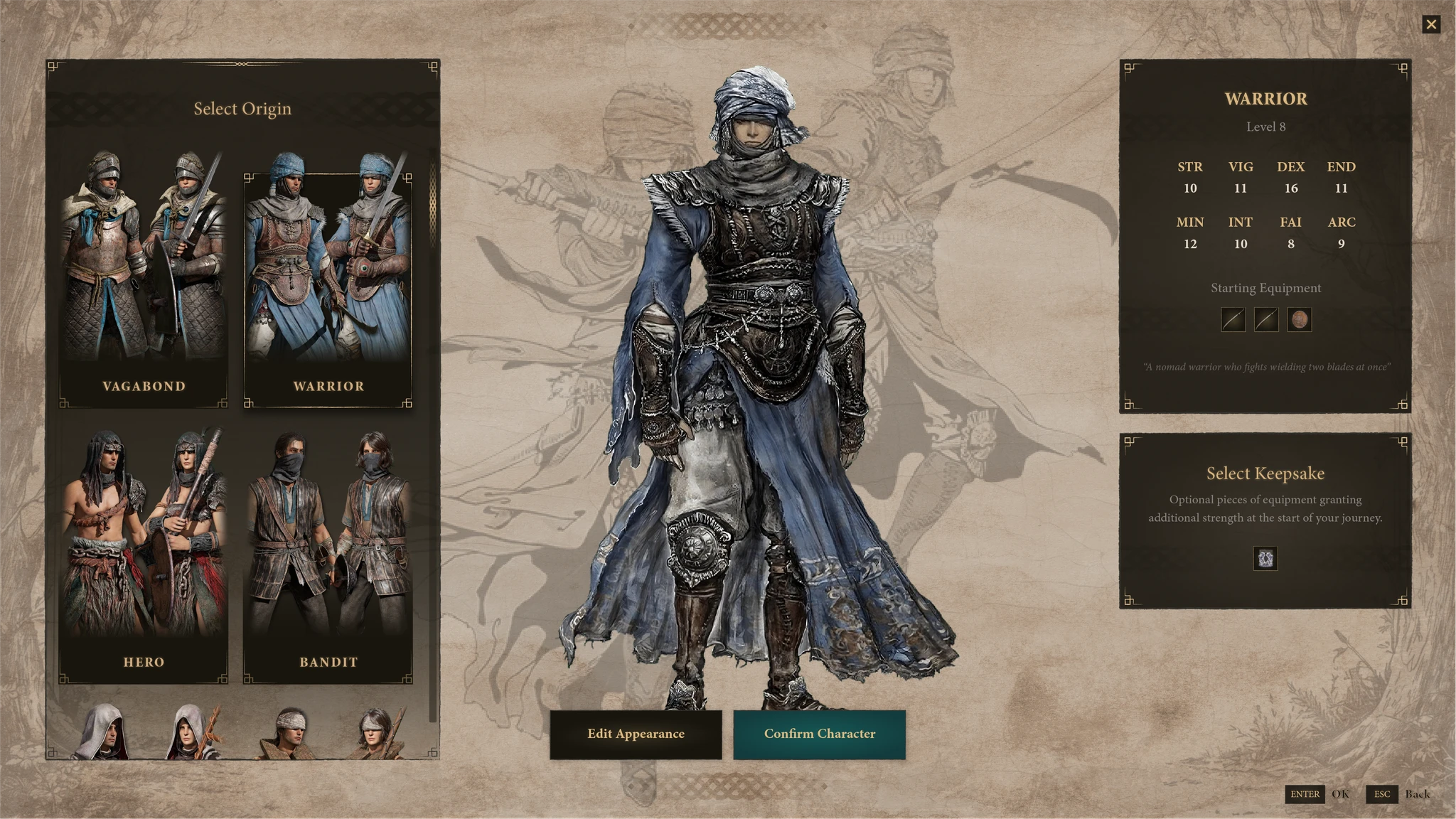
Visual Design
The visual direction had to walk a specific line: different enough to feel like a genuine proposal, close enough to the Elden Ring universe that it didn't feel like a different game.
Quieter than the current interface — less texture noise, more intentional use of space — while keeping the weight that characterizes the aesthetic.
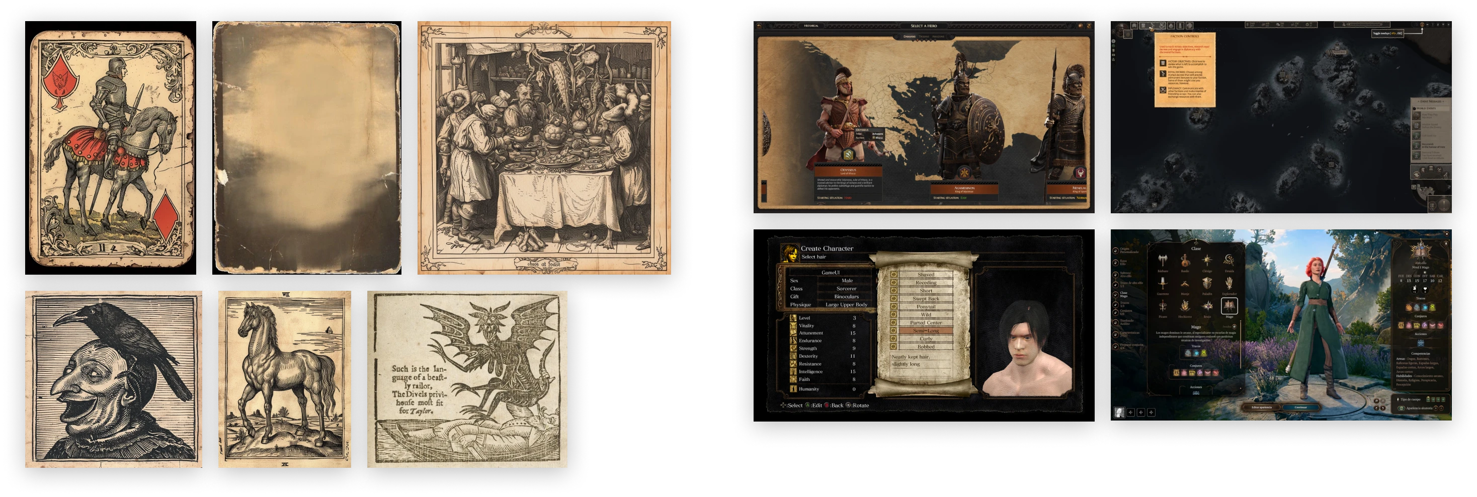
The icons & characters were borrowed from Elden Ring Wiki, I designed everything else from scratch. The background image is a mashup I made from various textures I found for free use and edited in PS.
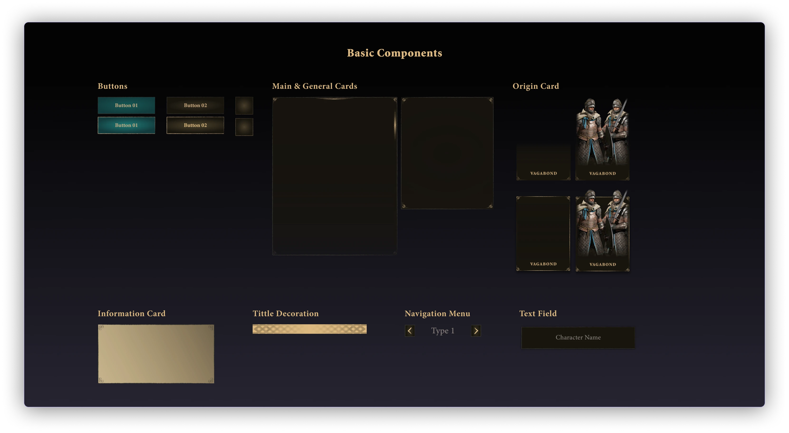
After several visual iterations, here is the final result, which was shared with the testers. Their acceptance was quite positive for this new visual proposal that was different from the current one.
- "Character creation is much more intuitive and easier."
- "I understand more easily the differences between origins."
- "It is clear to understand what a Keepsake is."
- "I like the new design, it's a new interesting style."
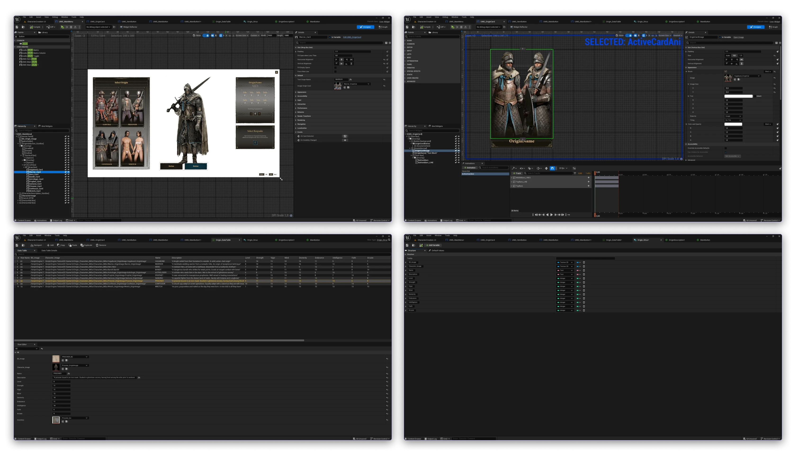
UE5 Implementation
Implemented the first screen in UE5 using UMG — partial prototype to validate how the design held up in-engine.
- Data Tables & Structures — Origin content reads dynamically, no hardcoded values
- UI materials for card backgrounds — better performance than textures
- Animated origin cards — hover states match the Figma prototype
Outcome
User tested, iterated, and partially implemented in-engine. After one round of iteration, all 5 testers completed the flow without abandoning or randomizing any choice.
Onboarding friction in games is often mistaken for depth. Elden Ring's difficulty is intentional — but the character creation confusion wasn't hard in a meaningful way. It was just opaque. Fixing that doesn't dilute the game. It gets players to the actual challenge faster.