UI Design · Mobile
Personal · Spec Work
2022
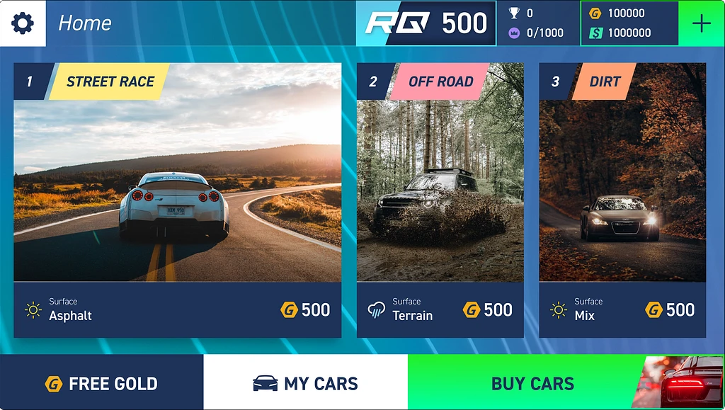
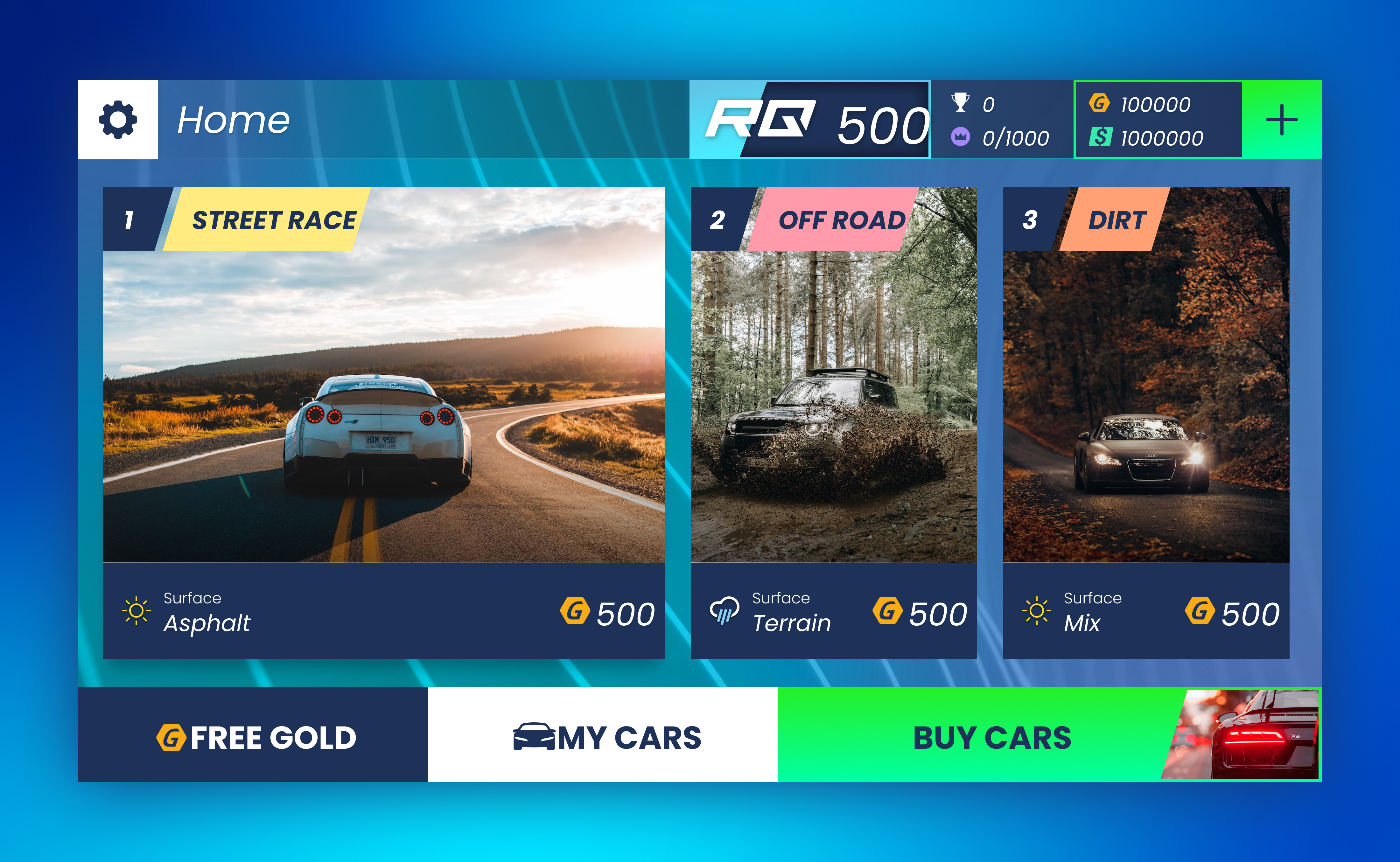
Top Drivers — Home Screen Reskin
A premium reskin of the Top Drivers mobile racing game home screen — modernizing the interface while preserving the brand energy that makes racing games feel alive.
Objective
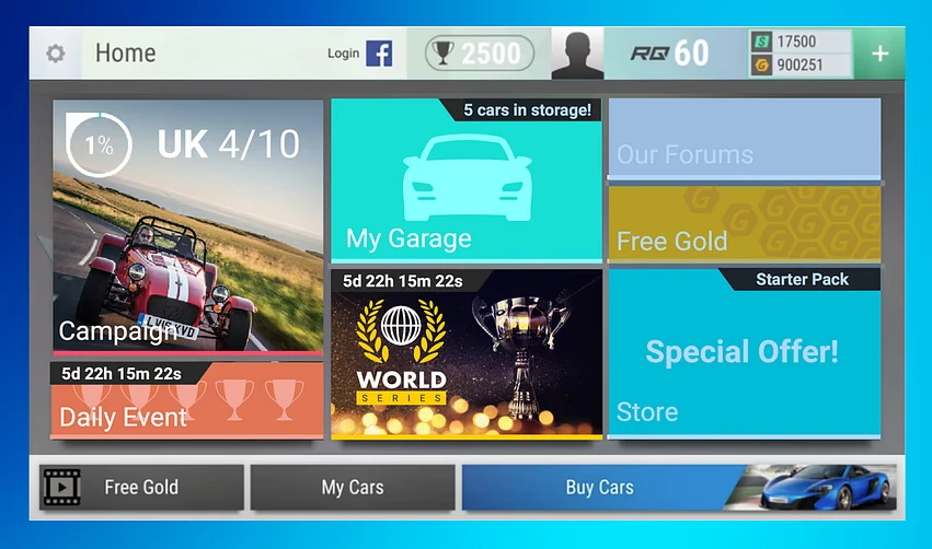
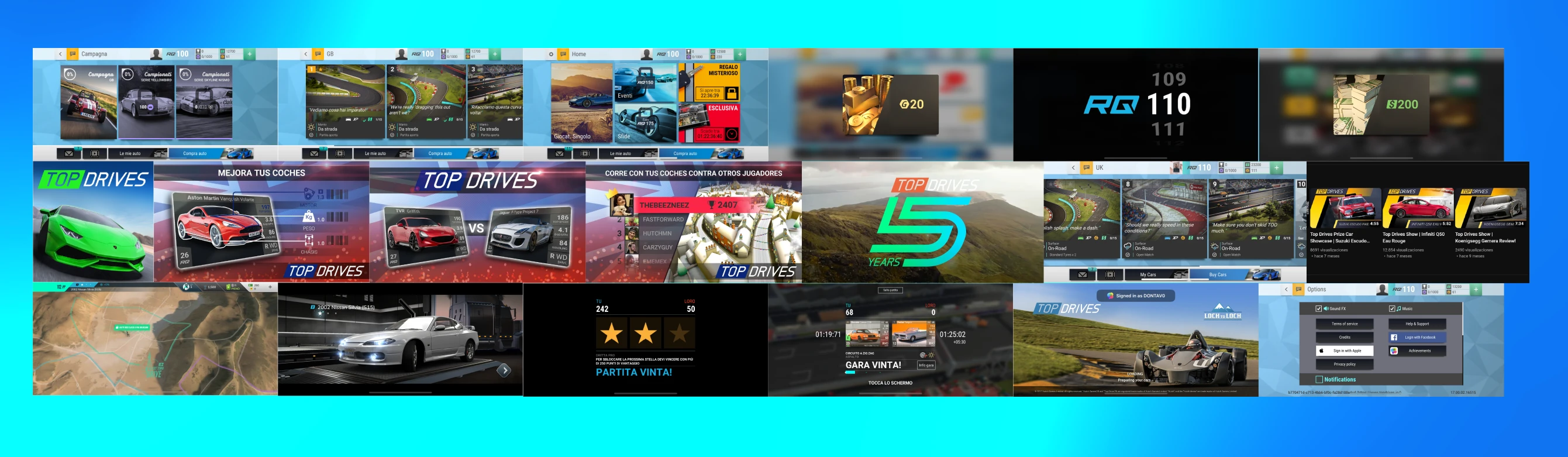
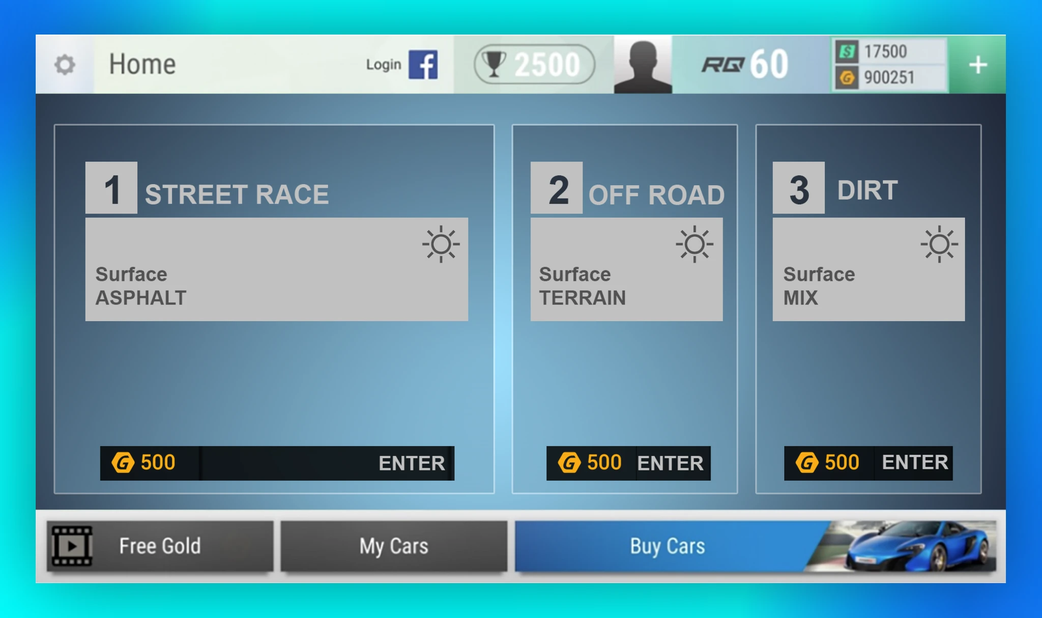
Top Drivers had a home screen that worked — but read as dated. The layouts, component styling, and UX conventions had all aged out of what players expect from a premium mobile game.
The structure stays. The visual language gets rebuilt.
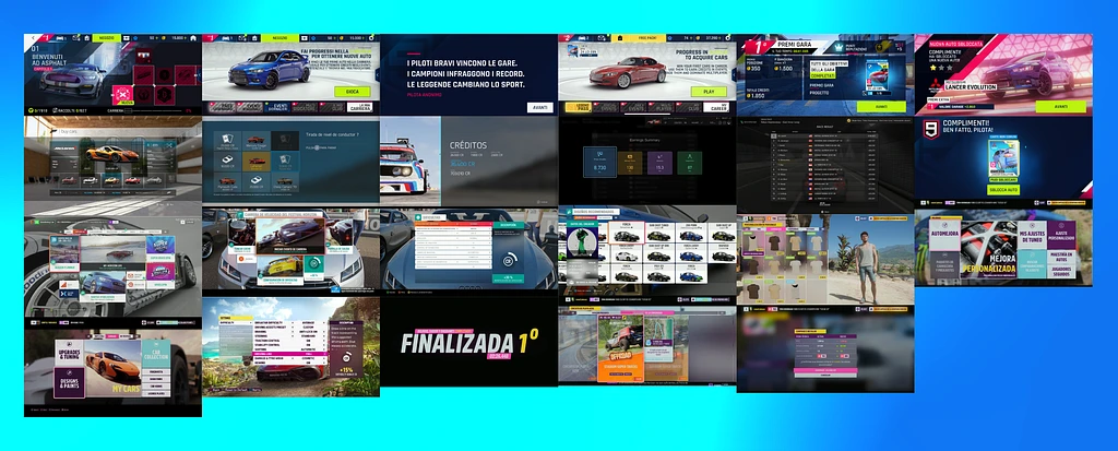
Research & References
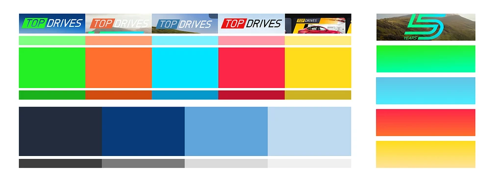
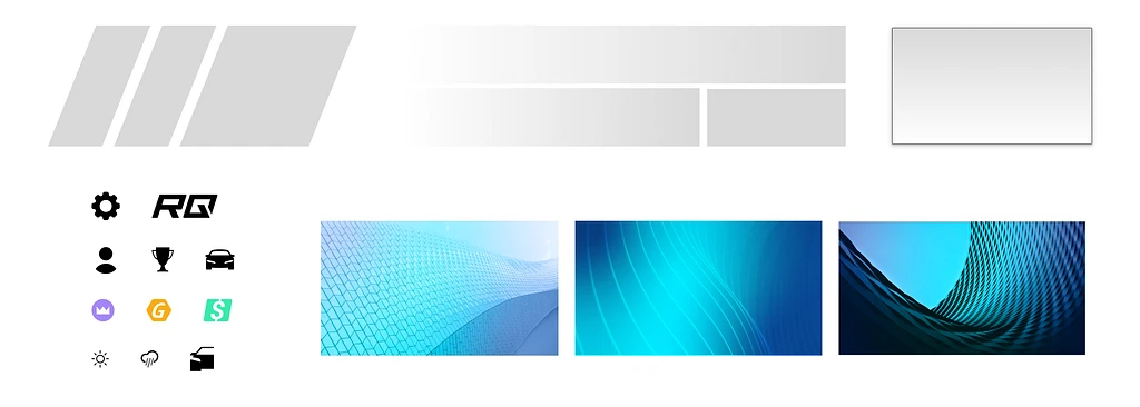
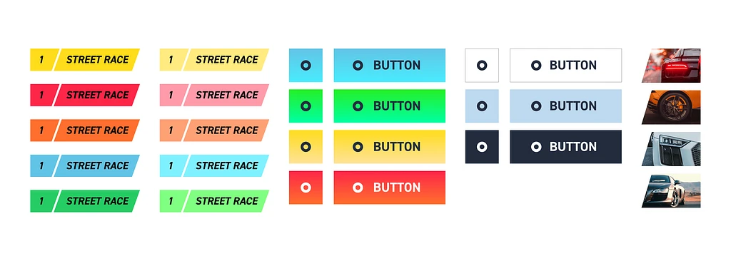
Pulled references across the racing game category to identify what makes these interfaces feel right. A few patterns showed up consistently:
- Bold, dynamic layouts — directional energy that communicates speed
- Square, blocky component shapes — fast to scan, consistent with the brand tone
- Clear accent colors — dedicated to action states, not decoration
- Dense but effortless — hierarchy does the lifting, not content volume
Design
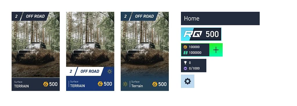
Started from the home screen and expanded to test how the direction would scale across secondary screens and key components. Enough to validate that this was a system, not just a single screen.
- Tightened typographic scale
- Harder edges and more deliberate component proportions
- Accent color used sparingly — it always means something when it appears
- Diagonal, forward-leaning visual direction — speed without relying on animation
Outcome
The core skill this exercise develops is translation — reading the visual essence of an existing brand and rebuilding it at a higher level of craft. The identity has to survive the update.
What surprised me: much of the original character came from things I initially wanted to change. Some of the density, the component heaviness — that is the game. Modernizing meant sharpening those qualities, not softening them.