Luis Octavio
CV ↓

EldenRing:CharacterCreationRedesign

UE5 / UMG

From design to engine

partial prototype, data-driven

Elden Ring: Character Creation Redesign
01

The Problem

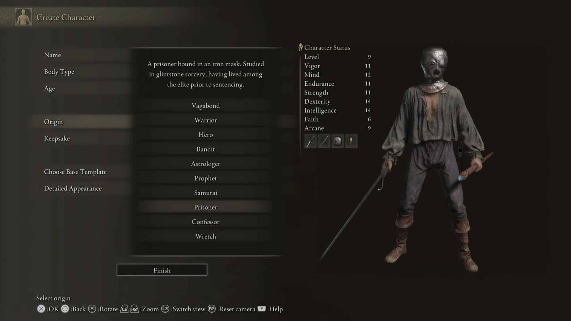
For new players, the volume of choices creates a kind of paralysis before the game has even started. Ten origins, eight stats, an optional keepsake, and no explanation for any of it.

The goal: reduce cognitive overload without reducing depth. The complexity has value — the problem is how the information is organized and surfaced.

ERG-PROB-original
02

Scope

Solo project. Unofficial fan concept, not affiliated with FromSoftware or Bandai Namco.

Scoped to PC — mouse and keyboard. That decision drives the interaction model throughout: hover-triggered contextual help, cursor-based selection, keyboard prompts. A console version would need a different help layer, since focus replaces hover and the readable distance changes. Out of scope here, on purpose.

03

The Decisions

I made three structural changes. Everything else follows from them.

01
Layout
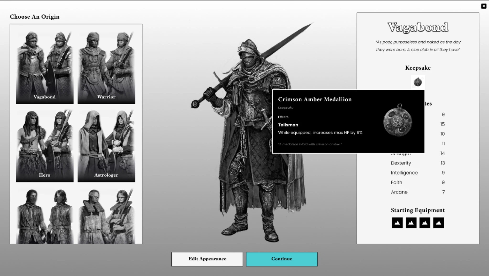
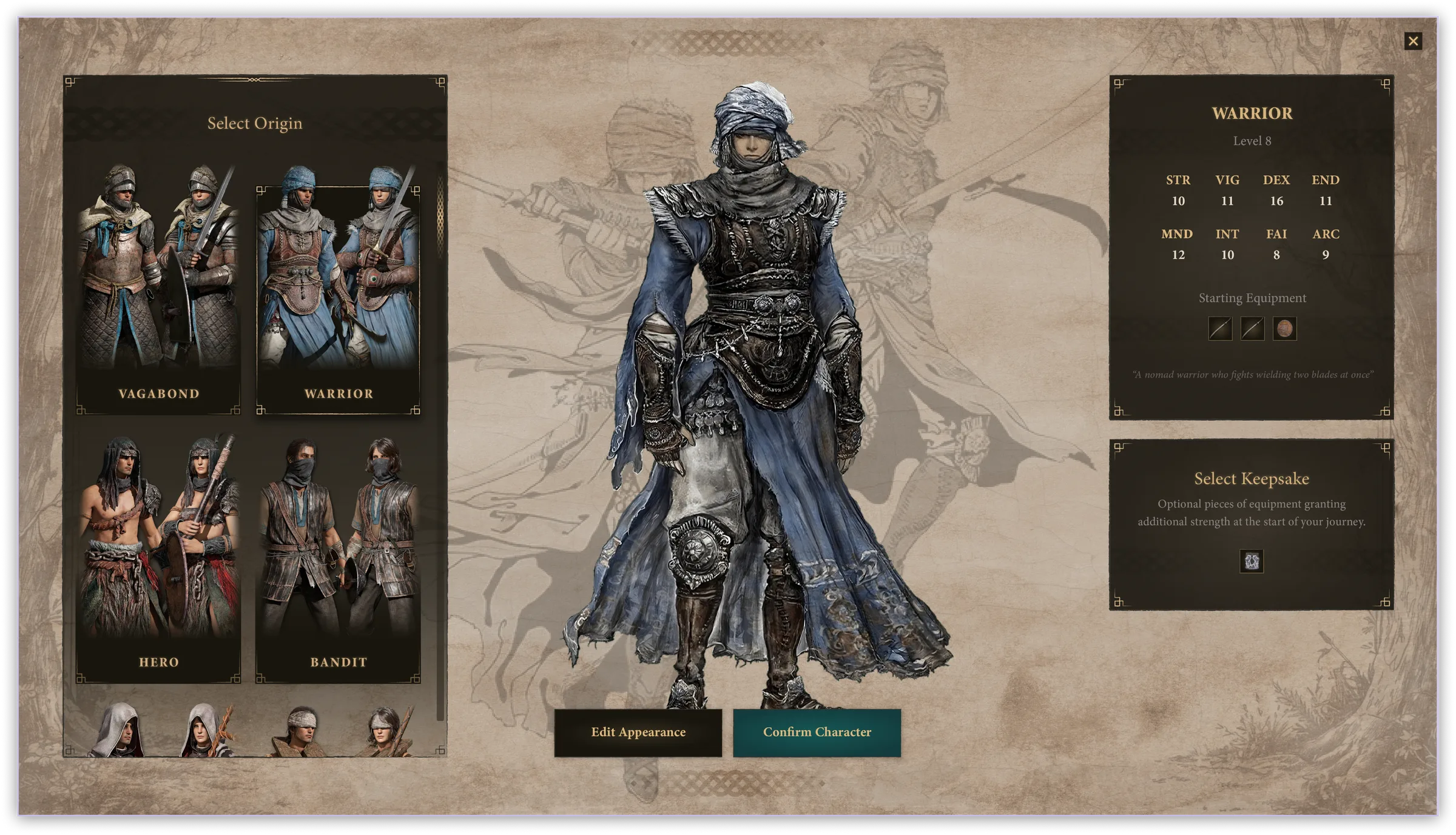
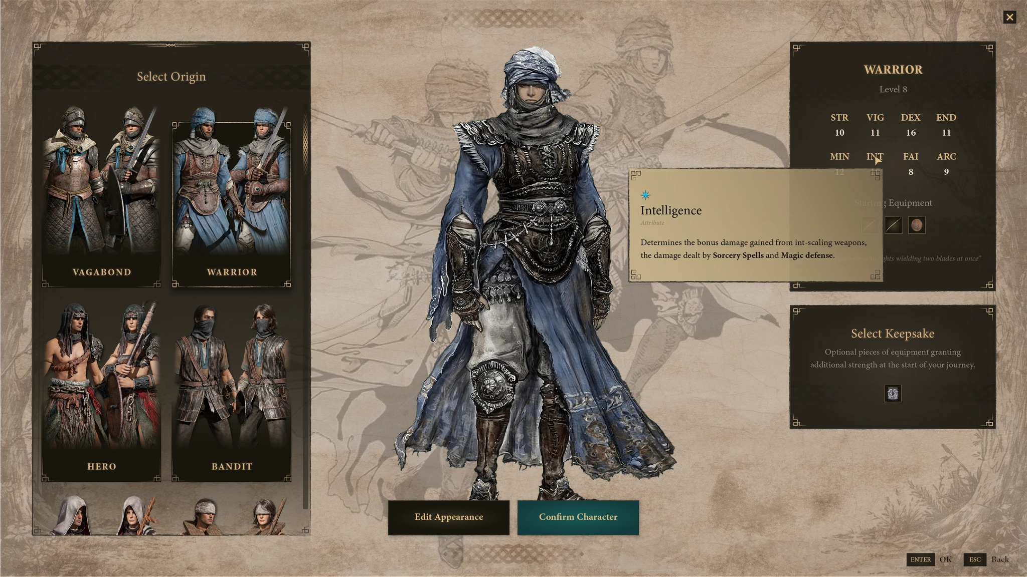
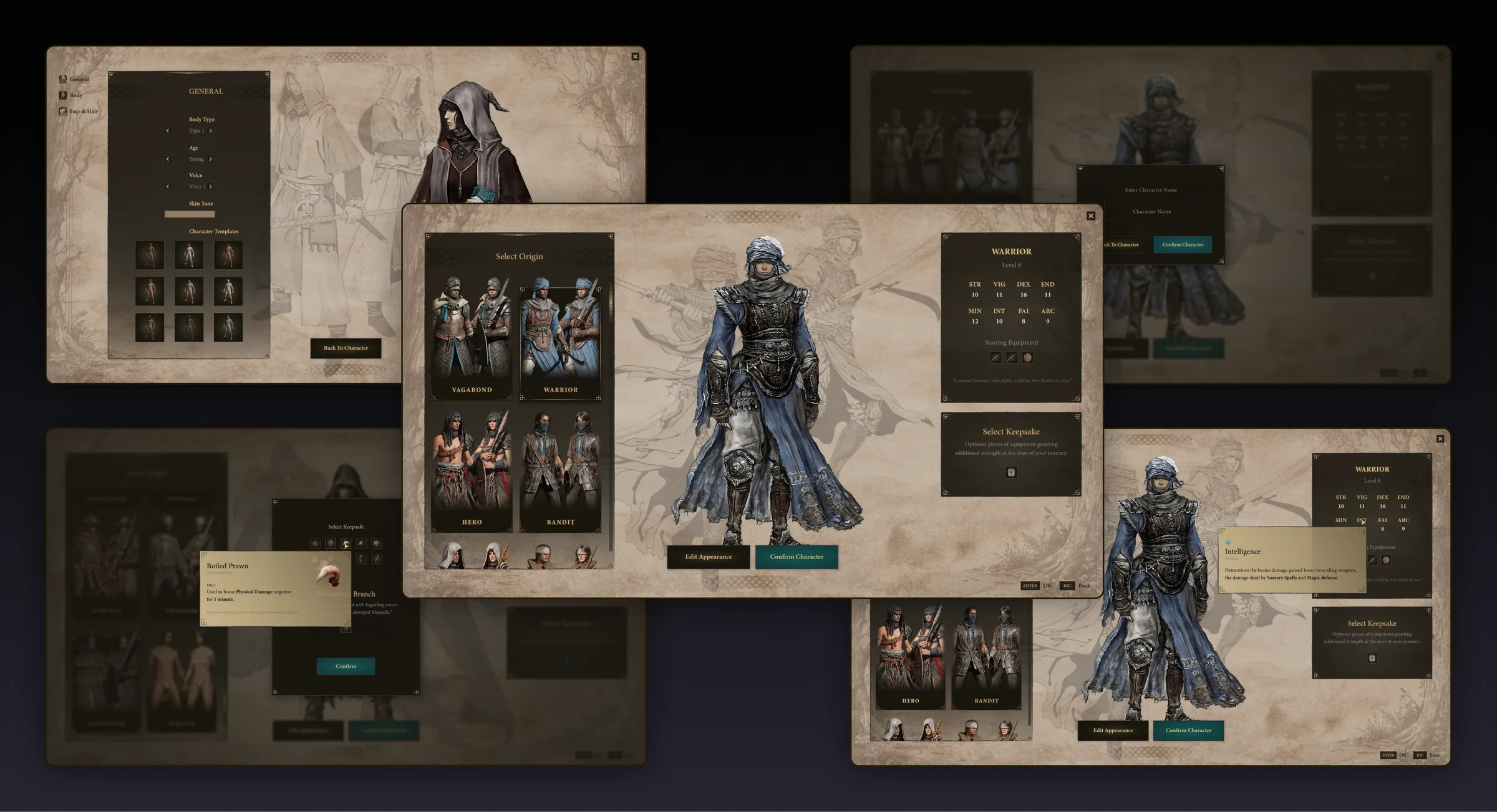
Panels reorganized around decision sequence. The natural order — class, appearance, keepsake — is now reflected in the screen structure, reducing back-and-forth navigation.
02
Contextual help
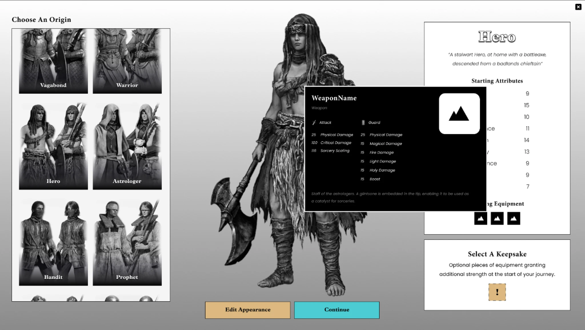
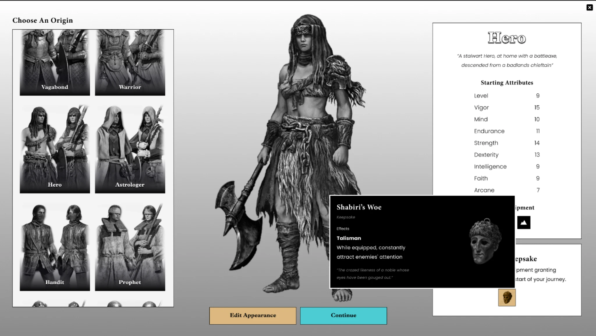
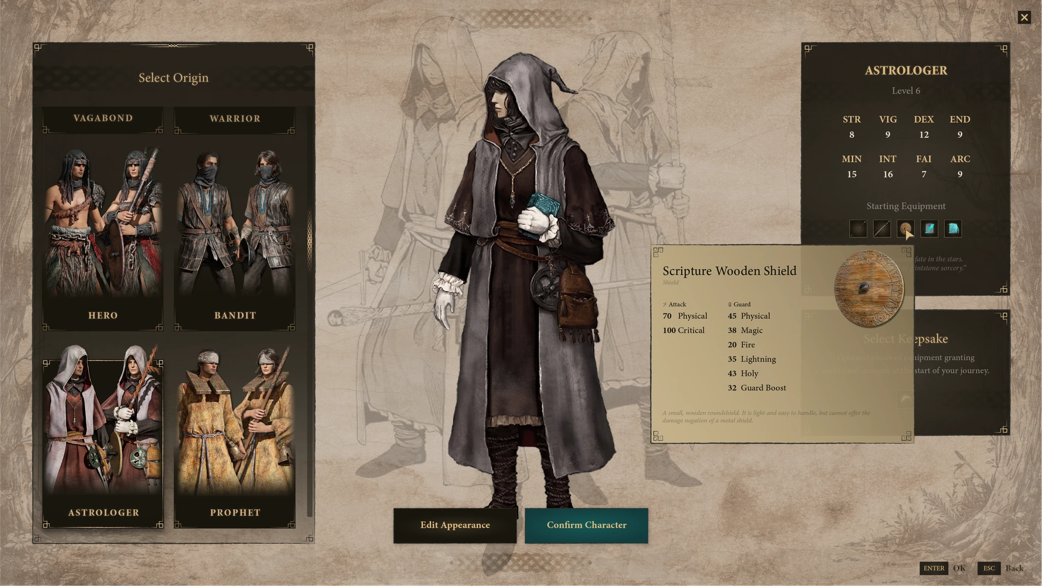
Stat explanations inline at each decision point. Hovering a stat surfaces a plain-language tooltip — no wiki needed. First-time and returning players both benefit without the UI becoming cluttered.
03
Action prominence
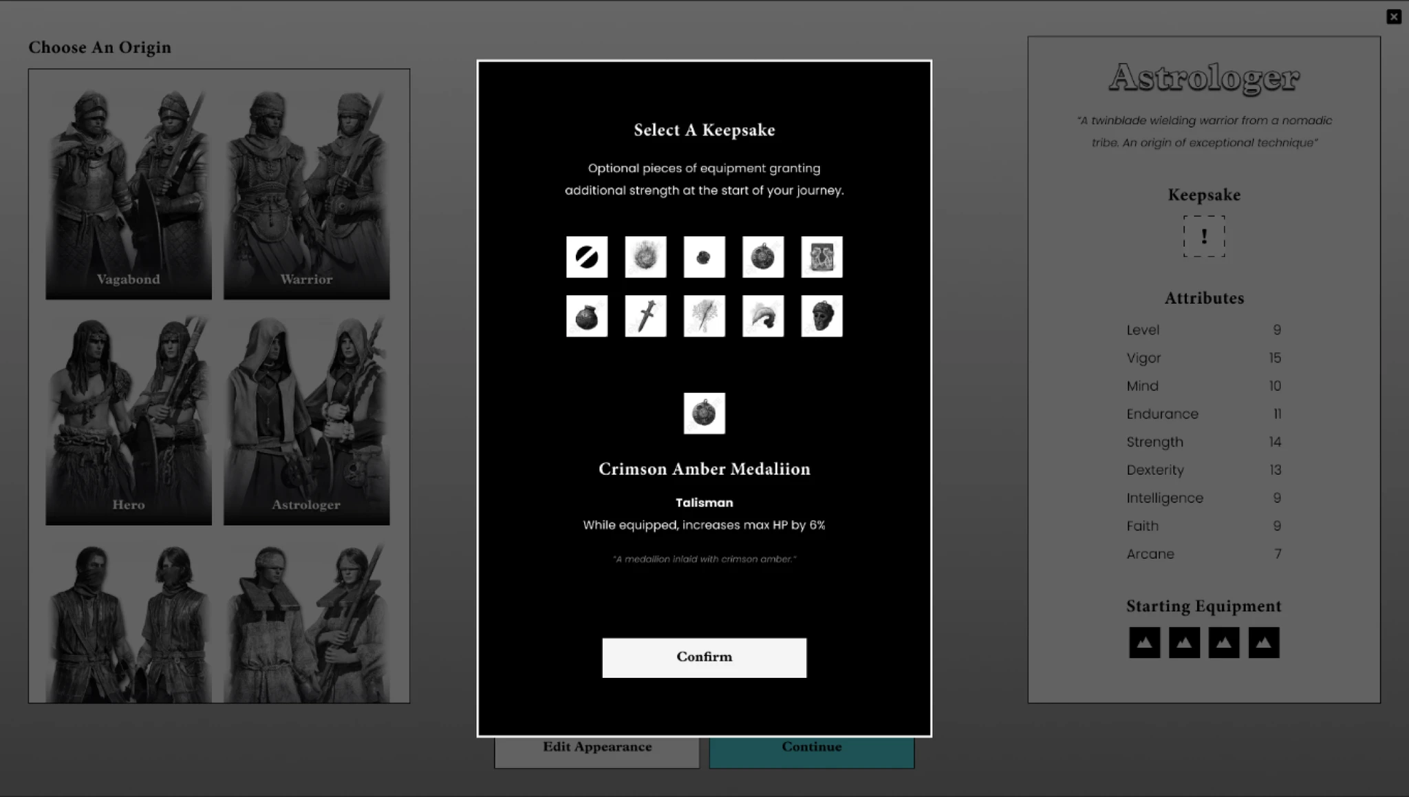
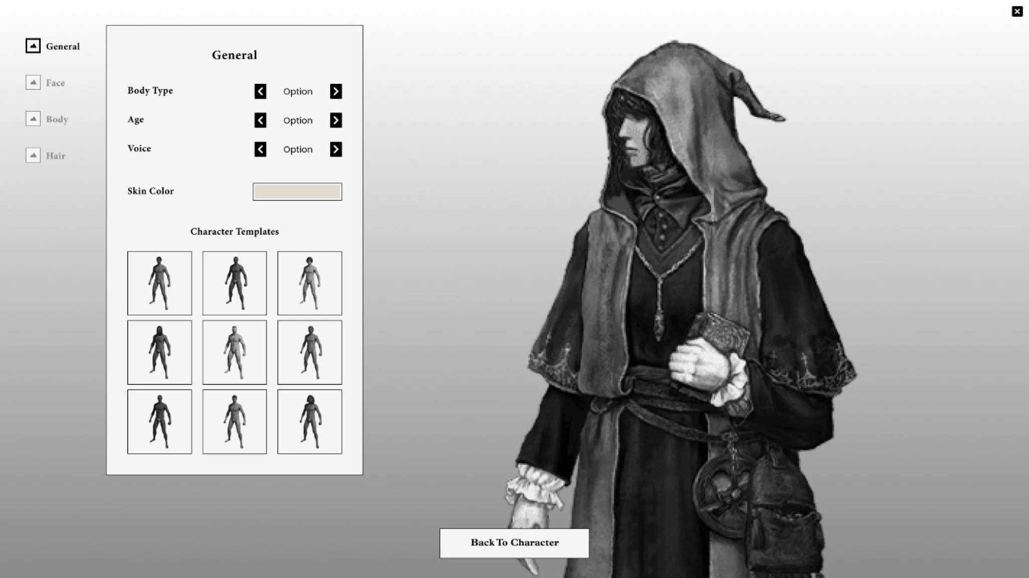
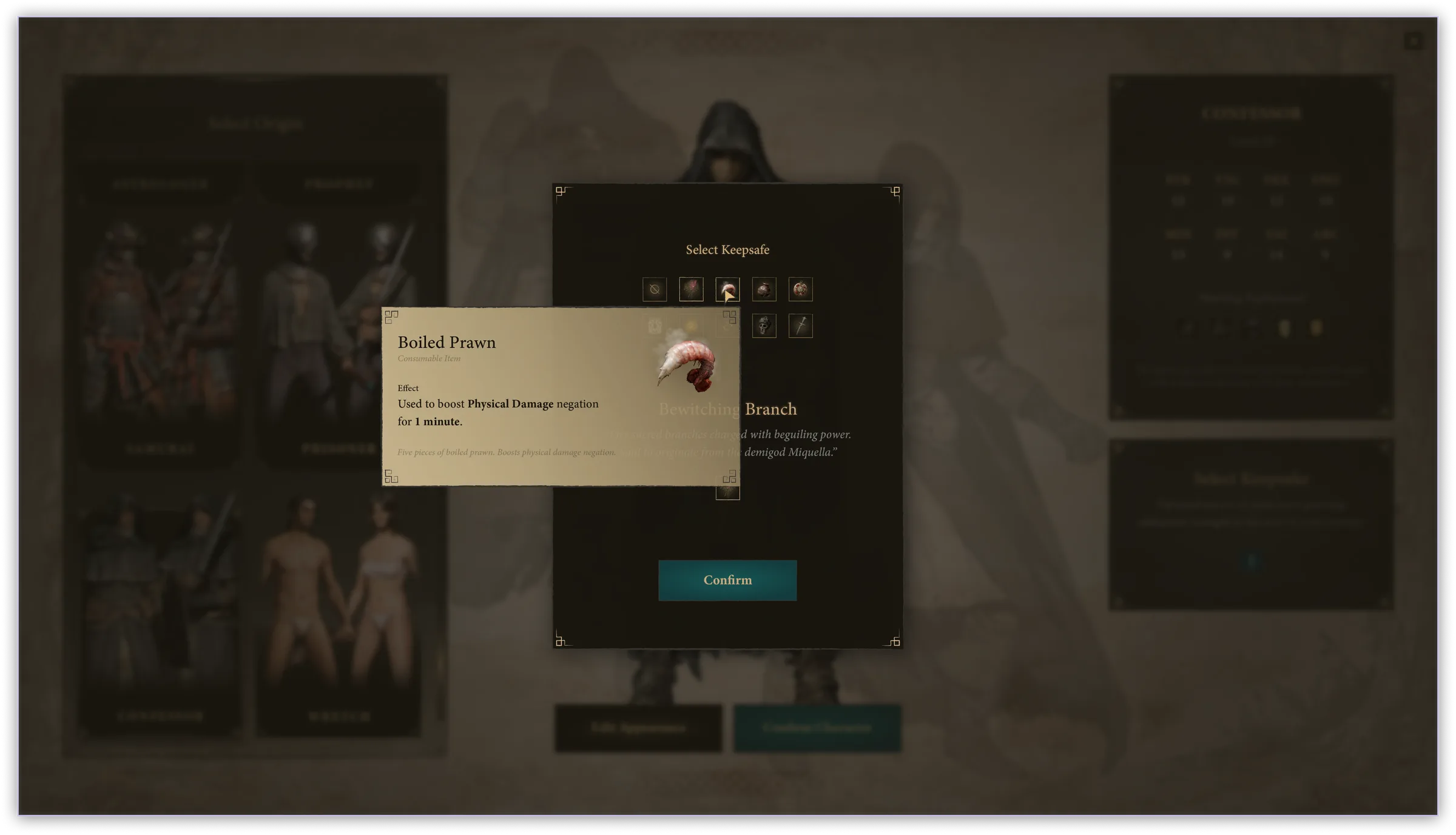
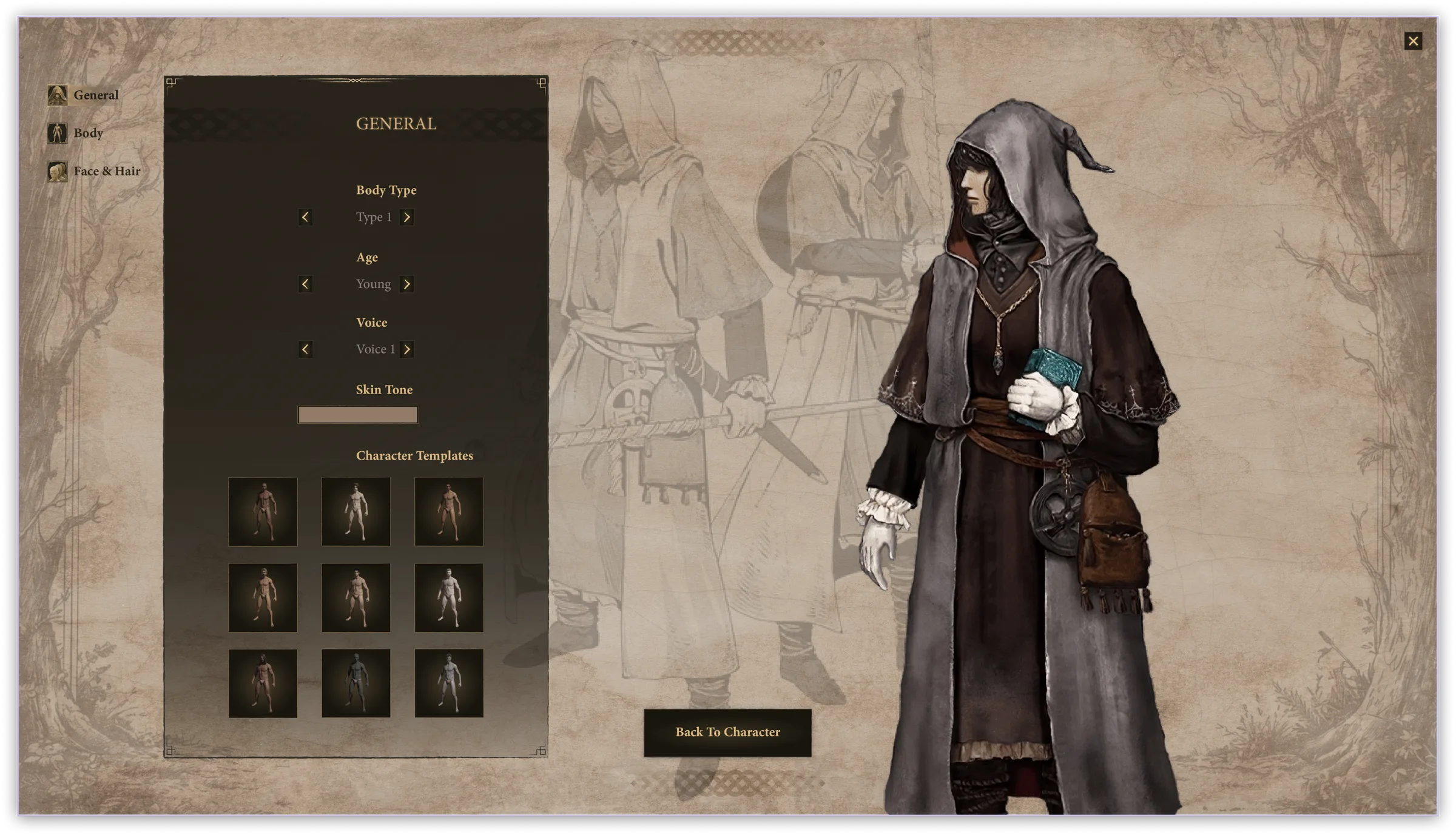
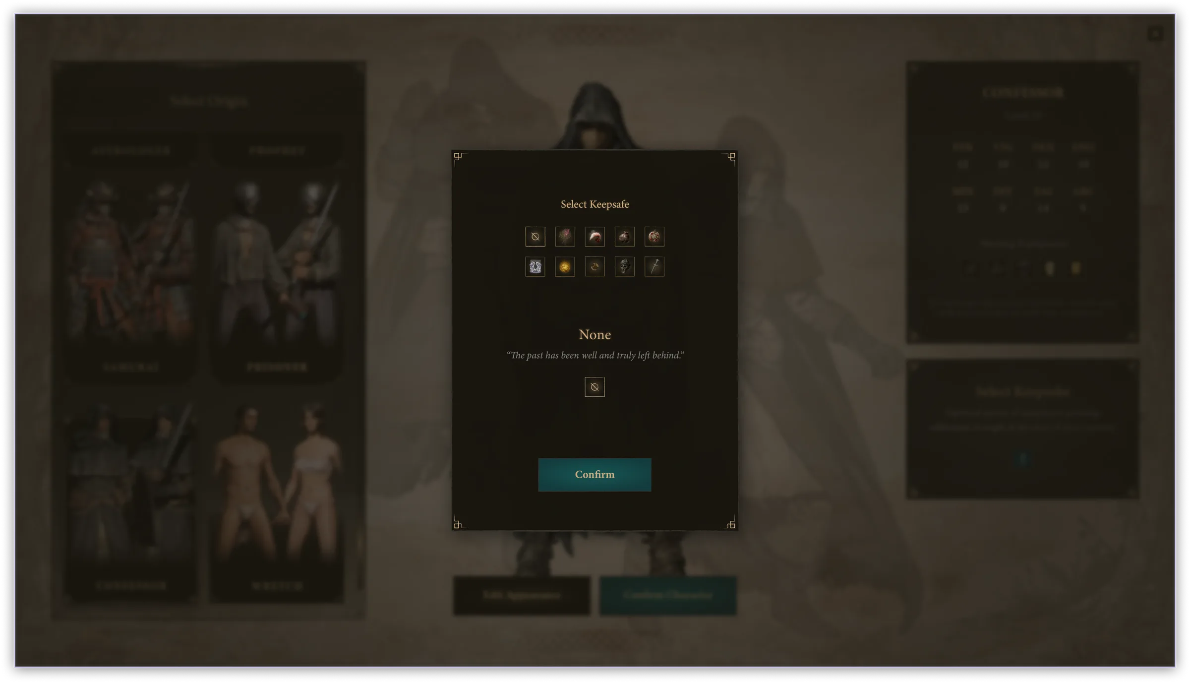
Keepsake and Edit Appearance made unambiguous. Both actions were demoted in the original UI. In V1 they are persistent, labeled, and positioned within the natural scan path.
04

In Engine

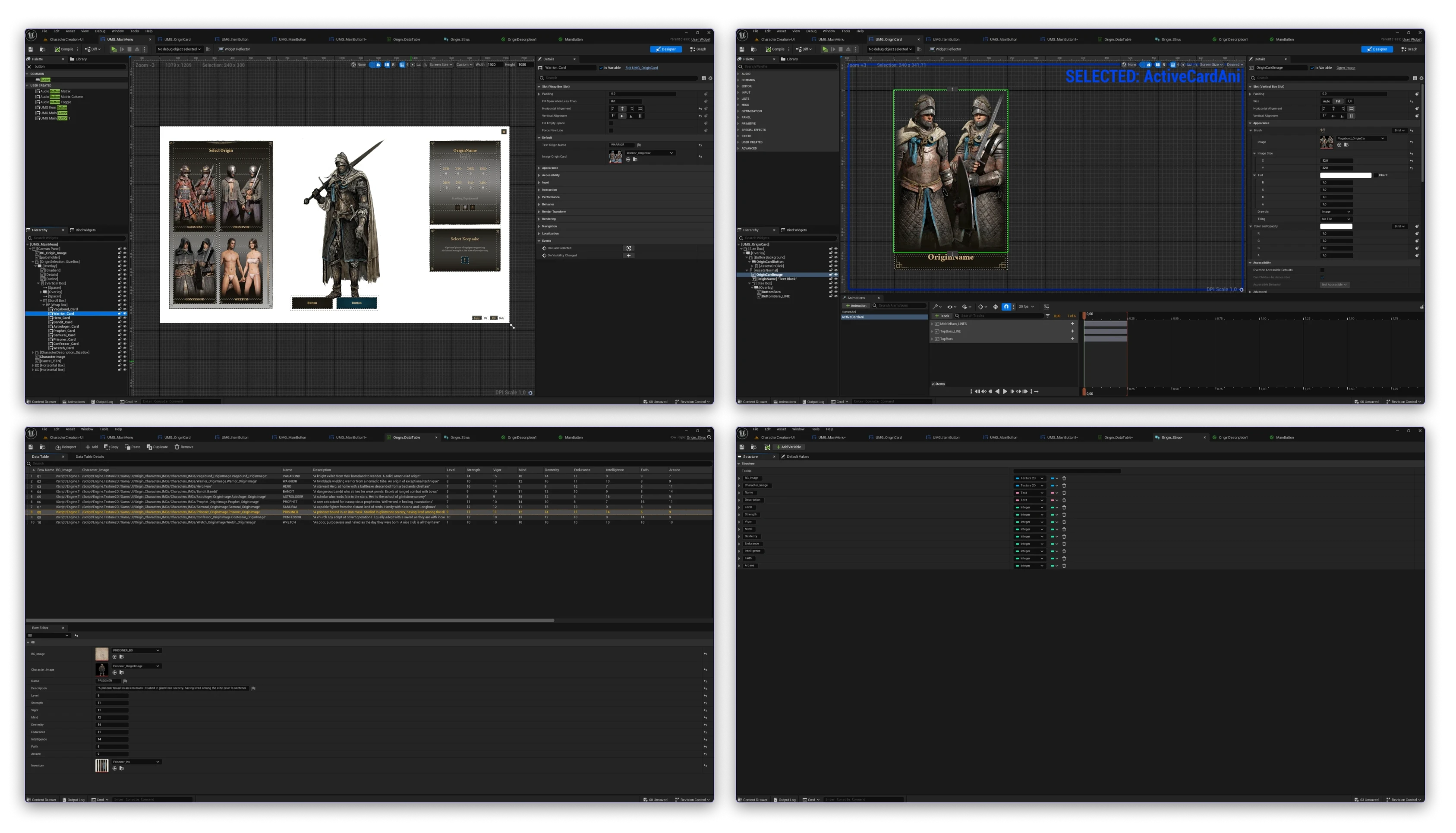
Implemented in UE5 with UMG — a partial prototype, built to test whether the design survives contact with an engine instead of a Figma canvas.

Three things I built for it rather than around it:

Data Tables & Structures
Dynamic content
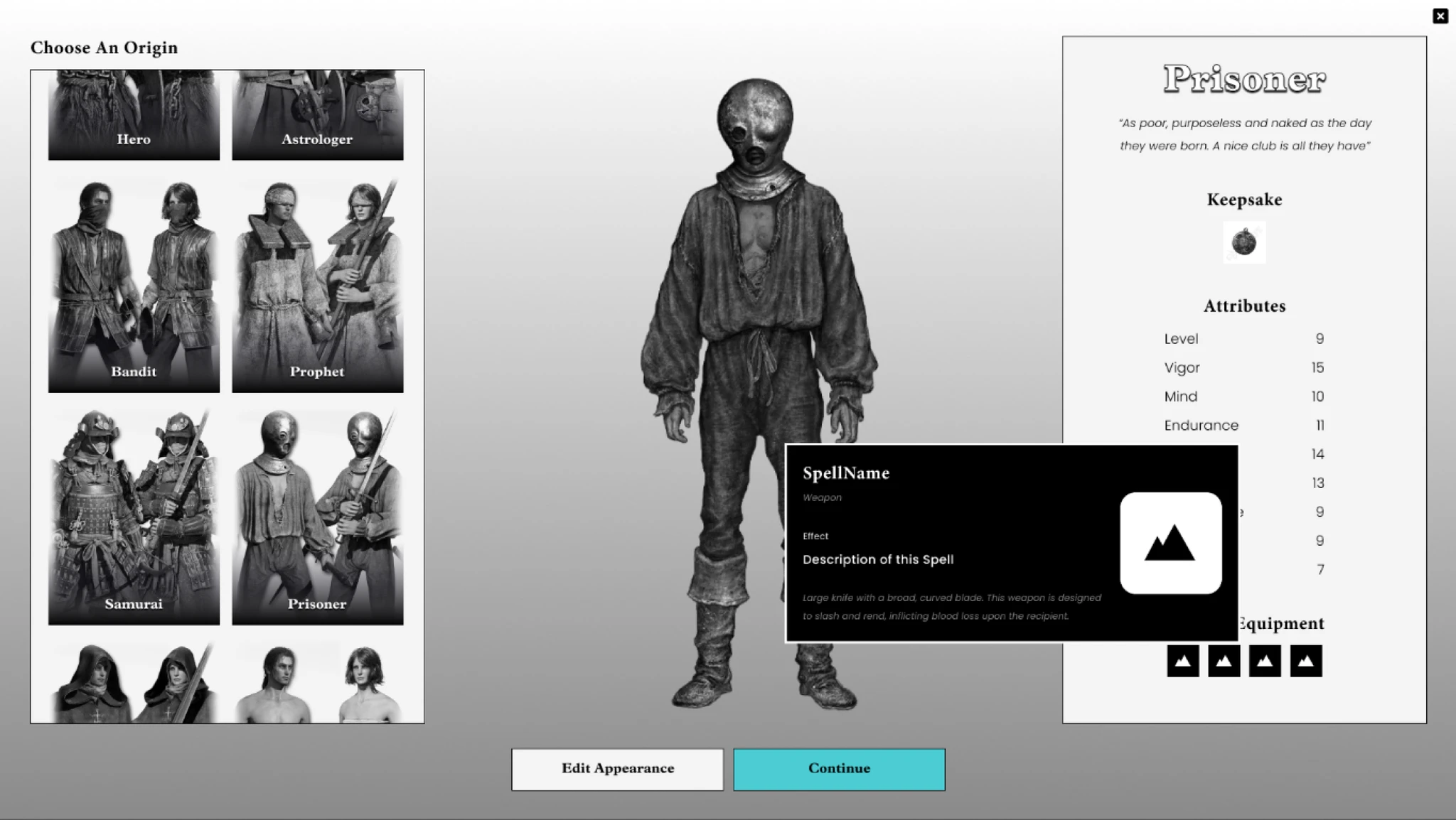
Origin content reads from Data Tables — no hardcoded values in the widget. Swapping, adding, or localizing an origin requires zero Blueprint changes.
UI materials for card backgrounds
Performance
UI Materials instead of textures for card surfaces. Cheaper draw calls and better resolution independence — scales to any aspect ratio without artifacts.
Animated origin cards
Interaction
Hover states implemented in UMG match the Figma prototype timing. Each card scales and brightens on focus with a smooth curve, not a frame snap.
ERG-UE5-still--full
05

Research

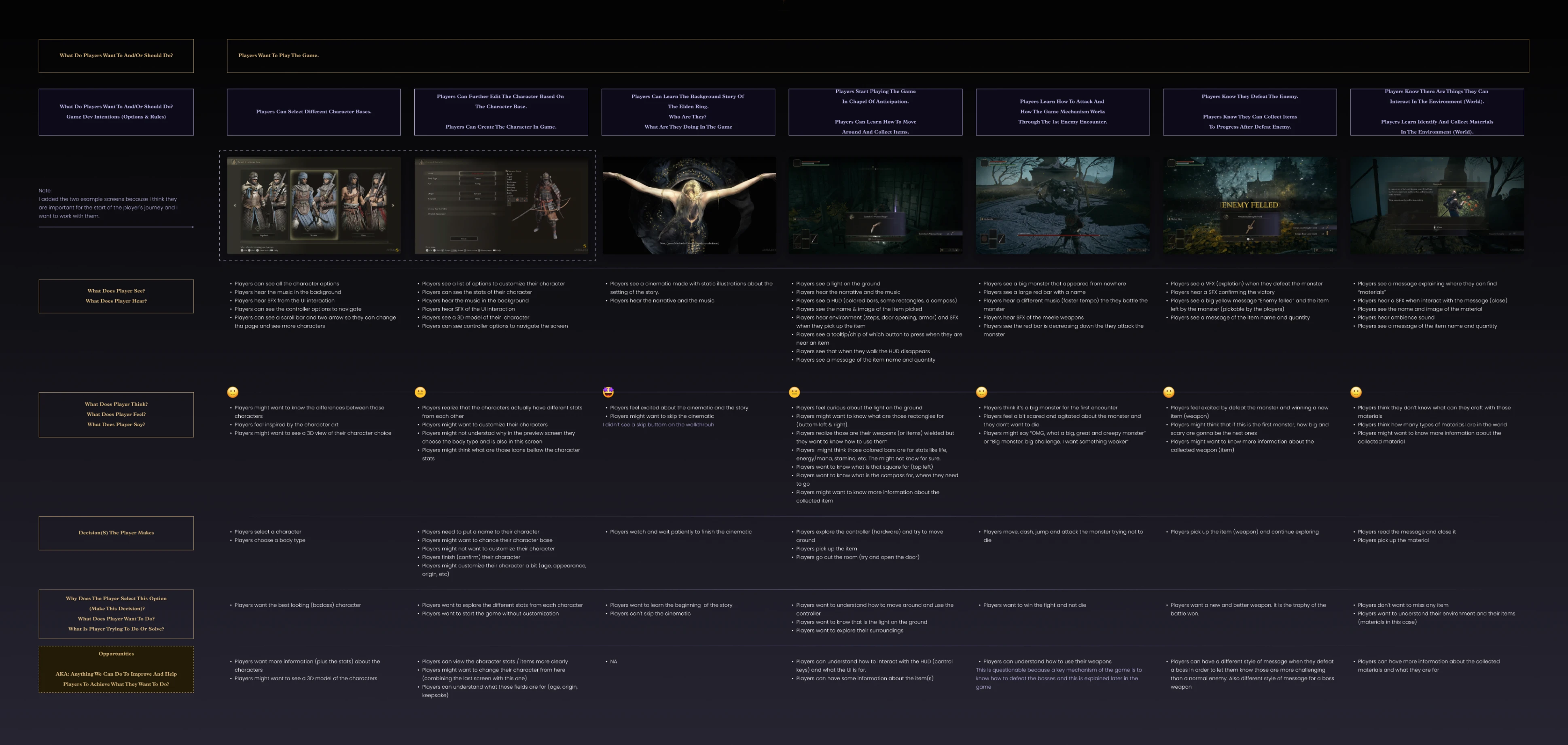
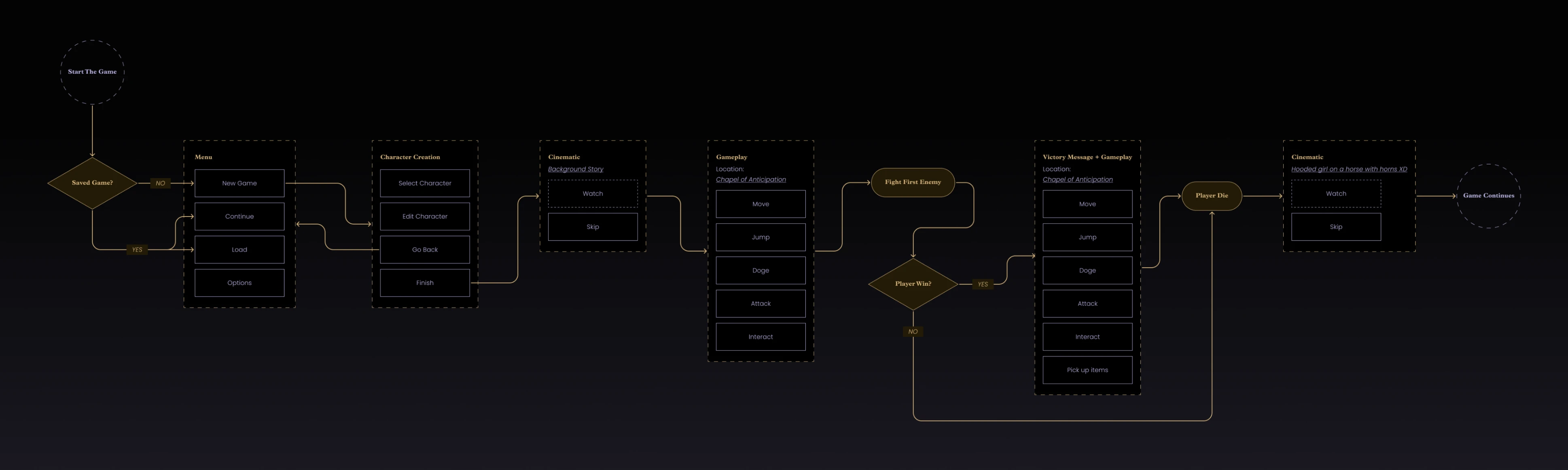
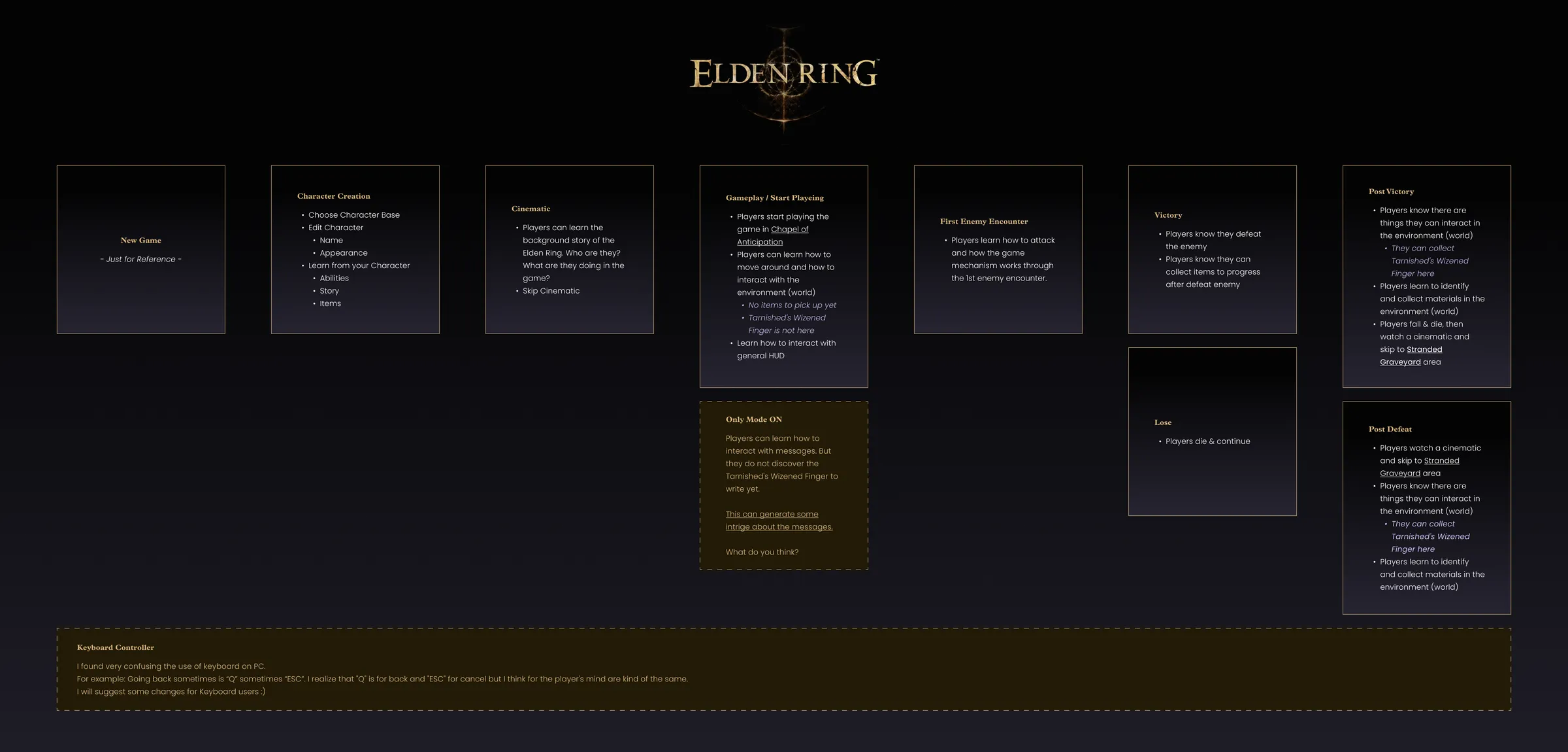
I mapped friction across the early-game flow — character creation, opening cinematic, first combat encounter. I focused on moments of hesitation: where players slowed down, reread, or gave up and randomized a choice.

Two problems accounted for most of it.

High friction
Keepsake selection
Missed entirely on first pass by most players. The section sits below the fold with no visual emphasis — players completed character creation without noticing it existed.
High friction
Origin descriptions
Assumed stat knowledge that new players don't have. Terms like "Vigor" and "Mind" are undefined — players either randomized or picked by name alone.
ERG-RES-journey--full
ERG-RES-flow--full
ERG-RES-mapping--full
06

Wireframes & Testing

I prototyped a new flow from the friction map, then built V1 around the three structural changes.

ERG-WF-paper--full
ERG-WF-v1-1
ERG-WF-v1-3
ERG-WF-v1-2
ERG-WF-v1-4

What the testing was, and what it wasn't

I ran formative testing with 5 participants — a mix of new and returning Elden Ring players. Five is enough to surface comprehension problems. It is not enough to prove a success rate, and I didn't run a baseline pass on the original screen, so nothing here is a comparative claim.

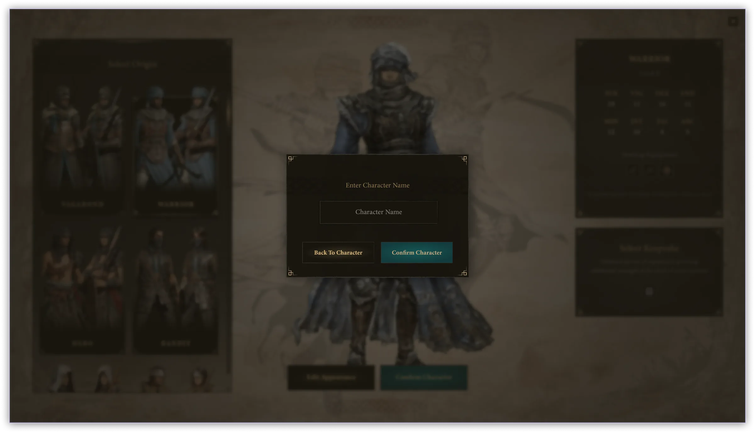
The split mattered more than the total. Returning players already know what a keepsake is, so their sessions validated the layout but told me nothing about comprehension. The new players are who the redesign is for. That's where the findings came from.

✓ Working
No one abandoned the flow
Participants moved through origin selection, appearance editing, and confirmation. With 5 participants and no baseline pass on the original screen, this reads as "nothing blocked them" — not as a measured improvement.
✓ Working
Origins layout and contextual hover received well
Both new and experienced players responded positively. Experienced players appreciated the faster scan; new players appreciated the explanations.
⚠ Needs iteration
Keepsake info missing before selection
Players wanted to know what the keepsake does before choosing it. The current hover exposed the description too late in the interaction.
⚠ Needs iteration
Select Keepsake & Edit Appearance buttons unnoticed
Despite being present, both buttons went unnoticed at the start of the flow. Positioning and visual weight needed iteration.
ERG-TEST-doc

The second flag stung, because action prominence was one of my three structural changes. V1 fixed the layout and didn't fix the noticing — the buttons were present, labeled, positioned in the scan path, and still missed. Presence isn't prominence. V2 is where that got addressed.

ERG-WF-v2-1
ERG-WF-v2-2
07

Visual Design

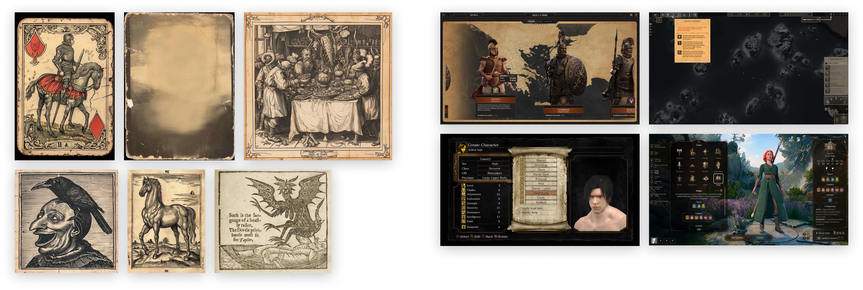
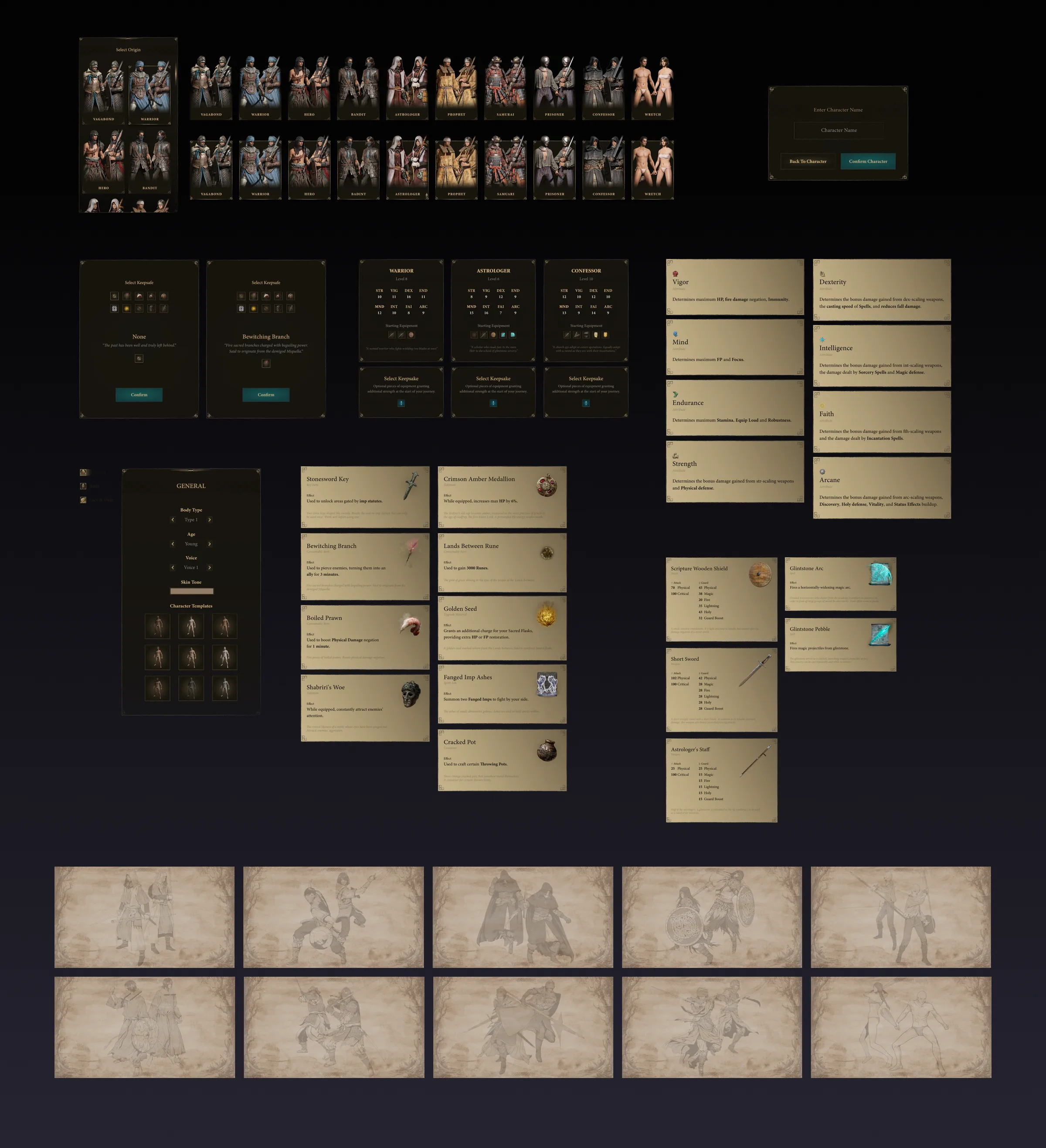
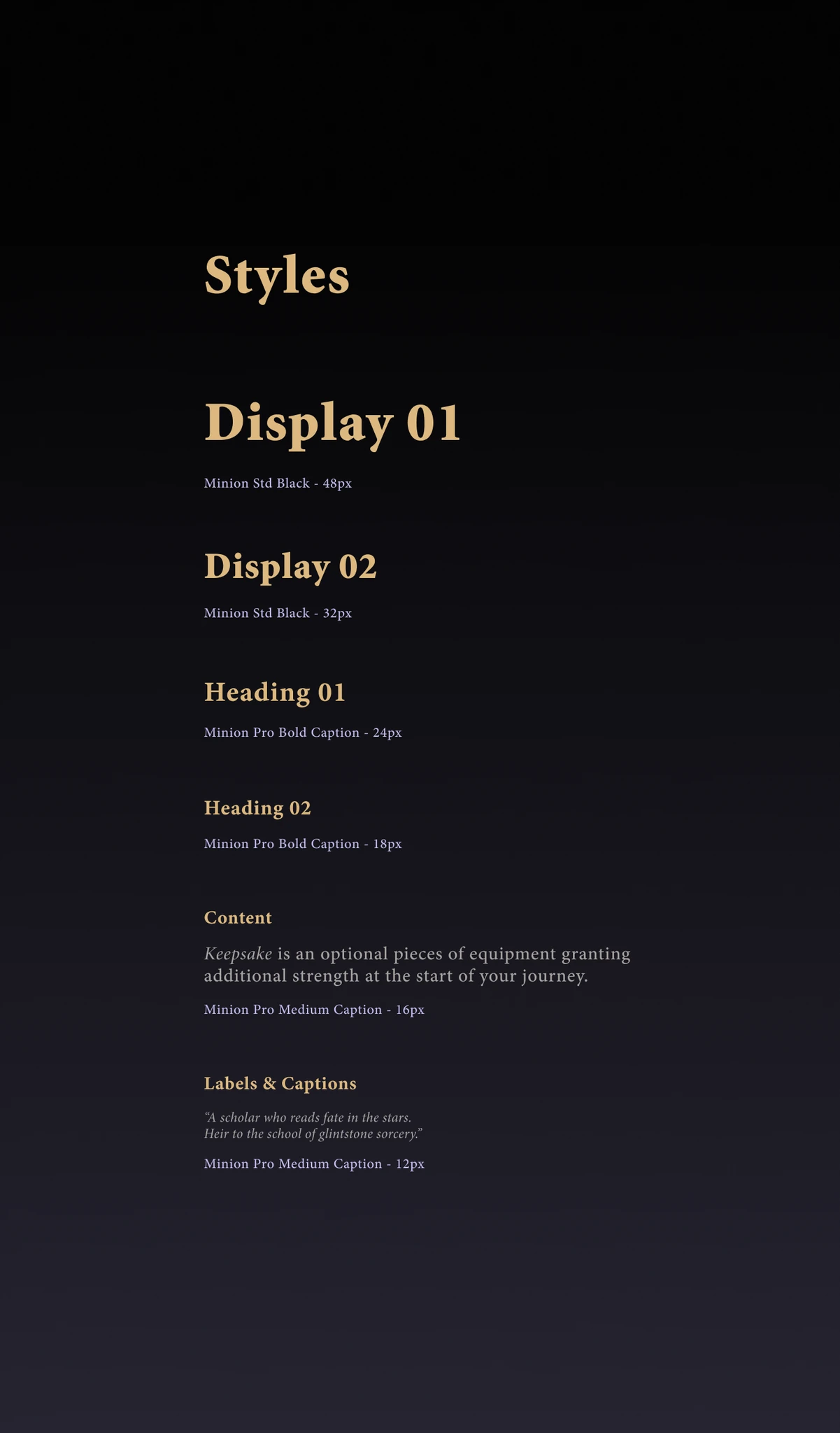
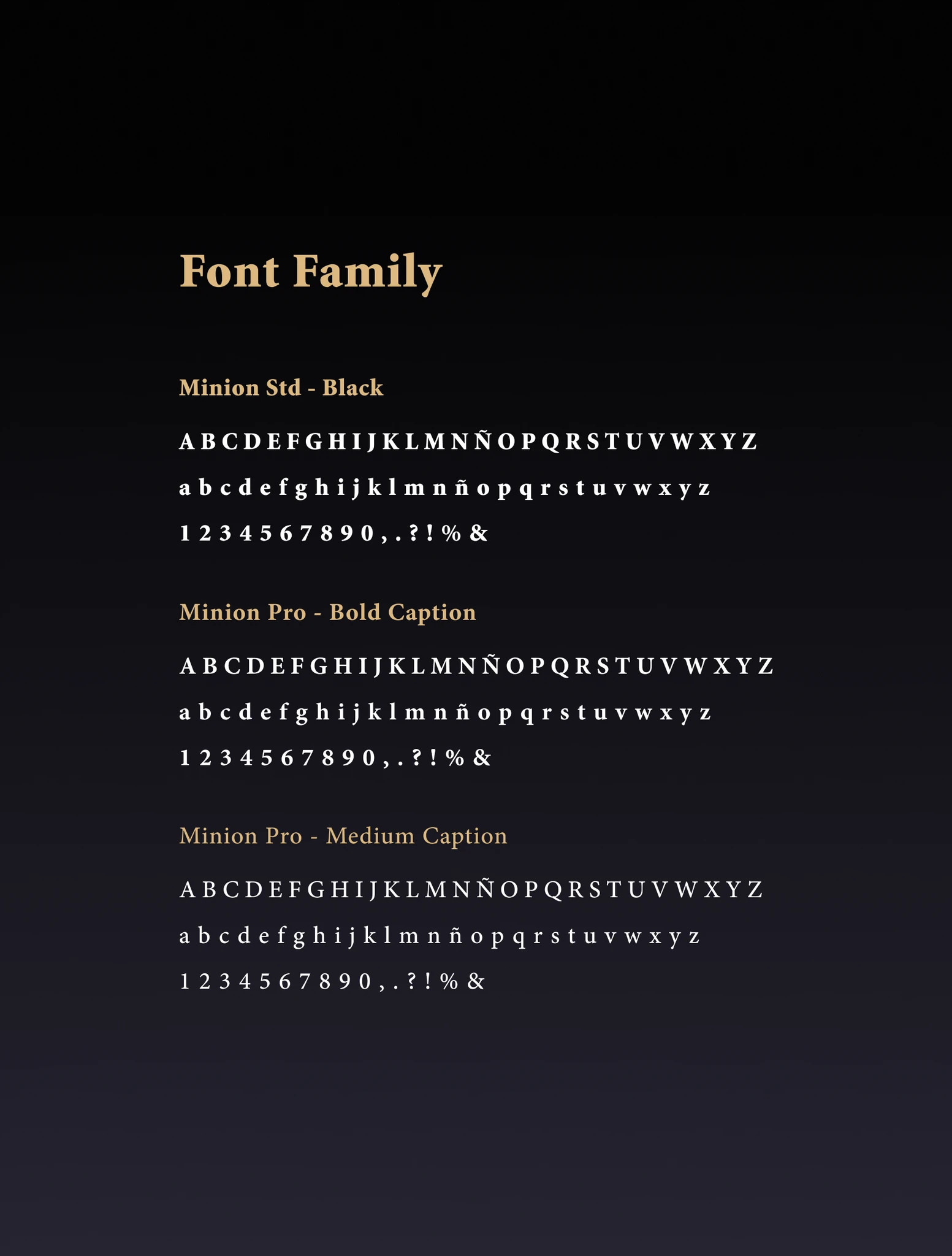
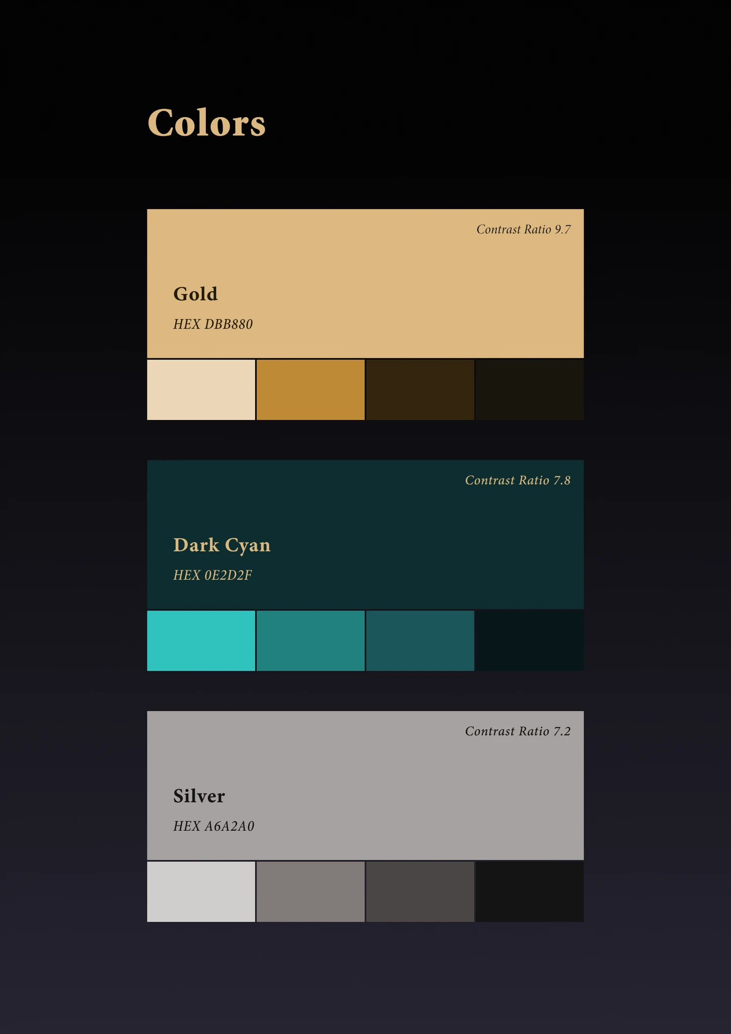
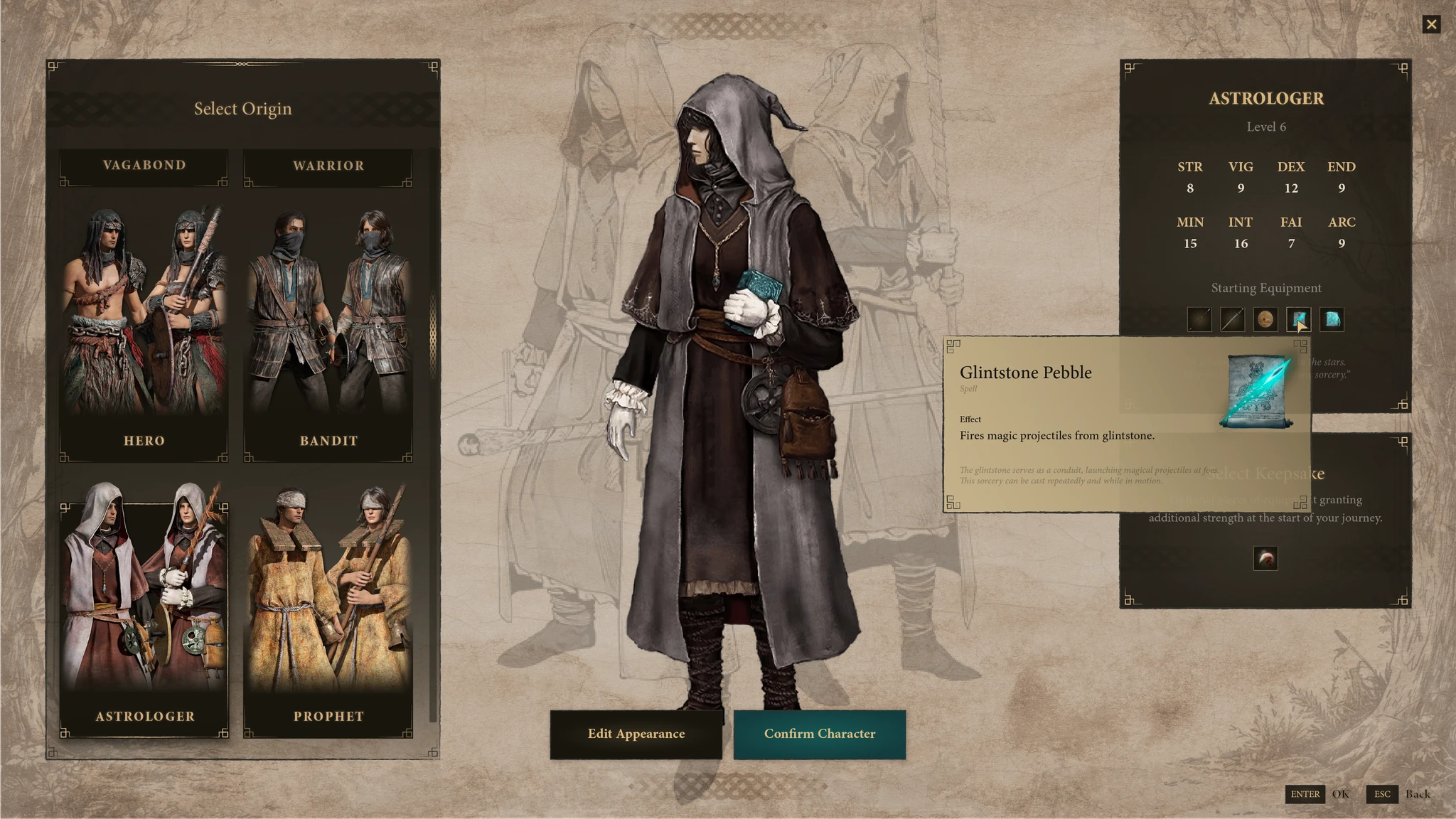
The visual direction had to walk a specific line: different enough to feel like a genuine proposal, close enough to the Elden Ring universe that it didn't feel like a different game.

Modernizing it would have been easier and wrong. The opacity is a structural problem, not a stylistic one — solving it by flattening the game's visual language would fix the wrong thing.

ERG-VIS-moodboard--full
ERG-VIS-style-a--3
ERG-VIS-style-b--3
ERG-VIS-style-c--3
ERG-VIS-components
ERG-VIS-components-samples
ERG-VIS-final-a--3
ERG-VIS-final-d--3
ERG-VIS-final-g--3
ERG-VIS-final-b--3
ERG-VIS-final-e--3
ERG-VIS-final-h--3
ERG-VIS-final-c--3
ERG-VIS-final-f--3
ERG-VIS-final-i--3

I ran the palette through a color blindness pass — protanopia, deuteranopia, tritanopia — to check that nothing in the interface depended on hue alone to be readable.
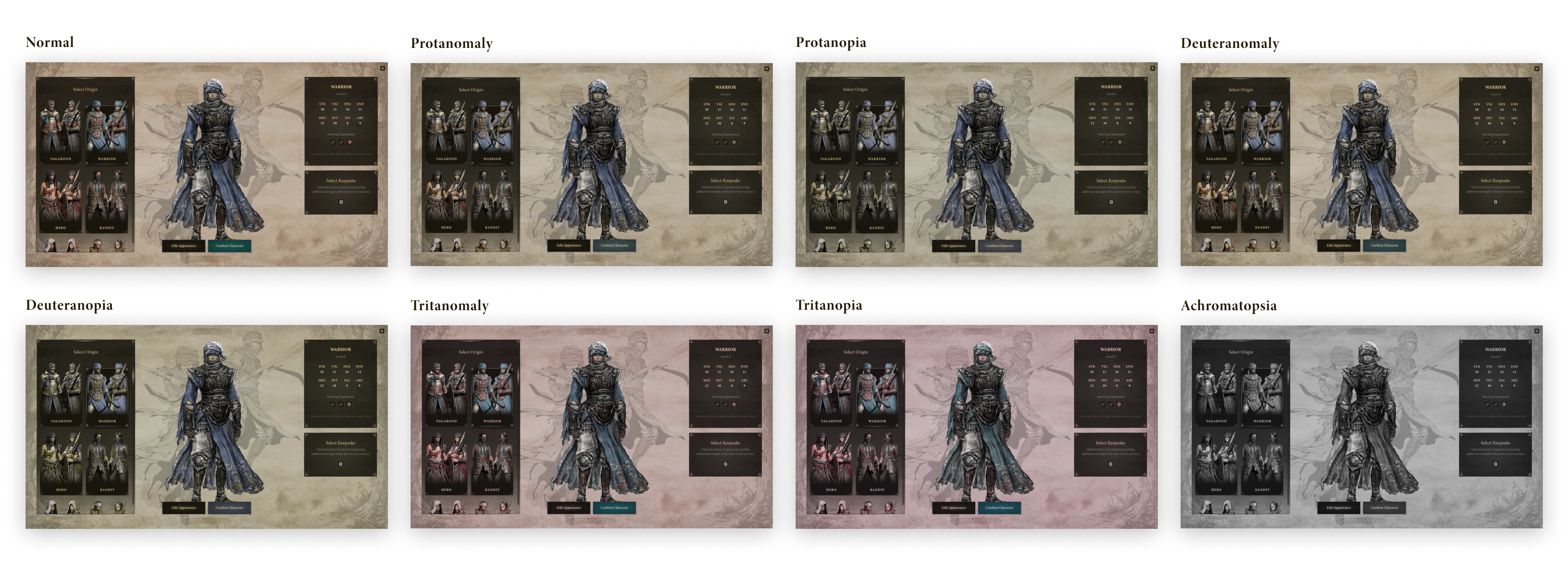
ERG-VIS-blindtest--full

Shared with the same testers after the visual pass:

"Character creation is much more intuitive and easier."

"I understand more easily the differences between origins."

"It is clear to understand what a Keepsake is."

"I like the new design, it's a new interesting style."
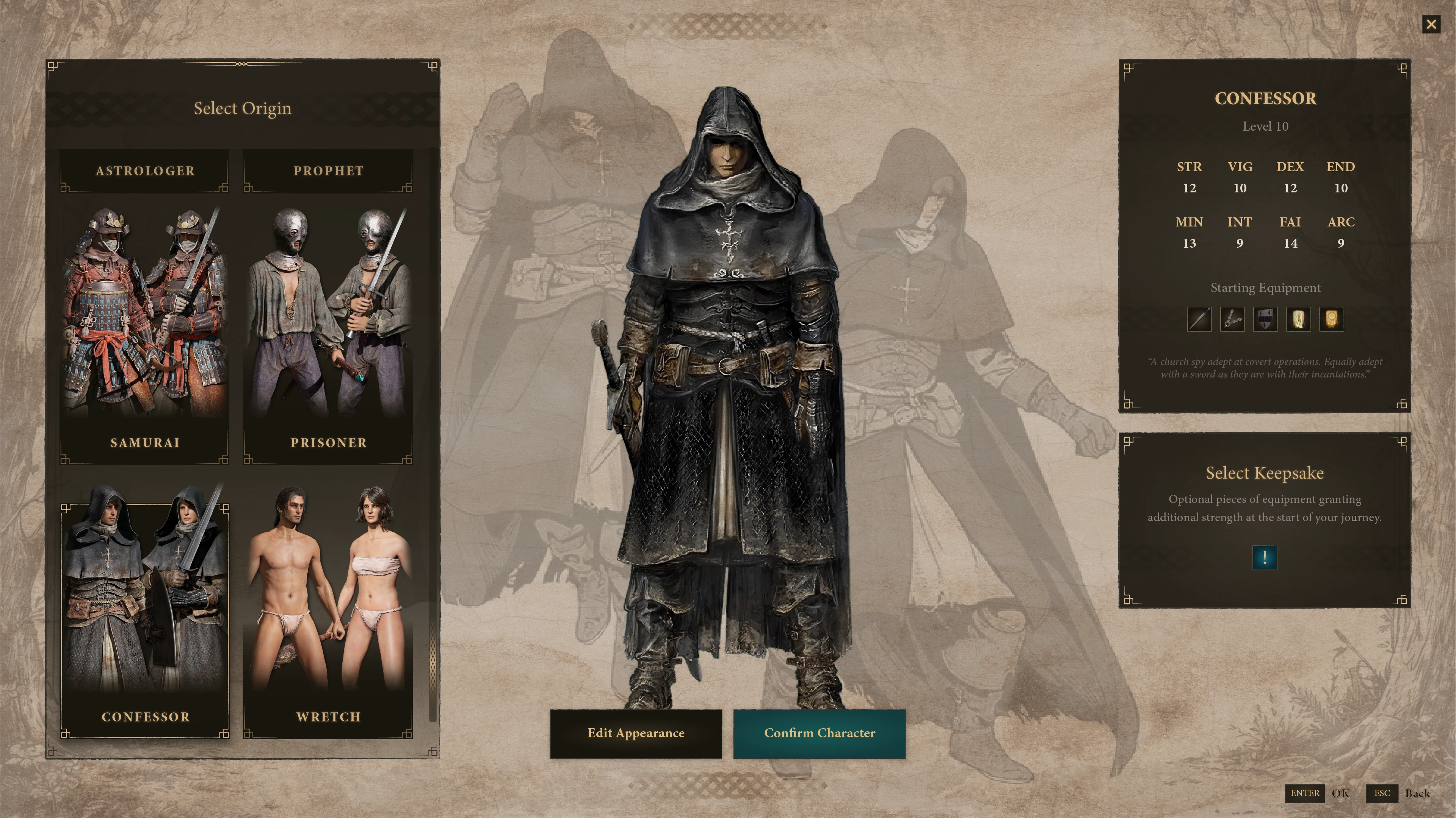
ERG-VIS-hero--full
08

Reflection

Onboarding friction in games is often mistaken for depth. Elden Ring's difficulty is intentional — but the character creation confusion wasn't hard in a meaningful way. It was just opaque.