
DesigningforFinancialBehavior
–25%
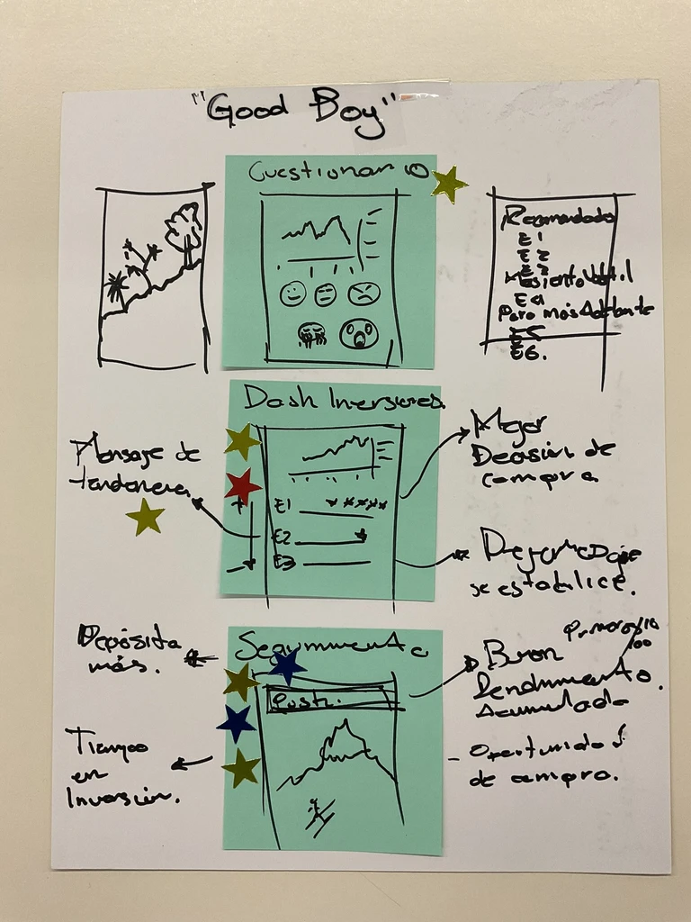
One-fund concentration
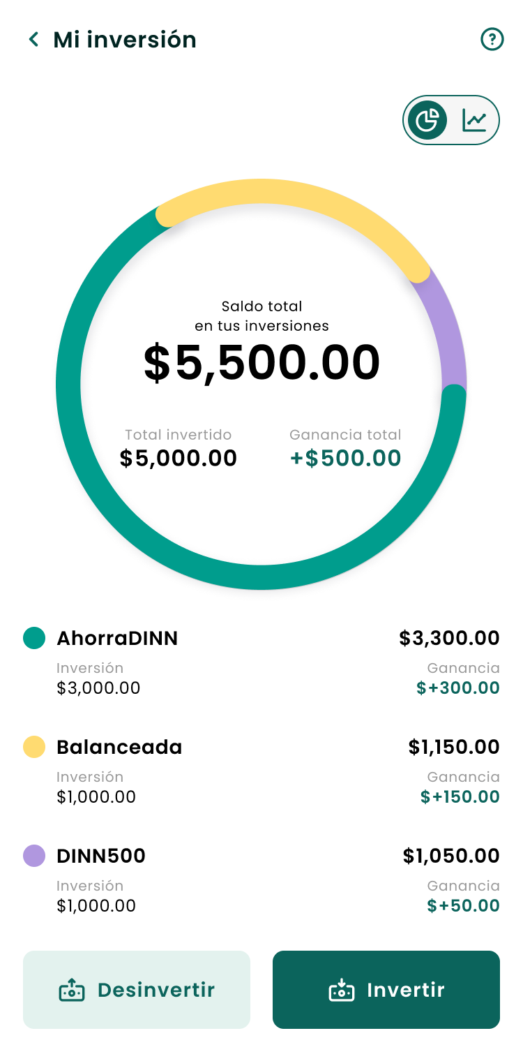
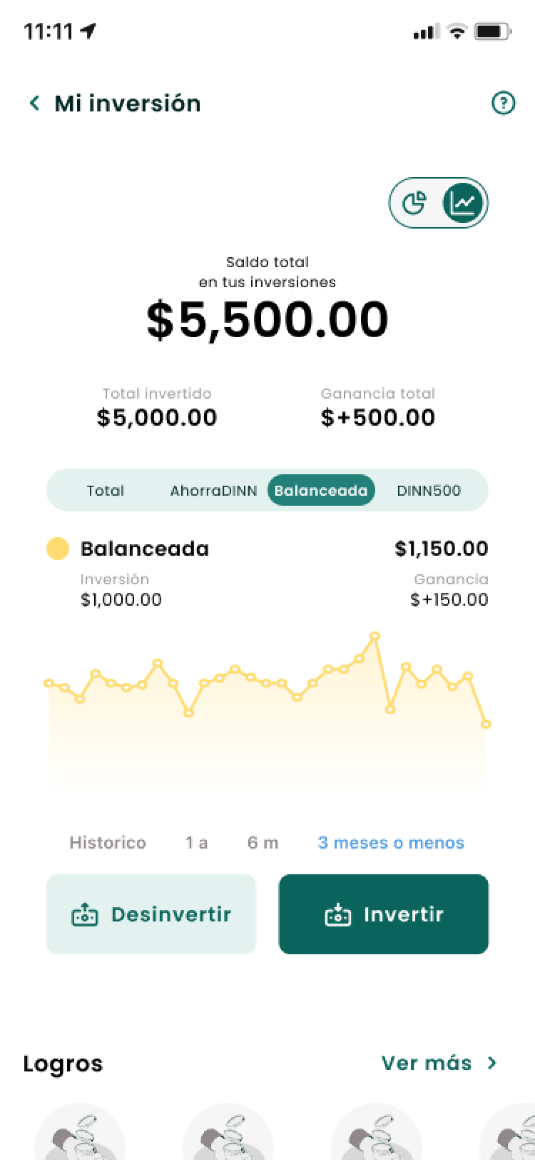
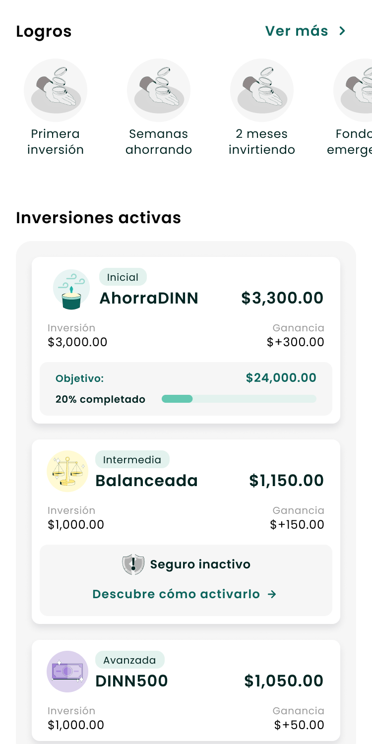
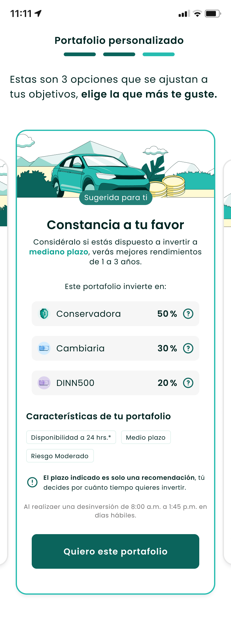
Diversification up across 5 investment strategies
Impact
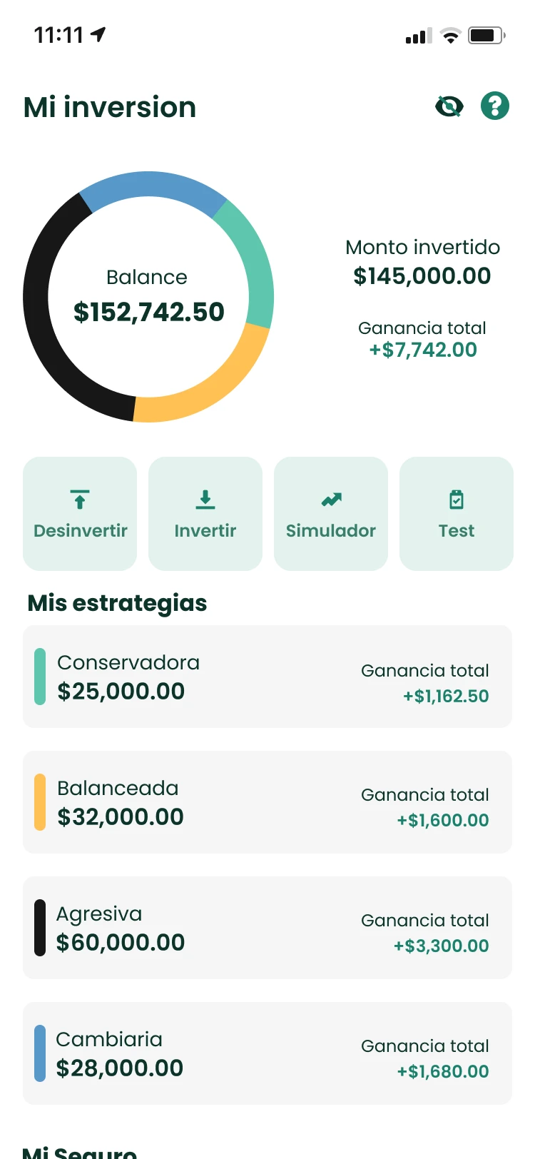
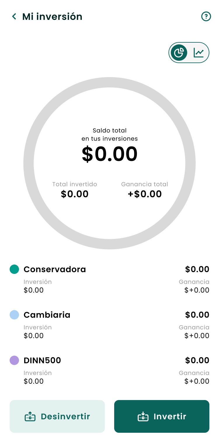
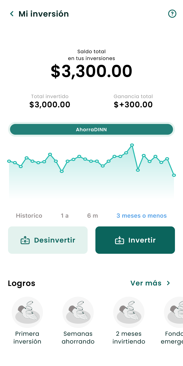
Investment dashboard — before and after
Context
DINN — Actinver's digital investment app for first-time investors in Mexico
October – December 2024 — from first workshop to development handoff
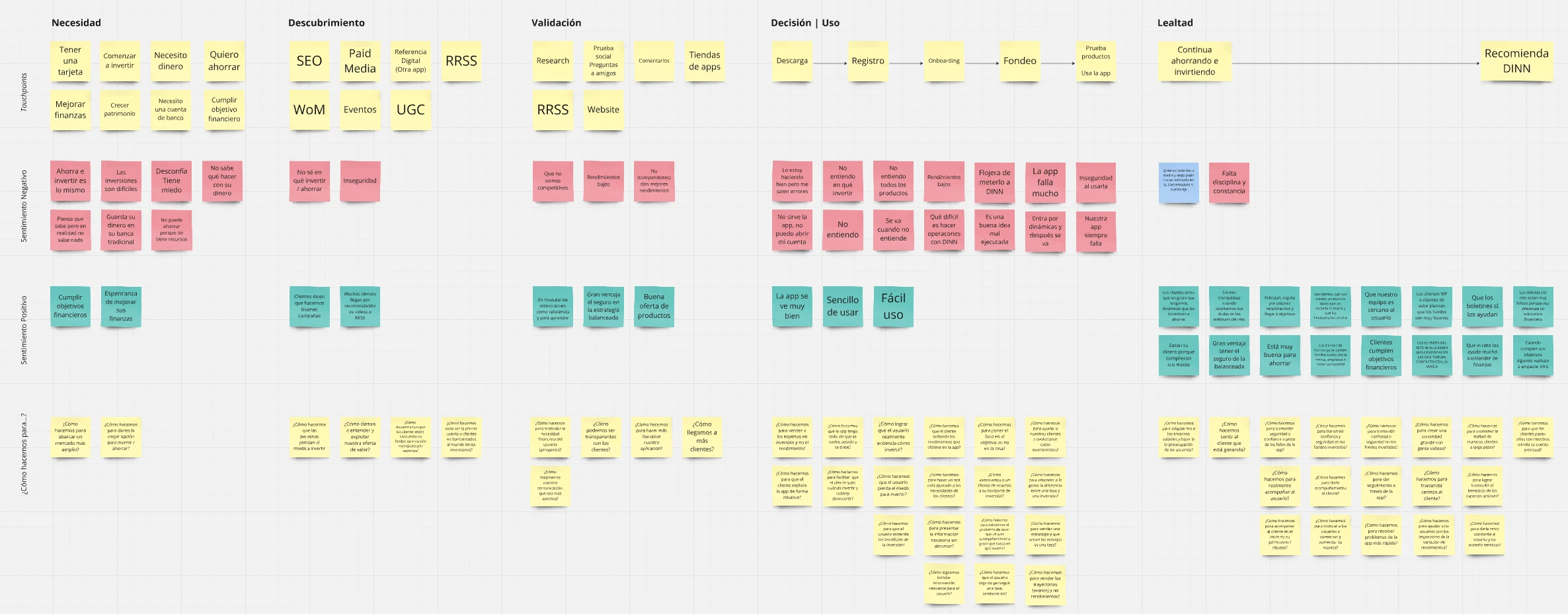
The workshops I ran surfaced the real problem.
Led UX design across all flows, ran the user testing sessions, and owned the development handoff.
The Problem
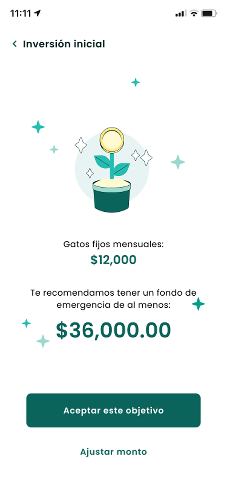
Users weren't distributing their investments. They picked one option and stayed there.
Hypothesis: users default to the conservative option because the product gives them no other frame to work with.
One interview quote was the whole insight: "I started with the conservative strategy because I didn't know how to diversify. If I'd known before, it would have been different."
The 3 Core Design Decisions
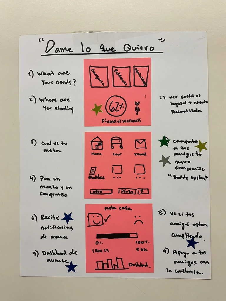
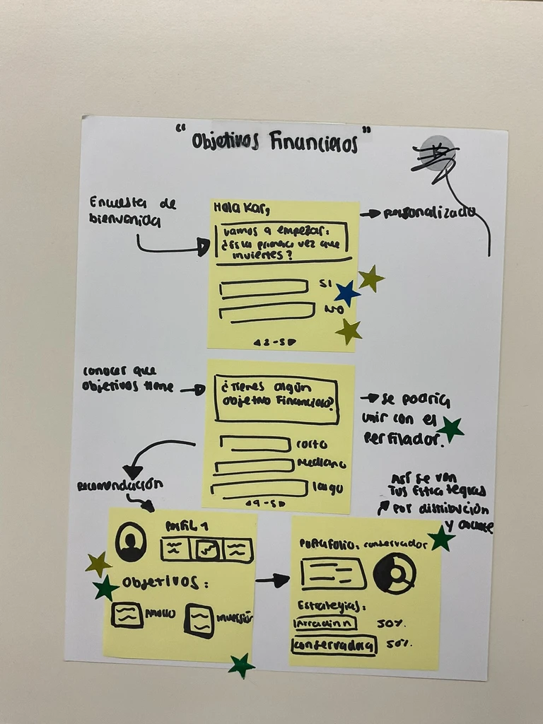
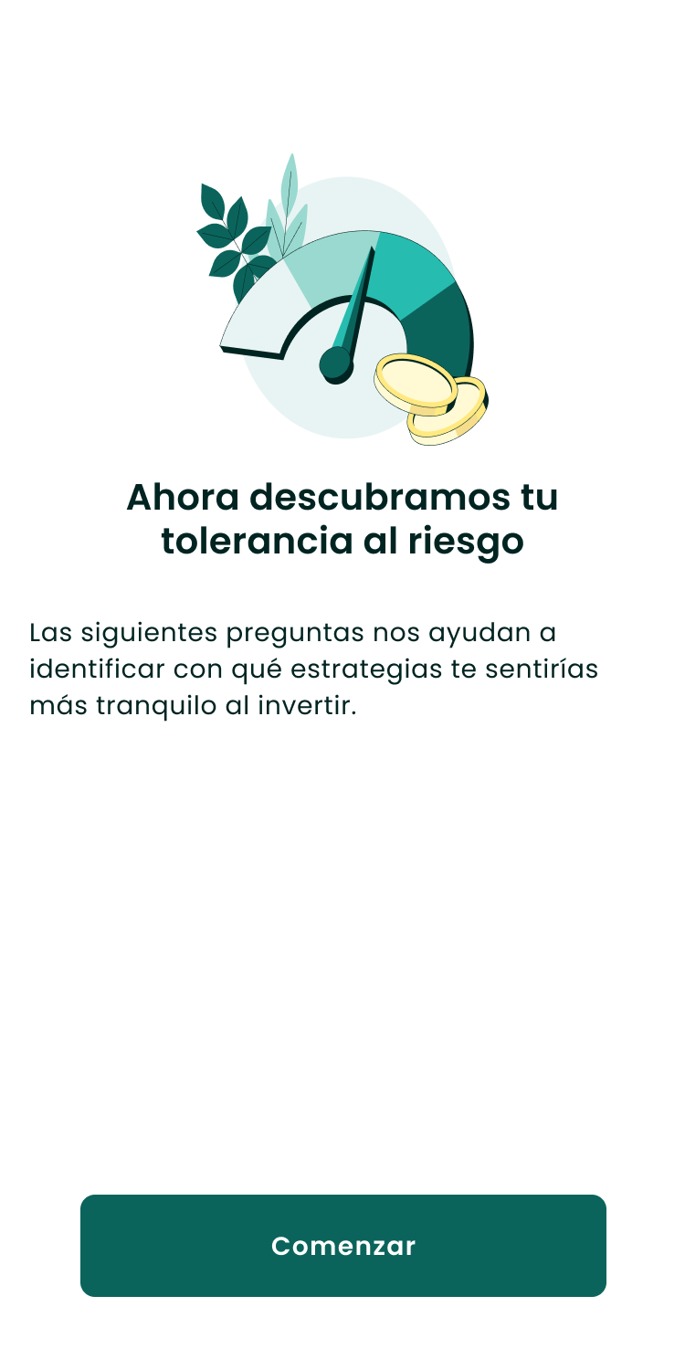
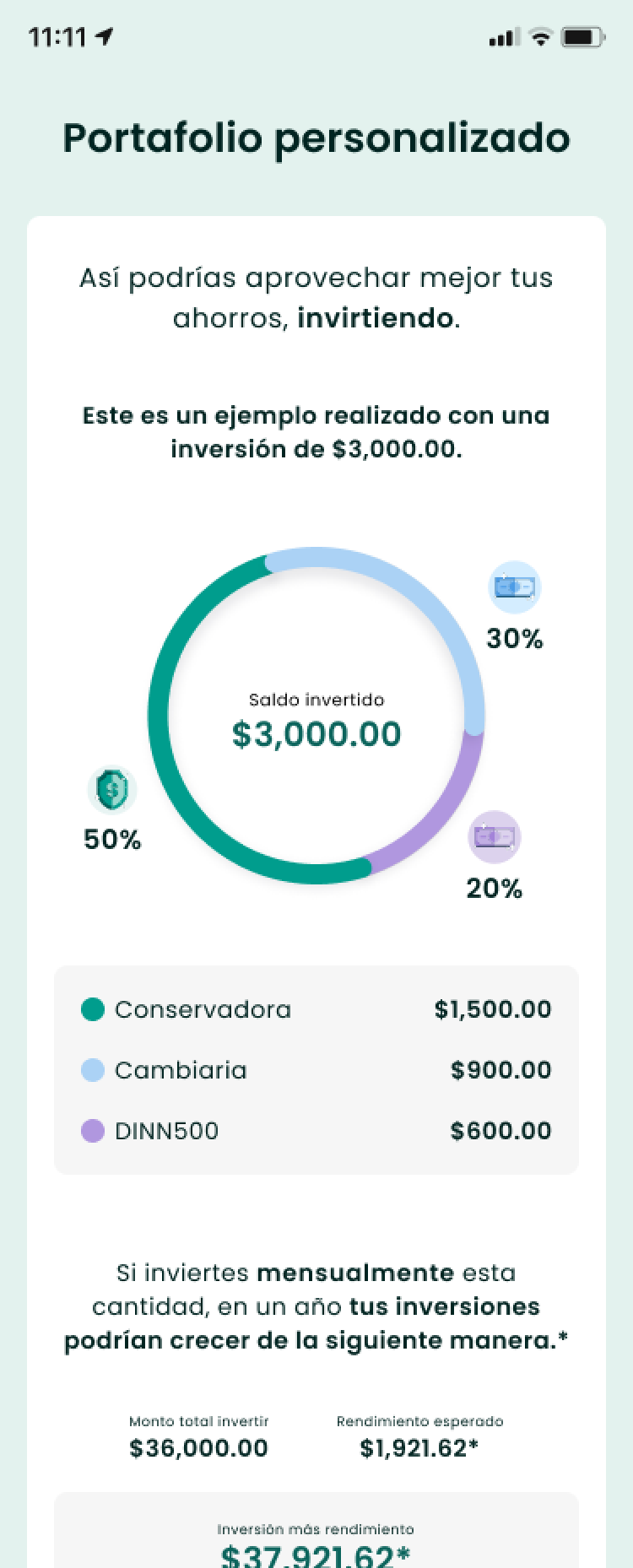
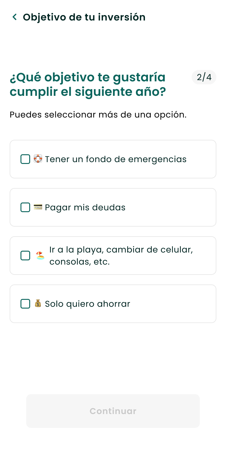
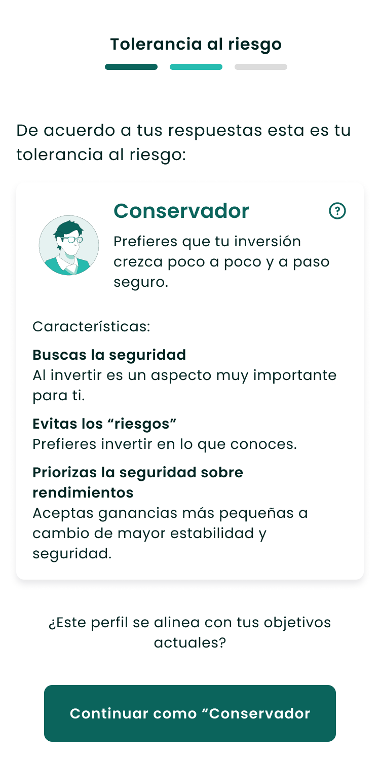
1. Start with the person, not the product. Instead of a list of funds, the experience opens with a few questions — what are you saving for, how much consistently, how do you feel about risk — then suggests, not defaults.
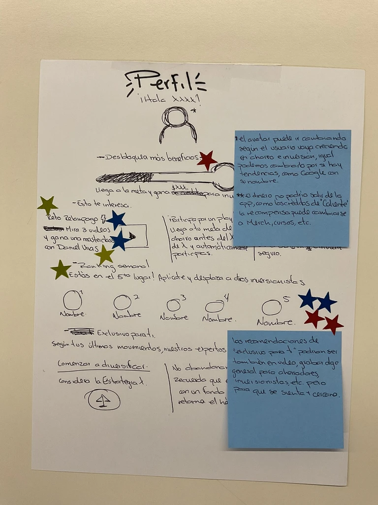
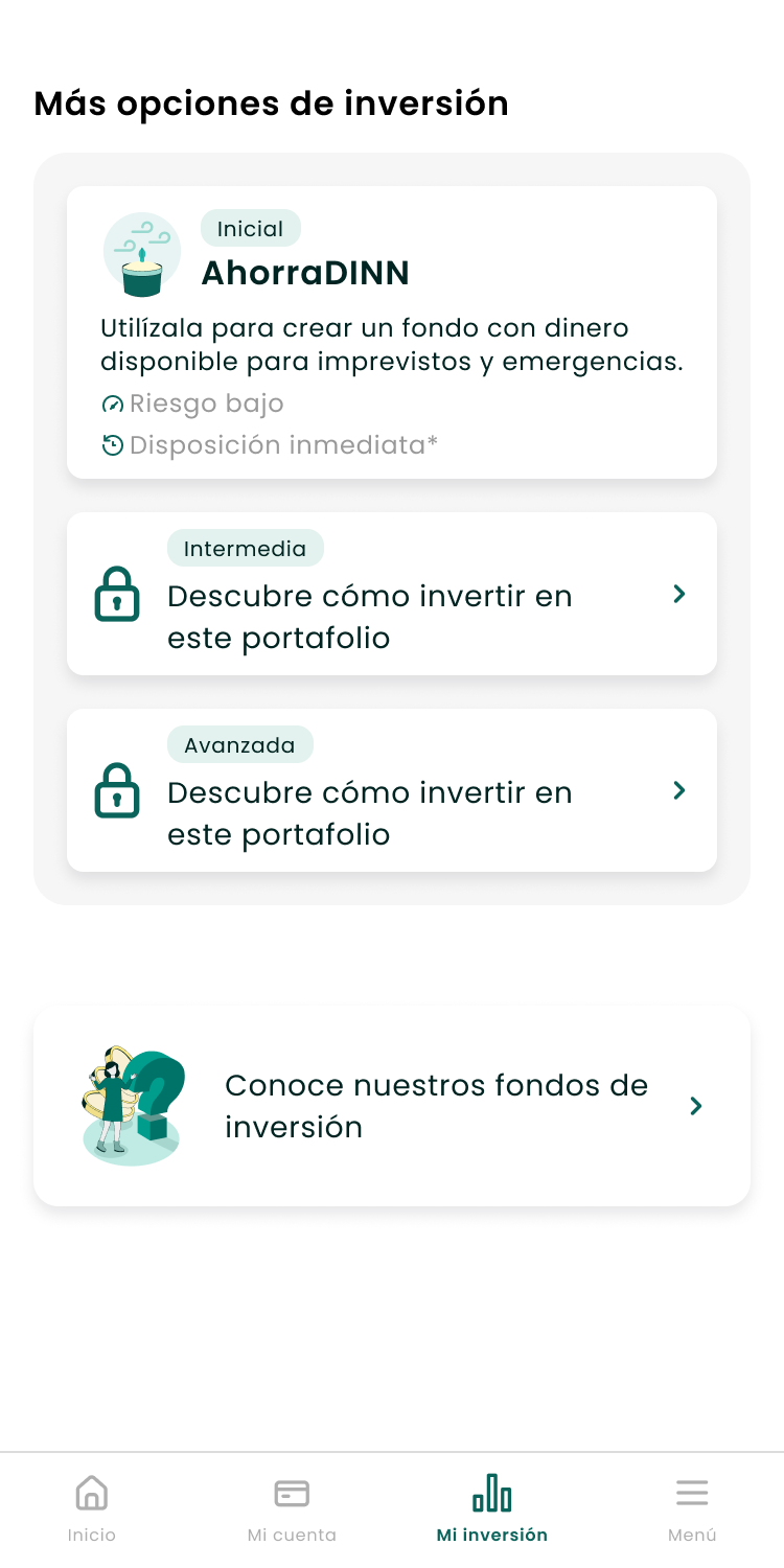
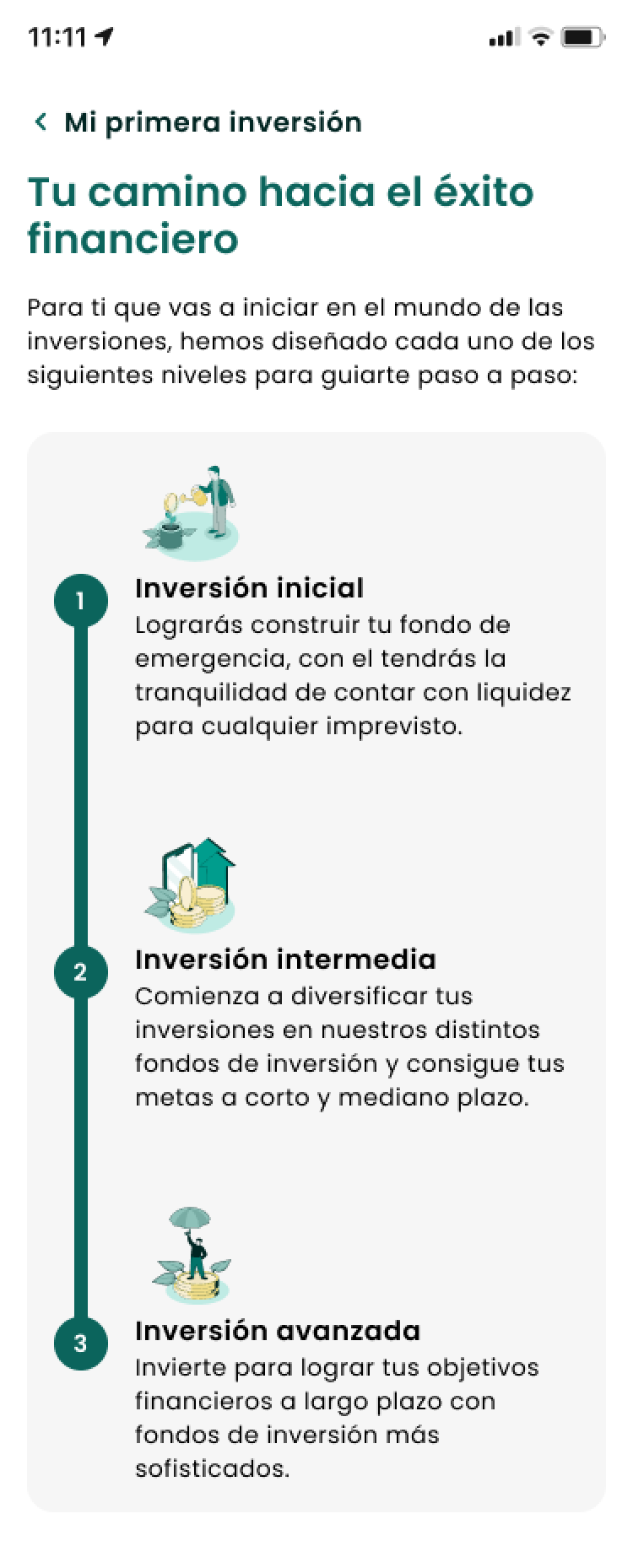
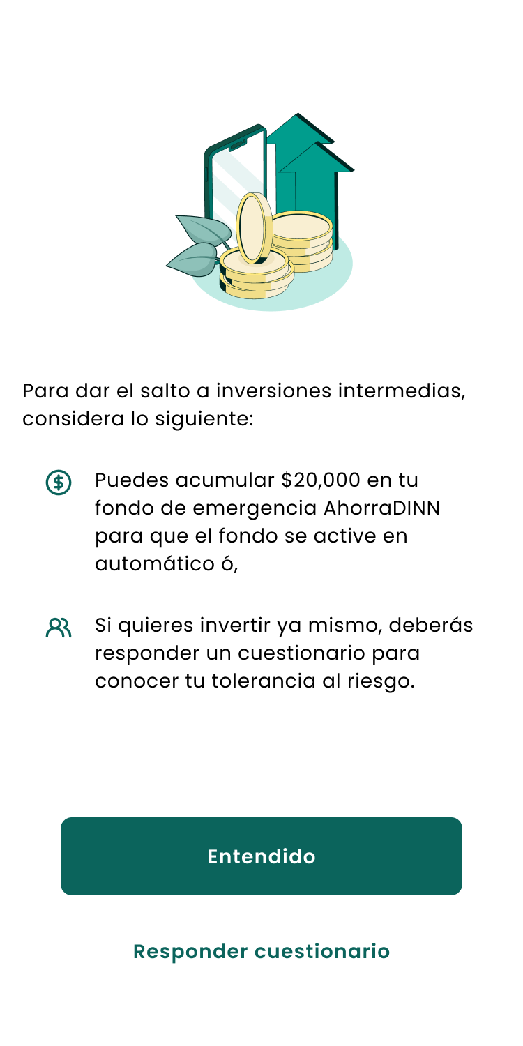
2. Guided autonomy, not forced restriction. Two paths: one with structure and progressive unlocking tied to real financial milestones, one with full immediate access. No paternalism.
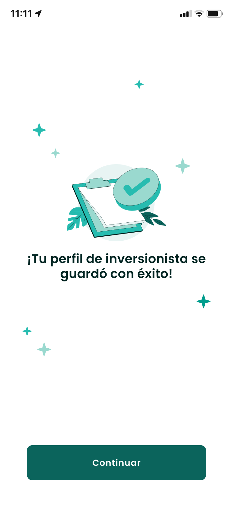
3. Compliance as a trust signal. The risk questionnaire couldn't change — fixed by law. But where it lived could. Moved from random legal interruption to a meaningful step toward a personalized recommendation.
Process
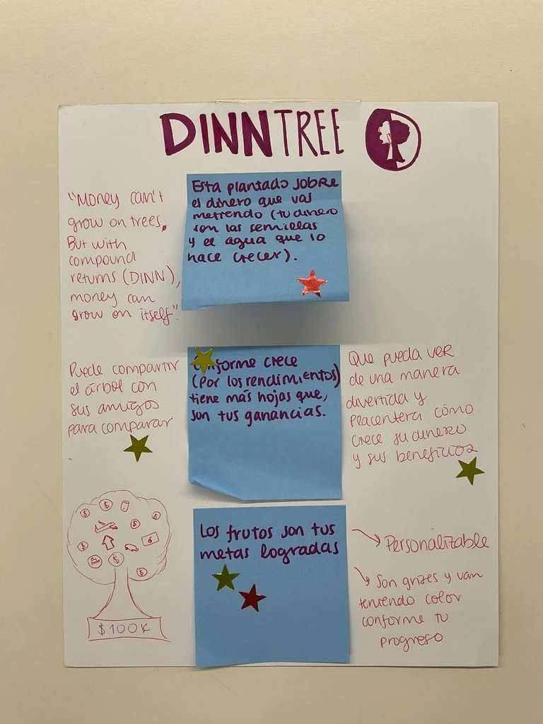

Key Deliverables
Outcome
Post-launch, single-fund concentration dropped ~25% as users redistributed across 5 strategies.
Validated with 15 user sessions before any development started.
It shipped with dual-path architecture and full compliance — investment access tied to real milestones, and the risk questionnaire turned from a legal checkbox into a meaningful allocation step.
Reflection
People don't read disclaimers. They respond to structure, milestones, and a sense of moving forward. Users don't need to understand compound interest to feel confident — they need to feel the product understands their situation. That's a framing problem, not an information problem. And every decision touched Legal, Backend, Growth, and Data at once — that coordination was as much the work as the UX.