
FromRebrandtoProductSystem
92%
Perceived increased security
100 users tested (50 existing, 50 new)
85%+
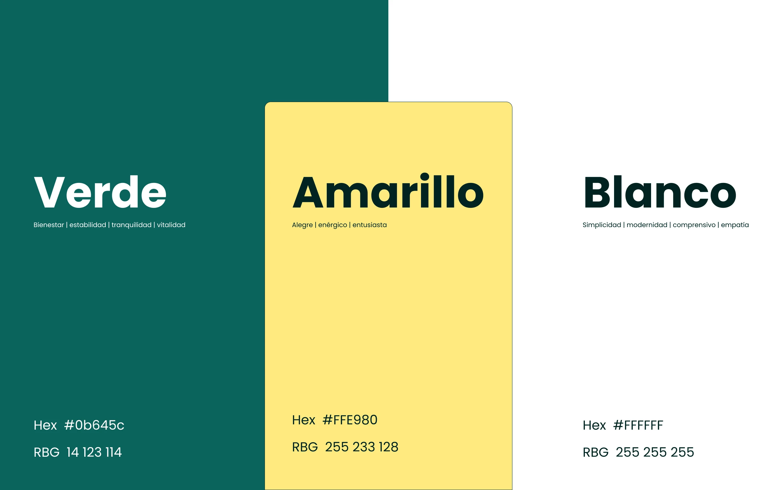
Trust, calmness, and simplicity
consistent across all perception dimensions
Impact
A product that felt inconsistent and a little playful became one that actually felt like a place to put your money.
Context
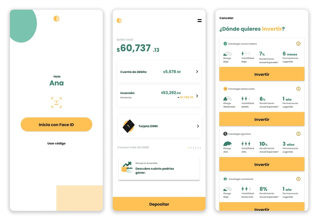
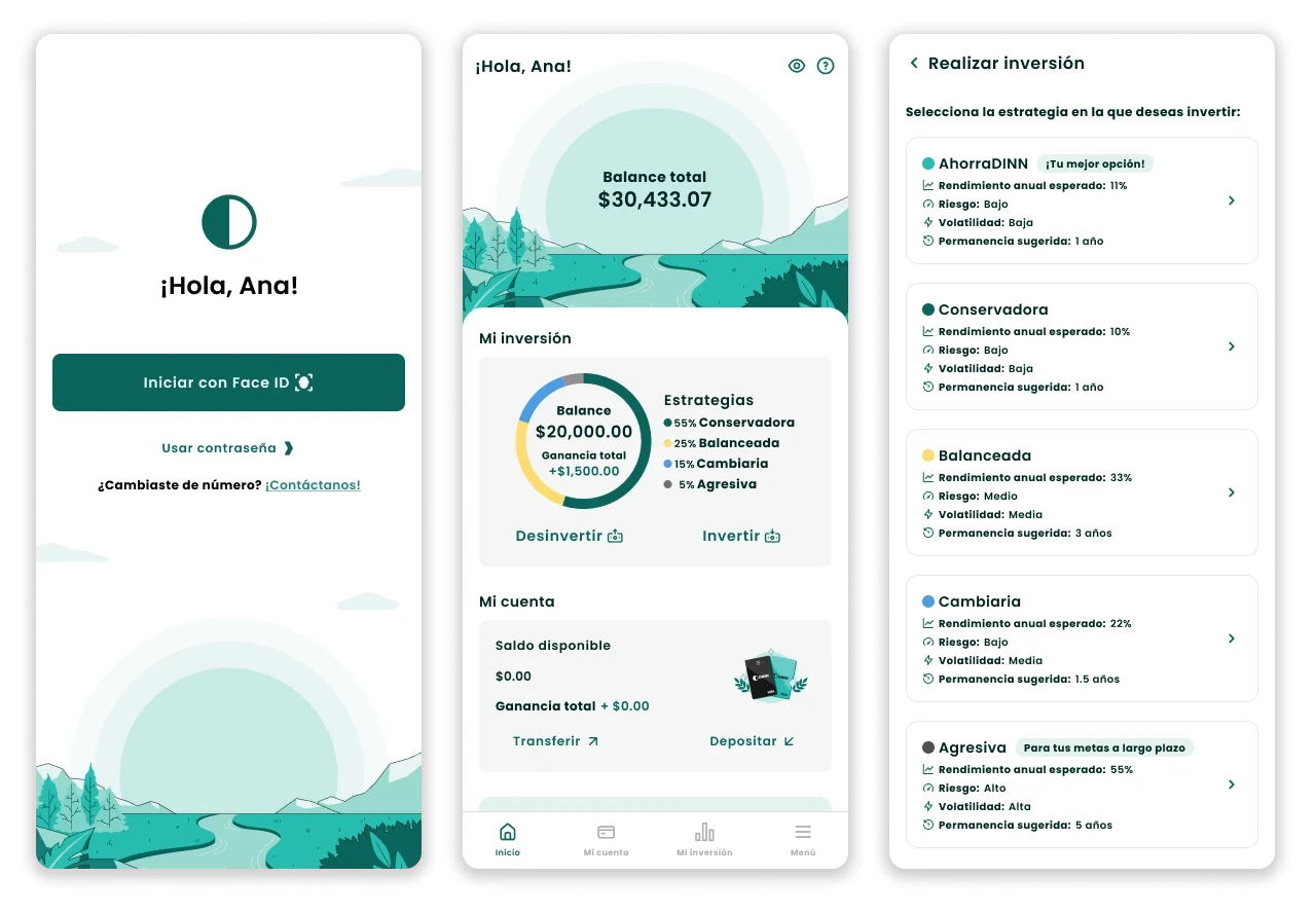
DINN — Actinver's digital investment app for first-time investors in Mexico
H2 2022 — DINN had completed a brand redesign. The product experience had to be rebuilt.
Ran the internal audit, defined the new visual system, and coordinated implementation across the entire app and website.
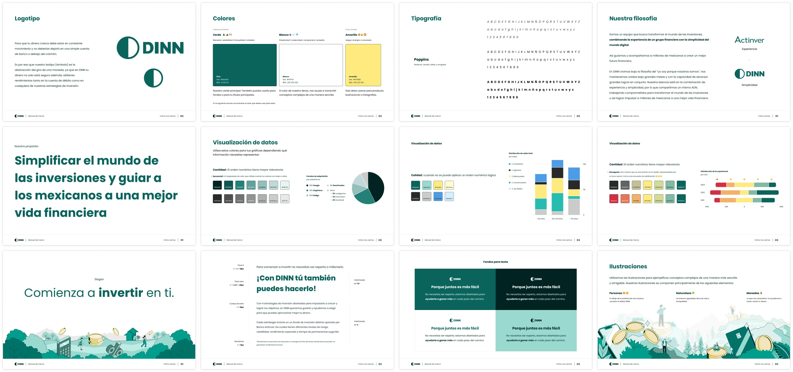
Built the governance documentation the team still uses today.
UX/UI designers, illustrators, communication team, external audit vendor, product stakeholders
The Problem
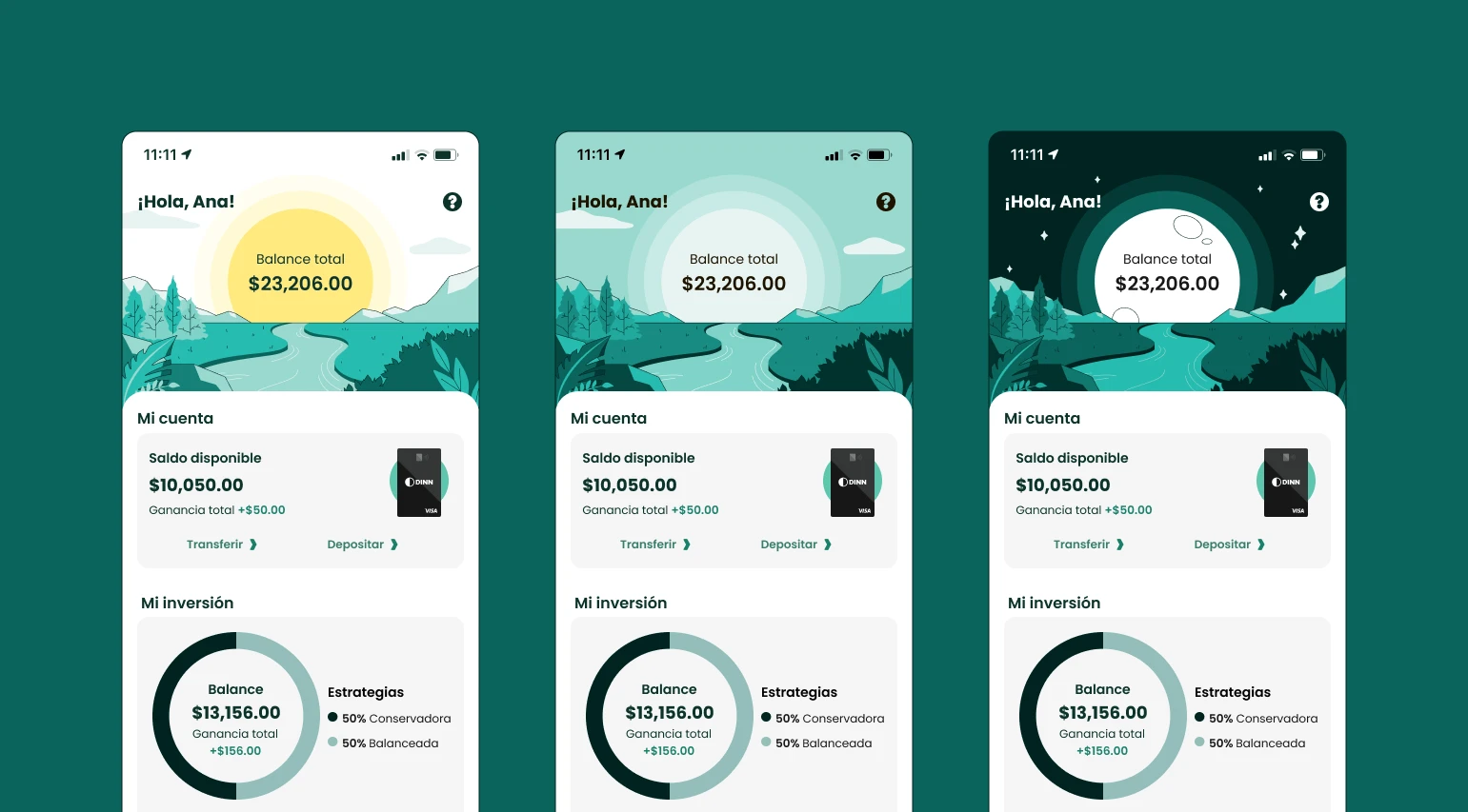
The product had grown fast — more clients, more screens, a bigger team — and visual consistency broke. In a financial product, inconsistency isn't just visual. It feels unsafe.
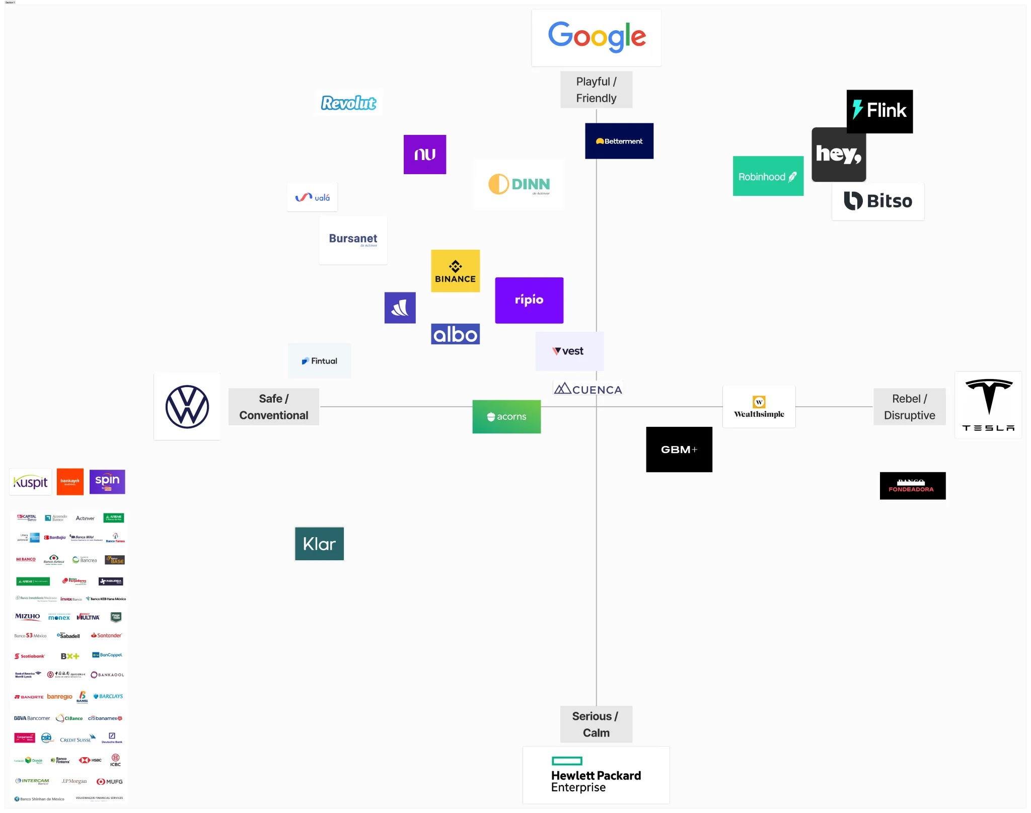
A qualitative study showed DINN read as "inversión chiquita" — a small, everyday tool — no matter how sophisticated the user.
The approachability worked. But it set a ceiling.


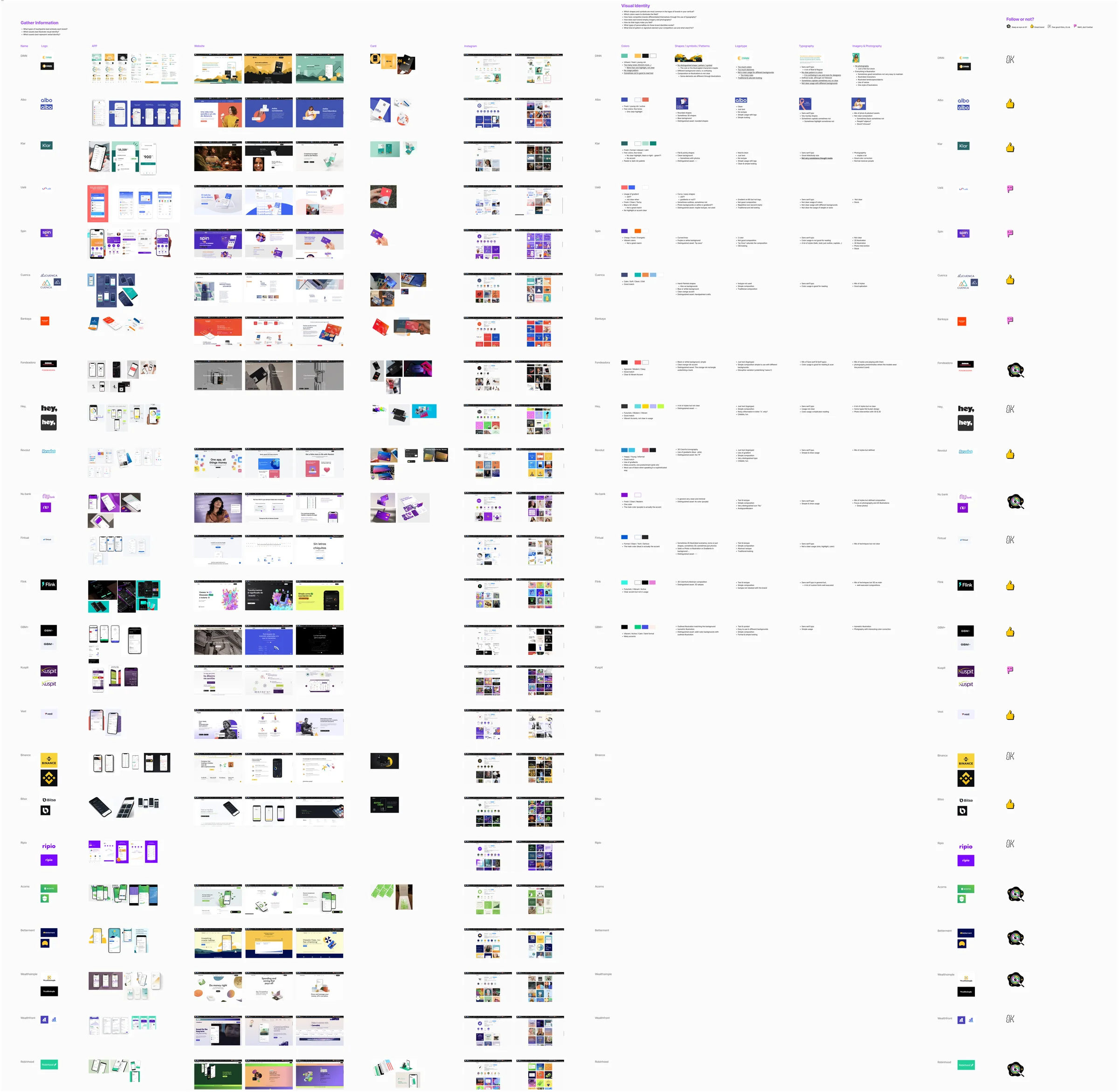
Diagnosis
Two visual audits, run simultaneously — one mine, one external. I didn't want the findings to be only my perspective, or only an outside one.
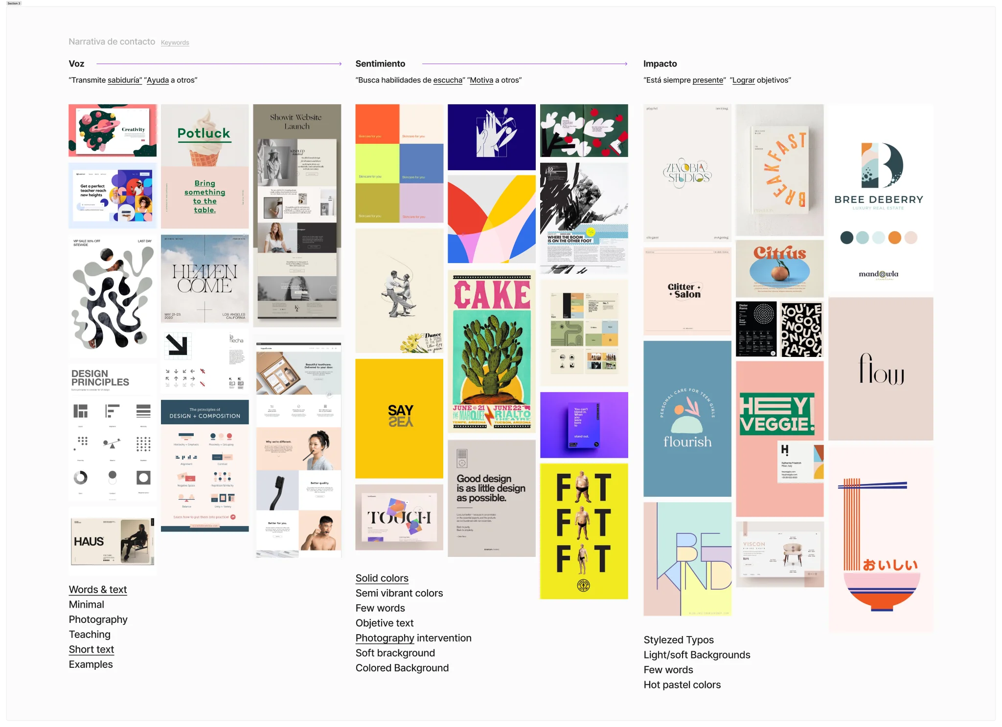
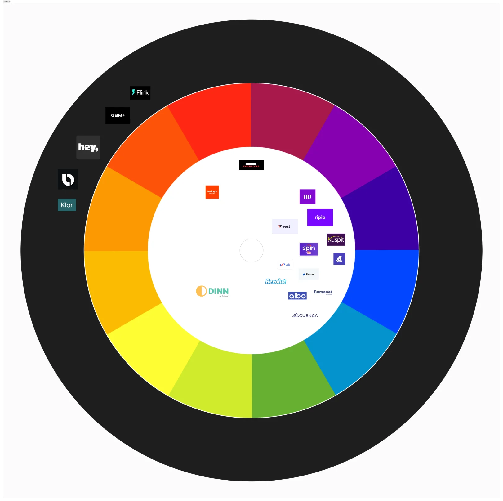
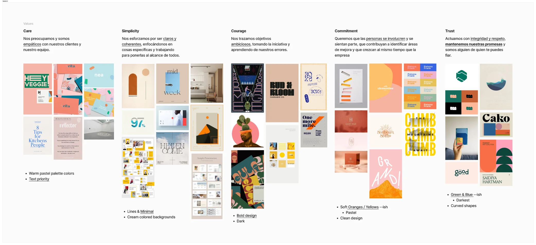
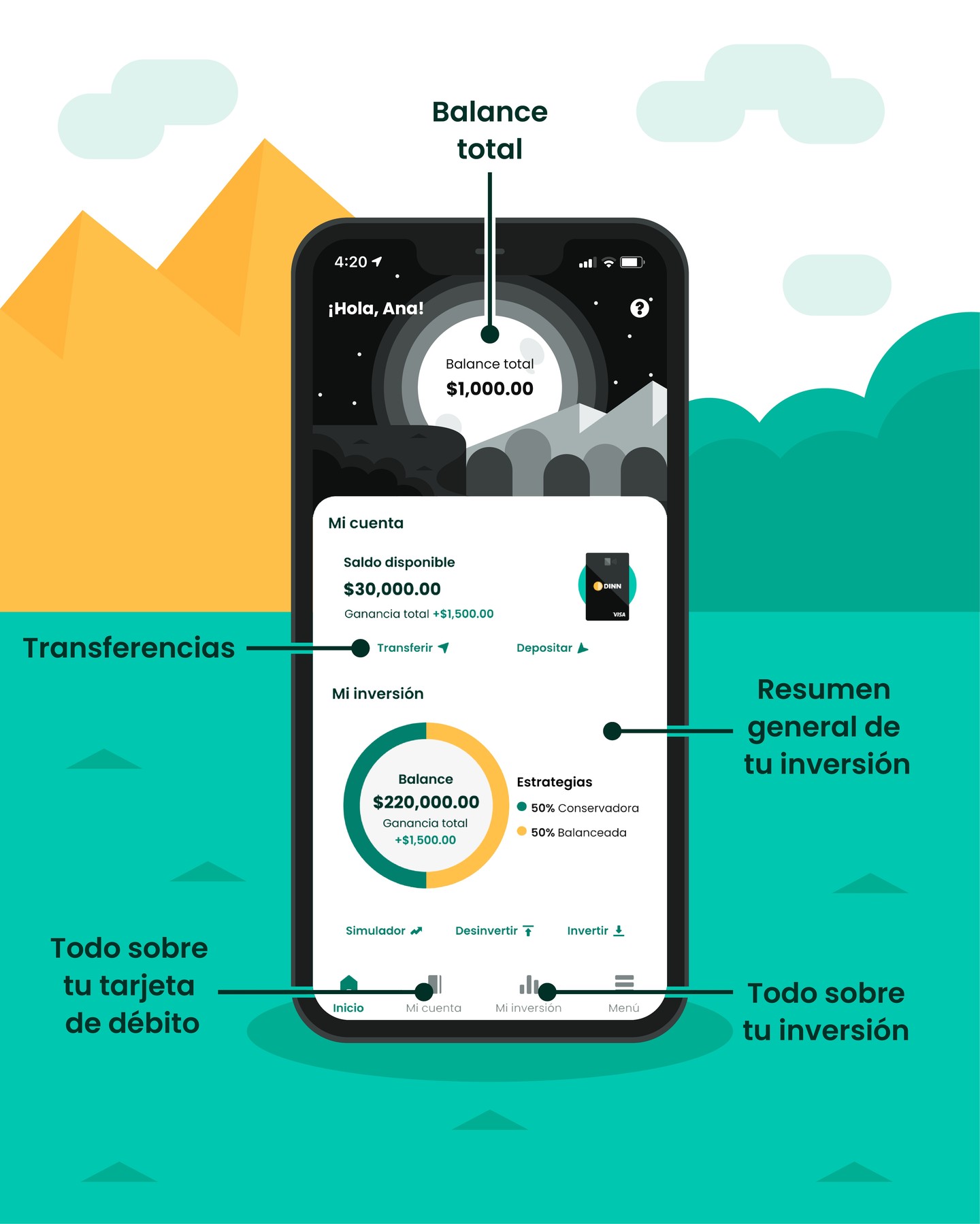
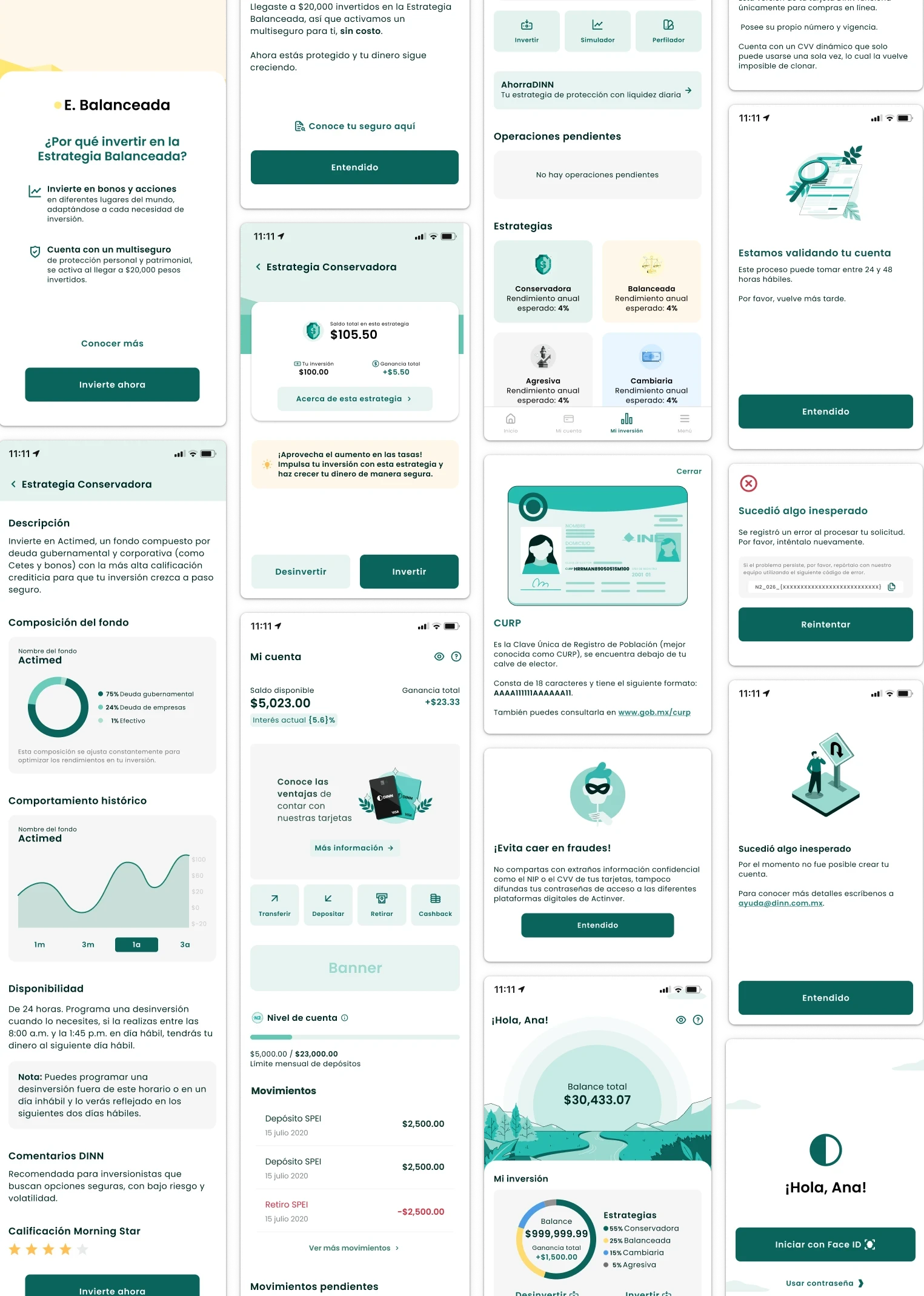
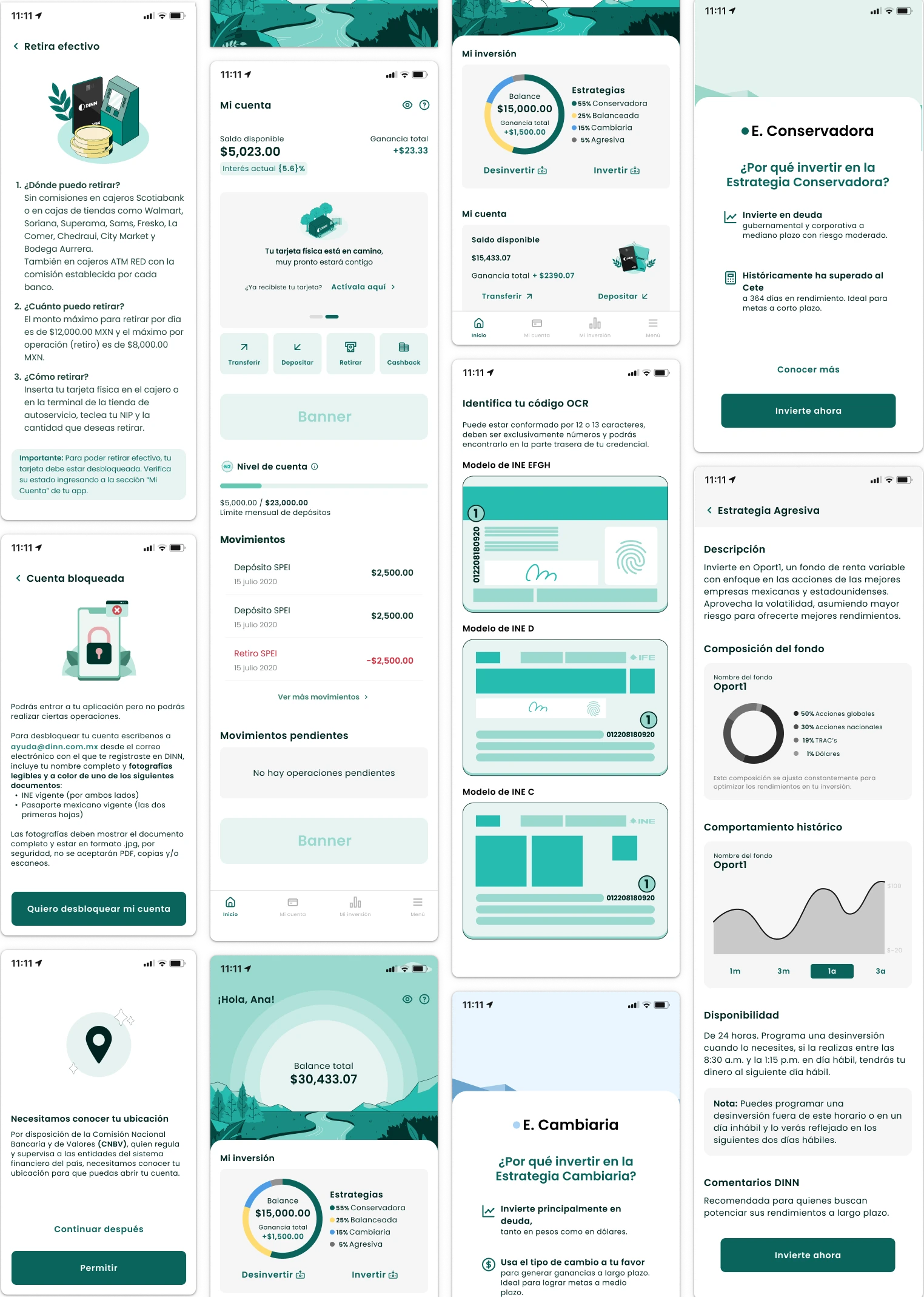
What I Built
A system that works for any designer, on any screen, without needing me in the room.

Validation
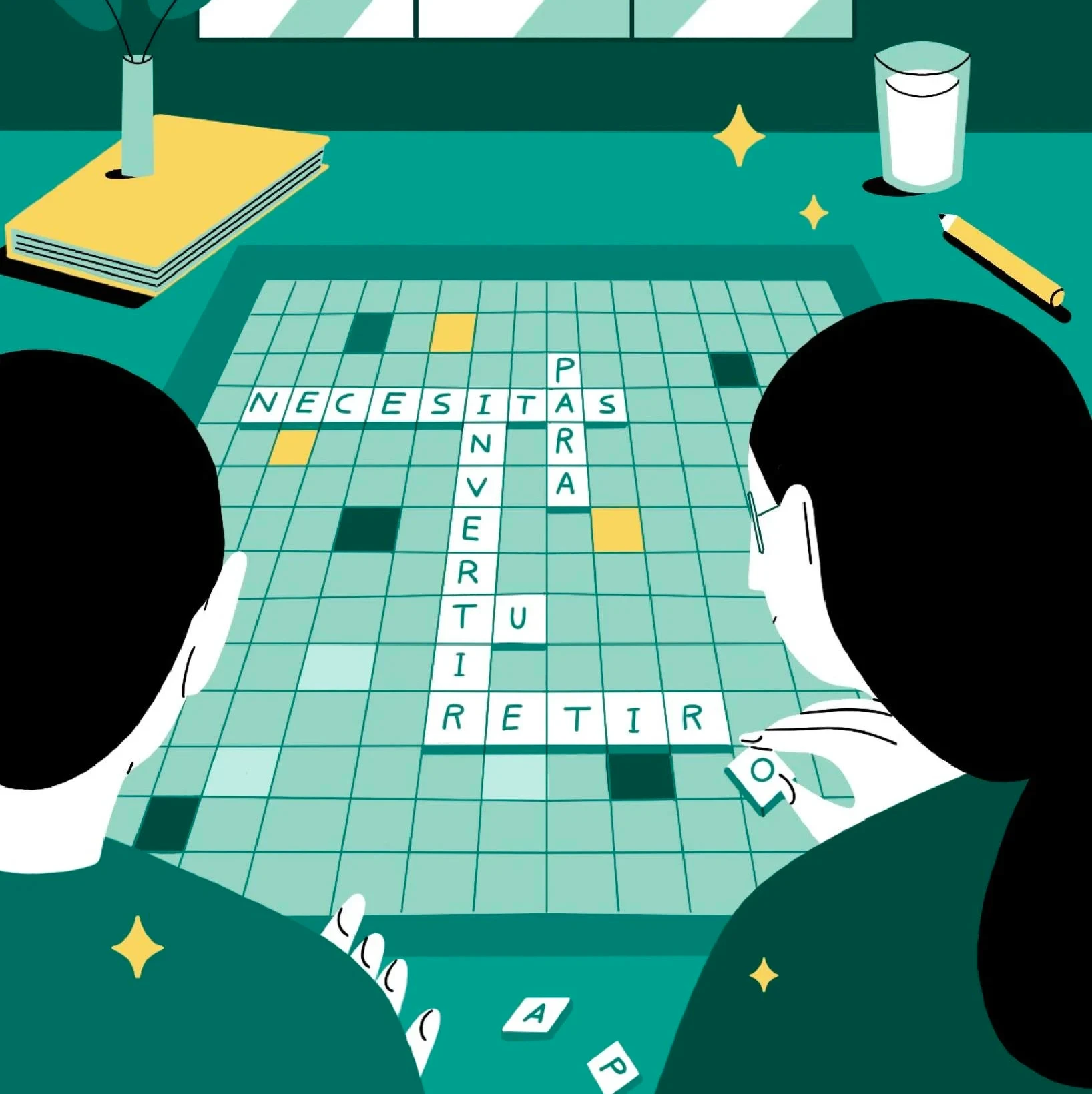
I tested the new system with 100 users (50 existing clients, 50 new) before rolling anything out. In a financial product, you don't ship on instinct.
50 new users — no prior exposure to the product
Execution
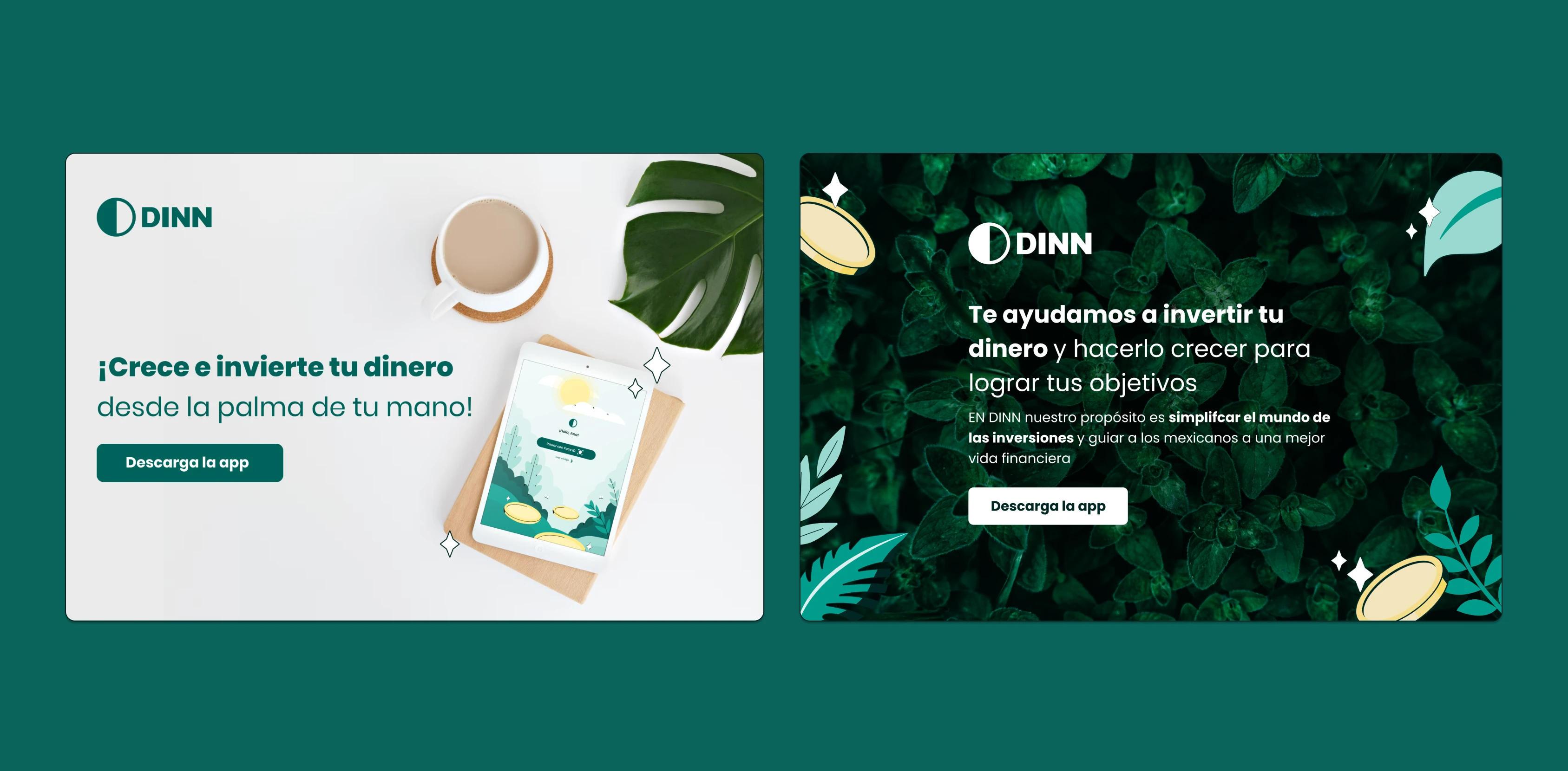
I led implementation across the full product, coordinating illustrators, UX/UI designers, and the communication team under one direction so the system applied consistently everywhere.
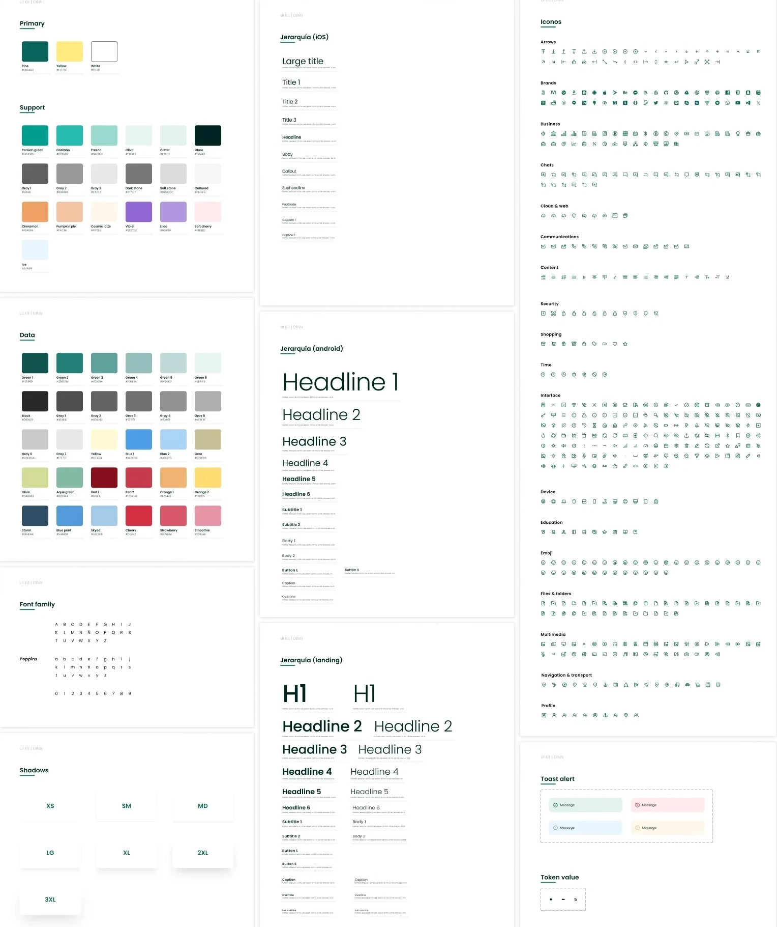
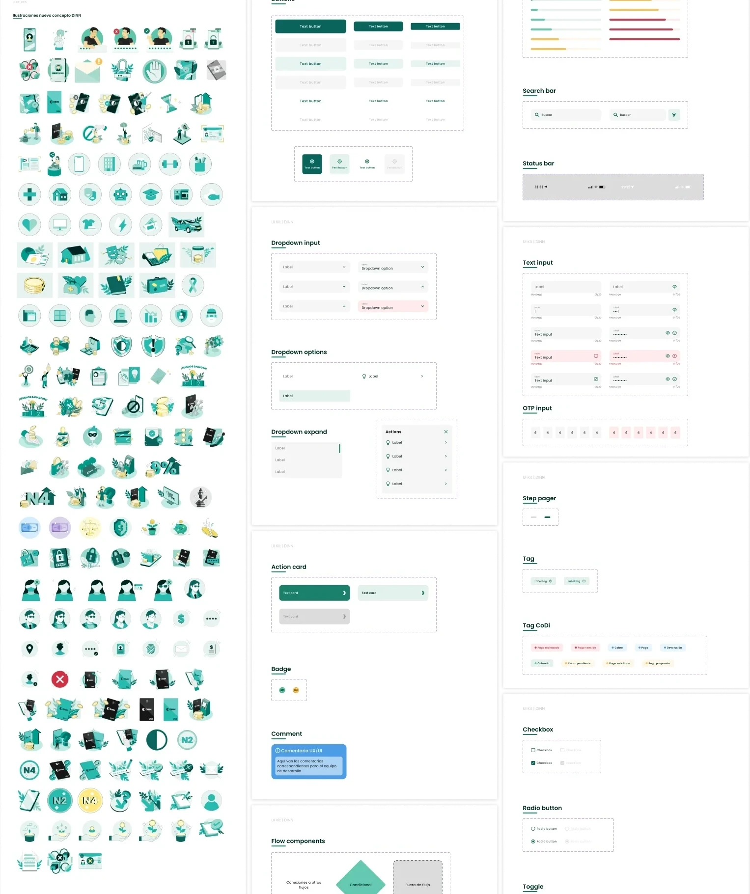
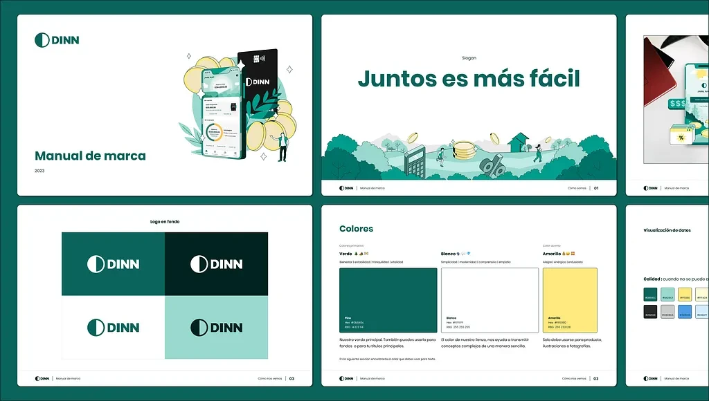
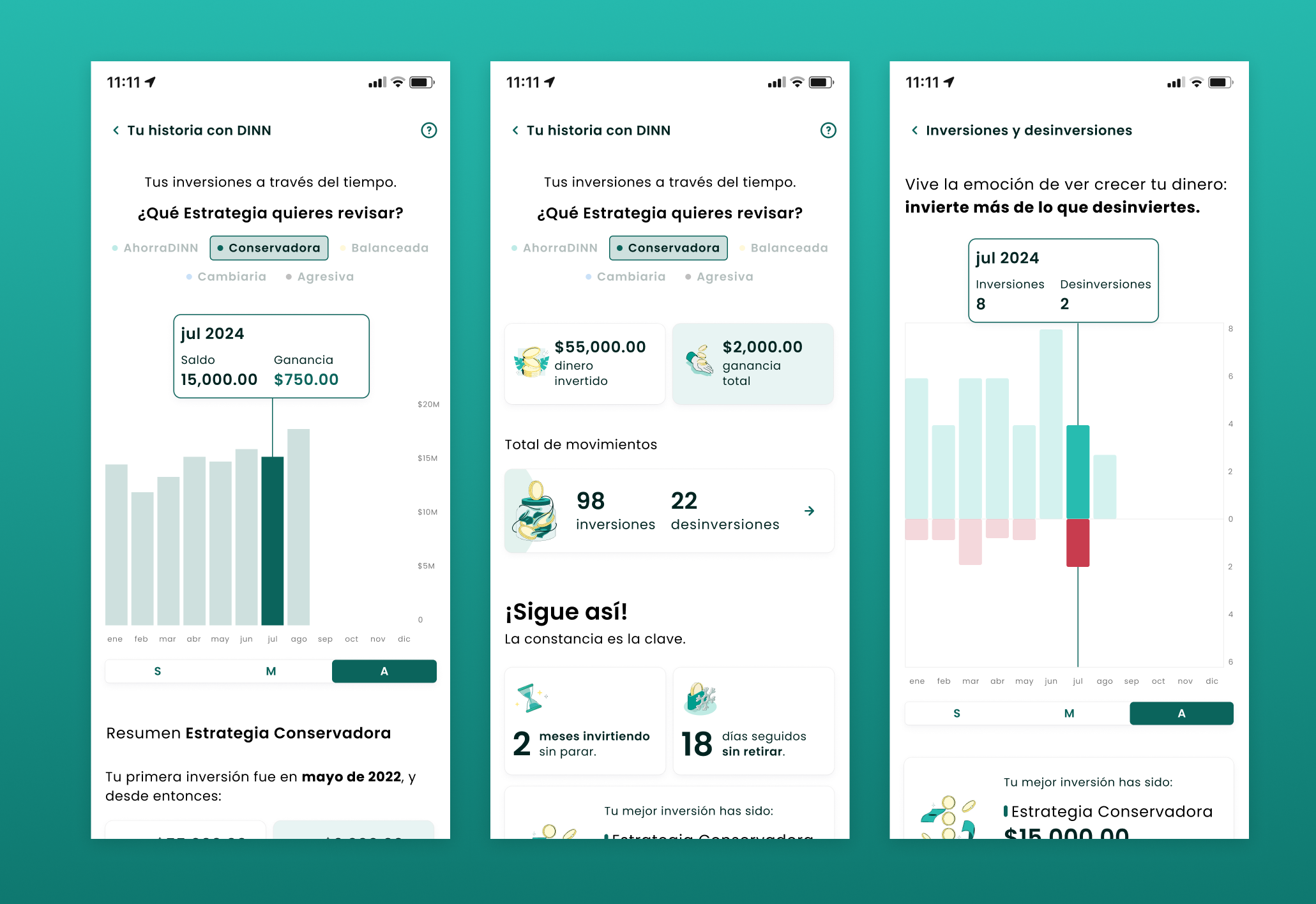
Key Deliverables
Outcome
92% of tested users perceived the product as more secure; trust, calmness, and simplicity scored 85%+ across every dimension. The documentation is the part I'm proudest of — it's still in use today, a real system the team keeps building on.


Reflection
Users don't process trust rationally — they feel it. Color proportions, spacing, illustration tone aren't aesthetic preferences. They're the product. You can update the logo and the guidelines, but if the product doesn't reflect the new brand, nothing actually changes.