
NationalBankBrand
+9pts
Aided awareness
Nielsen Brand Health Study, n=1,000
56%
Investment consideration
Nielsen Brand Health Study, n=1,000
+15%
Women-led creative engagement
Validated representation strategy
Impact
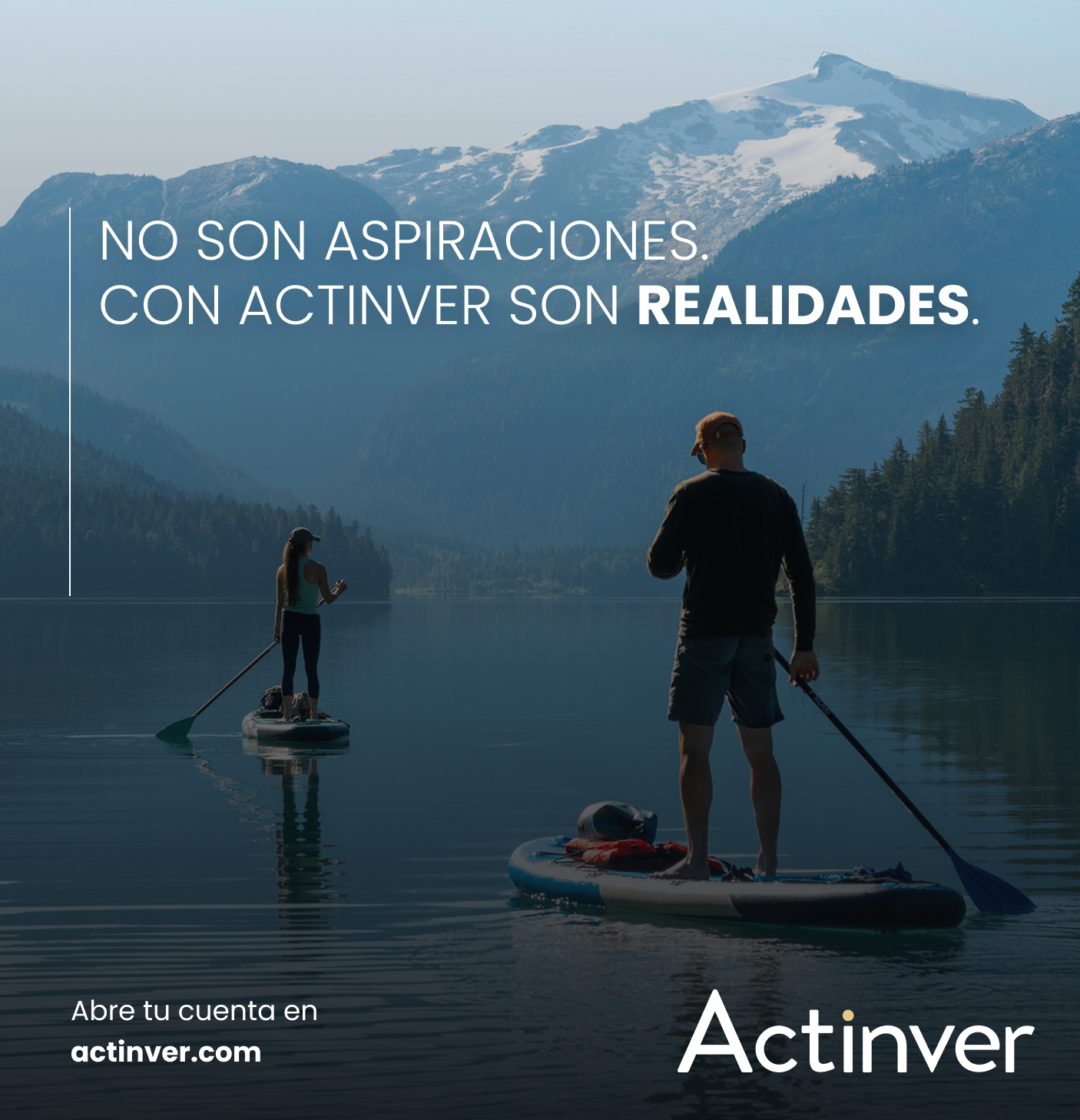
Security was the #1 driver and the #1 barrier at the same time. The rebrand didn't invent trust — it made the trust already earned visible.
Context
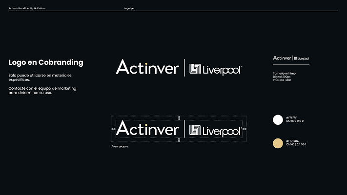
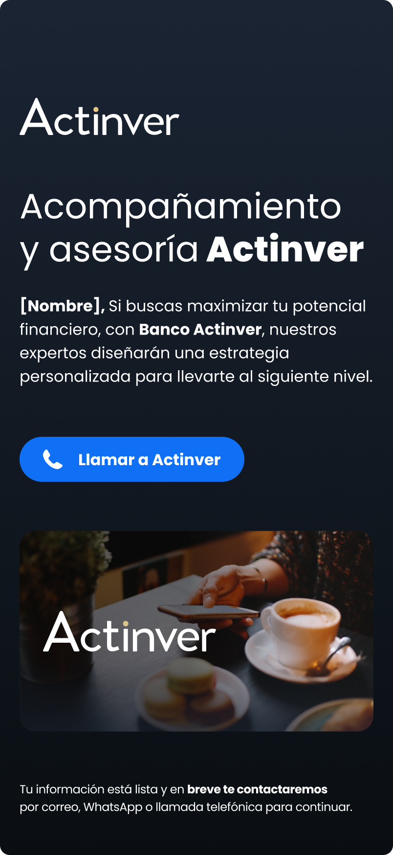
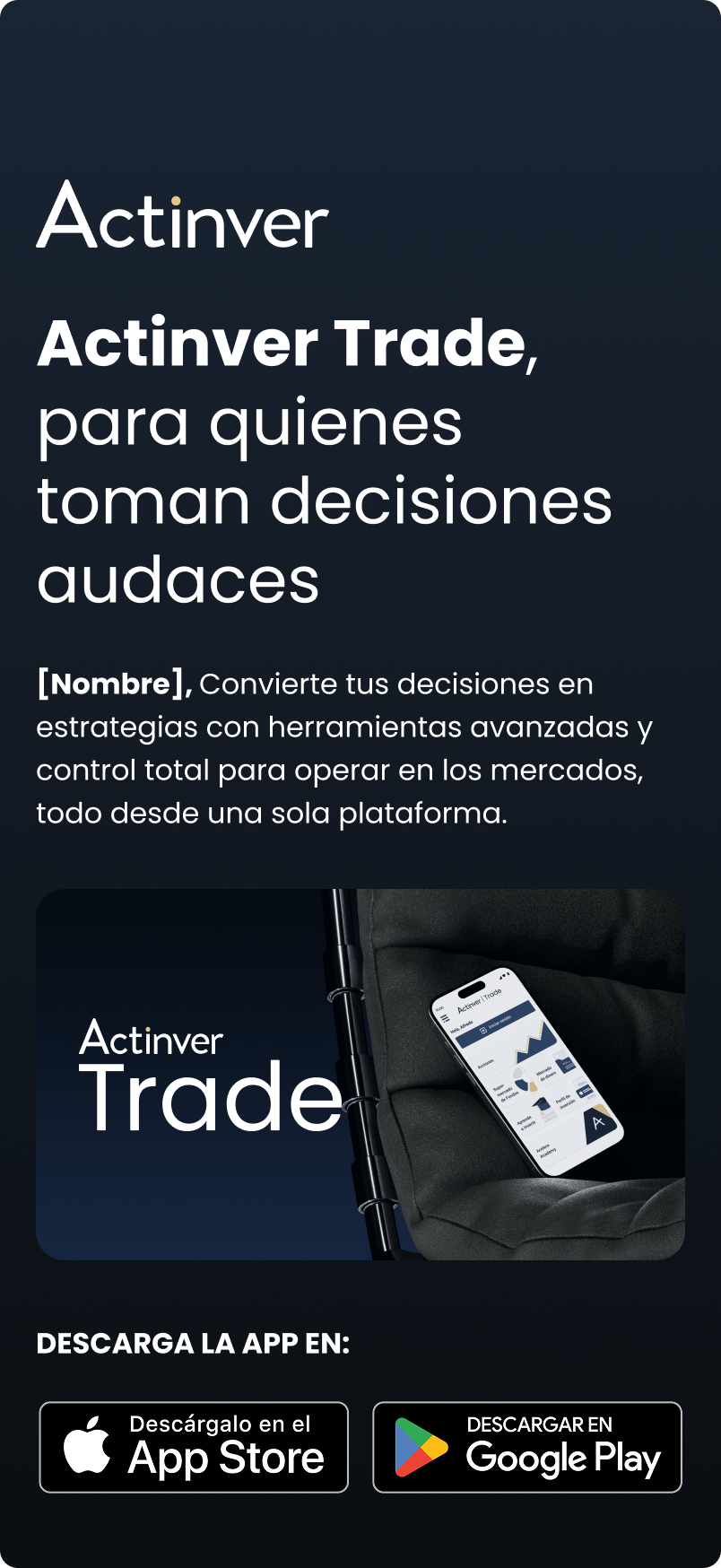
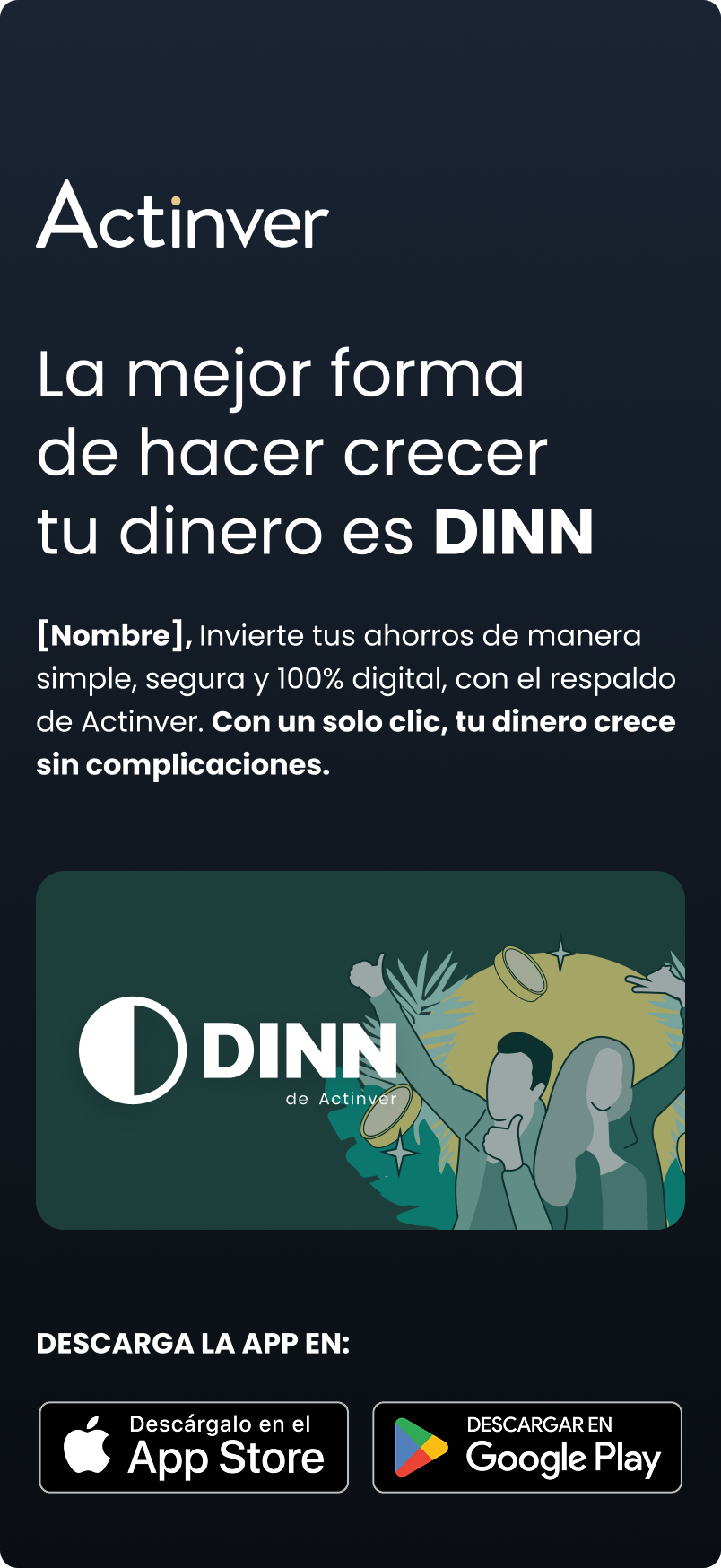
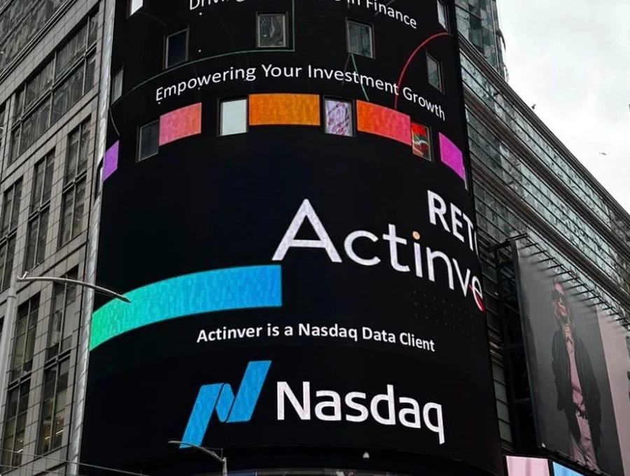
Actinver — national investment bank, multi-channel, multiple business units (digital investments, trading, insurance, premium advisory)
December 2024 – April 2025 — digital-first rollout, phased expansion.
Then into the product entry point and acquisition through 2025.
Led creative direction and brand governance across a 15-person in-house team — plus external agencies and executive stakeholders across multiple business units.
Owned the visual system, the narrative strategy, and channel consistency — from launch to ongoing production.
Then took the system into the product: designed the segmentation flow hands-on, set the routing logic with Data, and led the full-funnel acquisition campaign that fed it.
The Challenge
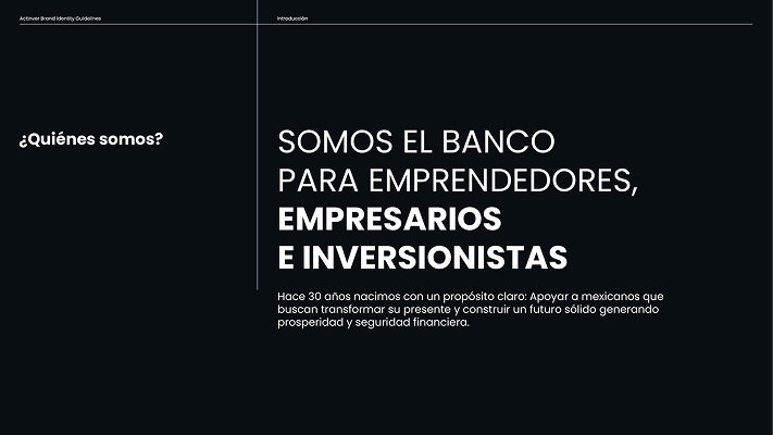
Actinver had what few financial brands have: decades of institutional trust built around investment specialists. But trust alone wasn't enough for a new generation.
The brand felt safe but outdated — pushing younger affluent audiences toward newer-looking options, even riskier, unregulated ones.
The challenge wasn't building from zero. It was making the trust they already had visible.


Diagnosis
Brand health research, competitive audit, and a full look at how the brand showed up everywhere.
An external qualitative study confirmed it: across every profile, Actinver read as a brand for "gente que ya sabe invertir." People with less financial confidence felt it wasn't for them — even when they had the capital. The visual language was communicating caution where it needed to communicate confidence.
Brand Architecture Shift
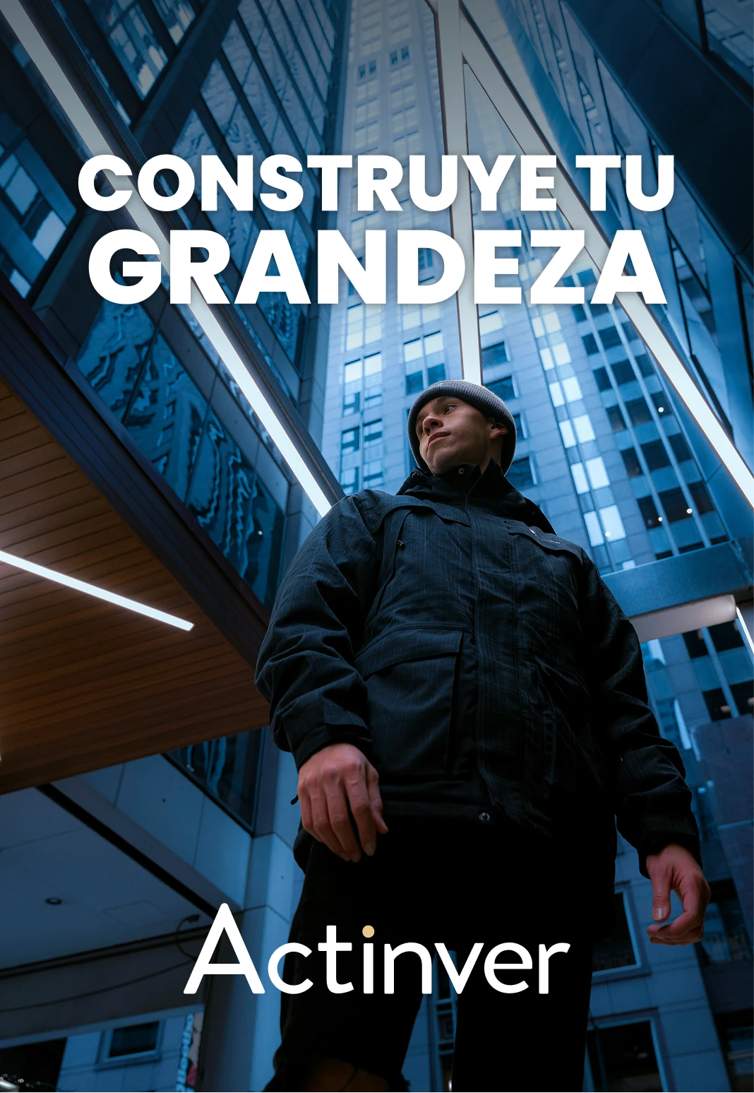
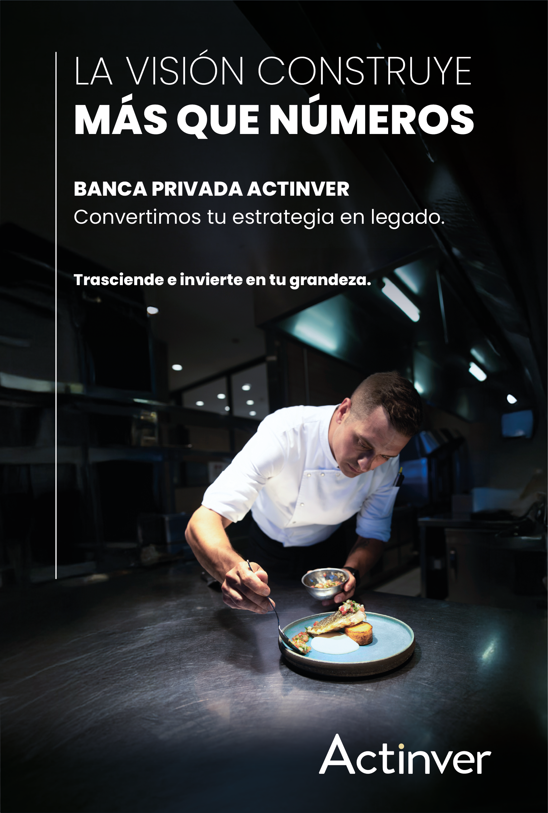
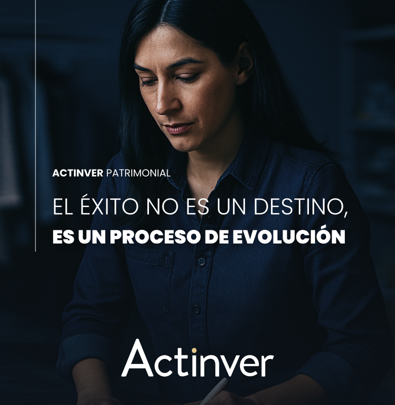
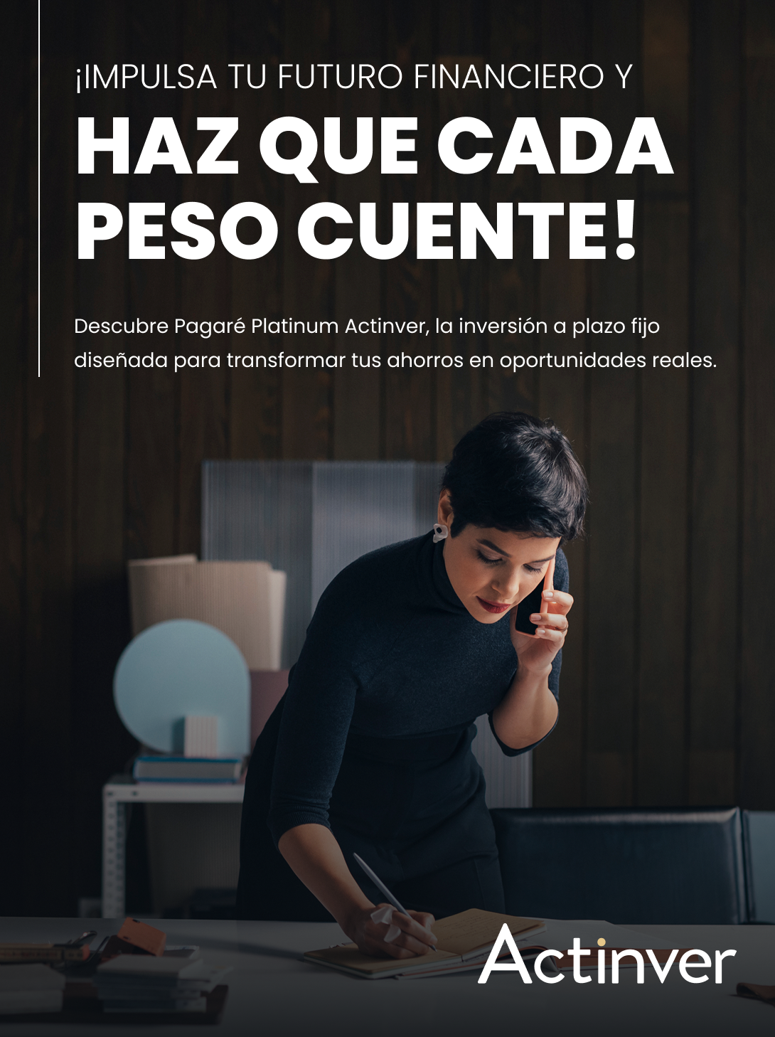
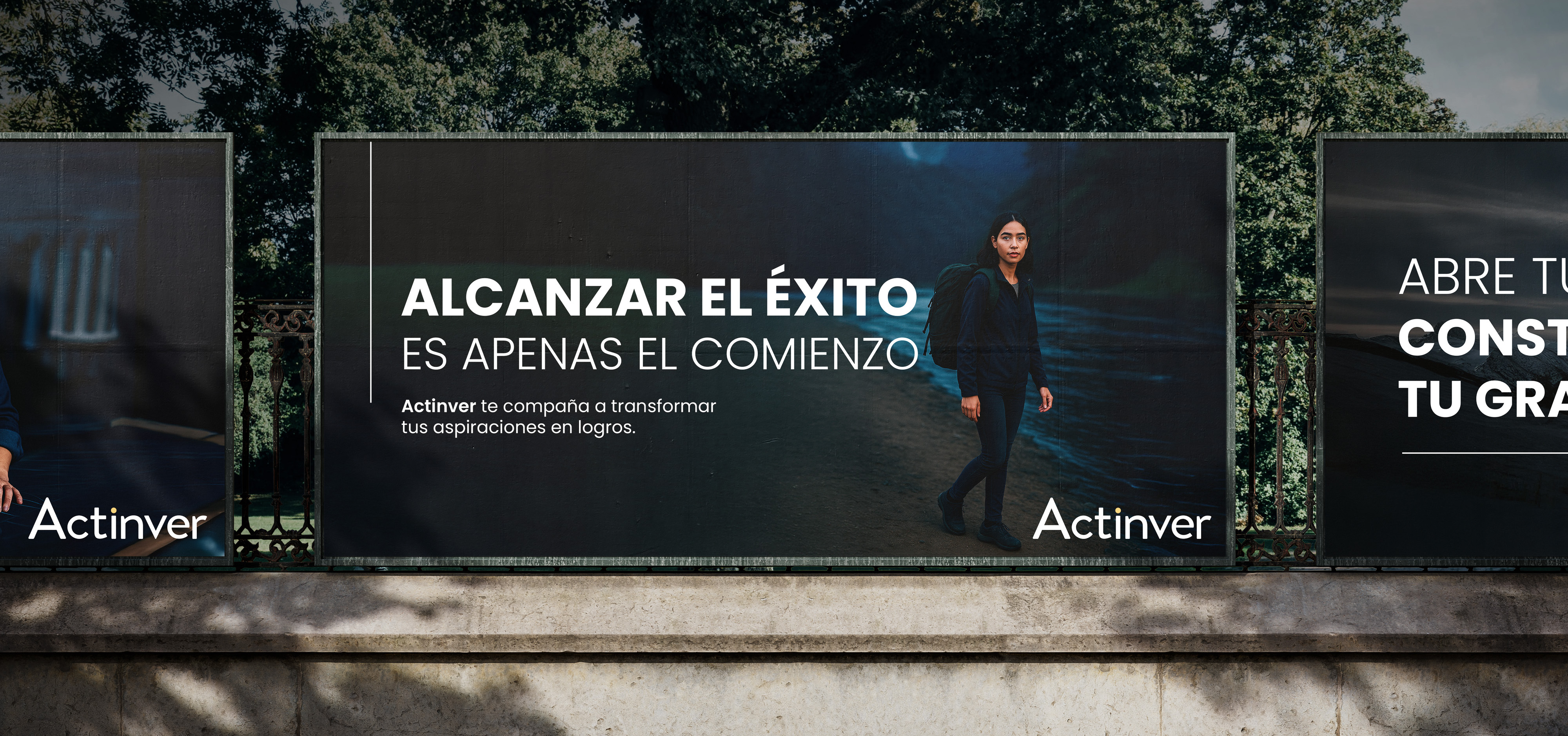
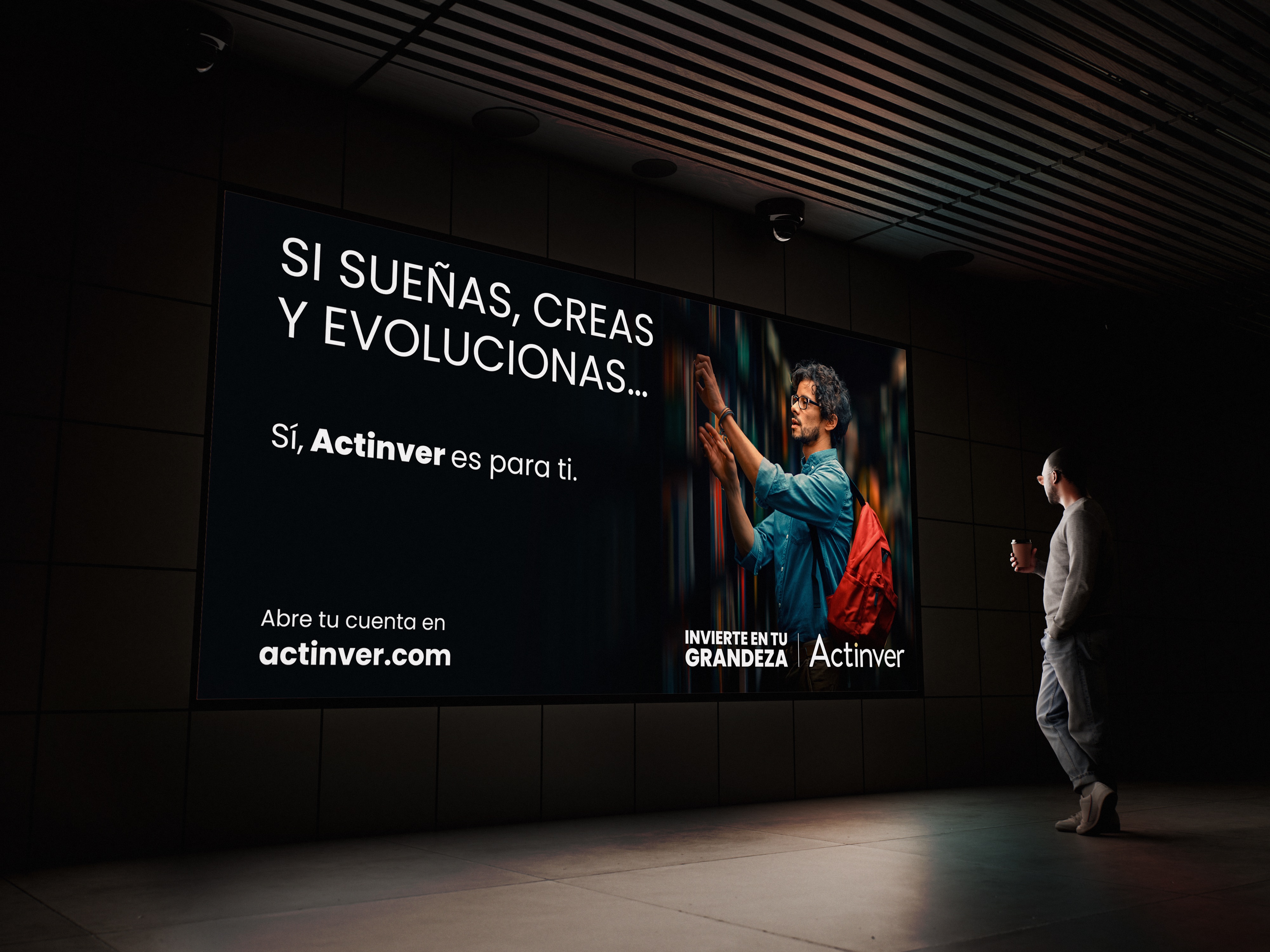
From product promise → to life-moment solutions. "Acostúmbrate a ganar más" → "Construye tu grandeza."
Actinver is for people building their own greatness — not just chasing a rate. That became the north star across every touchpoint and segment.
Actinver Brand Manifest
The 3 Hard Decisions
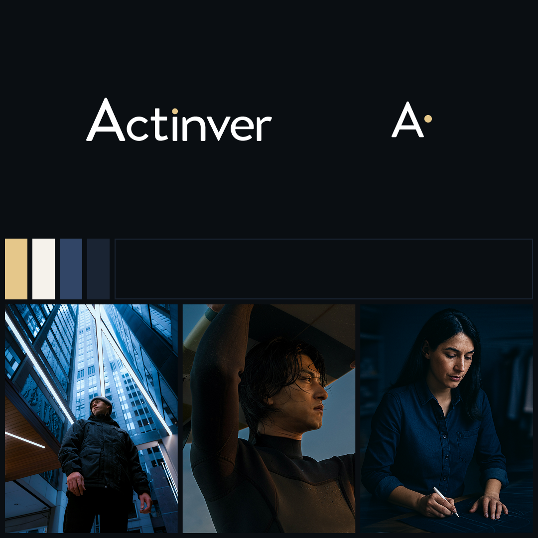
Visual System
01 — Fundamentals & Brand Narrative
Brand Essence
We are the partner of those who understand that success is not a privilege, but the result of ambition, discipline, and personal commitment. We celebrate the builders of their own greatness.
Our exclusivity is not defined by who you are, but by your willingness to invest in yourself, commit to your goals, and work toward them with discipline and passion.
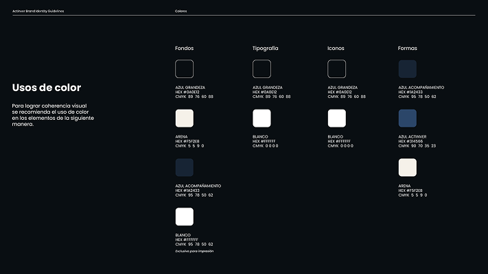
02 — Color
03 — Photography

04 — Typography, data viz, layout — everything documented.
Execution
I led the rollout — visual guidelines, narrative principles, motion system, cross-channel governance — across internal creative teams, Growth, CRM, and external agencies at once. Campaign testing ran in parallel, so real performance data fed straight back into the system.
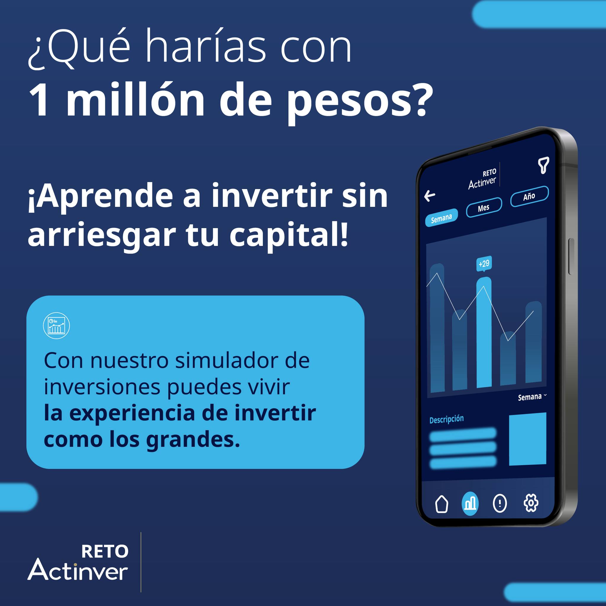
Social media
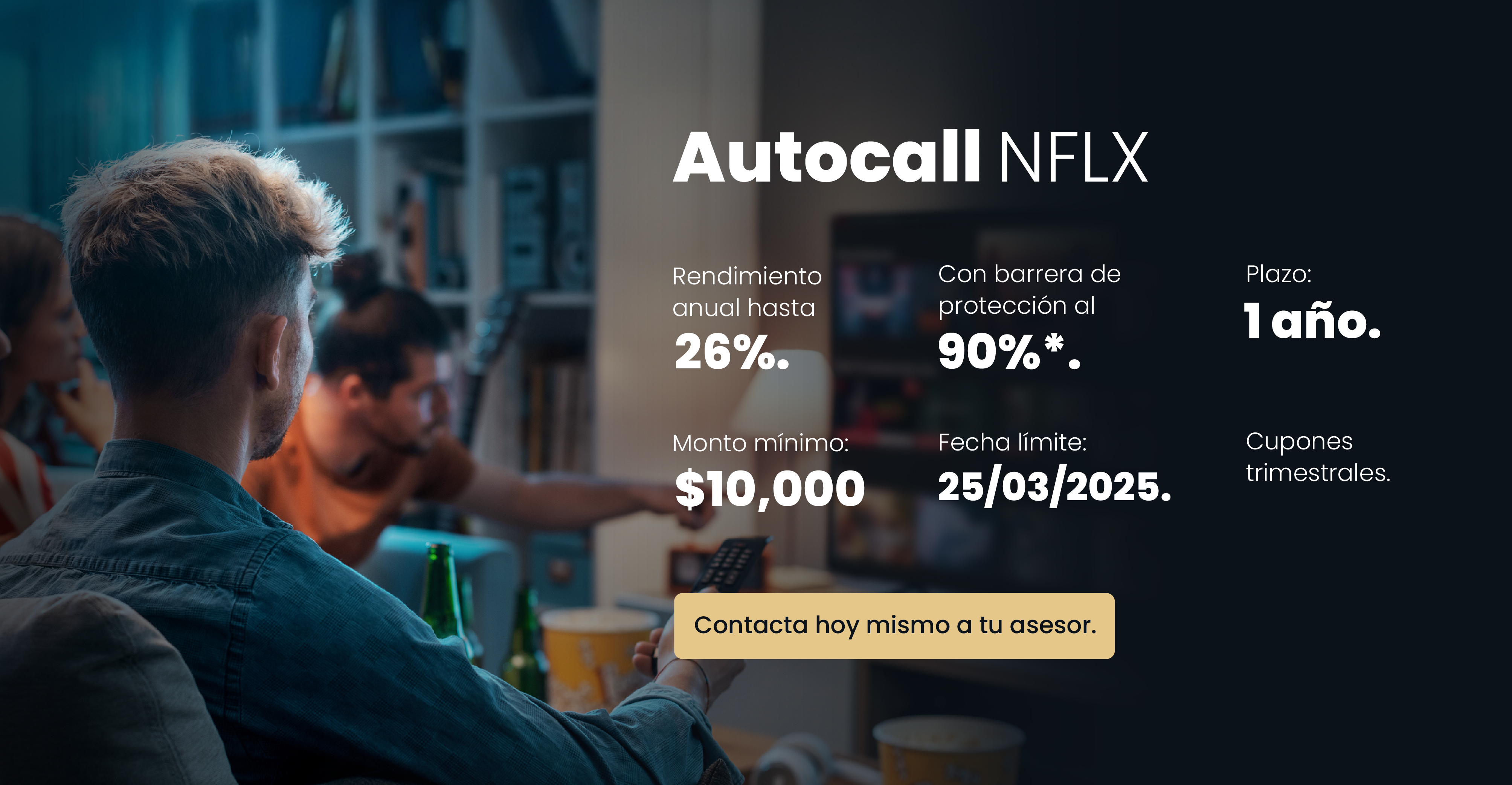

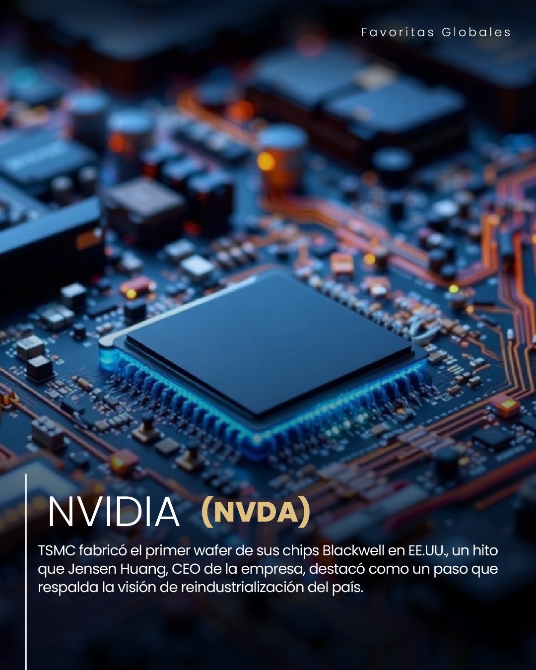


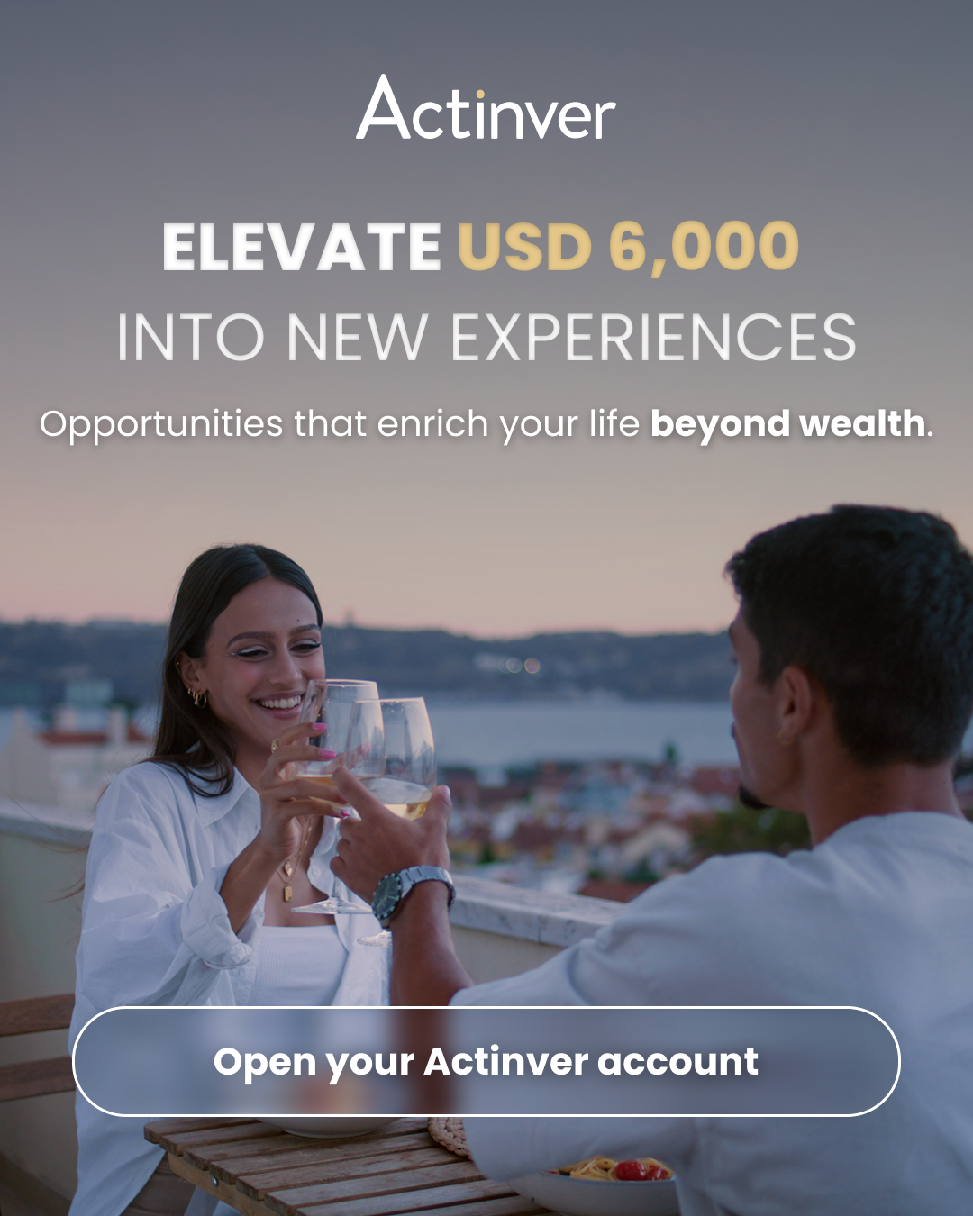
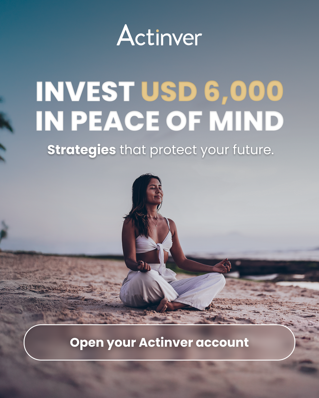
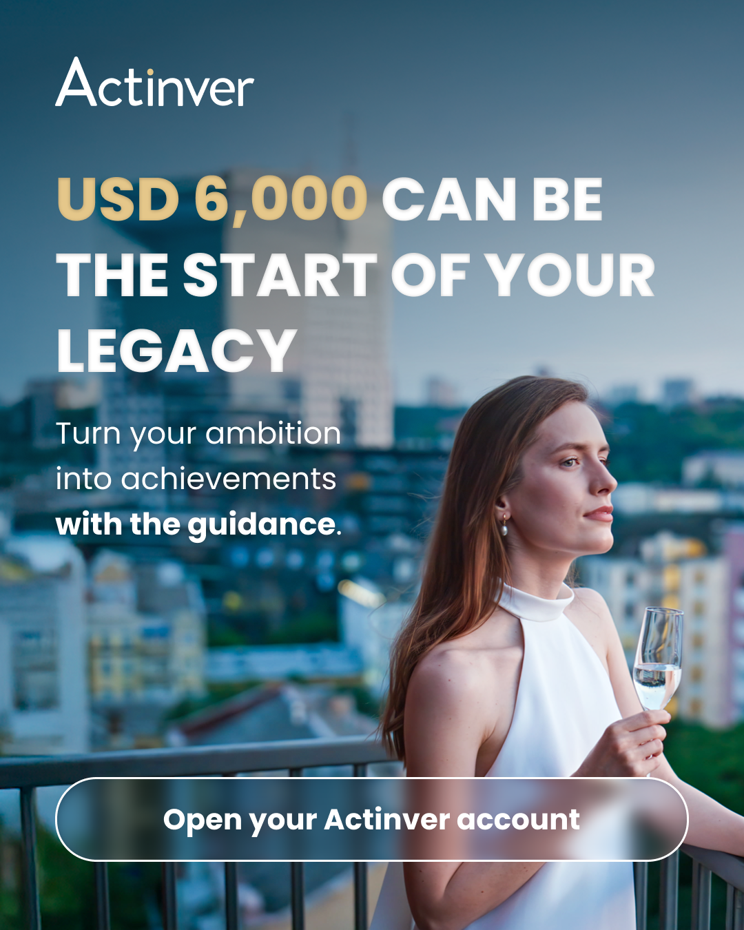
Full Funnel Digital & OOH Campaign


Print & documents


From Brand to Acquisition — One Entry Point
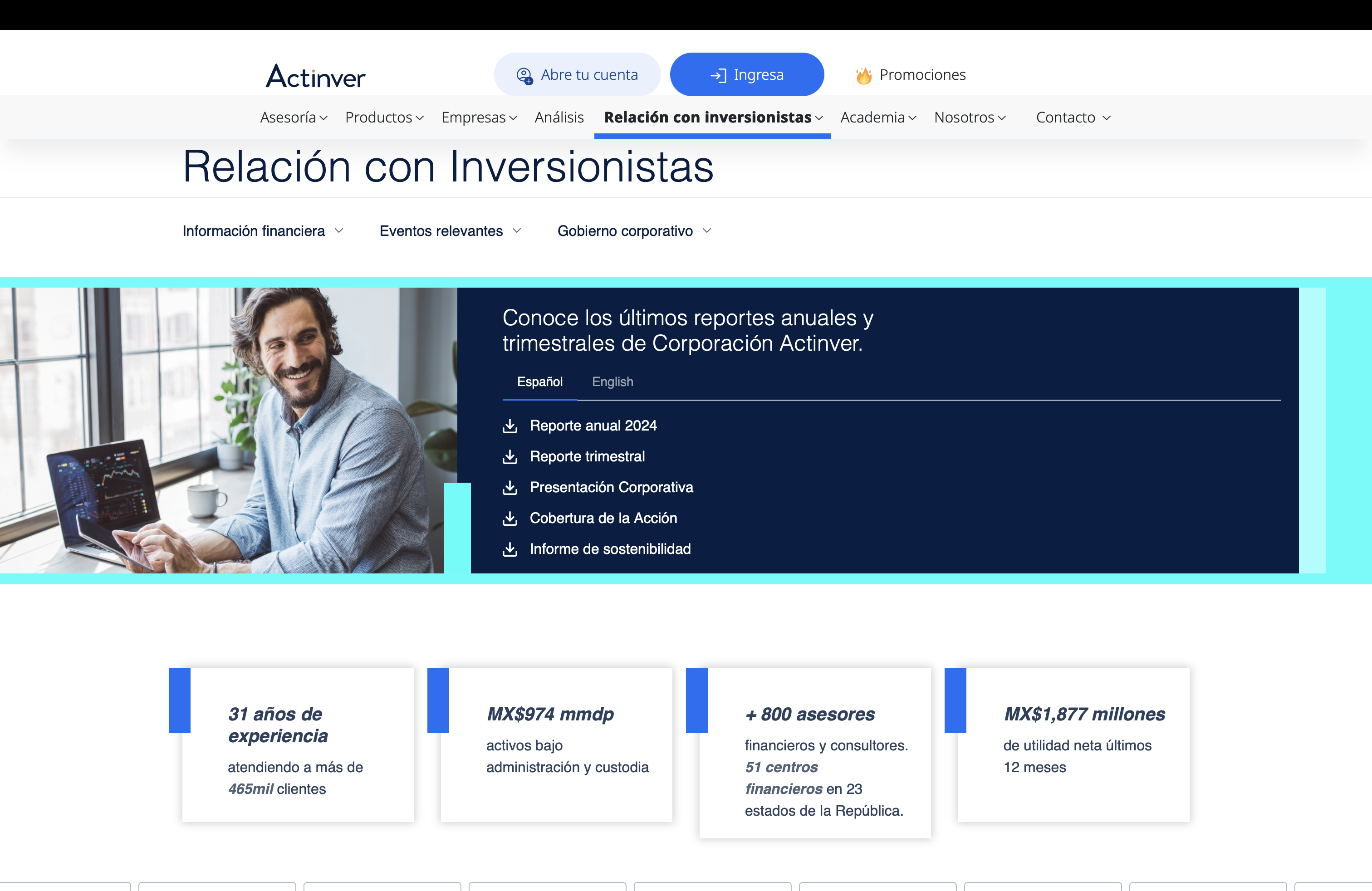
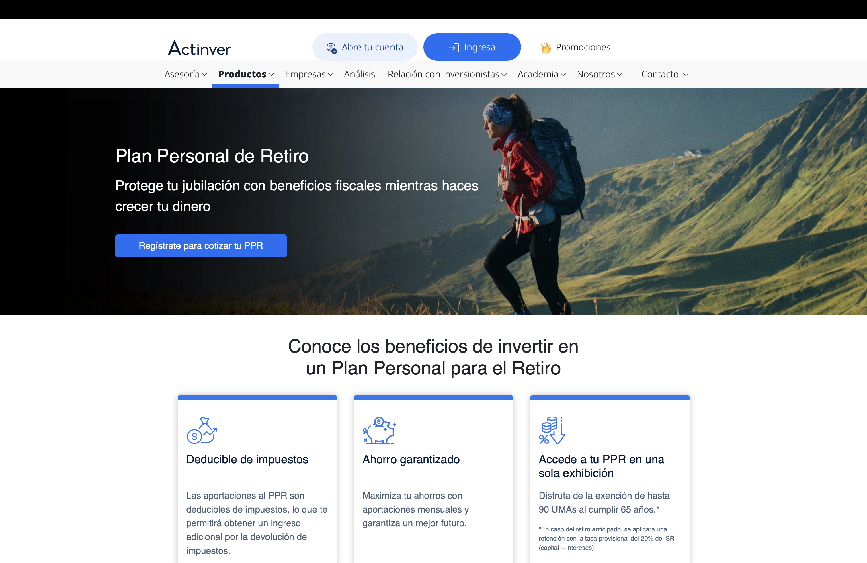
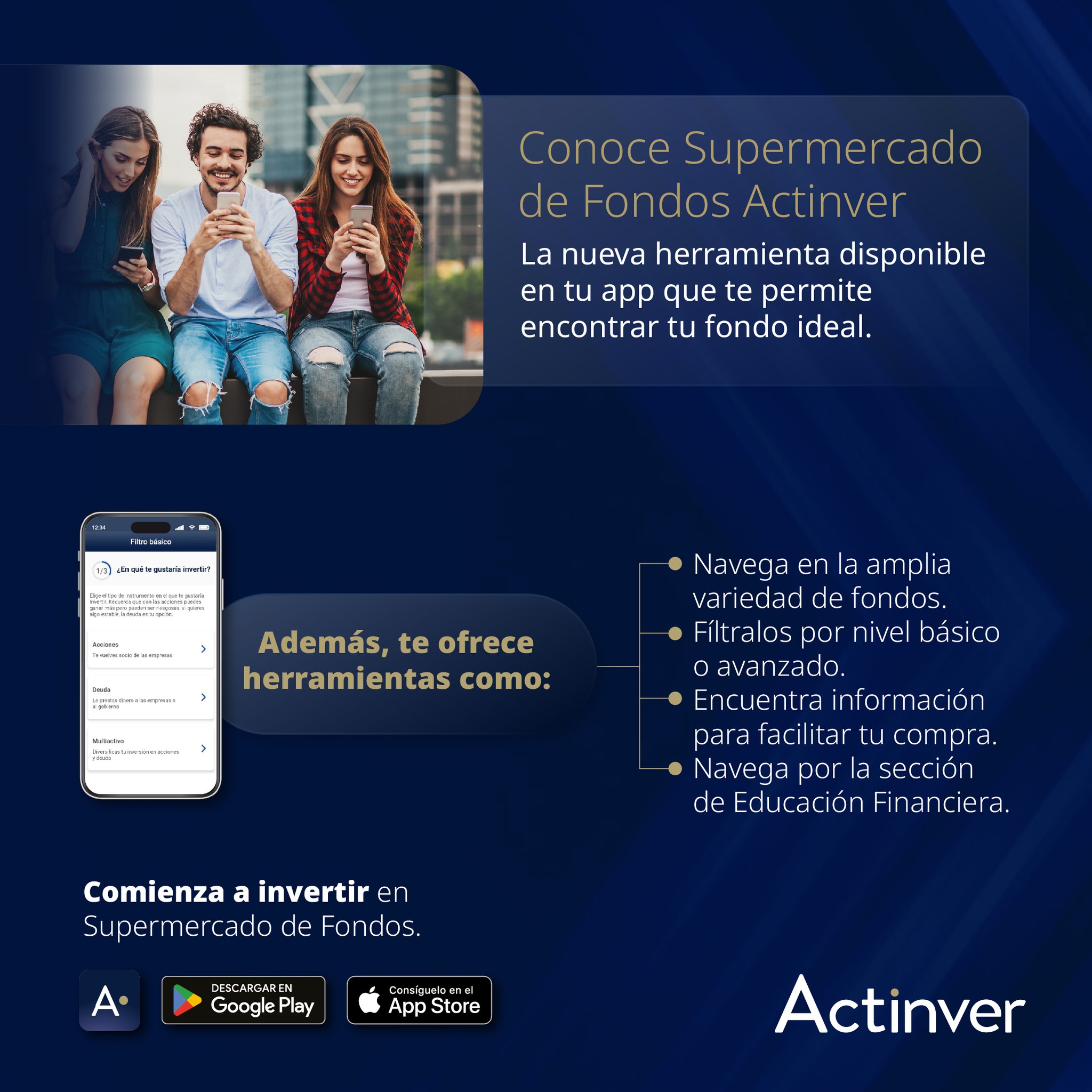
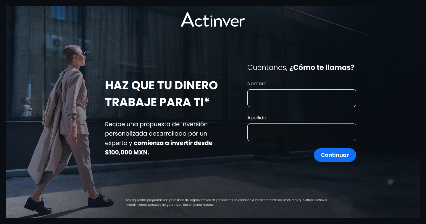
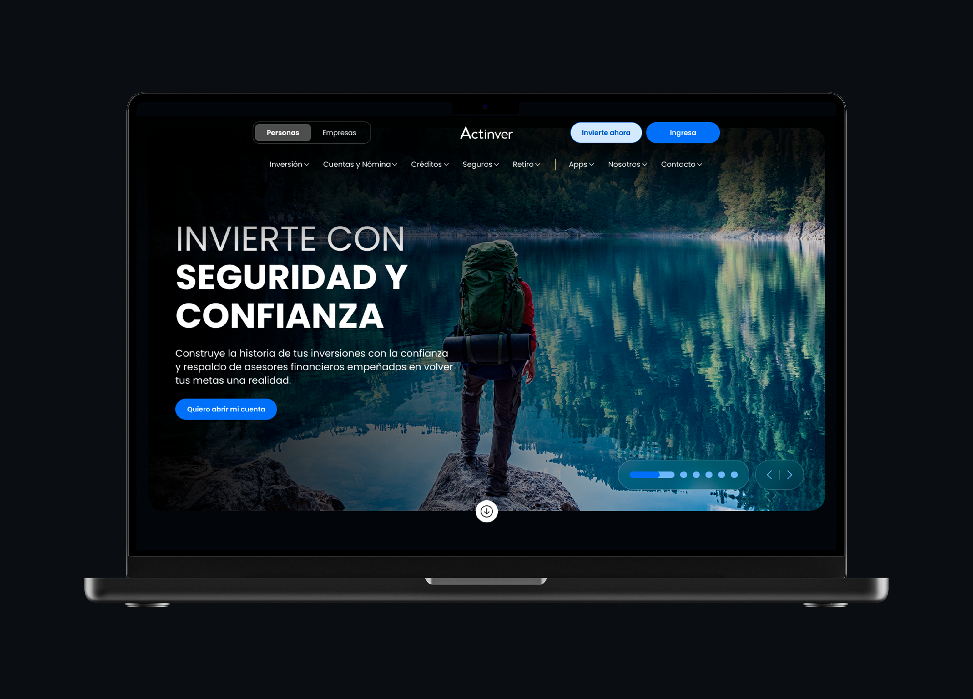
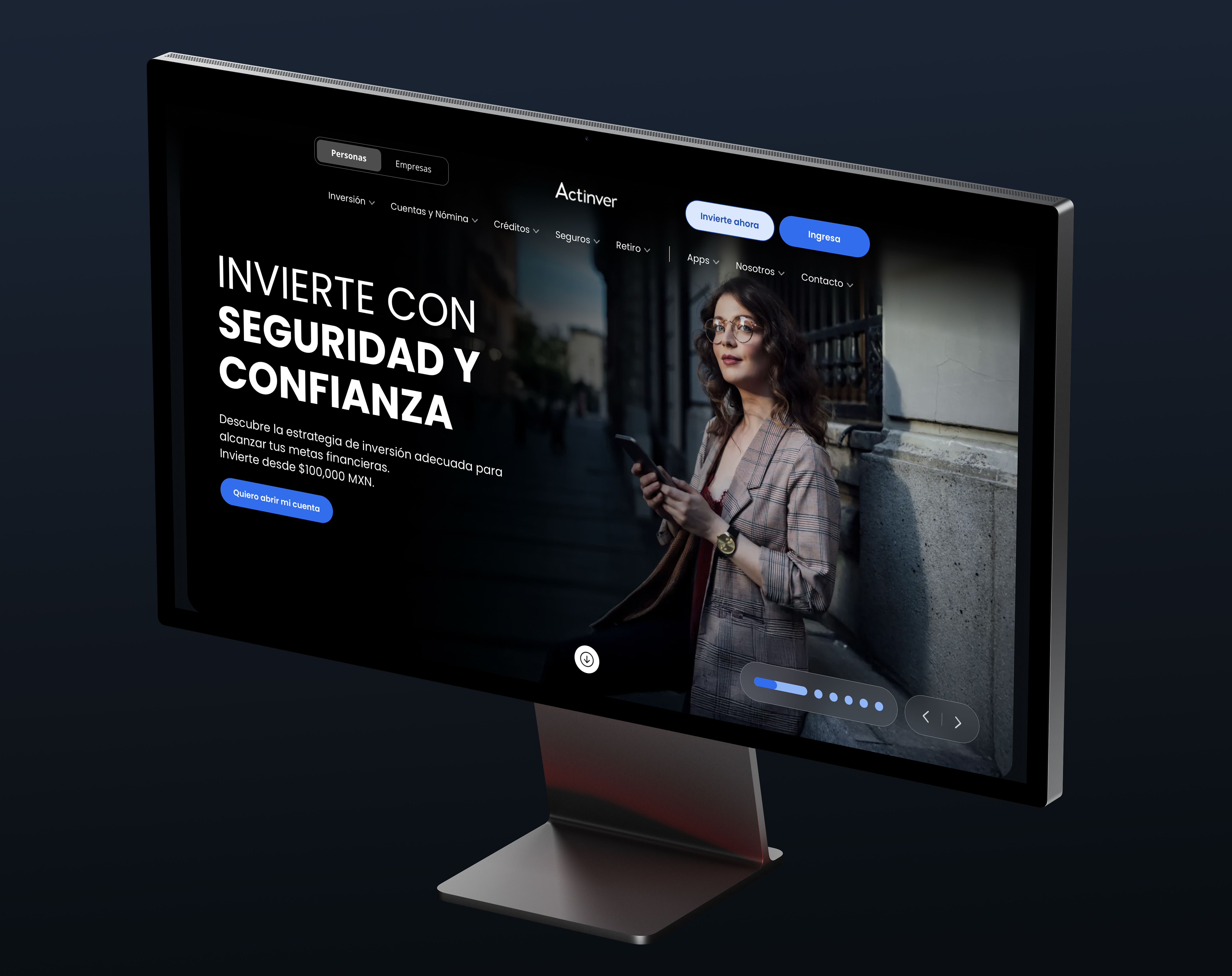
Actinver.com had close to ten entry points — different CTAs, different forms, some broken. The site mirrored the org chart.
But users don't think in product categories. They think in goals.
The entry point should speak the user's language — not Actinver's org chart.
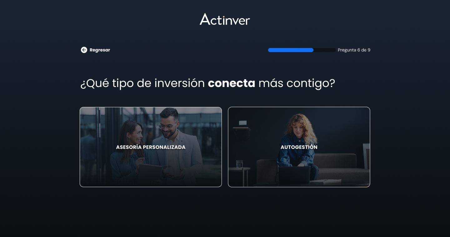
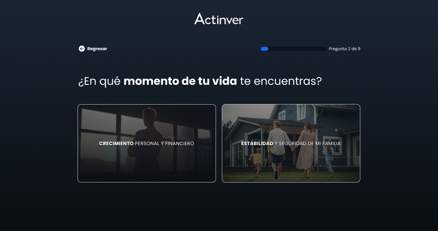
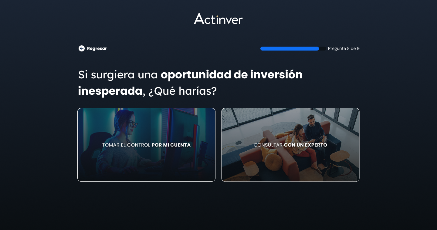
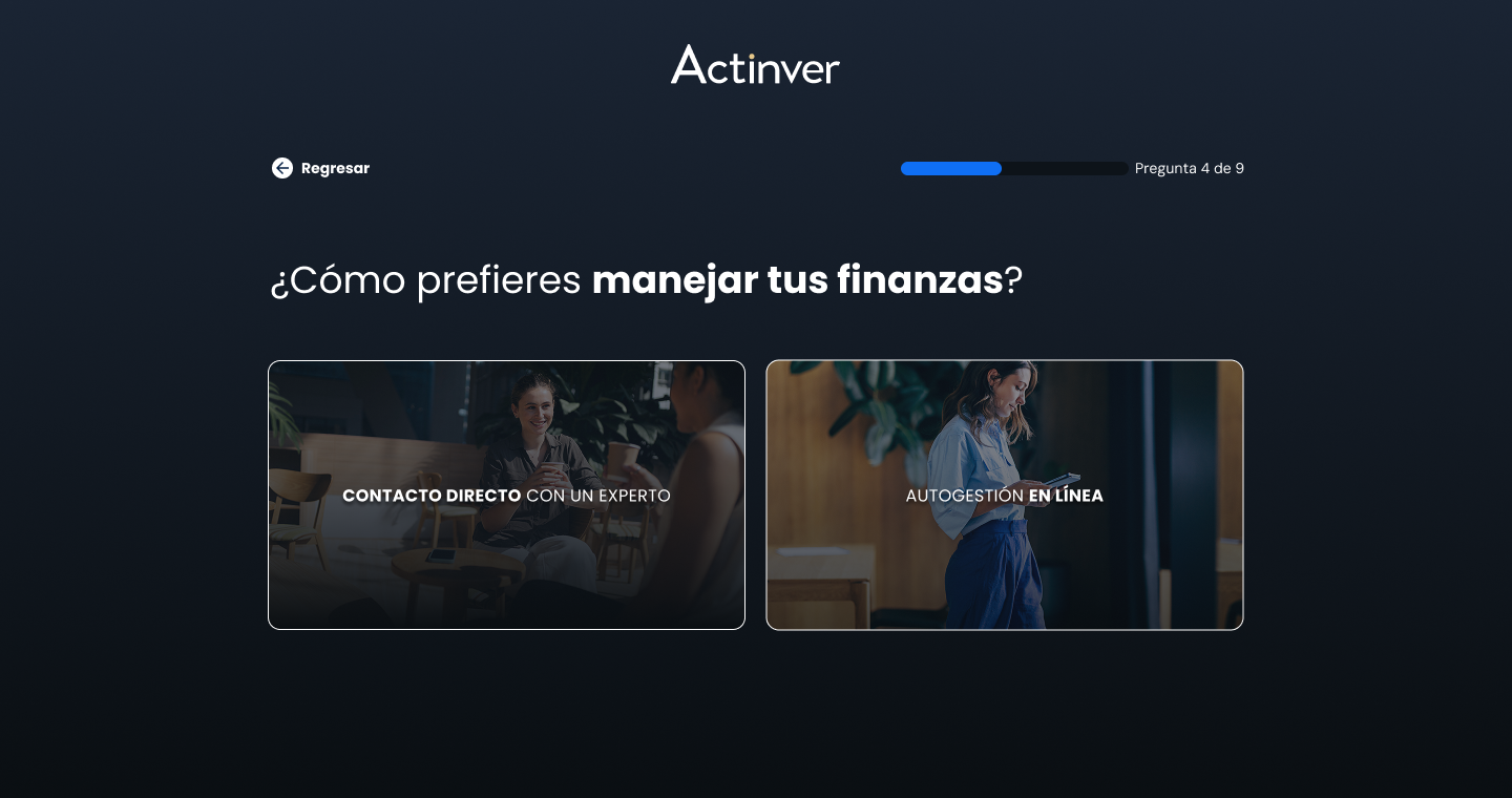
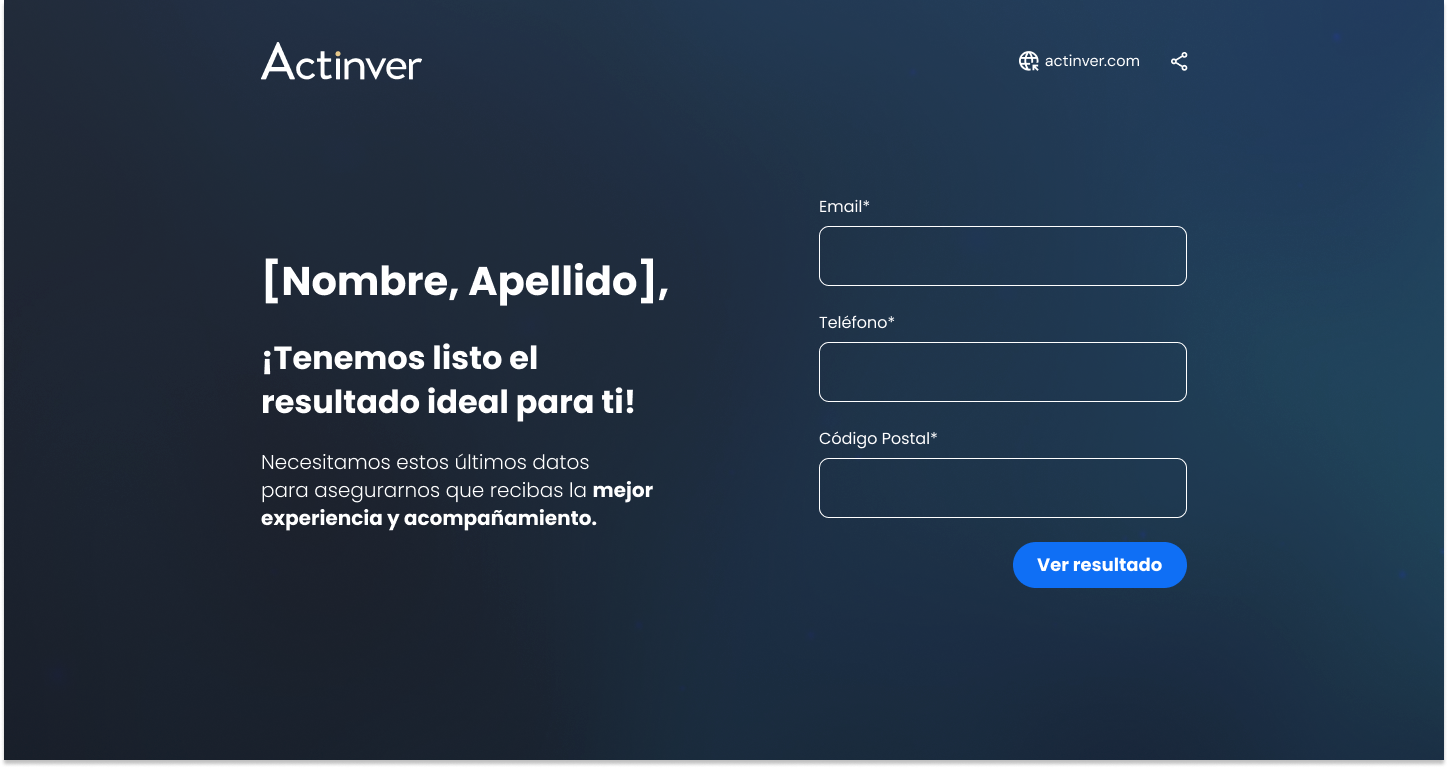
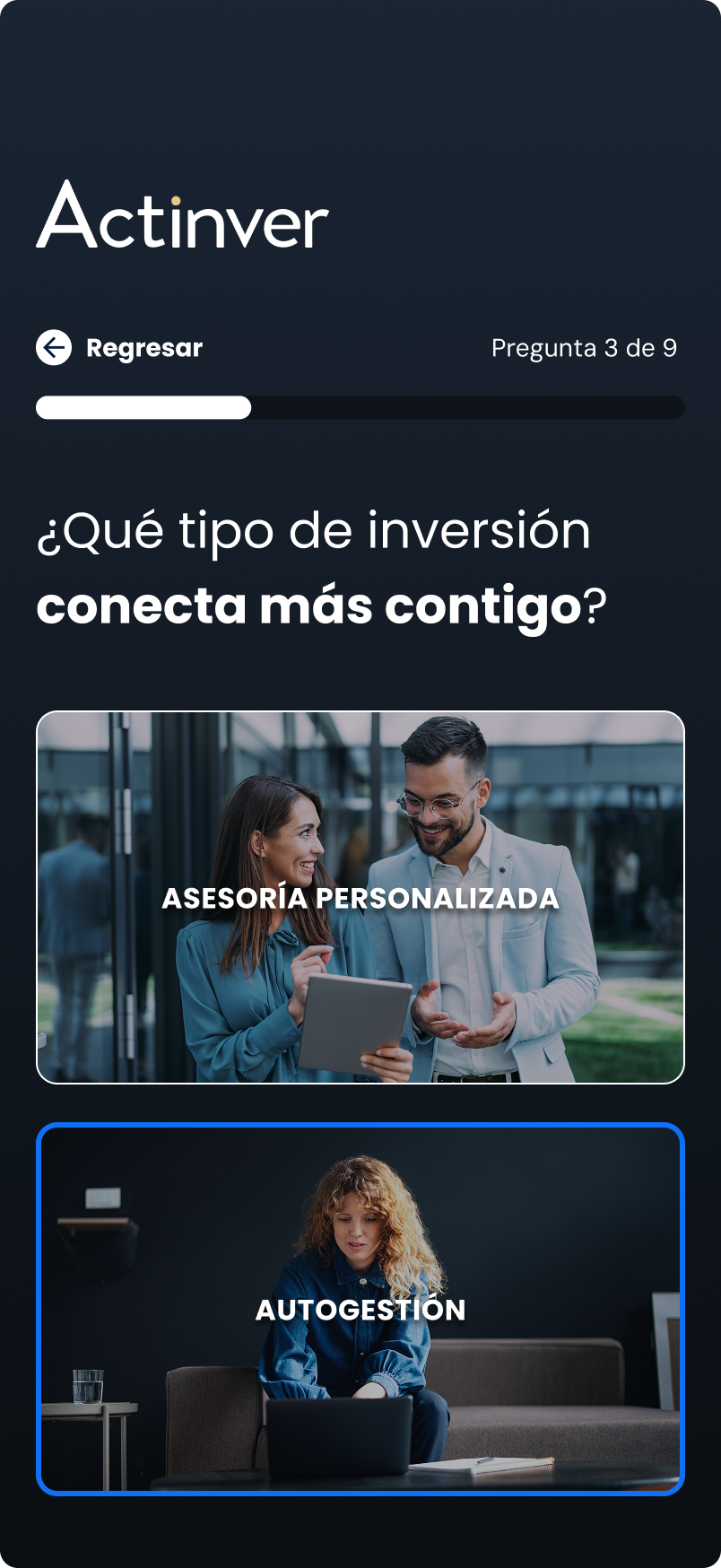
I designed one behavior-driven flow to replace all of them — ~9 questions about goals, savings habits, and experience, no jargon.
The answers route the user into one of three paths (Advised, Self-directed, or DINN). By the time they land, they're already qualified.
The campaign fed it directly. "Construye tu grandeza" became "Invierte en tu Grandeza" — invest your money, invest in yourself. Actinver as a mentor, not another bank teaching financial education.
I built the rationale with an external agency, created the master pieces, and my team produced every adaptation — video, static, email, DOOH, social. Every CTA led to the same place: the questionnaire.
We also ran geo-segmented creative for high-value zones like Los Cabos.


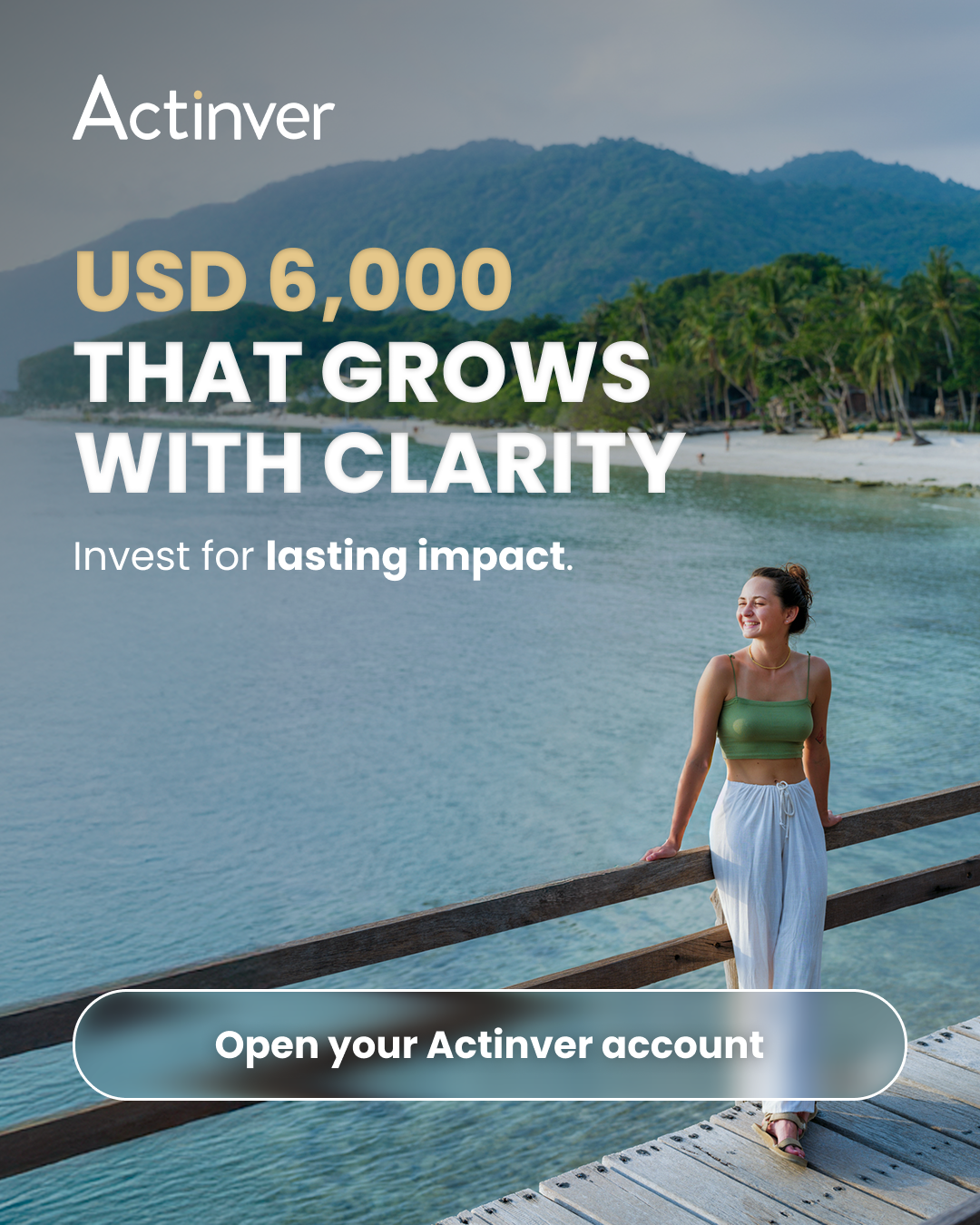

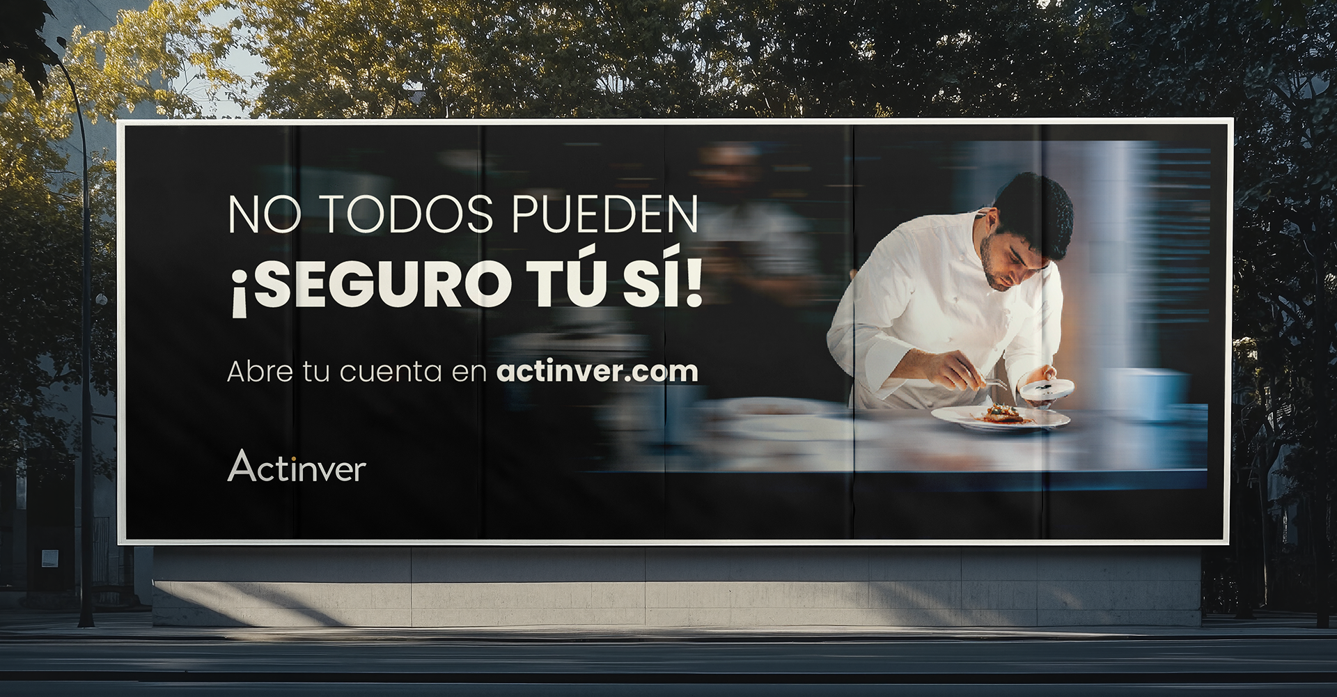
I ran the flow as a versioned experiment: hypothesis → variant → run → read → decide → feed back. Two findings went straight into the brand system — women-led creatives outperformed in the target segment (the representation bet, now confirmed with data), and proof-based headlines beat aspiration-only ones. Specific conversion numbers are confidential per Actinver policy, but the behavioral model held across every variable. Always as a team — Data, Media, Growth, Brand.
Key Deliverables
Outcome
Investment consideration among the target (20–49, NSE AB) reached 56%. Favorability for investments hit 65% — the strongest post-rebrand trust signal. Aided awareness lifted +9pts. (Nielsen Brand Health Study, n=1,000.)
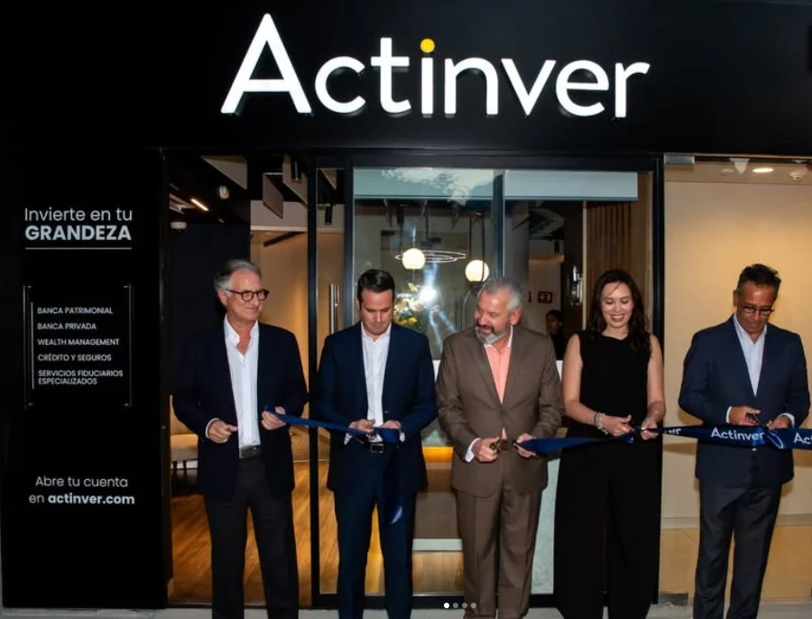
~10 product-sorted entry points became one behavior-driven flow, "Construye tu grandeza" activated as "Invierte en tu Grandeza," and the campaign's performance data fed back into the brand system. The rebrand now guides Actinver's new premium financial centers nationwide.
Reflection
The hardest constraints produced the clearest thinking — no logo change, blue stays, no abandoning existing clients. Those weren't limitations; they were the brief. And the campaign and the product were never separate workstreams: what we learned in the ads informed the questionnaire, and the other way around.